The Chainlink visual brand mark is one of the few elements inherited from the main brand. It is shown as a monochromatic flat emblem designed to be applicable in a variety of spaces, facilitating its adaptability and readability across a variety of applications.
The Chainlink isotype is an outlined regular hexagon. In a 2D or flat perspective, hexagons often symbolize connection, thanks to their equilateral and equiangular features. However, viewed in an isometric perspective, the hexagon takes the form of a cube (or block). This perspective allows for clear representation of 3D objects in a 2D format, thus simplifying the understanding of complex structures or architectures.
Both these concepts anchor Chainlink’s nature and mission, making the hexagonal shape the foundational piece for a scalable brand able to host all types of technical and non-technical artifacts.
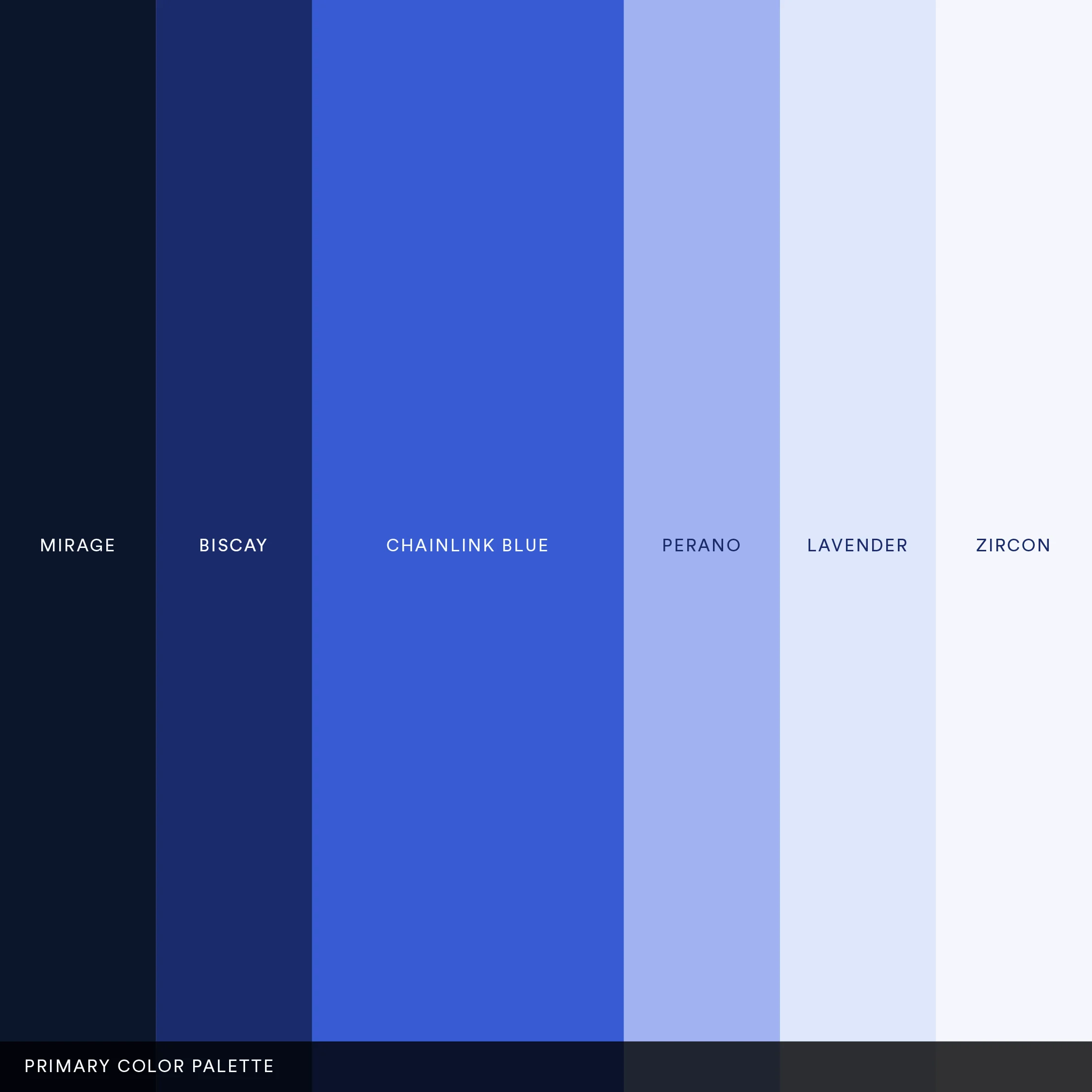
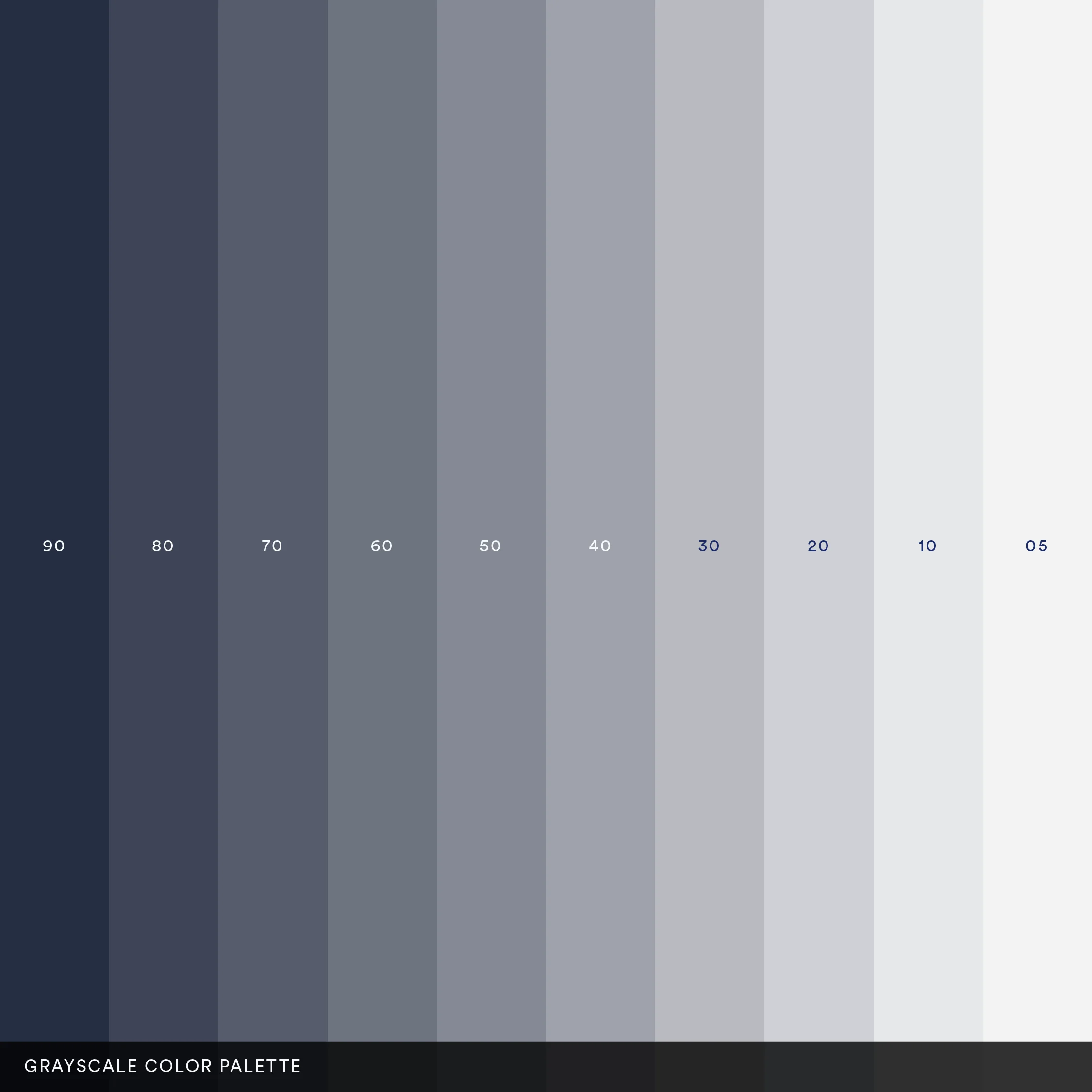
Chainlink’s dominant blue, another key element from the original brand, has been a consistent choice since the inception of the brand. When crafting the first brand iteration, we focused on using this familiar shade of blue to anchor and expand brand recognition. All colors within the main and grayscale palettes were subsequently derived from this primary Chainlink Blue.
The main color palette contains Chainlink’s core colors, which are used as main resource for Marketing properties and materials, and featured components and typography elements in Chainlink products, while the grayscale color palette contains a library of different instances of Mirage (the darker tone of Chainlink’s main palette), and is used more prominently in Product and Web application, as well as needed both in Marketing properties.
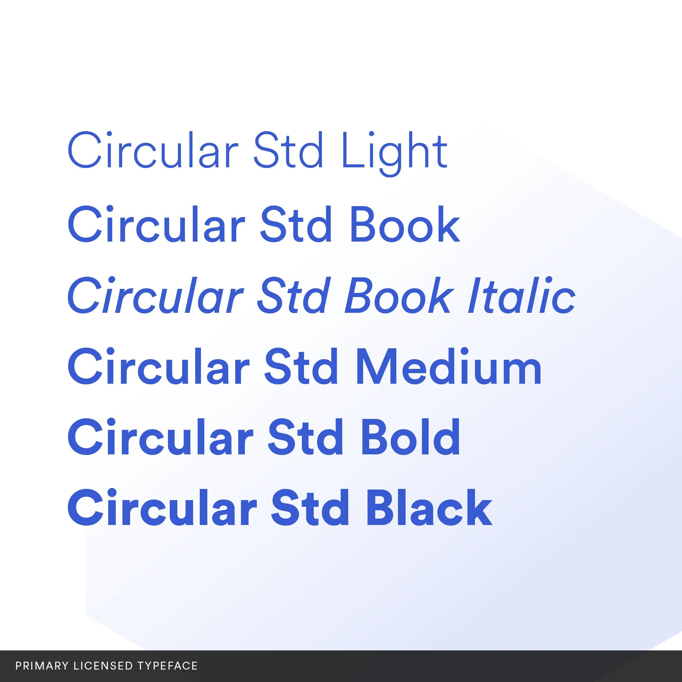
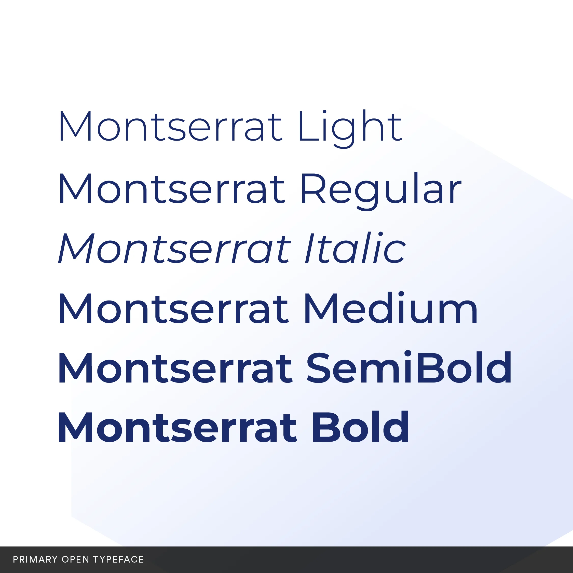
The Chainlink brand identity includes two alternatives for primary typefaces and a monospace font.
The official Chainlink font, Circular, is a geometric sans-serif typeface designed to foster modern and elegant designs across diverse applications. Using different weights of the font for headings and body text ensures a cohesive and easy-to-follow experience.
Given Chainlink's open-source nature, the inclusion of open fonts was critical to replace custom fonts when needed. Montserrat, a free commercial font from Google Fonts, mirrors Circular in its weights, widths, and X-height, and was thus chosen as Chainlink’s open typography.
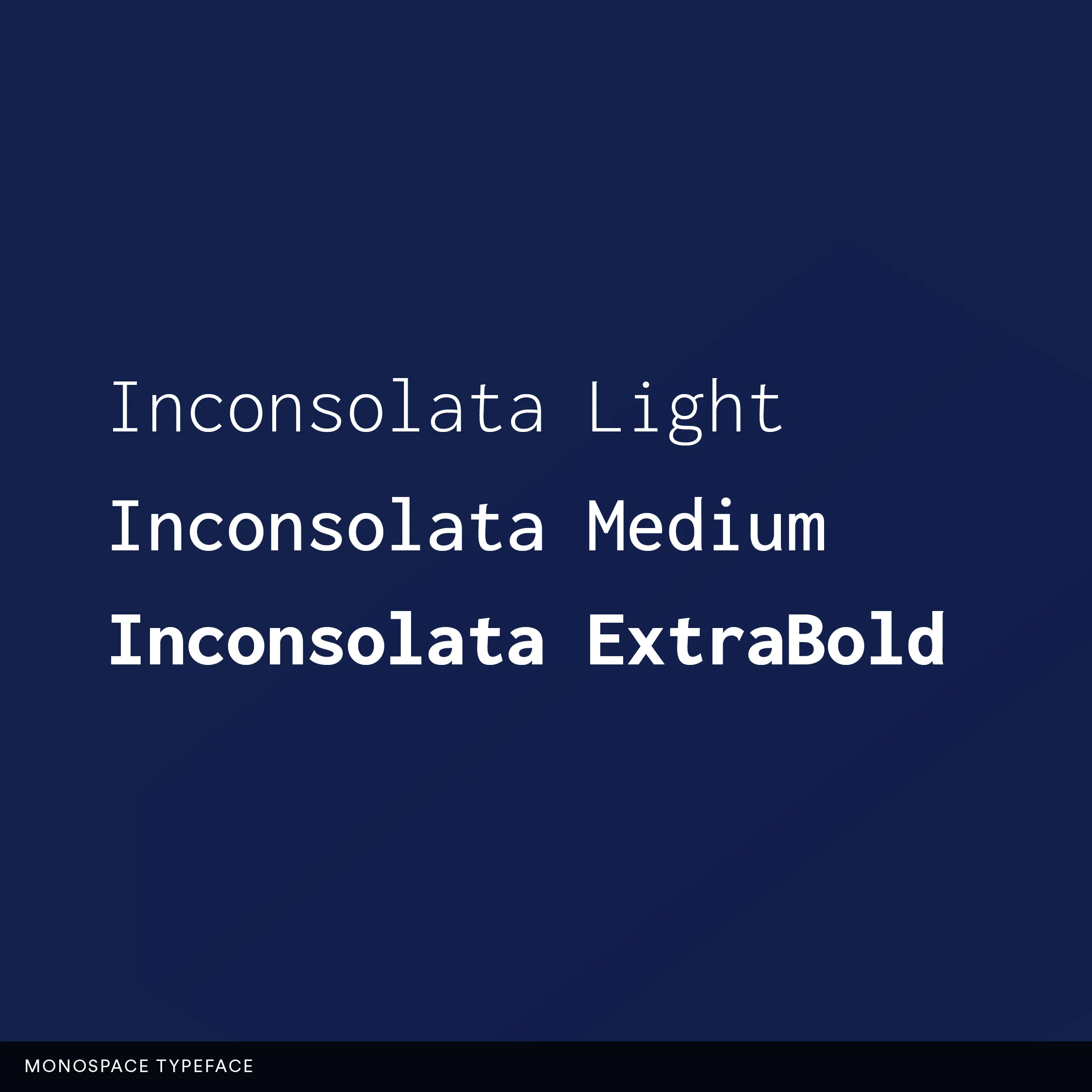
Inconsolata complements the font repertoire as the go-to monospace font. It is used wherever code is visually displayed, such as in web code snippets or code references in diagrams and slides.
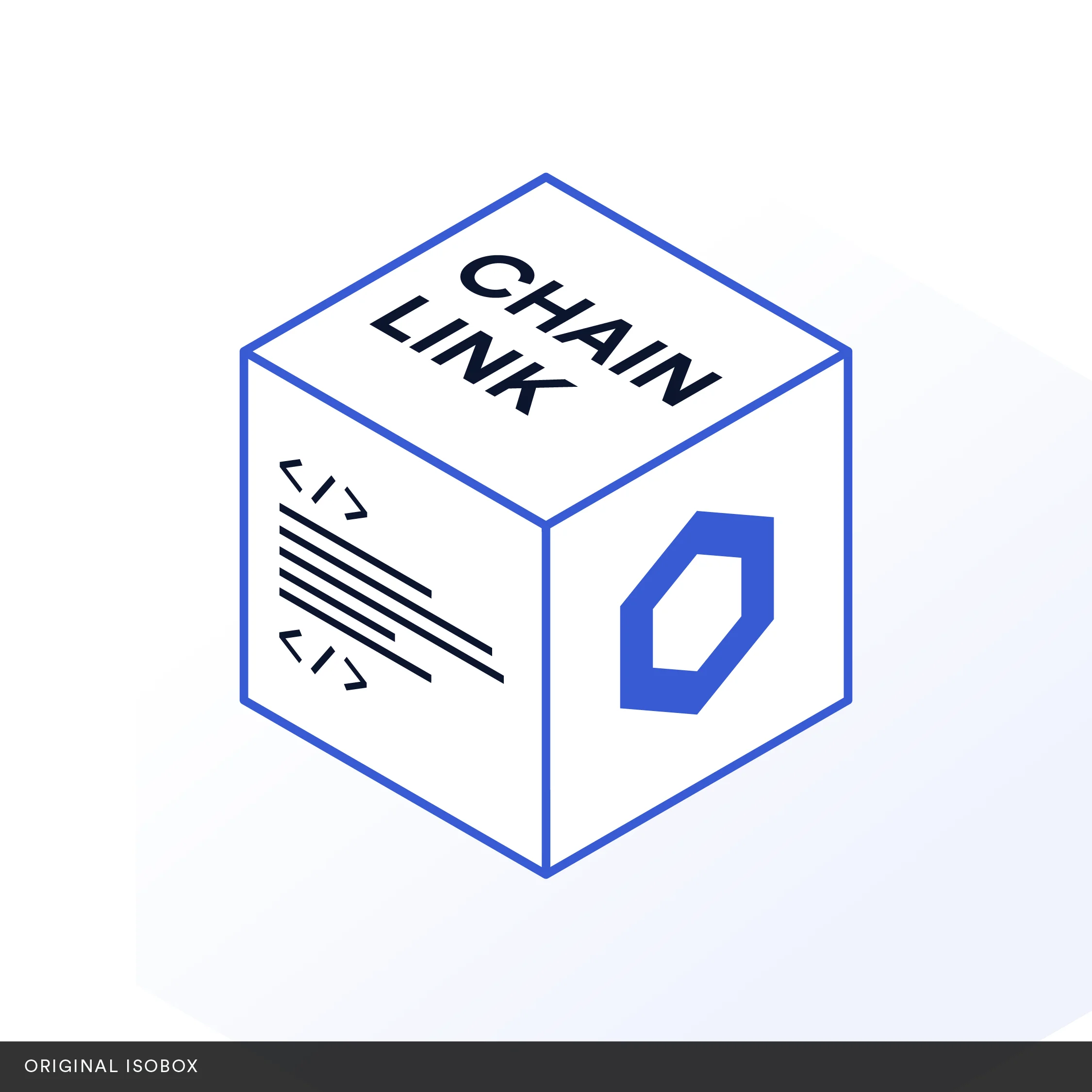
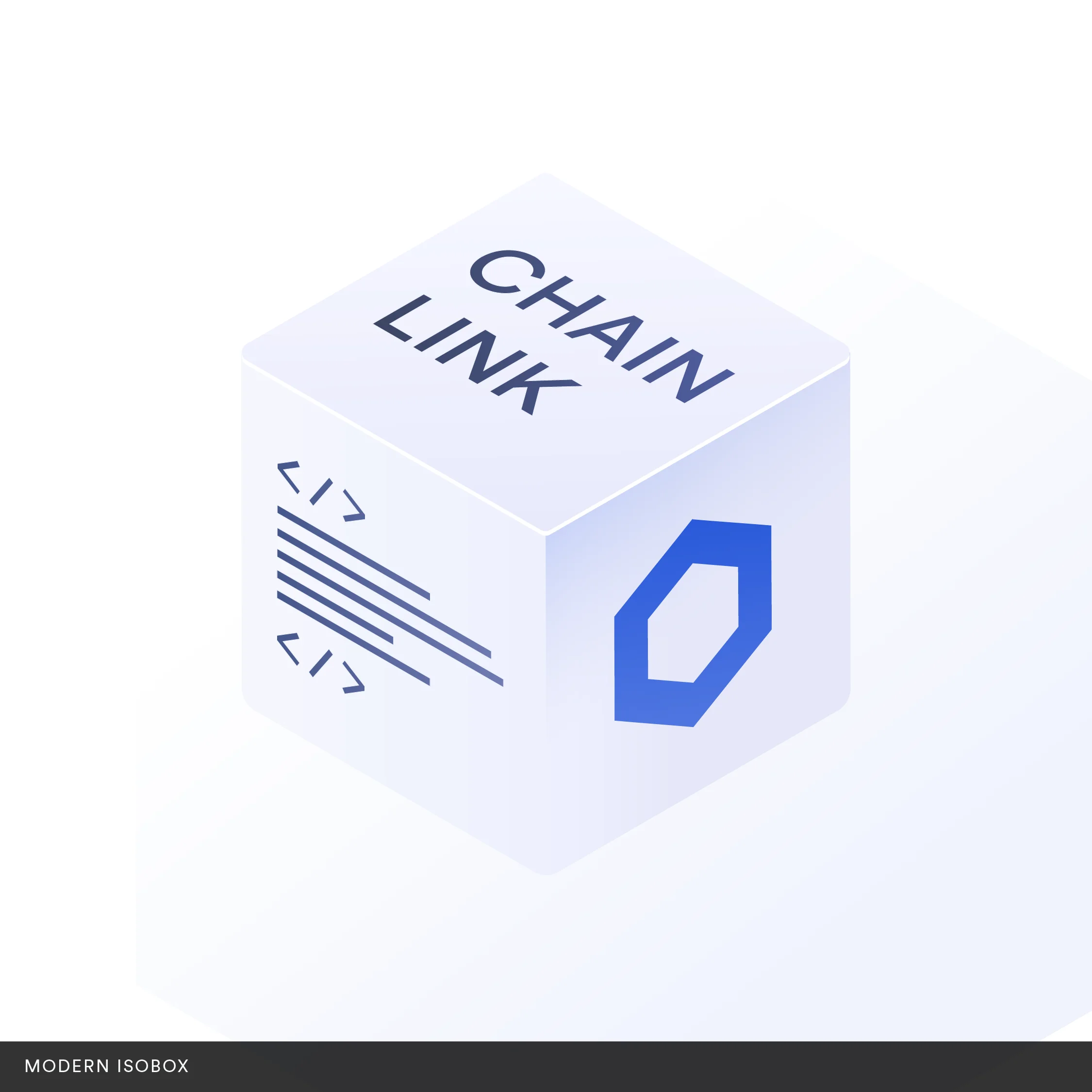
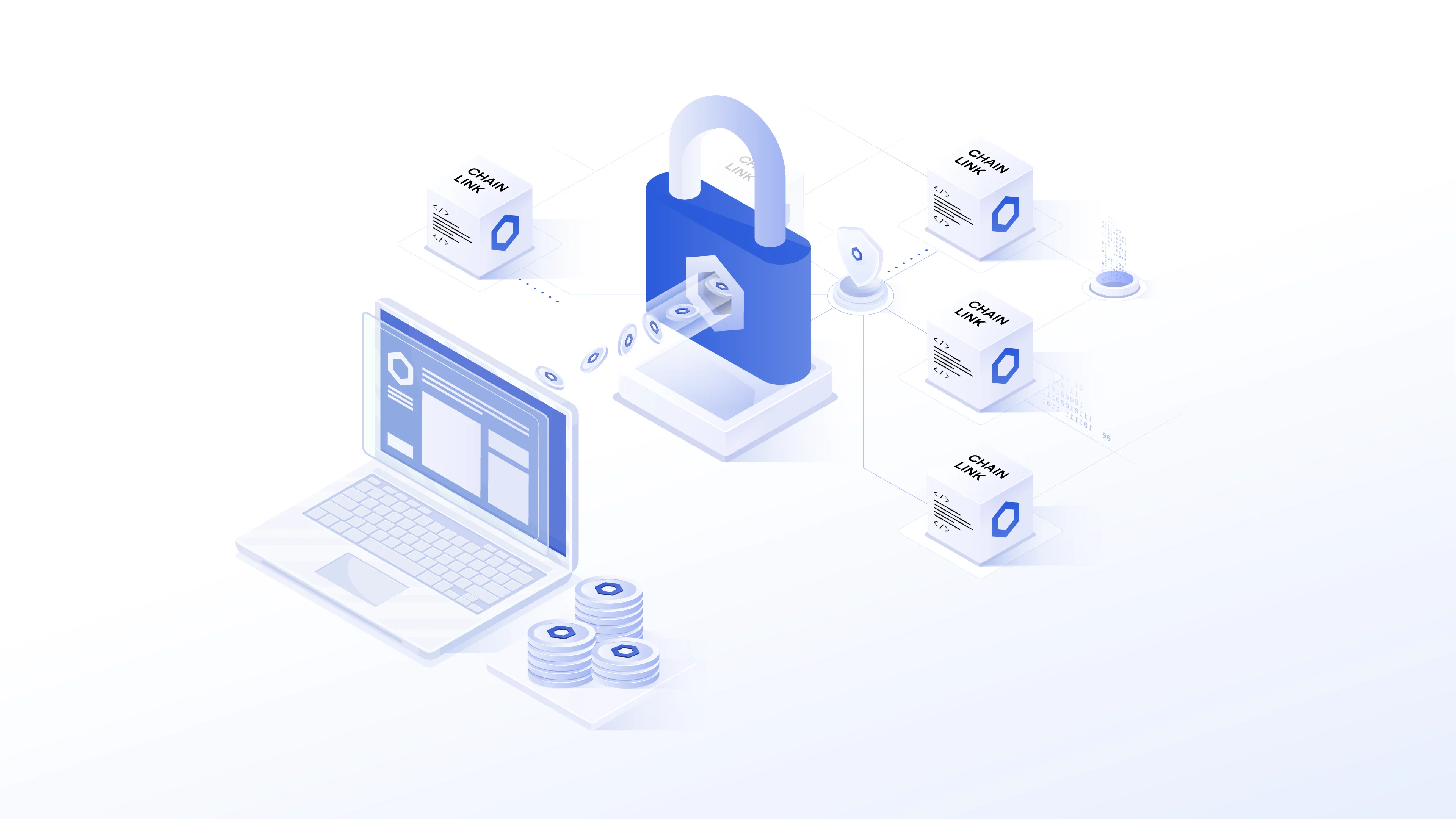
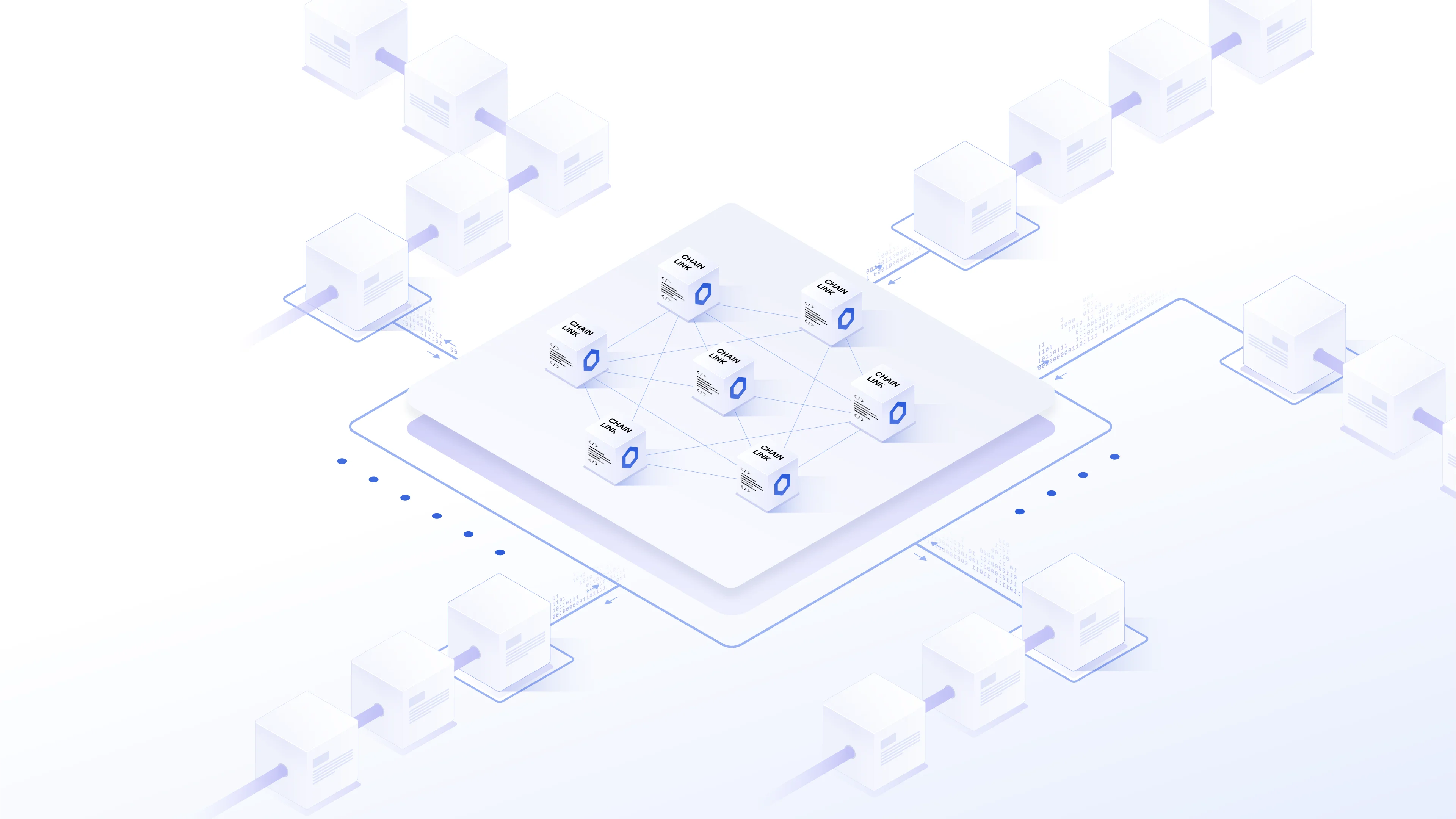
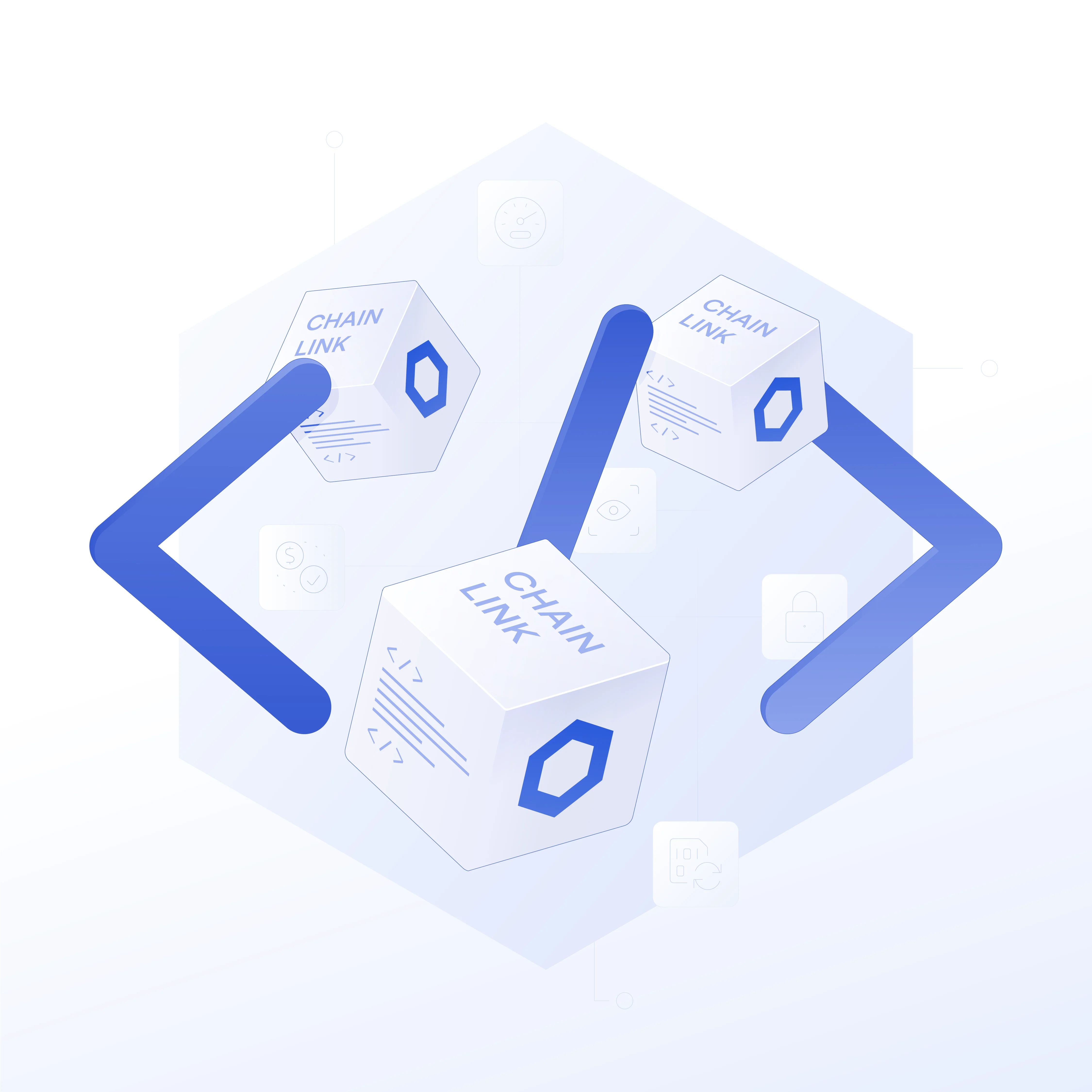
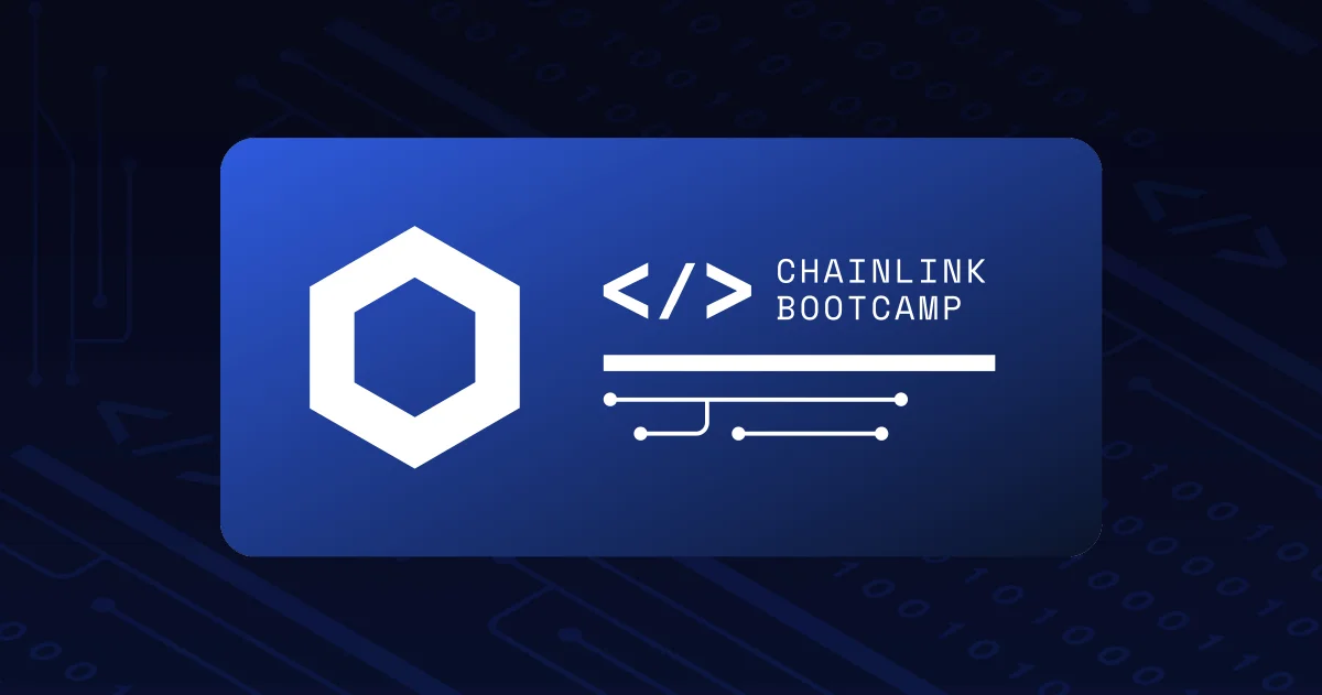
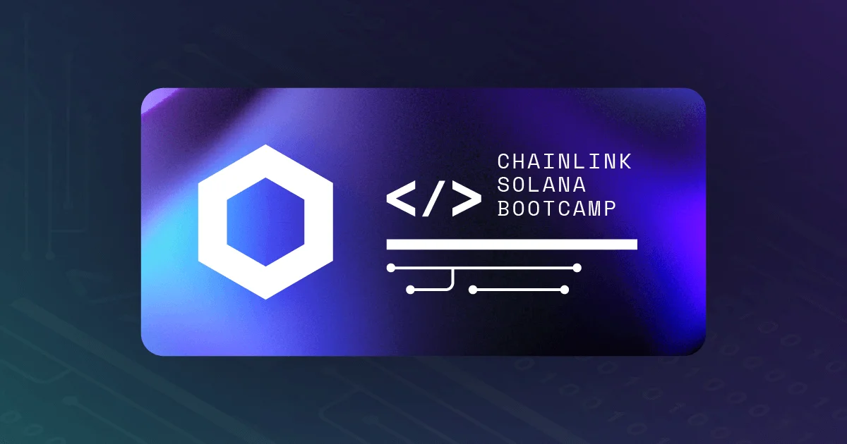
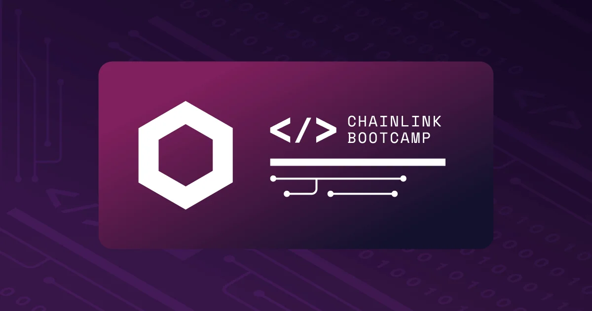
The Chainlink isobox is a signature element of the Chainlink brand. Firstly introduced in the original diagrams, it quickly evolved into an iconic visual element, widely recognized and utilized by the Chainlink community.
The isobox is an isometric cube, displaying the project name in uppercase on the top face, a visual representation of code on the left face, and the Chainlink isotype on the right face. The original isobox is extensively used in various materials, such as diagrams and illustrations, while the modern variant finds its place in editorial images and digital banners.
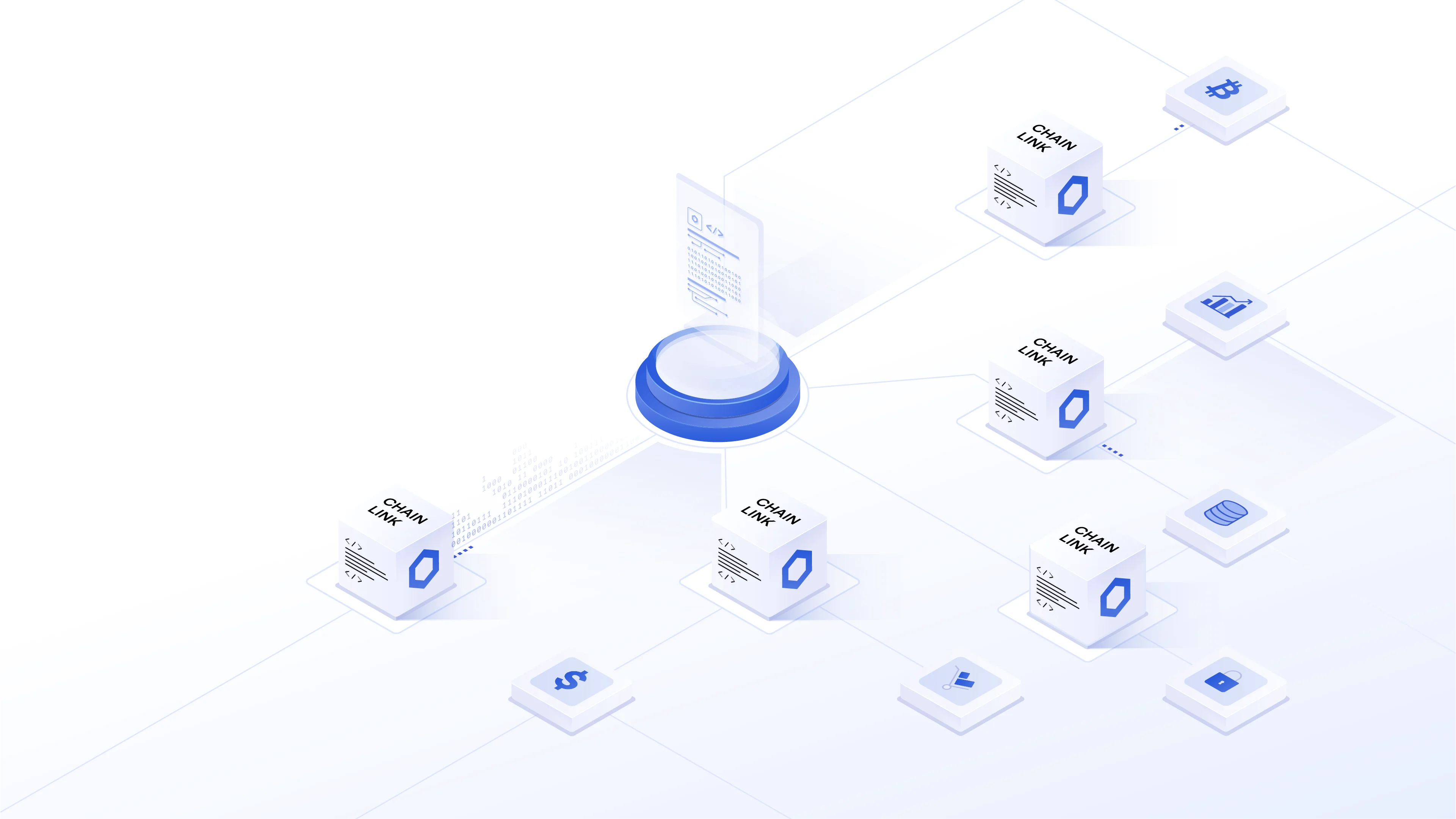
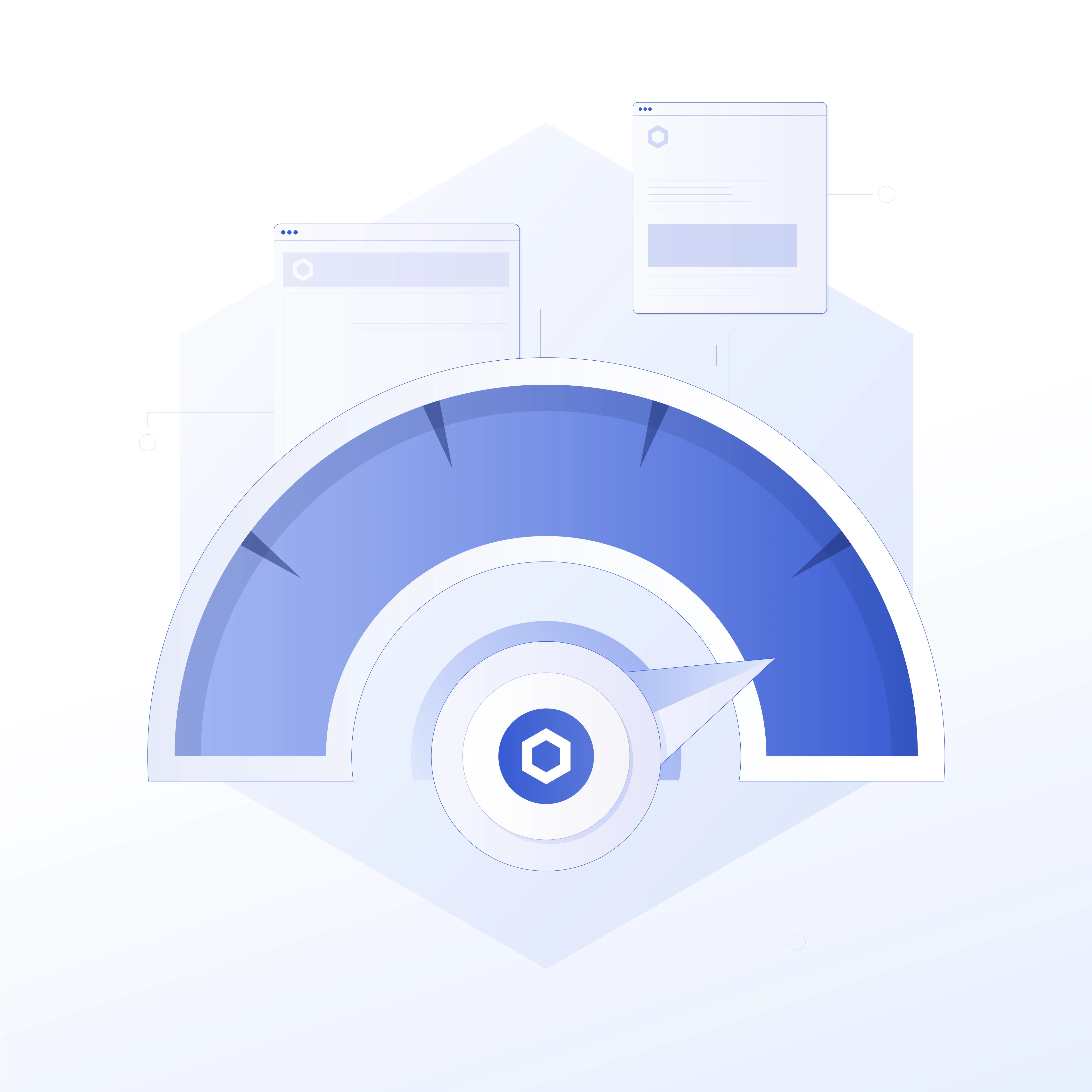
The Level 1 illustrations are the main illustration style used for featured communication pieces, press releases, announcements, and website hero elements. The isometric style was chosen to capture the essence of the project's vision and technical depth through an architectural representation that allows various objects to be placed in physical space to display their interactions, also supporting the cube interpretation of the main logo.
This style, heavily used in architectural and explanatory graphics, resonates with Chainlink's position in the blockchain industry. The construction-based metaphor underscores Chainlink's role as a fundamental piece of the infrastructure that enables a multitude of blockchain applications. In the same way that architects design structures to improve people's lives, Chainlink is designed to empower developers to build more efficiently and innovatively.
Attention to detail in our isometric illustrations was taken as a paramount principle, understanding that the strength of our visuals and the efficiency in reflecting Chainlink’s position as an industry leader lied not only in the grand scheme but also in the details. As such, we ensured that the Level 1 illustrations were always portrayed realistically, fully accounting for different elements that add depth and realism, such as highlights, shades, occlusions, and shadows.
The high attention to detail is expressed not only in the technical execution but also conceptually. The illustrations predominantly feature figurative elements, arranged in a coherent manner that makes technical sense. Each element is positioned accurately, crafted to resonate with our users, maintaining a balance between artistic expression and technical detail, reflecting the project's aim to attract developers and inspire them to build within this space.
Additionally, the isometric style was chosen for its ability to be animated. Animated Level 1 illustrations are used in featured product explainers, as well as in Web applications.
While the isometric style effectively conveyed the art direction of the brand as a primary level of illustration, the system also needed to include a more versatile and lightweight variation. This caters to instances where illustrations serve more ornamental purposes, or when the cognitive effort required to interpret images was meant to be reduced, for example, in a body web experience.
The Level 2 illustrations follow a flat, iconographic design, which simplifies the visuals without compromising comprehensibility. Flat design was chosen for its ability to communicate effectively through the use of minimal elements, delivering immediate clarity. To maintain a connection with the main isometric style and the overall branding, we integrated elements of shadows and shading in the lighter hues of the palette, as well as an outline colored with Chainlink’s main blue. This creates consistency across different styles and delivers a cohesive brand overall.
Additionally, this style was also used for animations, for instance, in secondary visual elements of video explainers, or web experience. Not only did these animations enhance the aesthetic appeal, they also offered a dynamic element, for instance, through engaging animate-in transitions.
Level 2 illustrations also equipped us with a toolbox for creating a high volume of visual representations of complex, abstract technologies or features. Notions like 'farming', 'abstraction layers', and 'trust minimized' are not only technically intricate but also inherently abstract. However, with the front perspective and iconographic depictions of our Level 2 illustrations, we could effectively transform these abstract concepts into concrete visual elements that shined particularly on our web pages and one-pagers.
At this level, use-case illustrations always had a dual role: to support the content by providing visually engaging elements that capture the viewer's attention and to help translate abstract concepts into more concrete visuals. They offer a visual break from the text and enhance understanding.
Chainlink utilizes a broad range of digital collateral to connect with its vast decentralized community. To maximize the impact of this visual aid, we've identified various series and set specific systems for each type of banner.
Chainlink has forged partnerships with thousands of projects. To sustain a vibrant yet cohesive system, we've designed a method that leverages the partner's brand while adapting it to a consistent layout that determines the scale and position of logos. This approach not only adds variety and distinction to the multitude of images we've created to avoid visual monotony but also gives us an opportunity to feature our partner's brand on Chainlink's social channels.
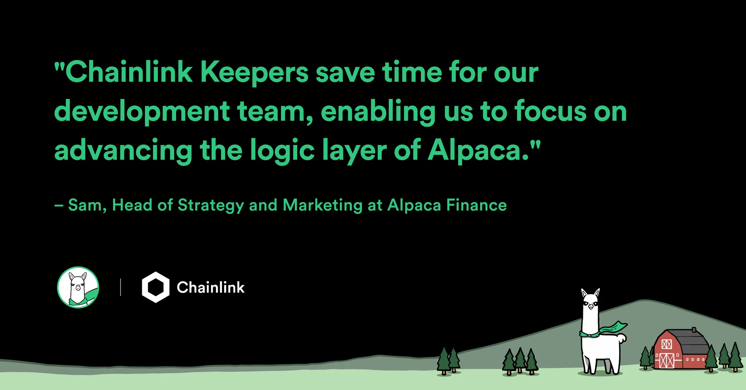
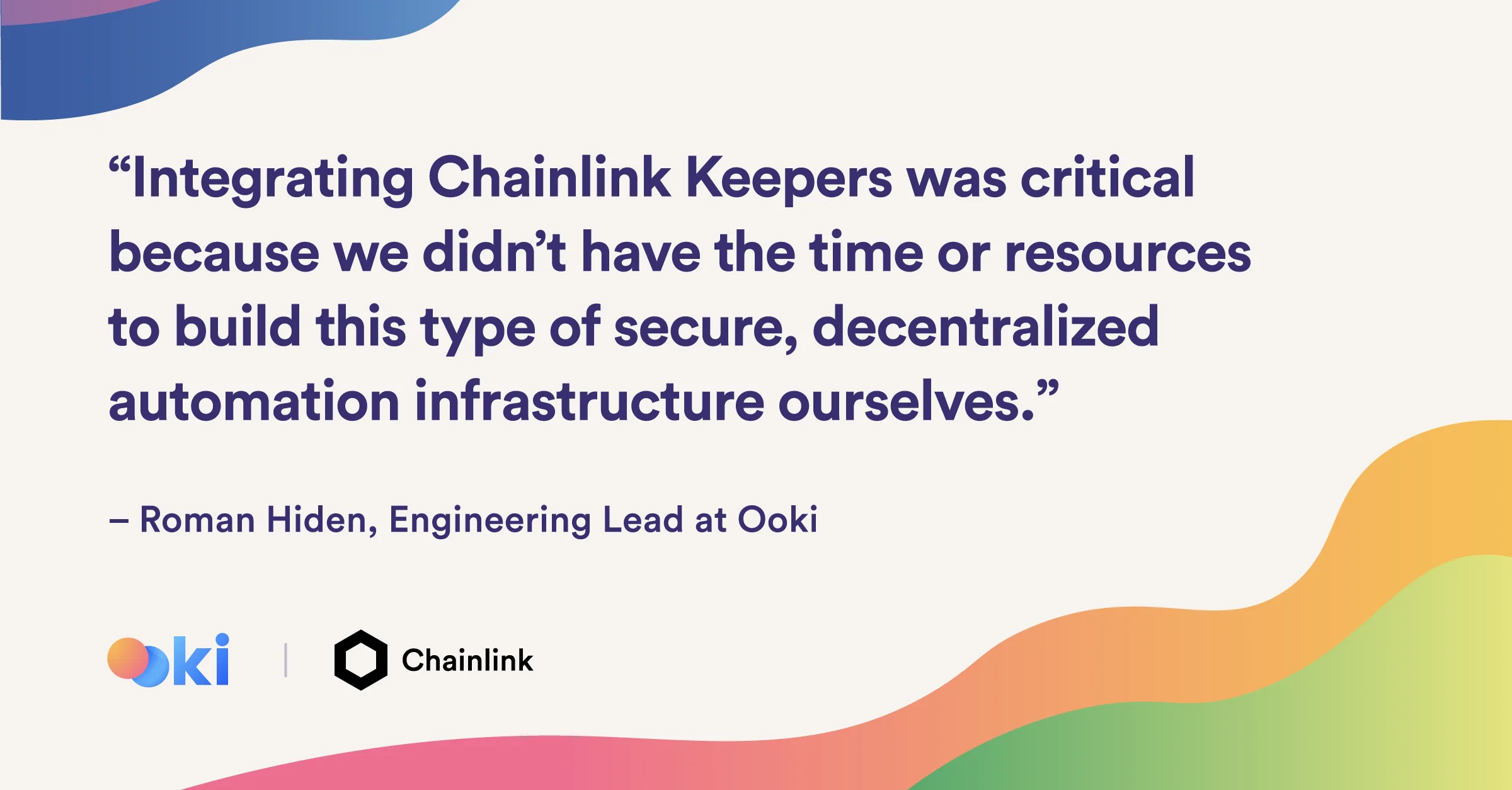
For a certain tier of partners, we developed a layout that accounts for a quote directly provided by the integrating project, which followed the same principle as the announcement banners, with bold typography as visual lead for optimal mobile viewing, branded background, and photography that helped personify the partnership.
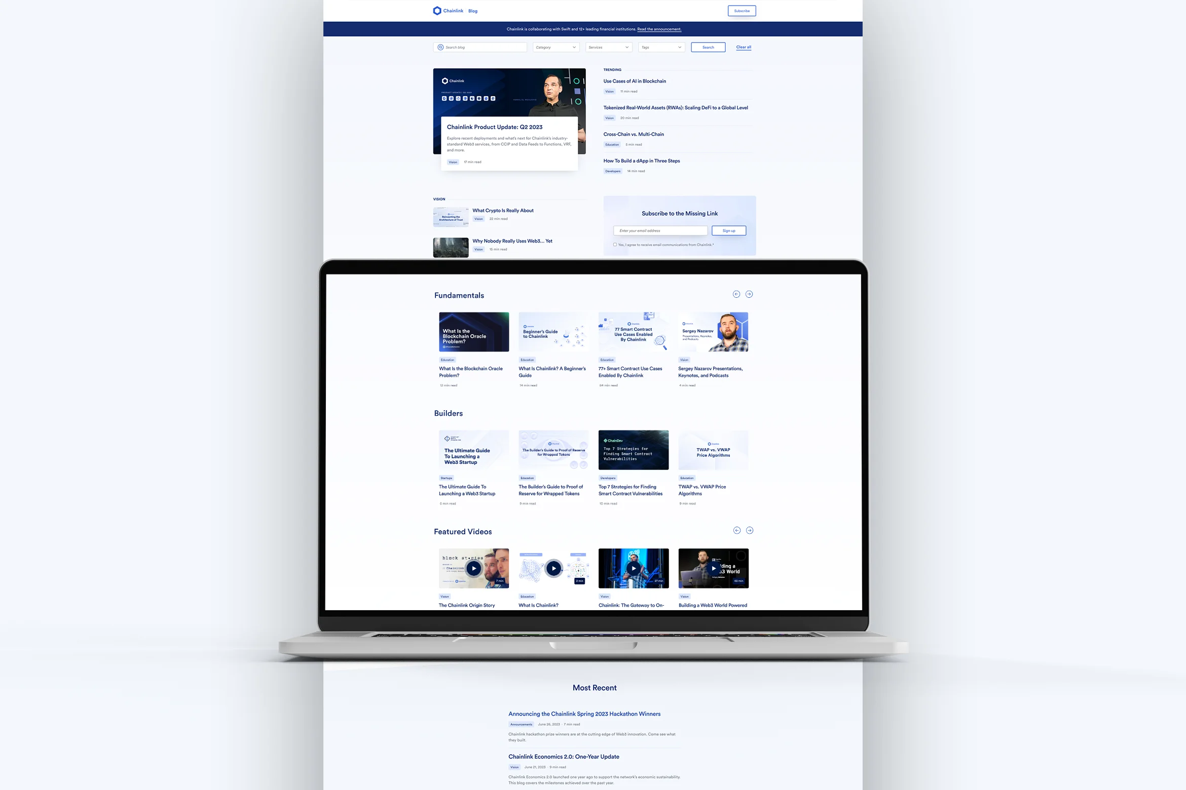
Chainlink’s blog features over 500 articles divided in different categories. For banners and open graph images, the strategic choice to optimize for mobile conversion was to lead with the banner's title, allowing the graphics to subtly texture the background.
The background illustrations, which follow the principles of Level 2 illustrations, can be abstract or figurative, depending on the topic. These are colored using gradients from the secondary palette to avoid high contrast. This system balances a content-first approach aimed at maximizing conversions, while also providing designers the creative freedom to add variety and counteract banner fatigue.
In addition to evergreen content, other key blog categories had dedicated systems to optimize visuals for the type of content and targeted audience. This involved defining specific individual layouts, alignments, and color schemes.
In addition to Chainlink exclusive content, for top-tier co-marketing content, the system offered some flexibility to highlight partner brand elements, such as color palettes or photography. This flexibility not only drew attention to high-visibility posts and boosted conversions but also allowed for the visualization of the partnership, adding visual richness to the blog scroll.
Communicating Chainlink’s value proposition, how it works, technical features, as well as its potential positive impact was a primary function of the Brand Design team. To establish a scalable and cohesive system, the team crafted a series of conceptual principles applicable to all diagrams:
Typography: Readability is crucial. Headings, captions, and visual elements need to be easily scanned and read, even at smaller breakpoints.
Space: Whitespace not only fosters harmony and balance but, in Chainlink diagrams, also guides the reader from one element to another.
Color: Diagram elements leverage a wide range of Chainlink’s primary palette, aiming to create a warm and inviting first impression for readers.
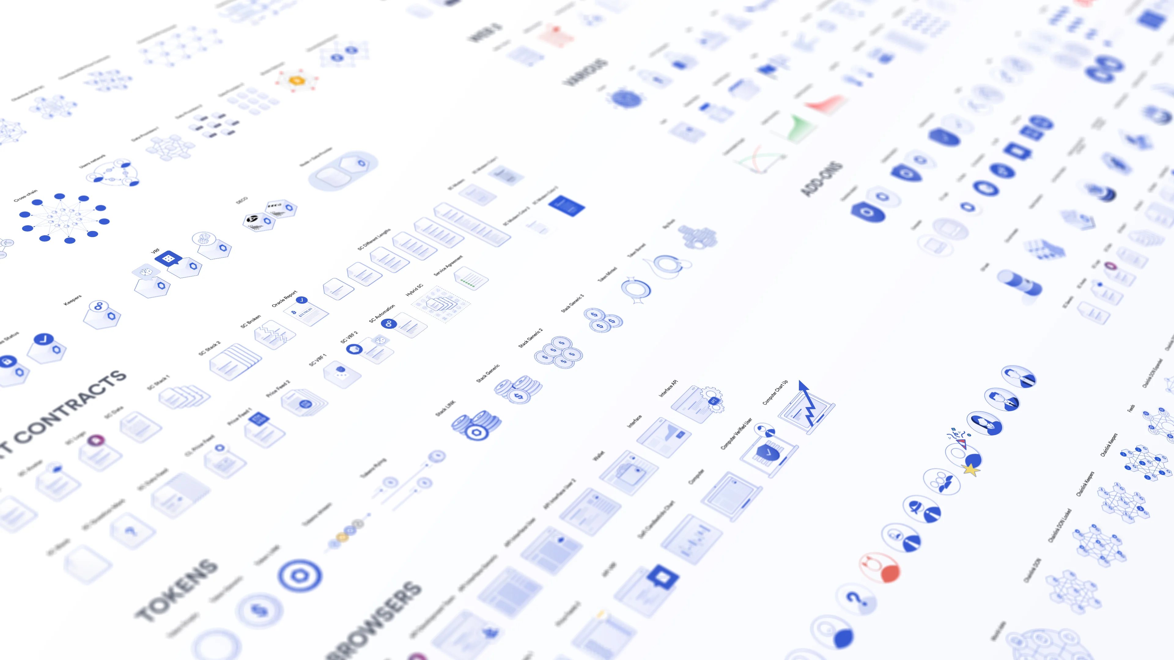
We developed an icon library specifically for diagrams, which allowed us to achieve technical consistency in how certain elements are depicted (e.g. Chainlink Network), as well as maintaining a consolidated color balance, stroke width, and overall style.
Our system for diagrams catered to two different outputs: technical diagrams and wireframe diagrams, each with specific rules and use cases.
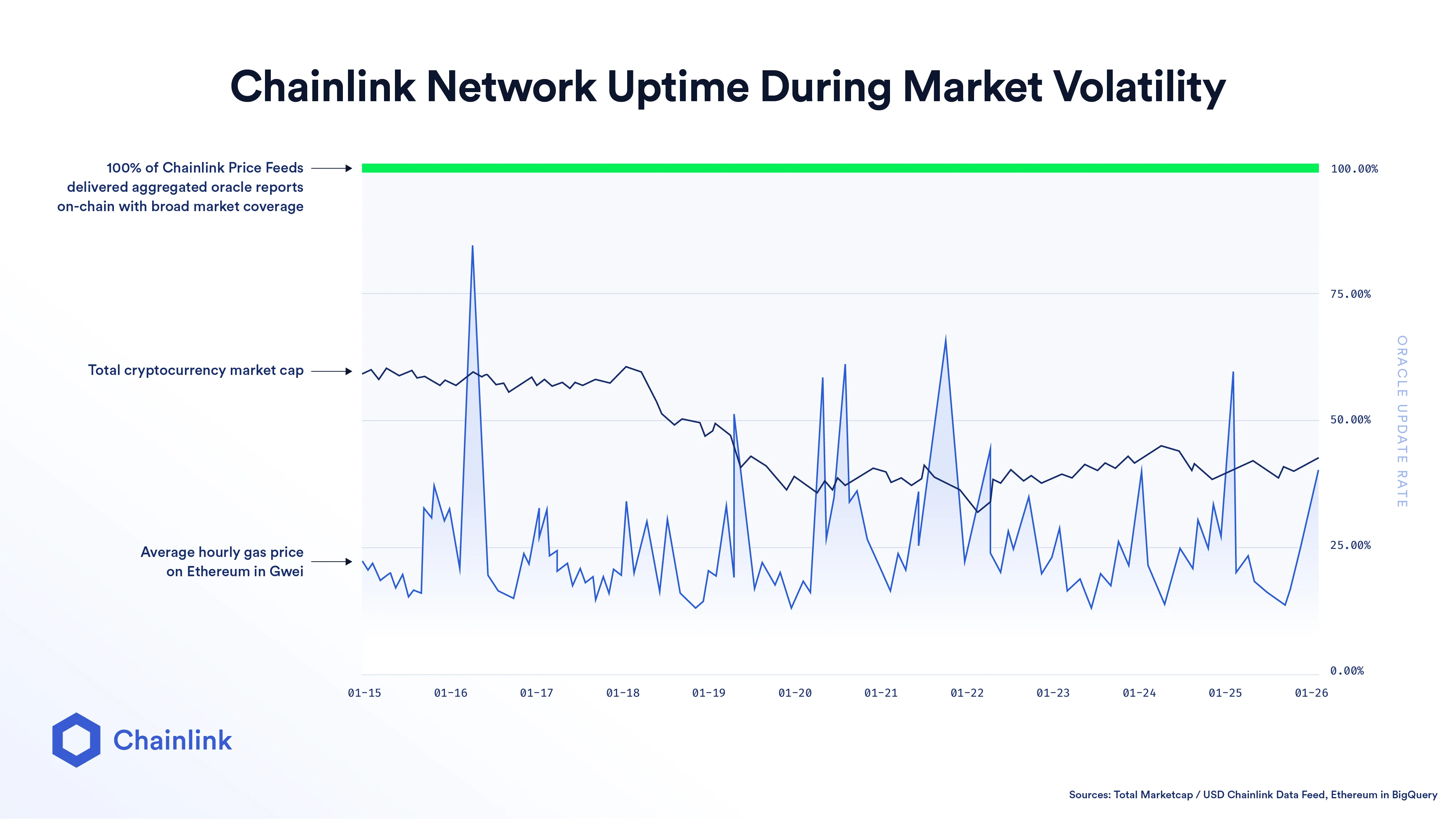
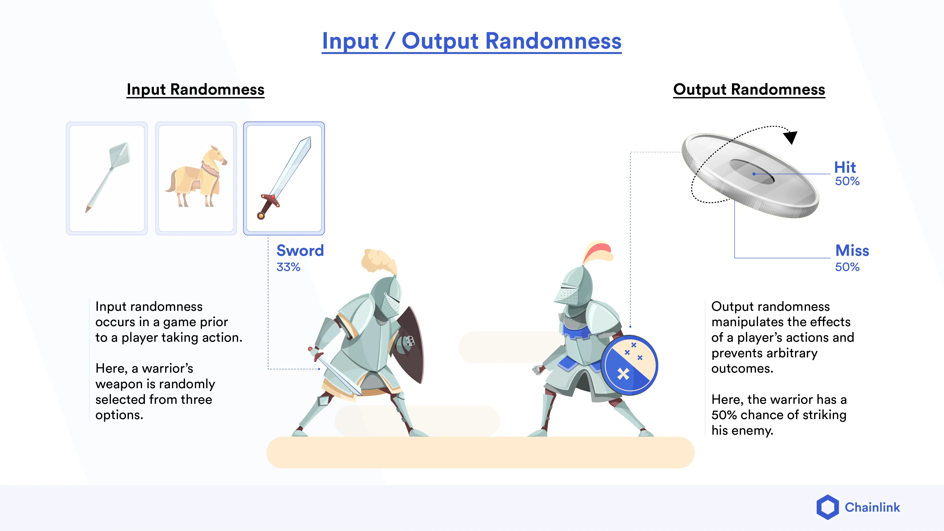
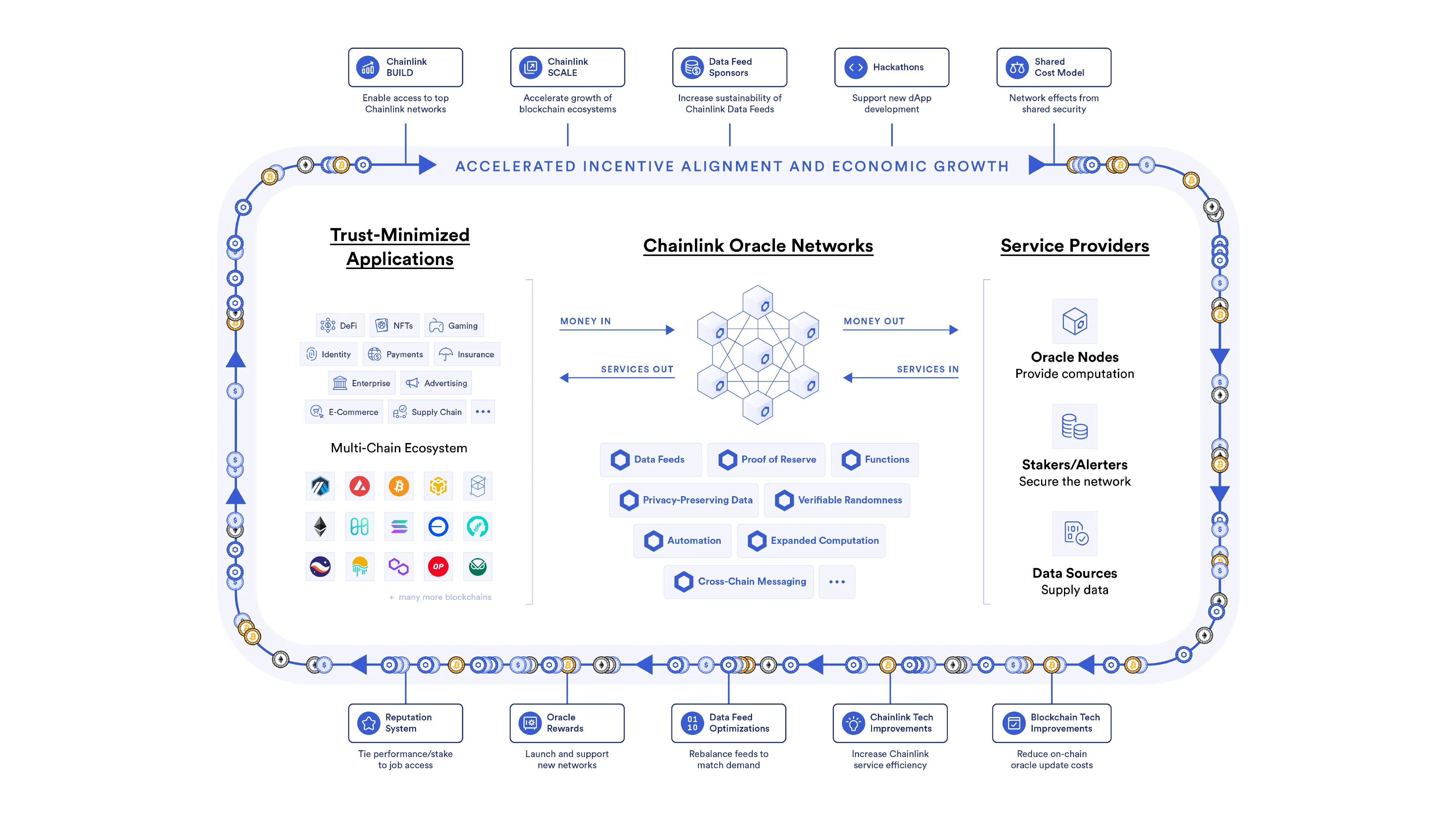
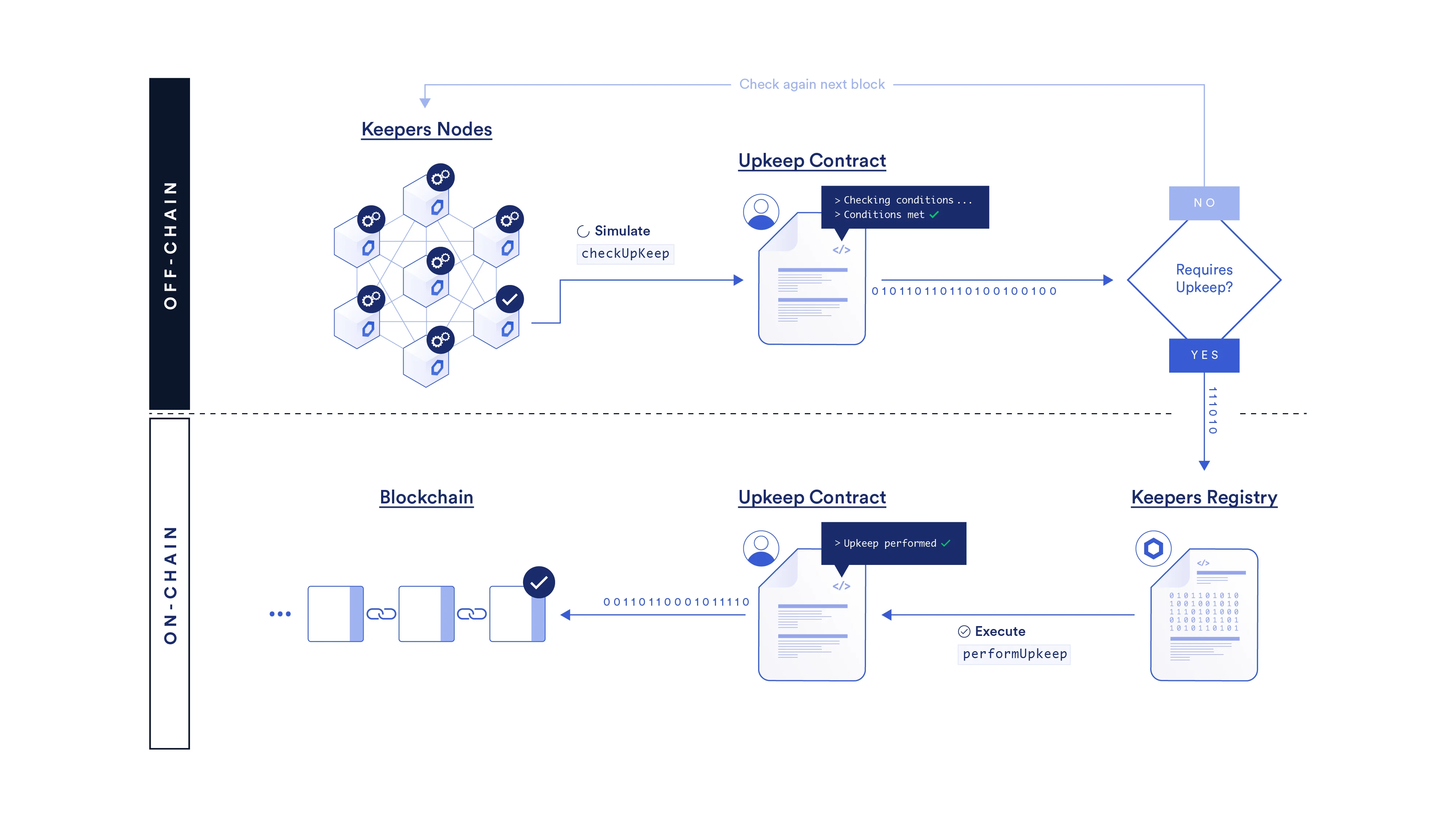
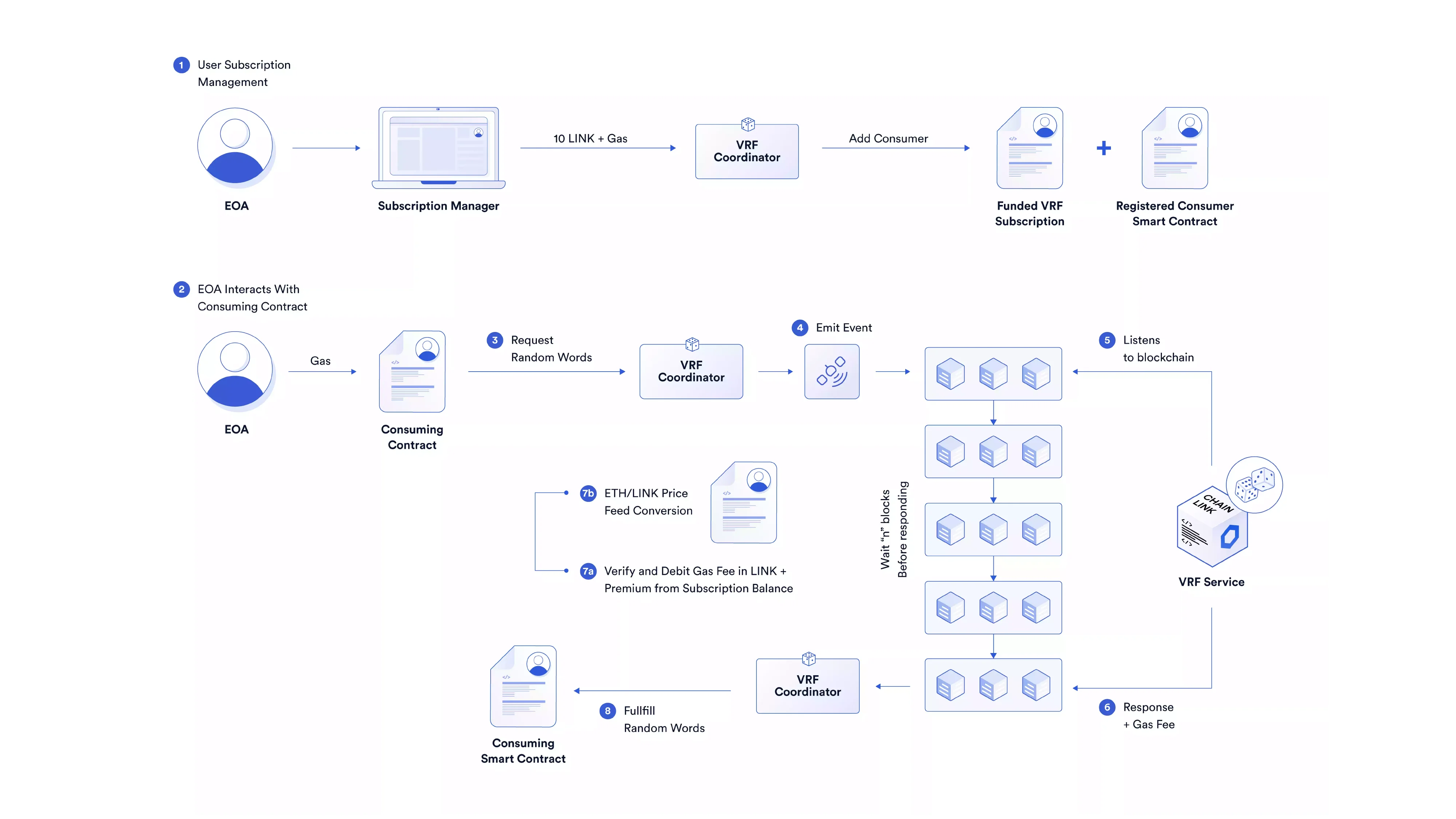
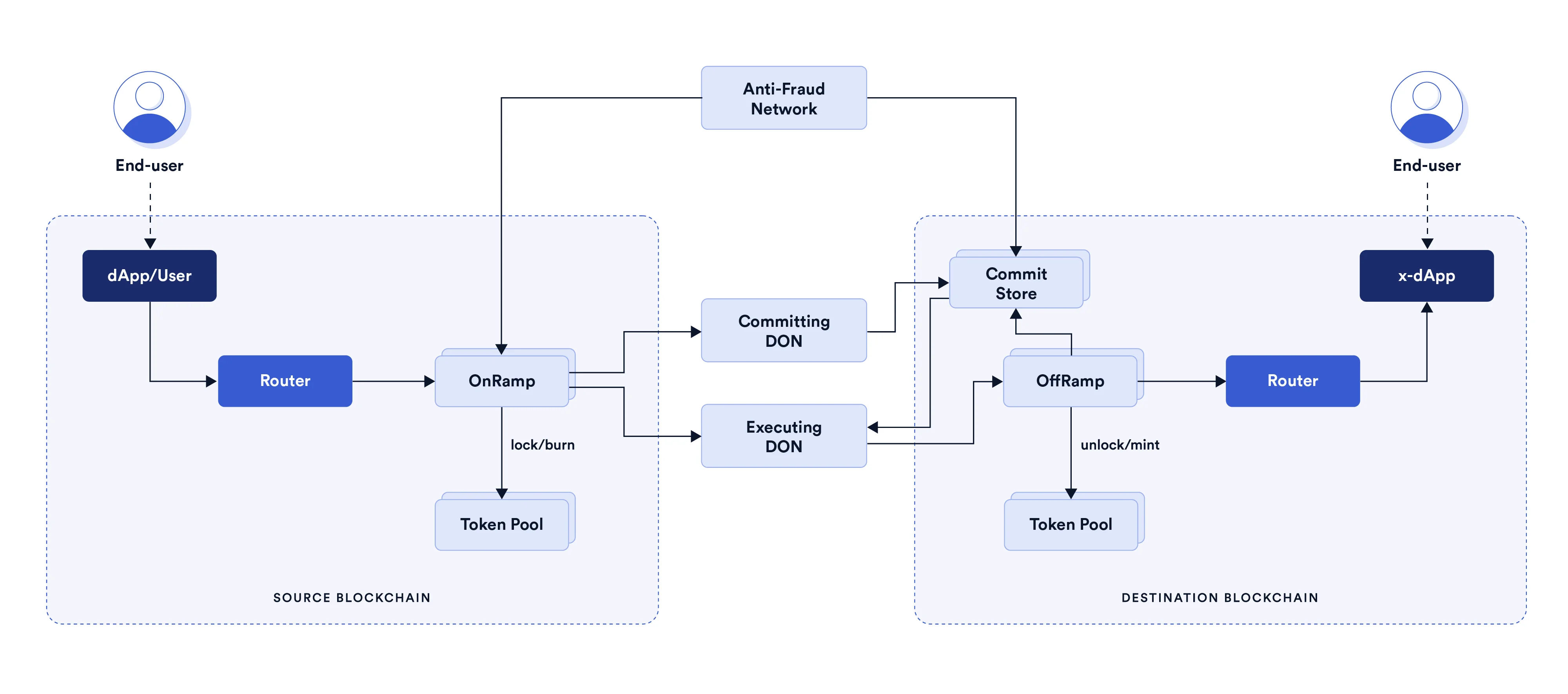
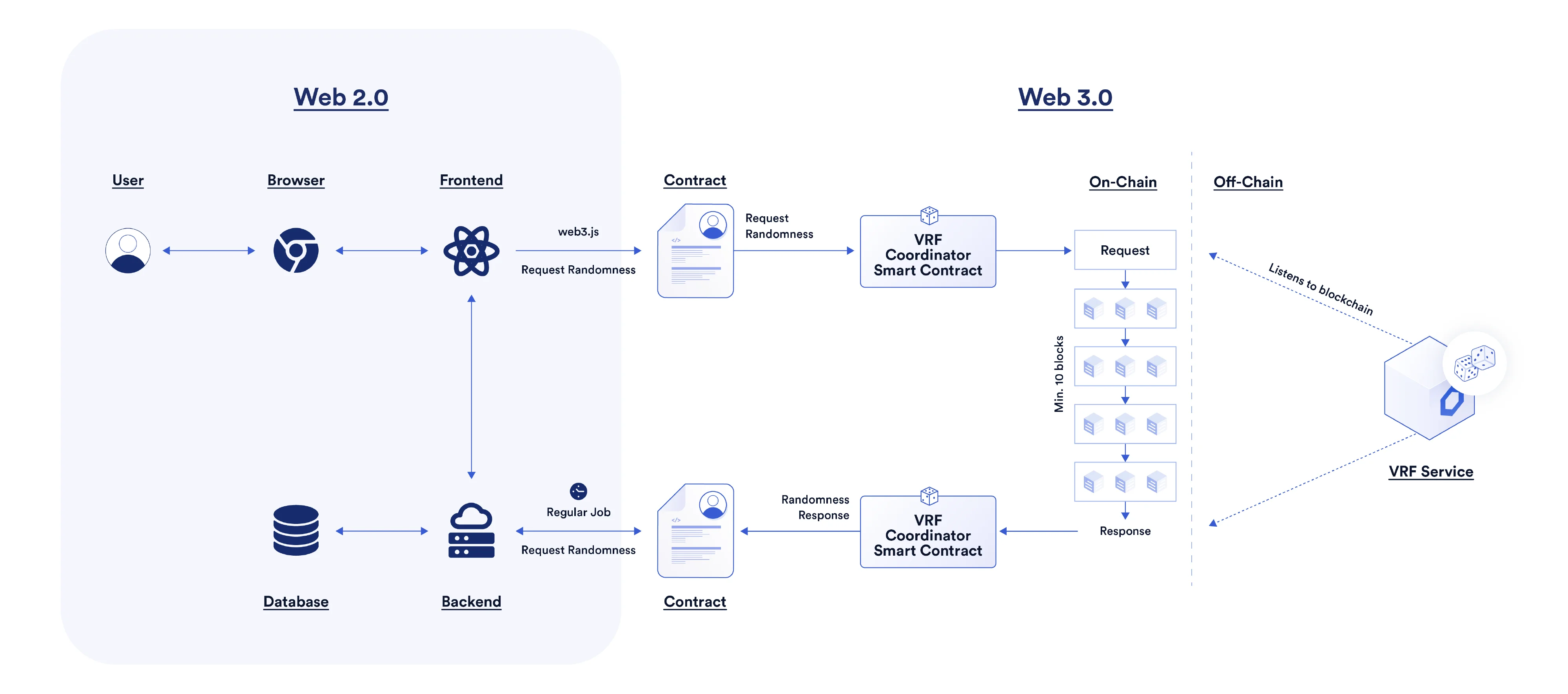
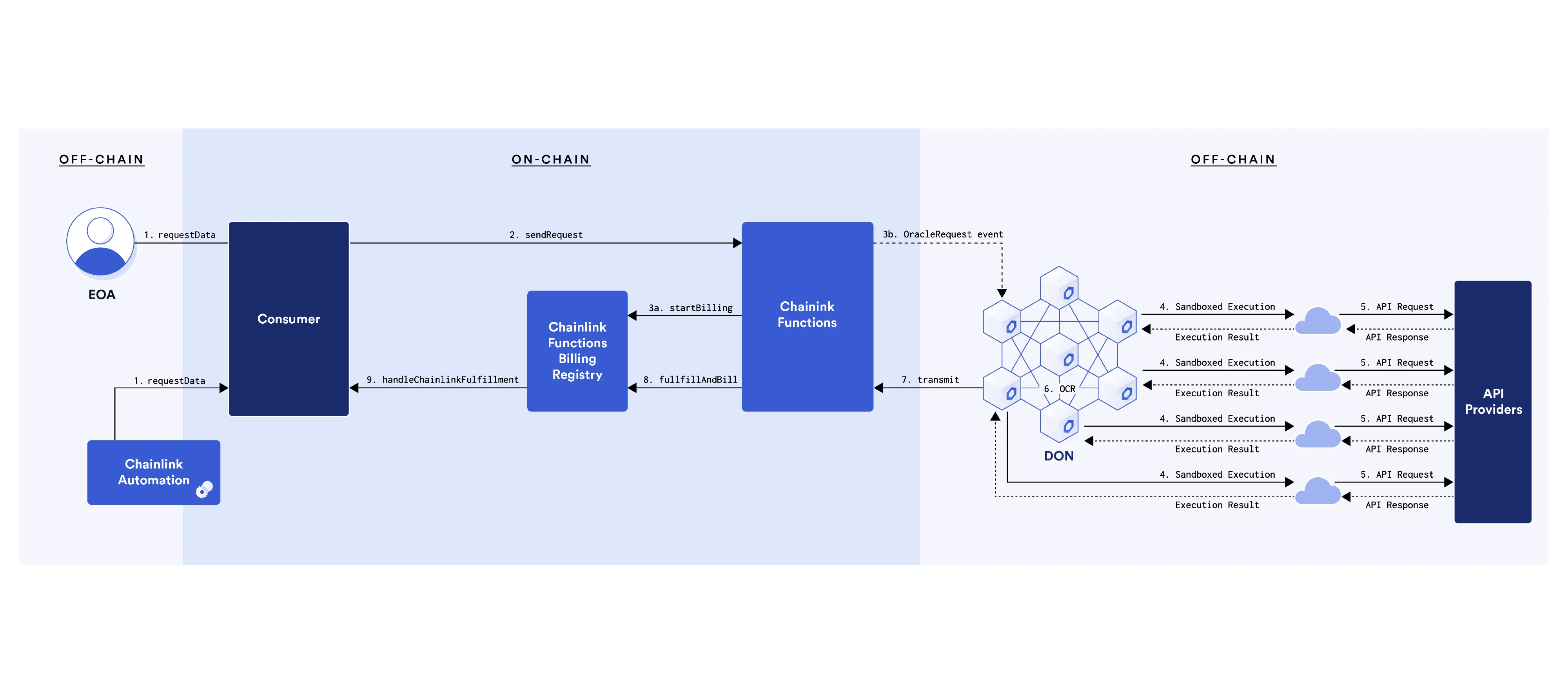
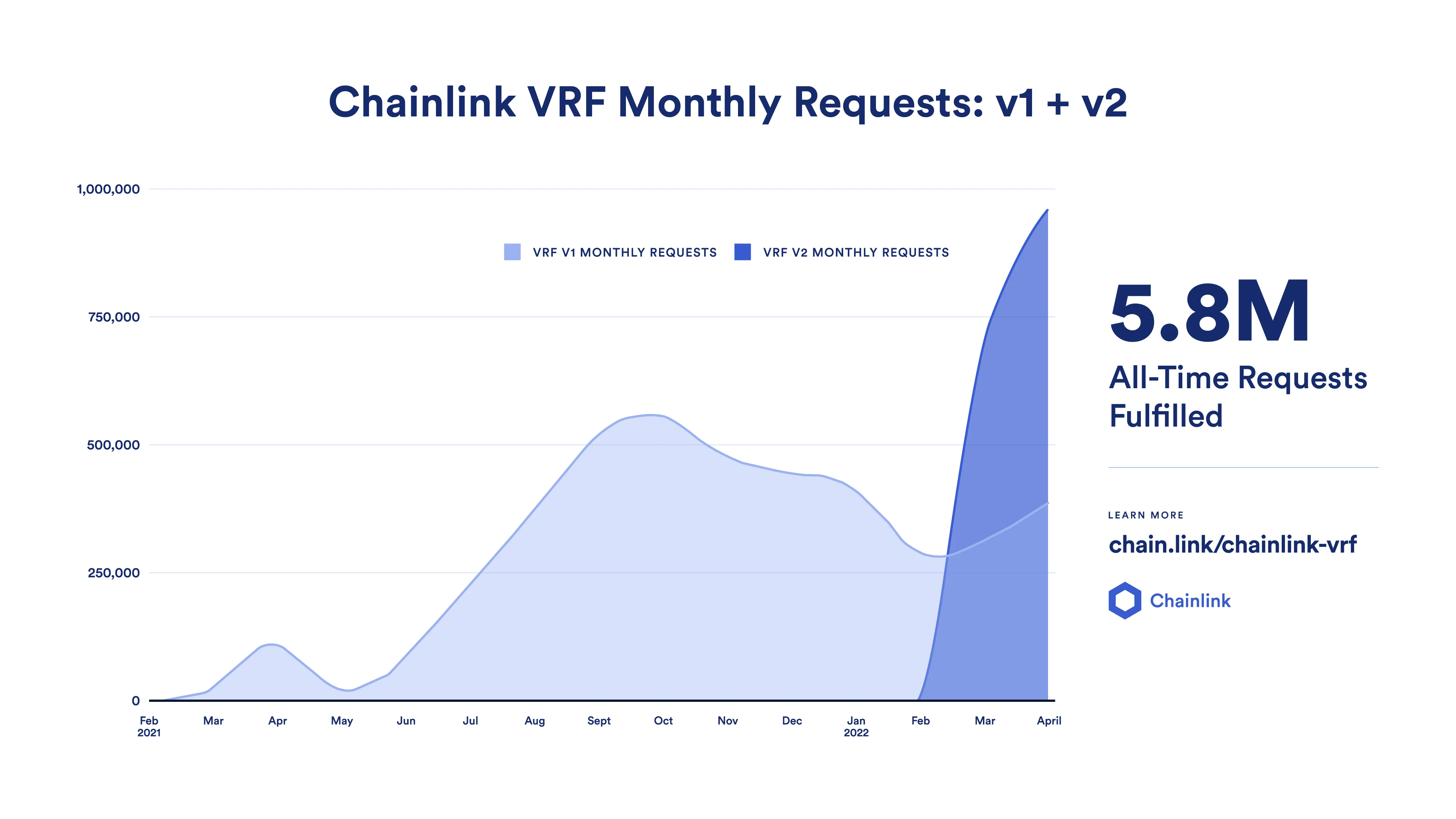
Technical diagrams, extensively used in blog posts, slides, social media, and web pages, are the most pictorial and colorful variation, mainly used in blog posts, social media, and other marketing materials. Here, different elements are visually represented through icons, which convey implicit information about the elements themselves, such as the number of nodes in a network or the number of connecting streams between two elements.
Typically, these diagrams narrate an end-to-end story rather than an architecture, with the story's progression highlighted through multiple brand resources, such as different icon levels, colors, heading sizes, etc.
In addition to static diagrams, we strategically employed motion to bring life into some of the more complex or fundamental diagrams. This adds an extra dimension to the concepts explained, aiding clarity about specific workflow details or illustrating the sequence of events.
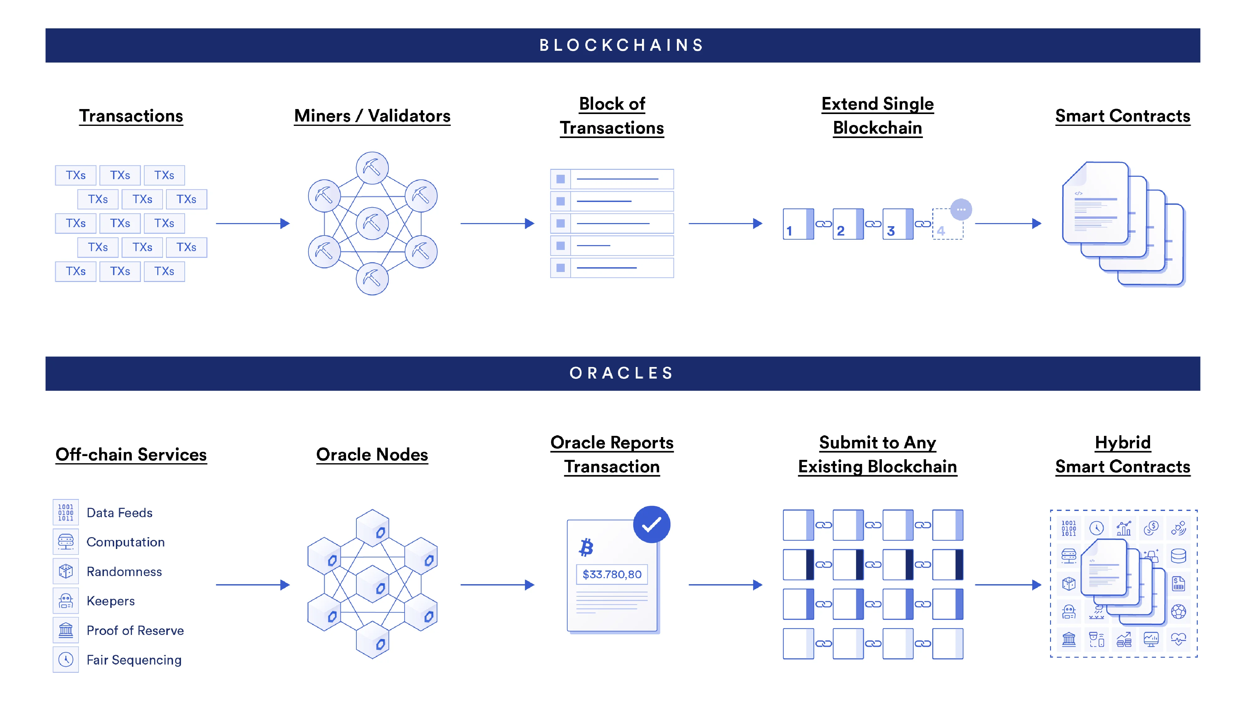
Wireframe diagrams offer a more architectural structure. Elements are portrayed through primitive shapes (rectangles, circles, rhomboids) rather than pictorial representations, and the color palette can be pared down to a monochrome scheme. These are a simpler version of Chainlink diagrams used to depict intricate systems and are targeted exclusively at a highly technical audience, such as technical whitepapers or advanced documentation.
Our system for infographic design was built on the foundation of the diagram system, supplemented with an expanded color palette and additional visual elements. In all instances, we established design principles that endorse clean, grid-based layouts, resulting in scalable guidelines to arrange information cohesively, prioritizing readability and simplicity.
When crafting co-branded infographics, we expanded Chainlink’s visual identity to seamlessly integrate with the branding of our partners. This enabled us to create series that were visually unique, while simultaneously reflecting the spirit of collaboration, which is integral to the Chainlink project.
Additionally, depending on the infographic series and its target audience, our system was scalable to offer a dark mode. Also, the dark optimized color schemes and balances helped to provide visual richness while adhering to the overall brand identity.
When handling complex infographics, a modular system guided our layout designs. This flexible approach permitted the deconstruction of intricate infographics into bite-sized, social media-friendly assets, which helped convey even the most complex or rich narratives in an accessible, digestible manner on a variety of touchpoints.
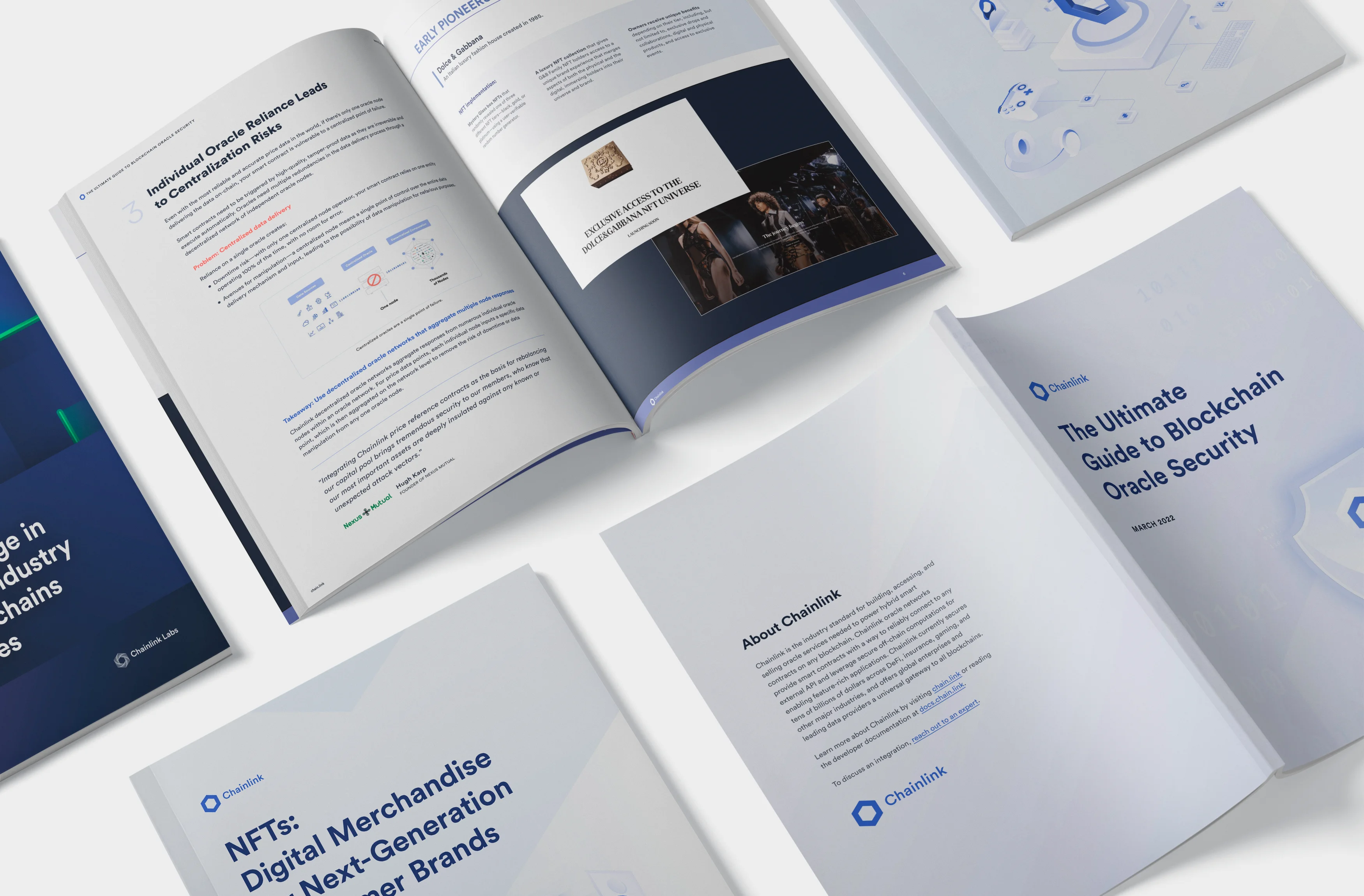
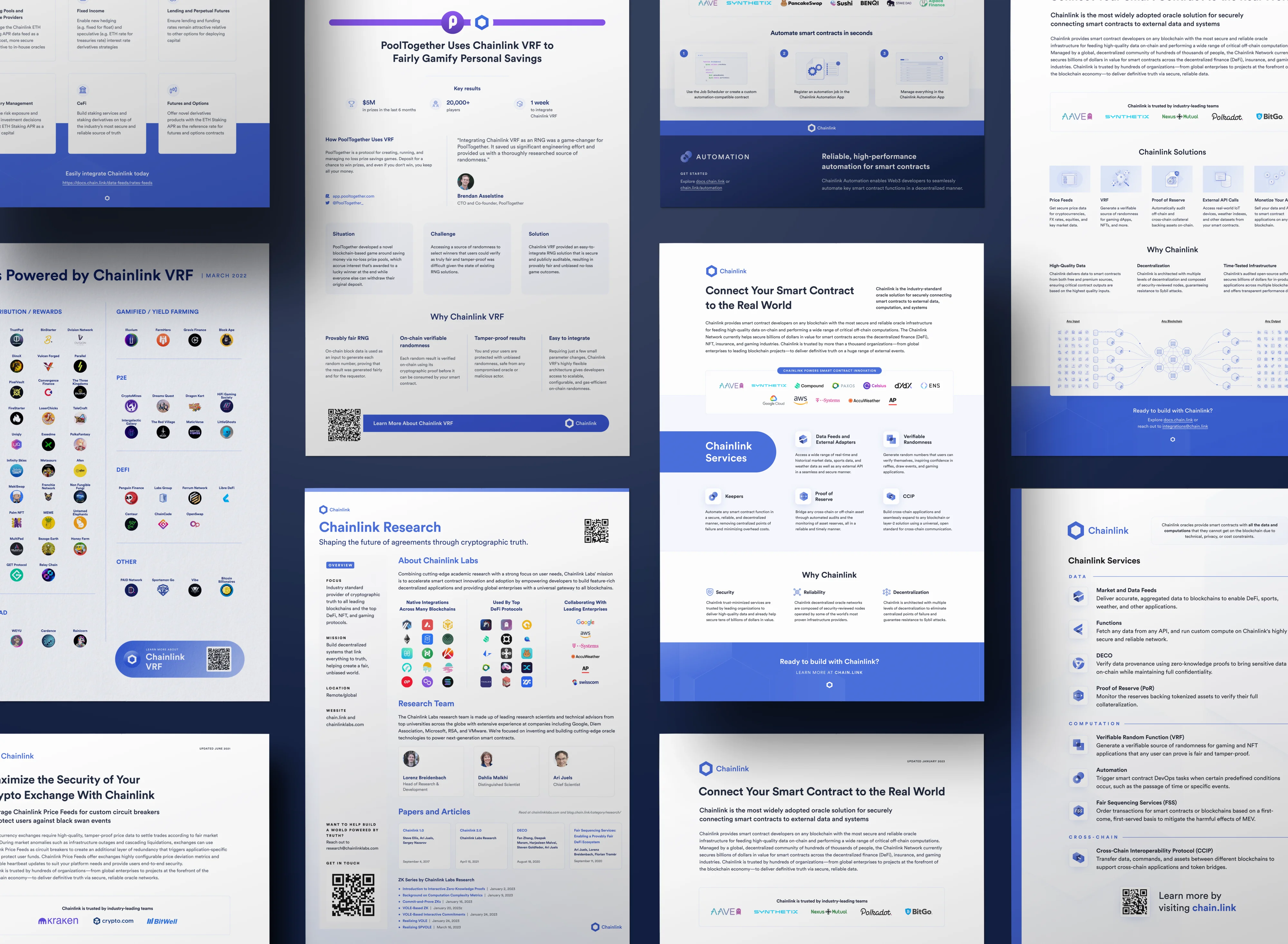
Documents served a key role not only in driving Chainlink's sales but also in reinforcing the project's reputation as an industry pioneer. Carefully crafted with precision and clarity, Chainlink's one-pagers and reports demonstrated our commitment to transparency and leadership, while providing valuable resources to our diverse audience.
The product and Chainlink technical one-pagers were primarily educational. Technical concepts and features were presented as digestible information, assisting targeted users in accessing concise information about the value of Chainlink’s offerings.
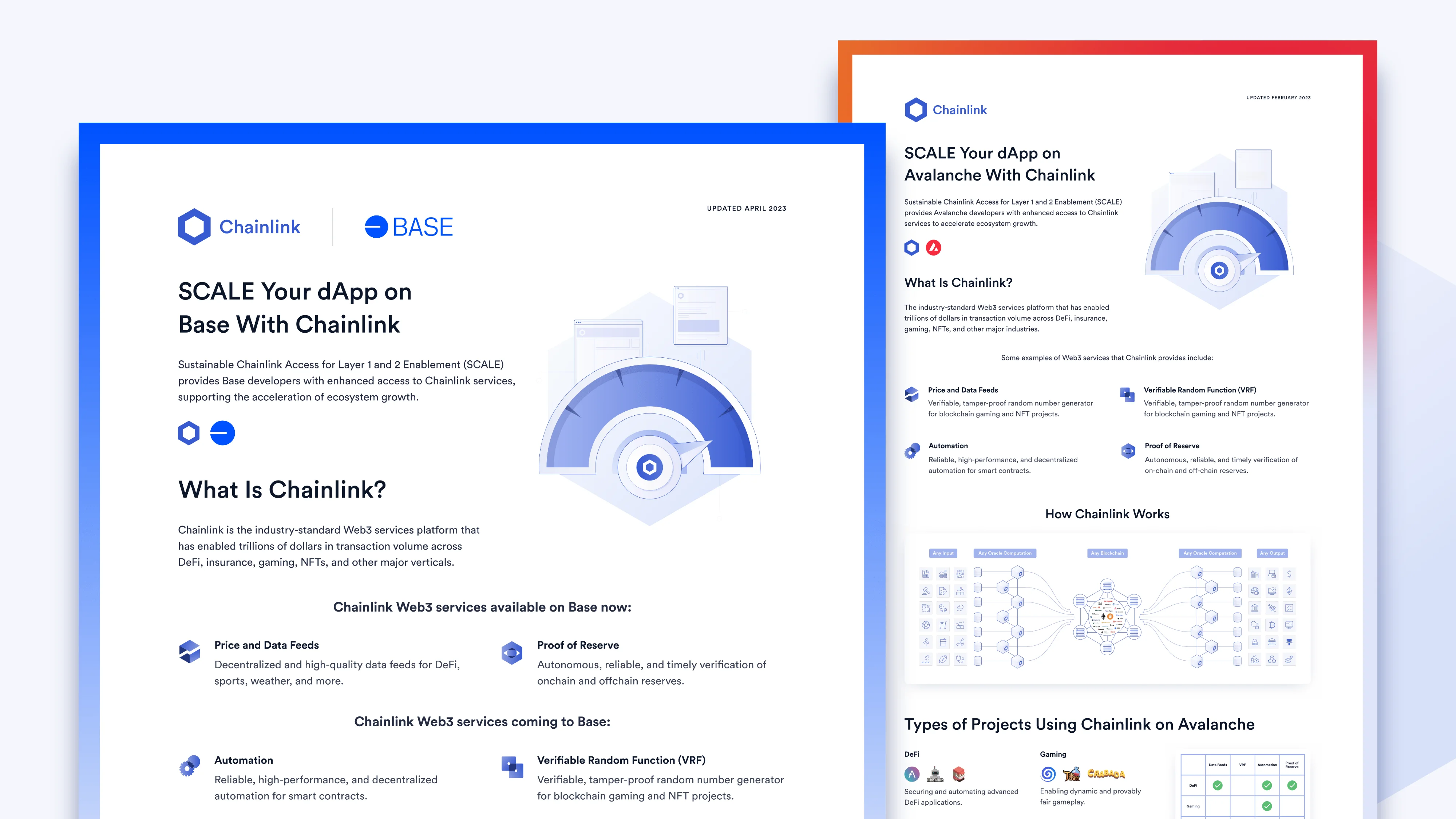
Co-branded one-pagers and documents became a medium for chronicling the stories of our successful partnerships. Merging Chainlink's narrative with that of our partners, our goal was to craft unique tales of shared success. These documents celebrated our collaborative journey, highlighting the accomplishments of each integration and illustrating Chainlink's dedication to cooperative progress.
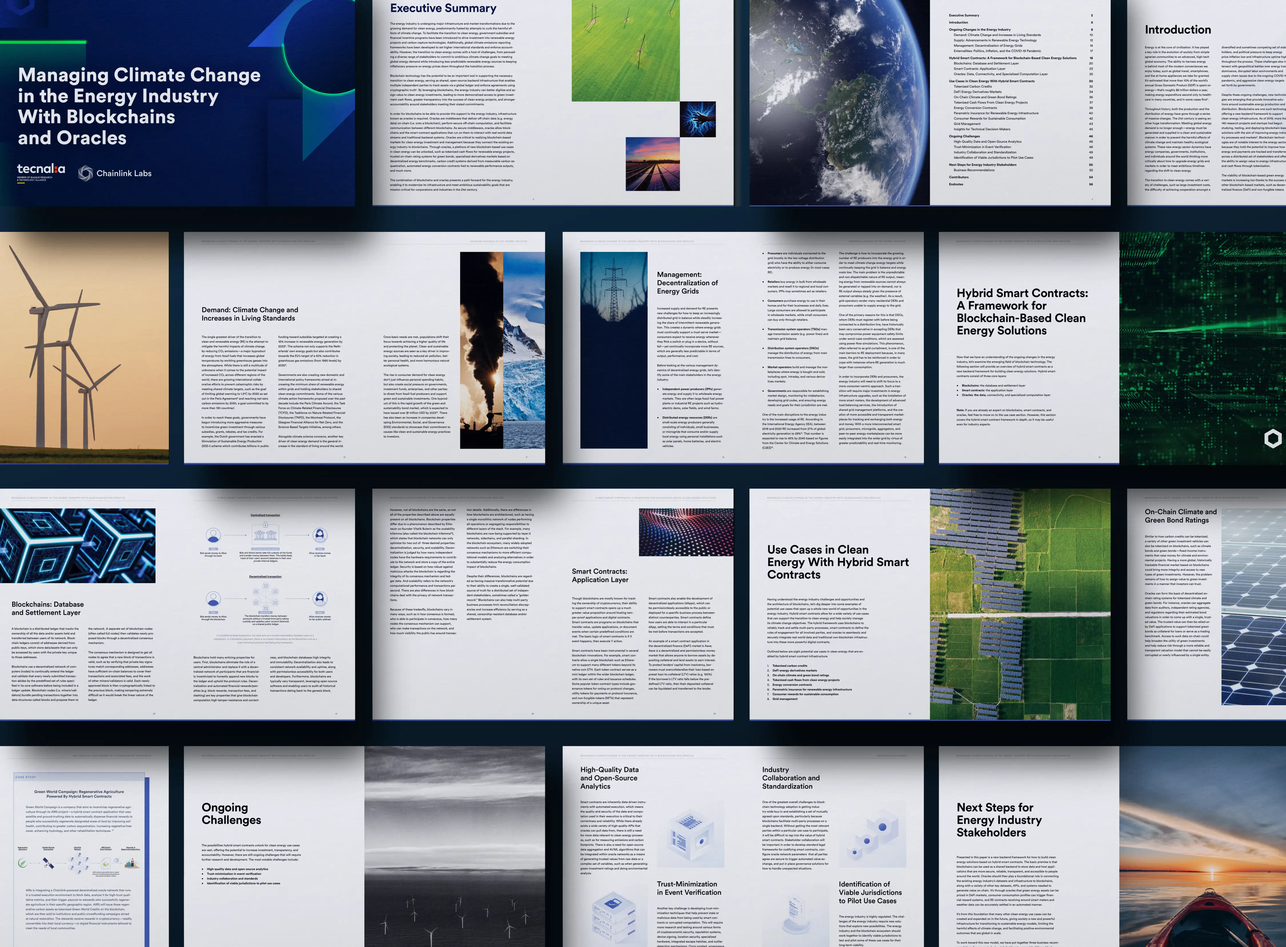
Lastly, for longer reports and thought leadership pieces, we adopted a more editorial design strategy. The system emphasized clean, visually appealing irregular layouts that presented the information engagingly. The aim of these meticulously curated documents was to fortify Chainlink's position as a thought leader, shaping the discourse in the blockchain realm.
Chainlink offers a broad array of products, each with diverse functionalities for building, accessing, and selling the oracle services required to power hybrid smart contracts on any blockchain. To create distinctiveness across products, enhance memorability, and fortify the relationship with users and audiences, each Chainlink product has an individual visual representation.
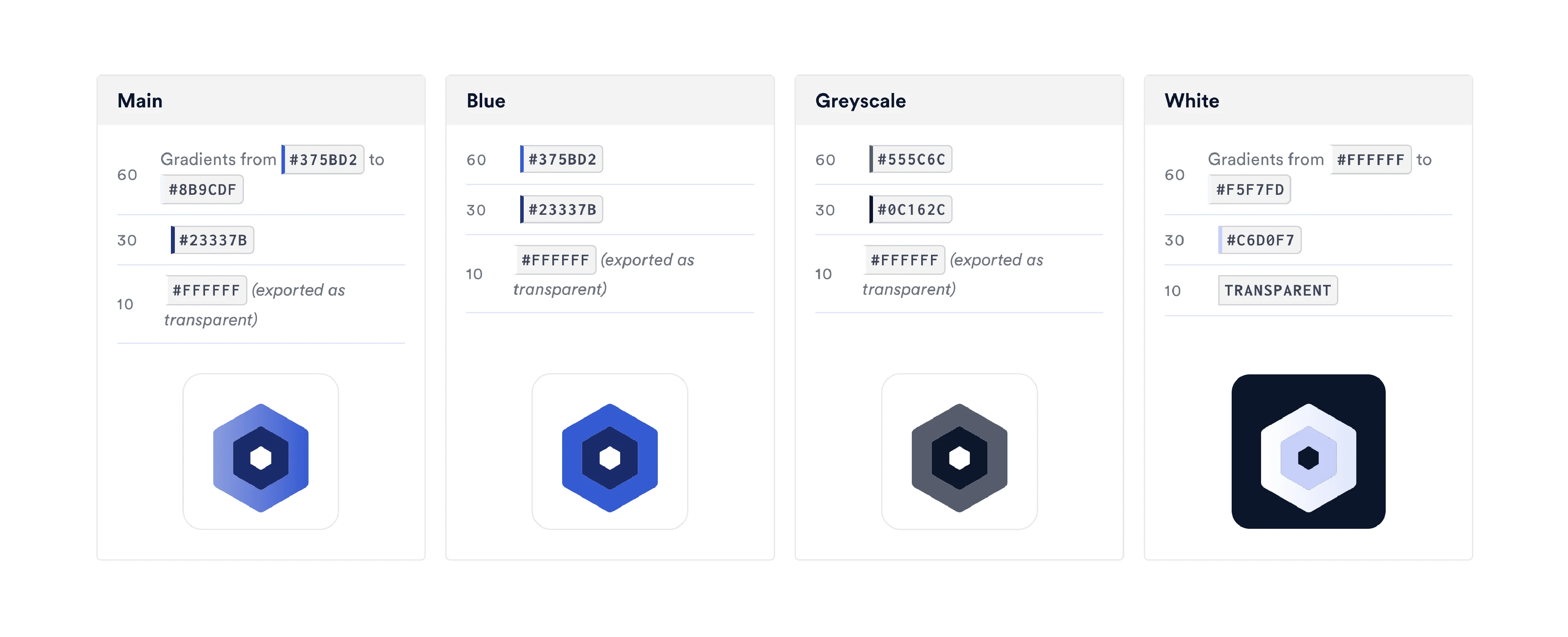
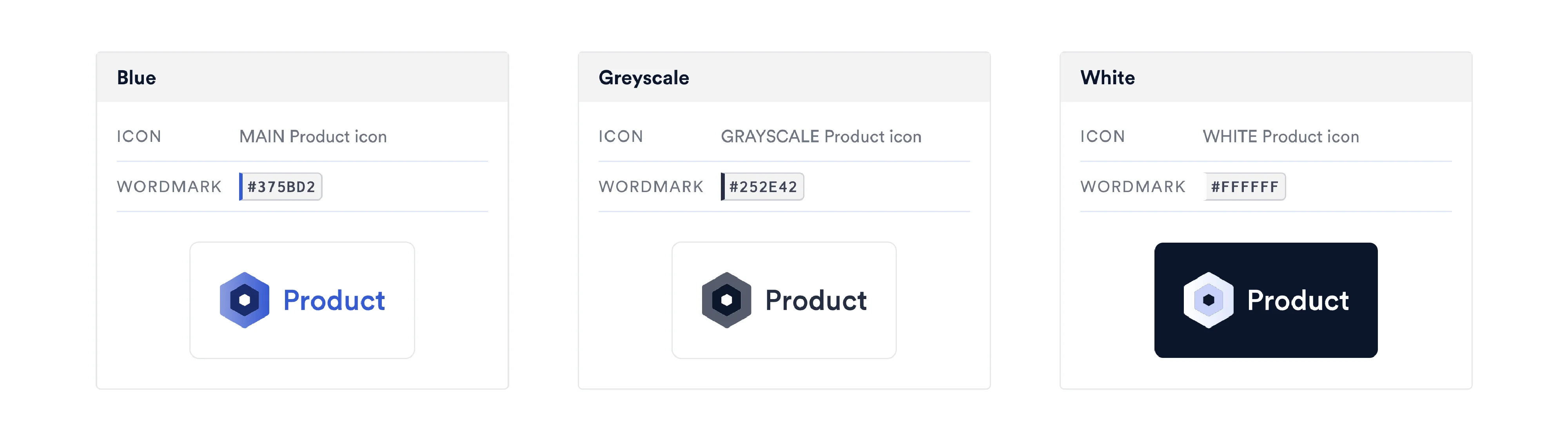
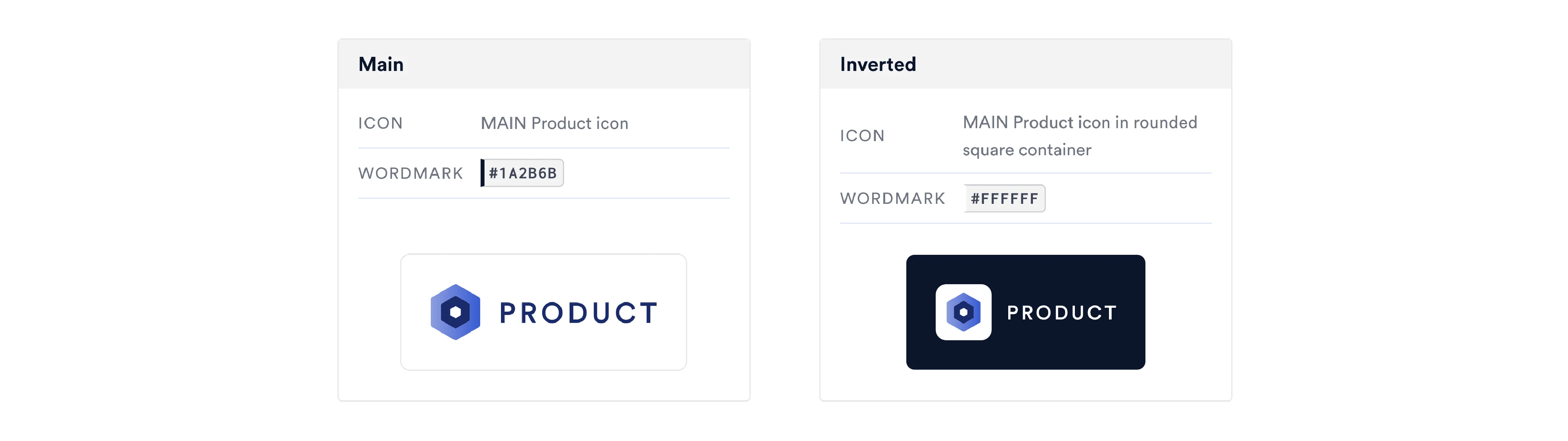
Each product icon is crafted using overlaid primitives and simple shapes, with slightly rounded corners on a predefined grid. To cover all use cases and schemes, the icons are available in four different schemes: main, blue, grayscale, and white. For color balance, we utilize the 60/30/10 rule as a guideline for each of the four schemes.
The system offers two different tiers for lockups: primary and secondary.
Primary lockups are individually designed by pairing each product icon with the product name in Chainlink’s primary typography, replicating the structure of Chainlink’s imagotype, in a horizontal layout. They are available in three different schemes: blue, grayscale, and white.
The primary lockups are mainly used as navbar logos on product pages (in combination with Chainlink Hexagons), and as individual featured elements in marketing materials and presentations, only on artboards where the Chainlink logo is also present.
Secondary lockups are designed by combining the respective product icon and the product name as a wordmark in all caps in Circular Medium with slight kerning, in a horizontal layout. They are available in two different schemes: main and inverted.
The secondary lockups are primarily used as complementary eyebrows for marketing collateral, for example, slide decks and digital banners, only on artboards where the Chainlink logo is also present.
Secondary lockups are designed by combining the respective product icon and the product name as a wordmark in all caps in Circular Medium with slight kerning, in a horizontal layout. They are available in two different schemes: main and inverted.
Following this system, each Chainlink product had a unique visual emblem, in which the product's functionality was represented in an abstract and minimalist manner.
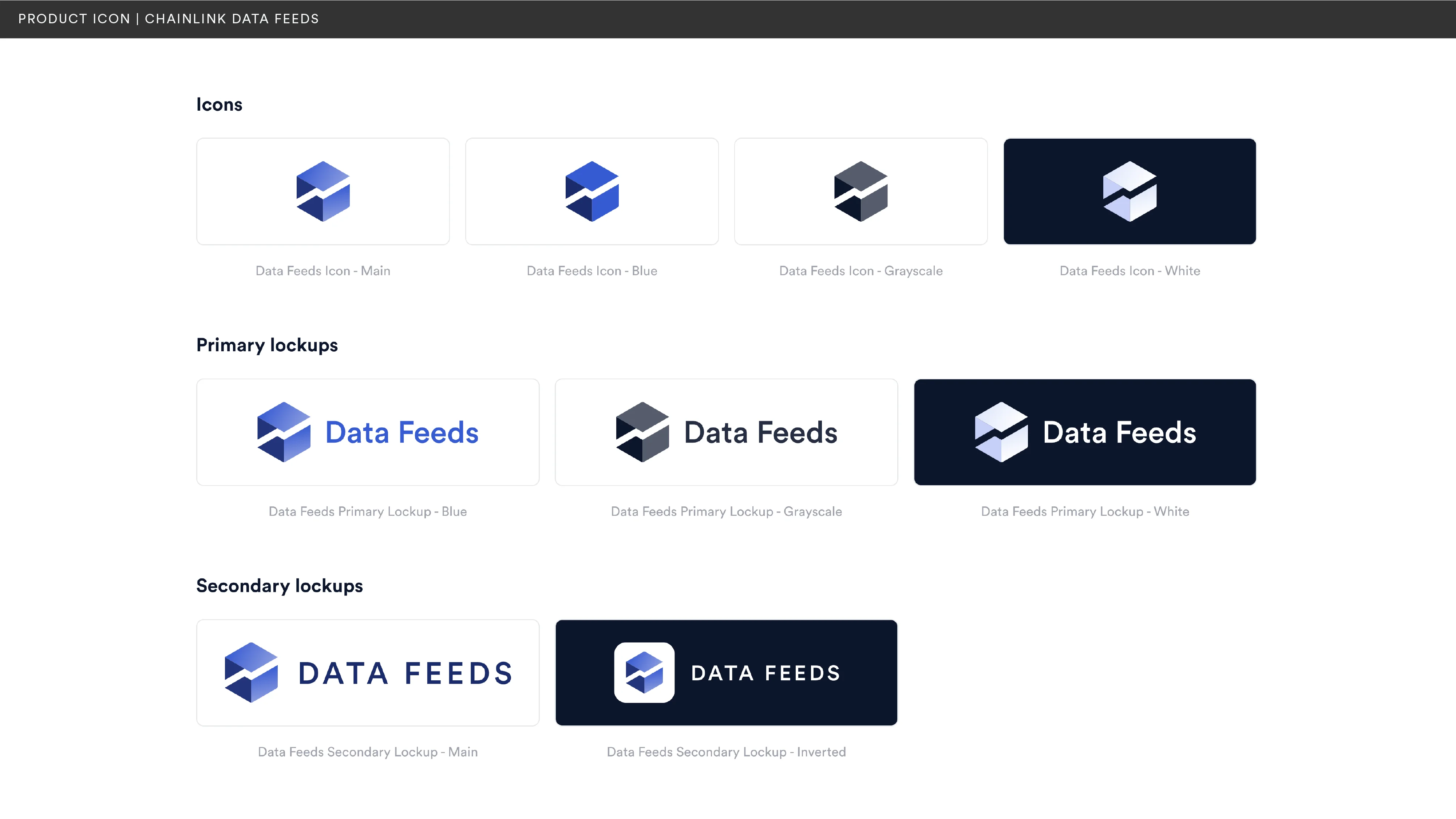
One of the most popular Chainlink products, the Chainlink Data Feeds product icon utilizes a hexagon as its primary shape. In the edge combination of the different faces, a line is created through white space, representing an upward graph curve, from left to right.
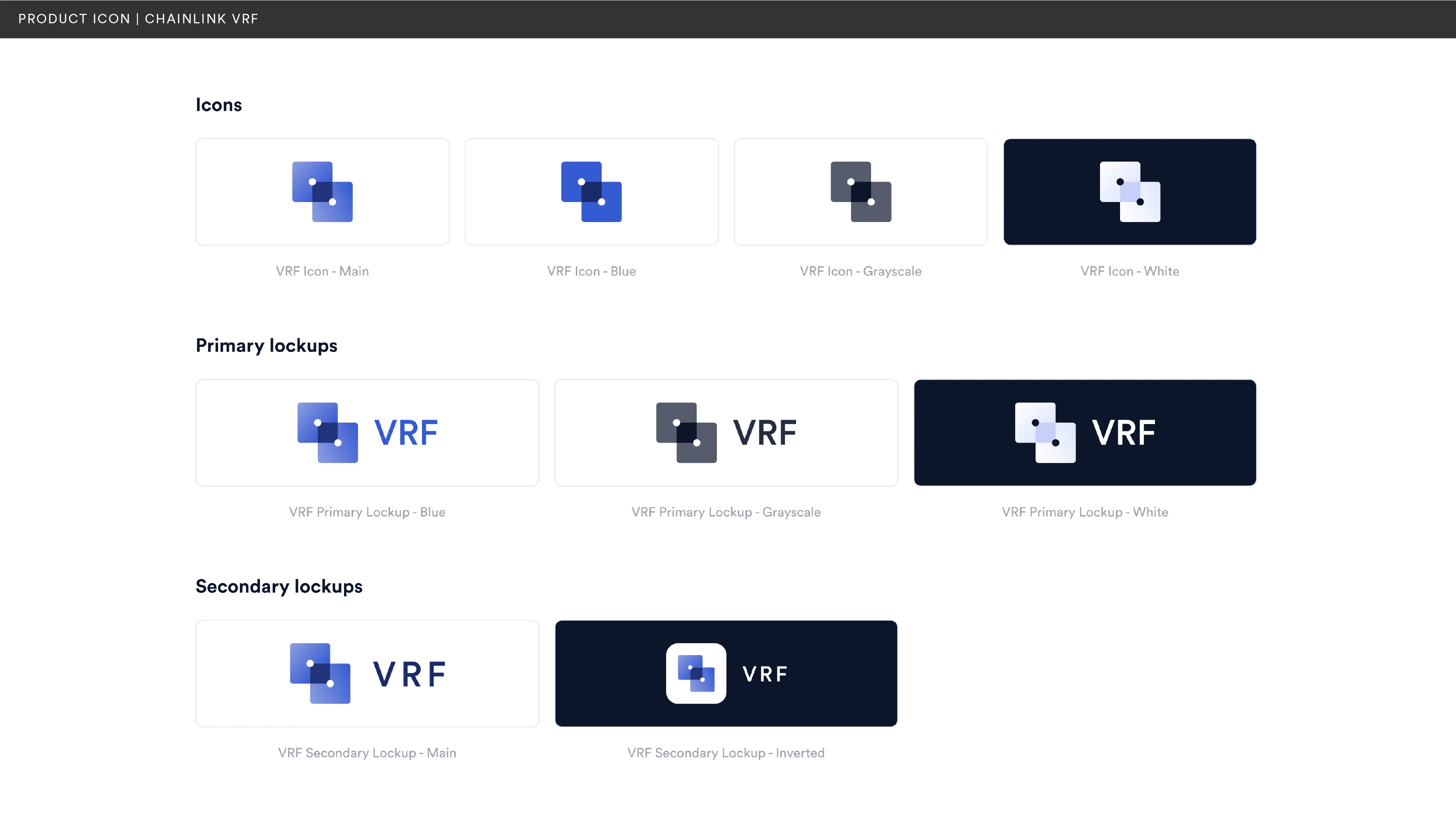
The Chainlink VRF product icon uses two overlaid squares with rounded corners. The white circles in the middle of each square are aligned to opposite corners of the overlaid intersection, and are placed to represent two individual dice, which is the primary visual element used to portray verifiable randomness in diagrams and other visual representations.
The Chainlink Automation product icon intersects two circles, with one of them using white space and irregular edges to represent the border mesh of a cogwheel, which is the primary visual element used to portray the product and its automation function in diagrams and other visual representations.
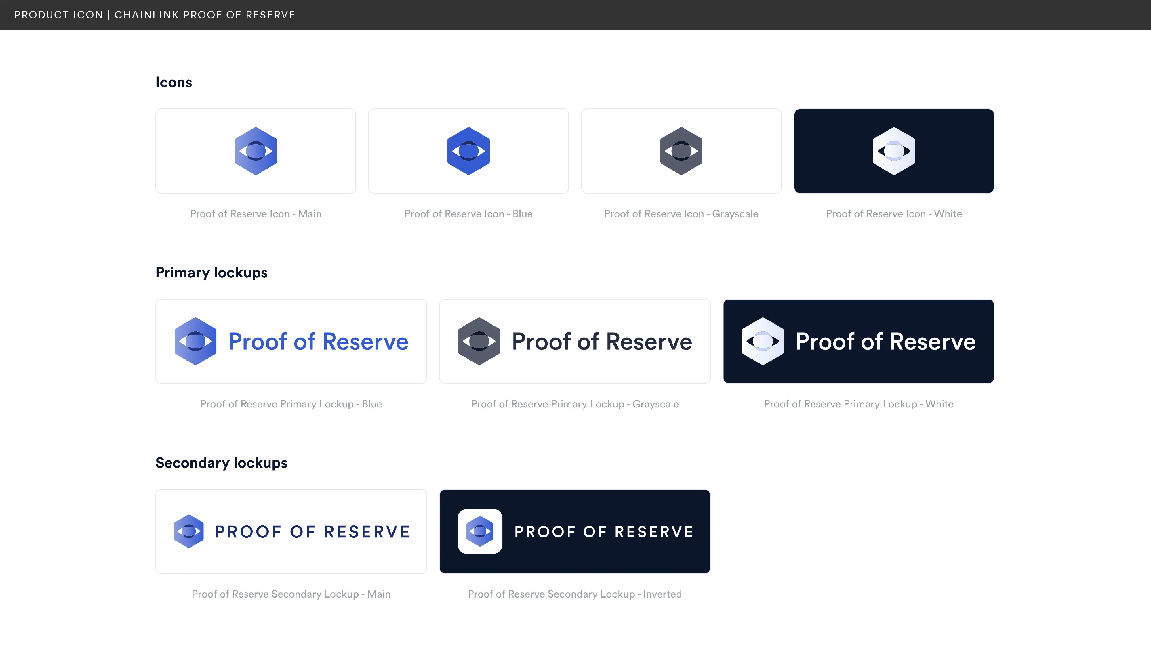
Chainlink Proof of Reserve
The Chainlink Proof of Reserve product icon uses a hexagon as a foundational shape, which relates it to its parent product: Data Feeds. In the middle of the hexagon is a rounded rhombus which overlaps with a smaller circle, shaping an abstract eye that aims to represent the monitoring nature of the product.
The Chainlink Proof of Reserve product icon uses a hexagon as a foundational shape, which relates it to its parent product: Data Feeds. In the middle of the hexagon is a rounded rhombus which overlaps with a smaller circle, shaping an abstract eye that aims to represent the monitoring nature of the product.
As showcased in some of the sections above, motion has seamlessly integrated into the Chainlink brand, becoming an integral part of our visual narrative. Used in promotional materials and interface elements, the motion style embodies Chainlink’s overall brand principles. It results in clean pieces that are scalable to various degrees of complexity and are animated with dynamic transitions and smooth keyframe interpolations.
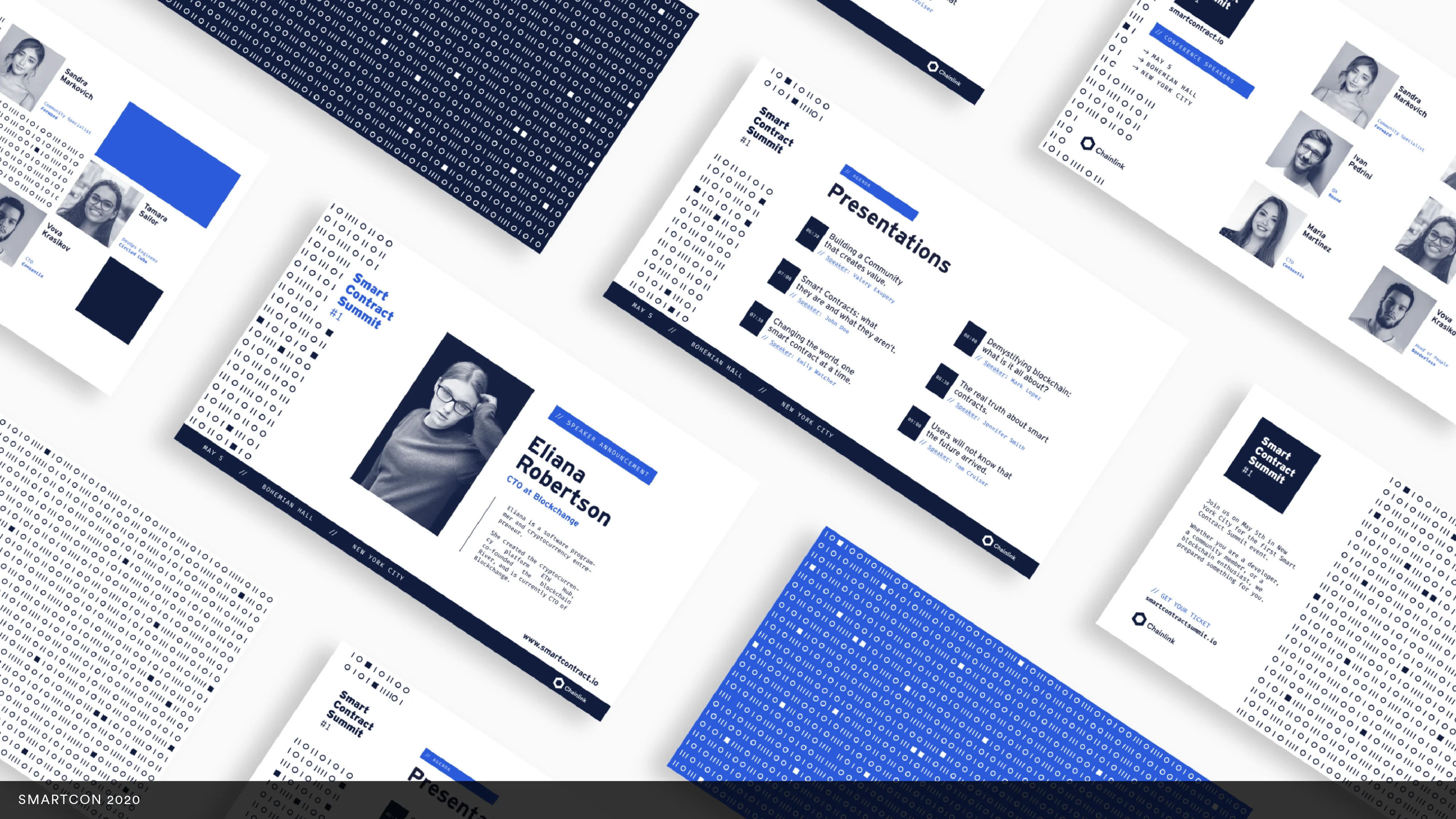
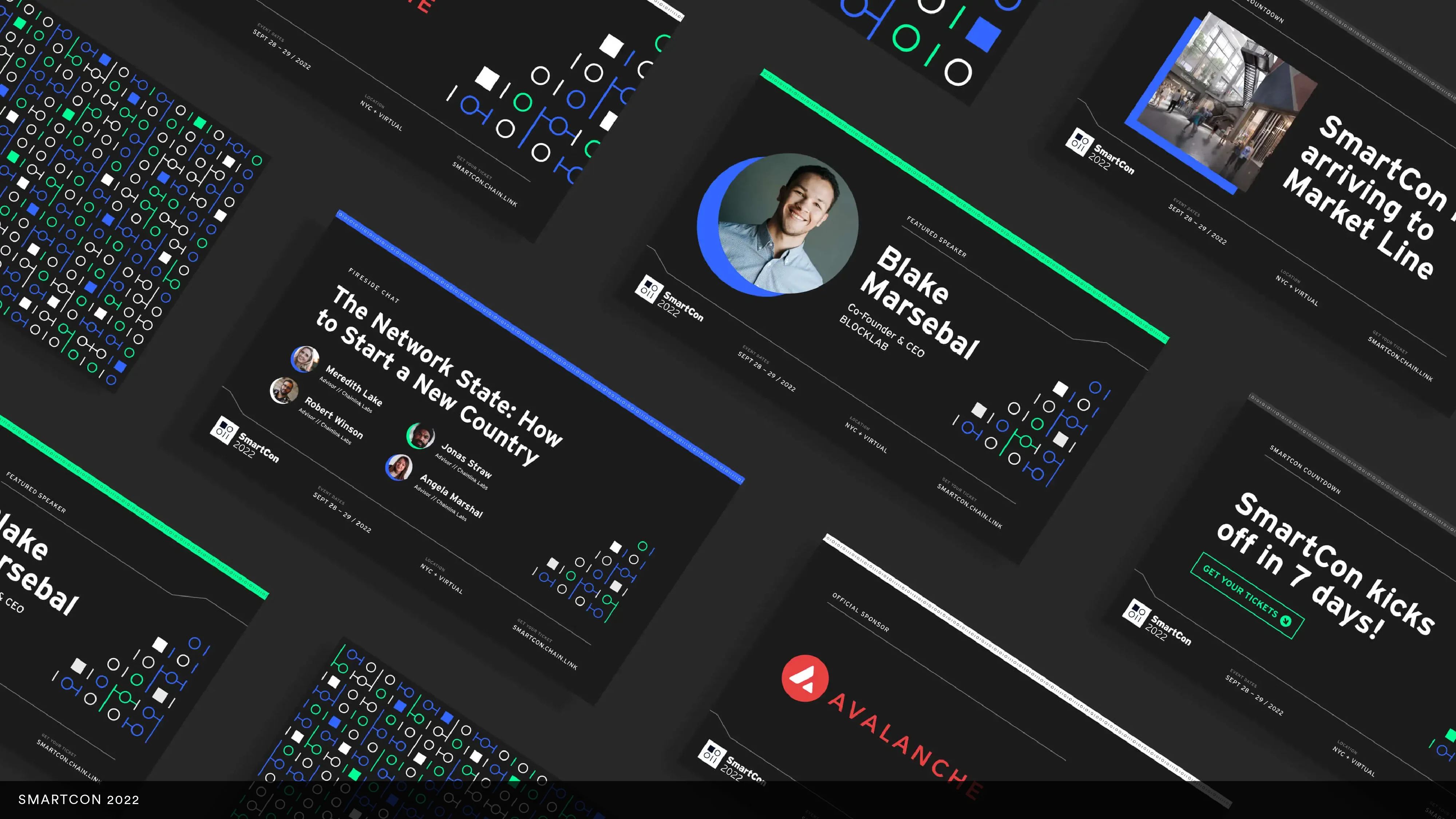
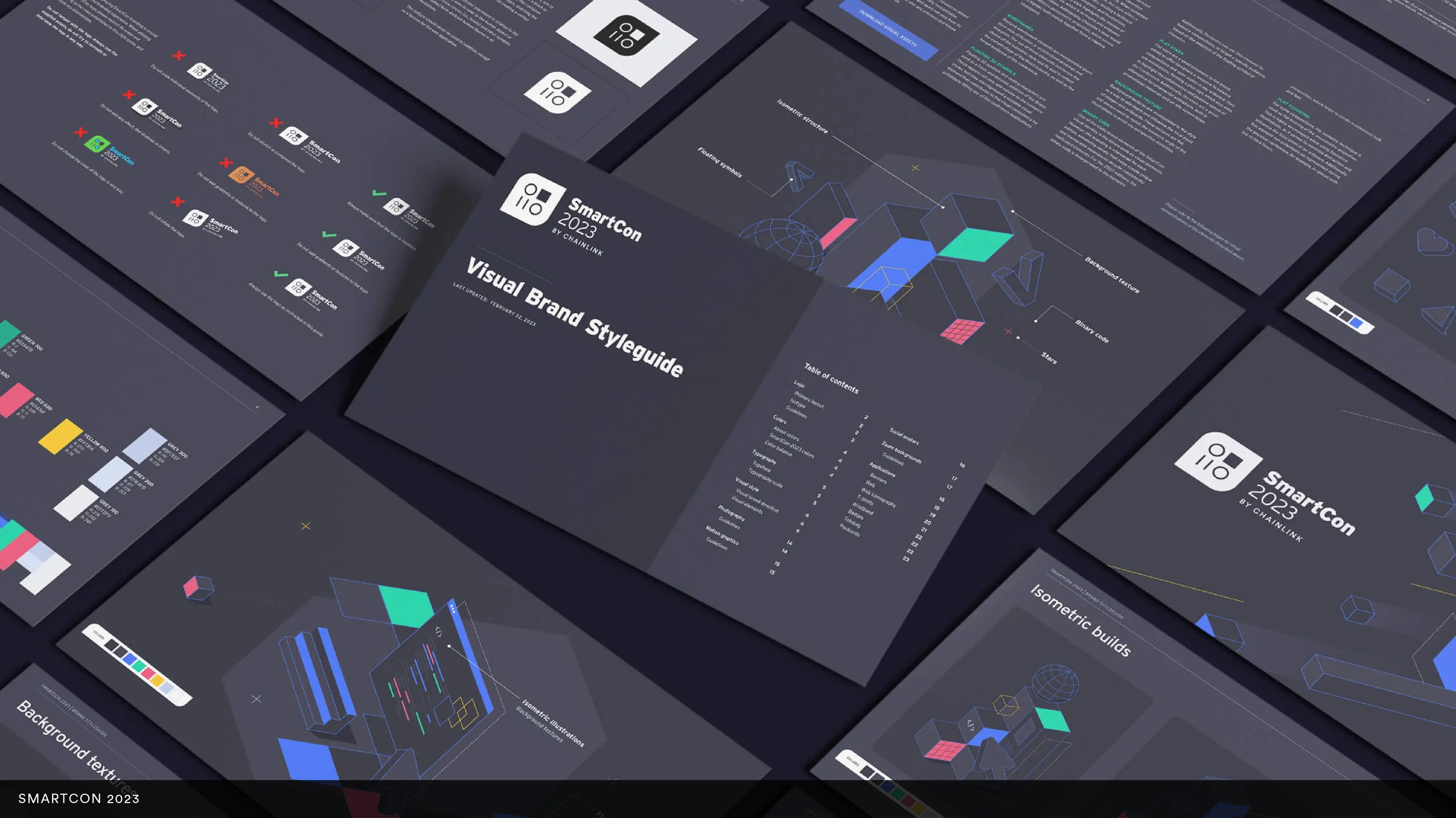
SmartCon, Chainlink's annual flagship event, demanded a unique, scalable Brand System. We designed it with an aim to maintain a consistent visual language across all editions while also delivering distinct experiences for each event. Our system embraced recurring visual motifs combined with more versatile elements, all combined with an intentional use of color, typography, and spatial relationships.
For more information and insights about the SmartCon brand system, please see the case study.
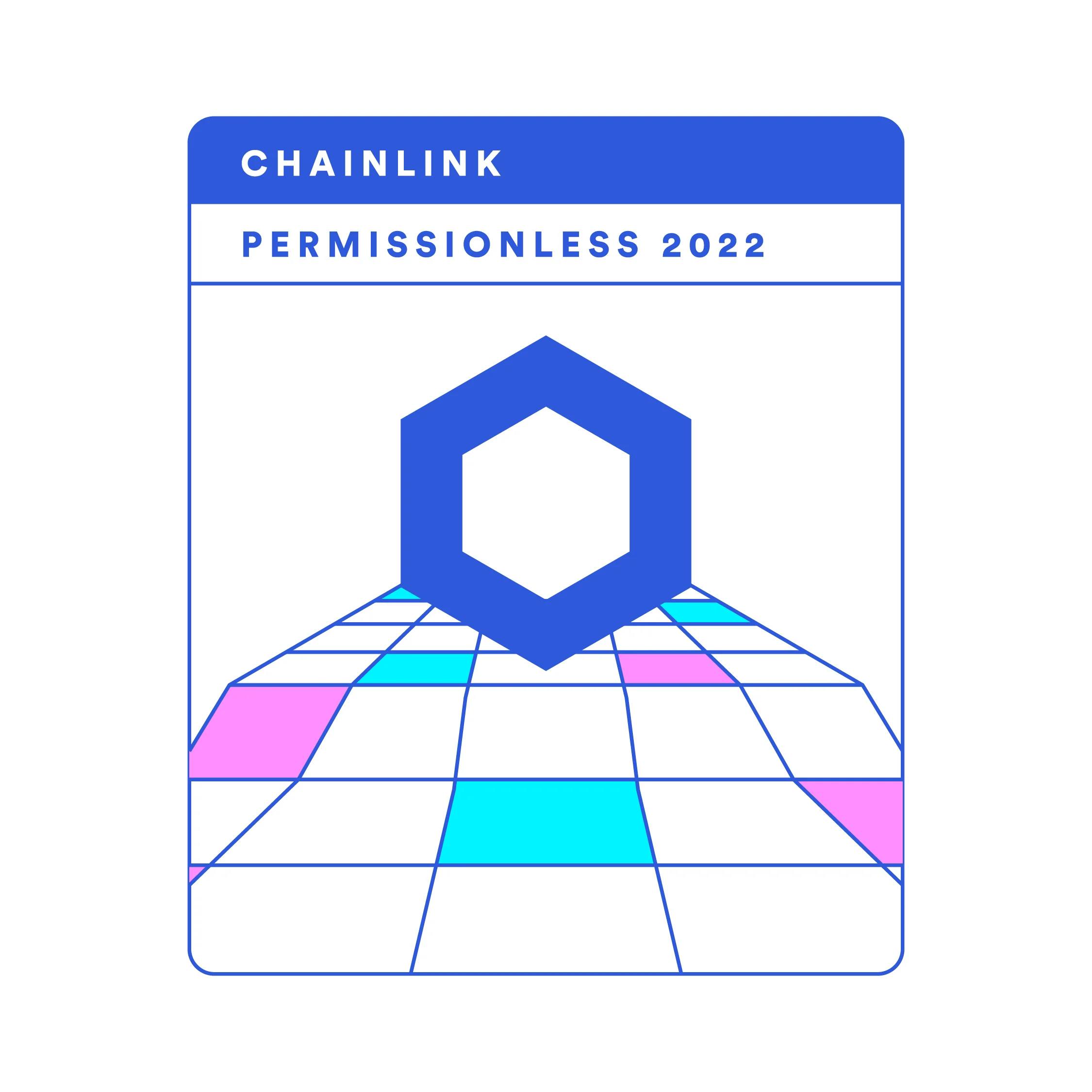
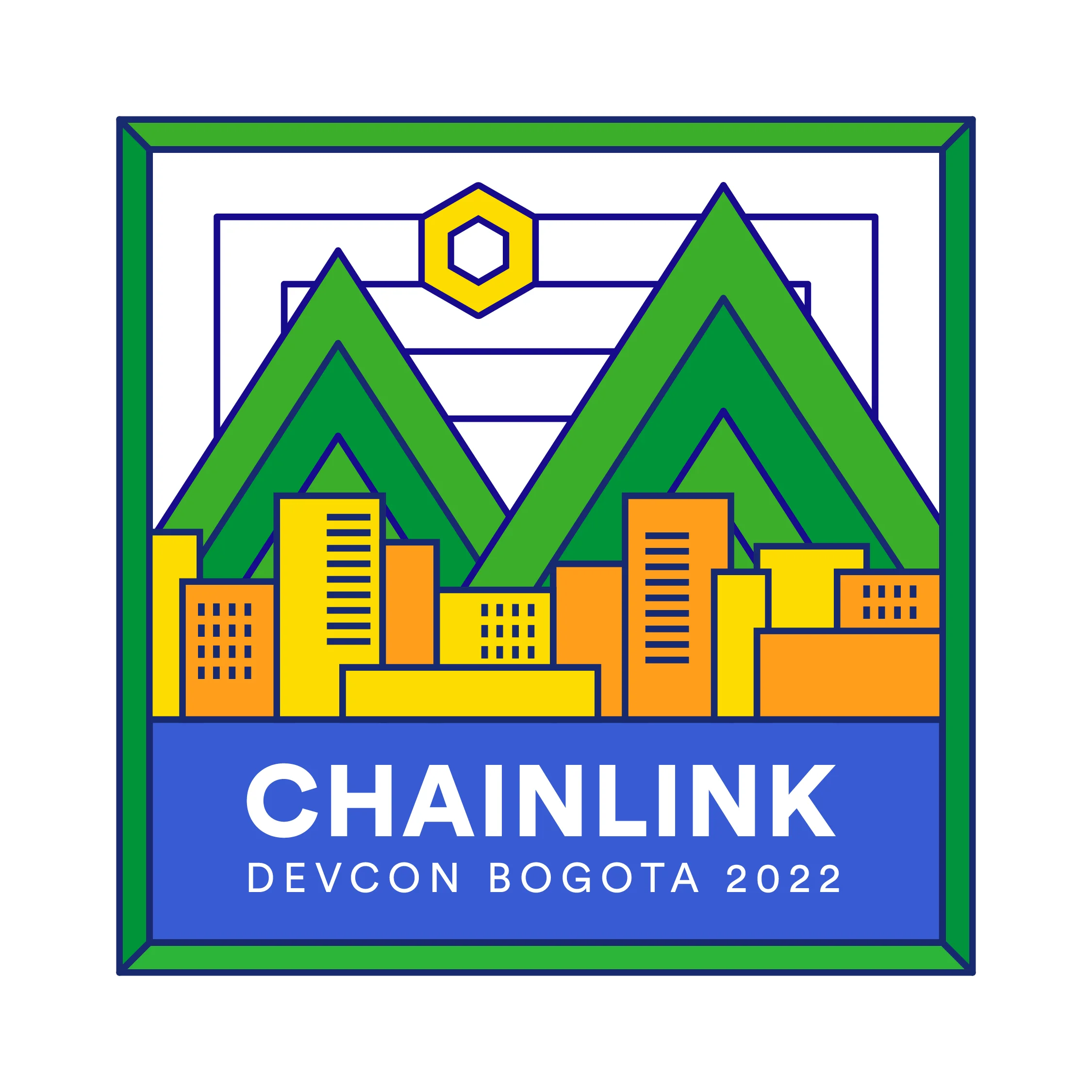
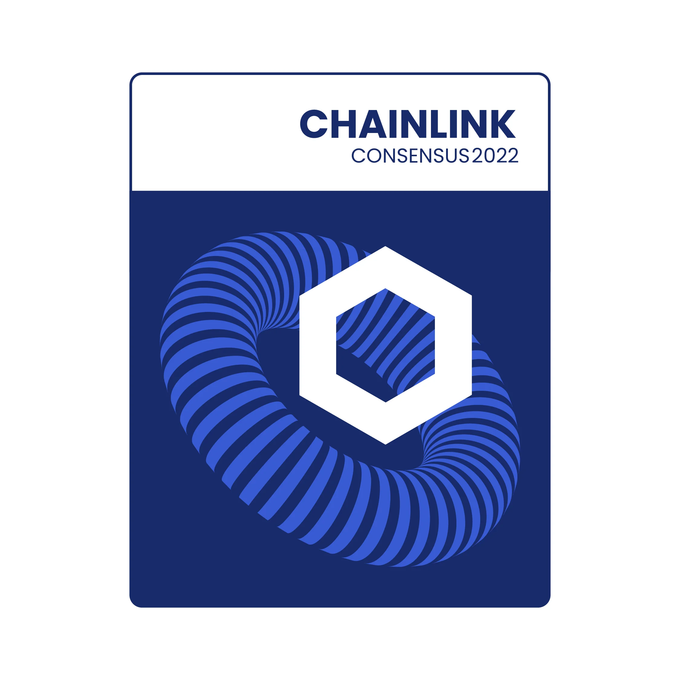
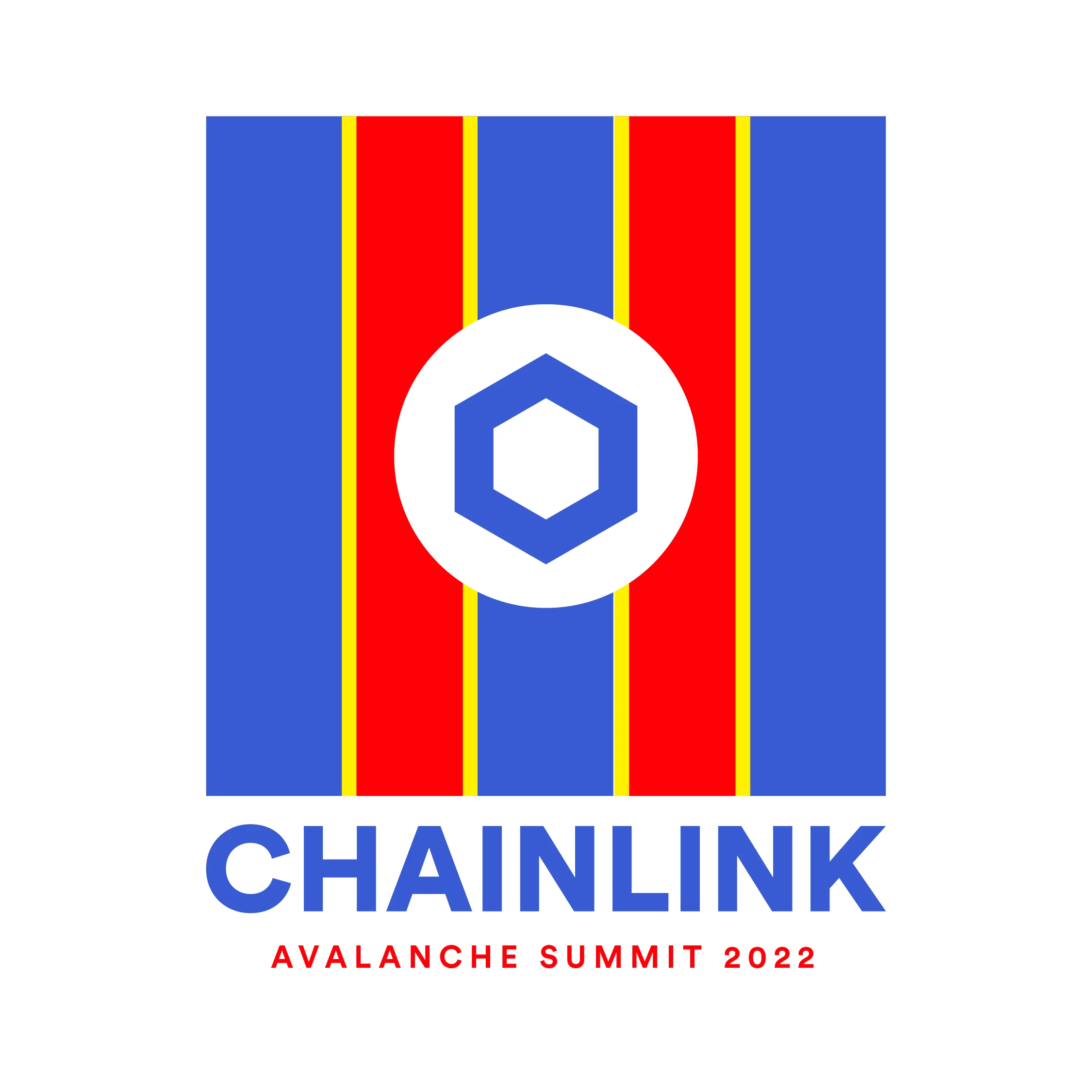
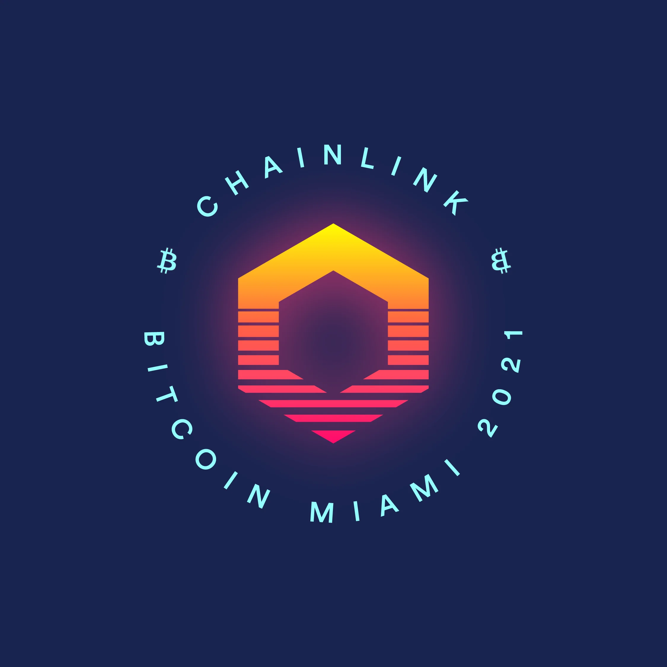
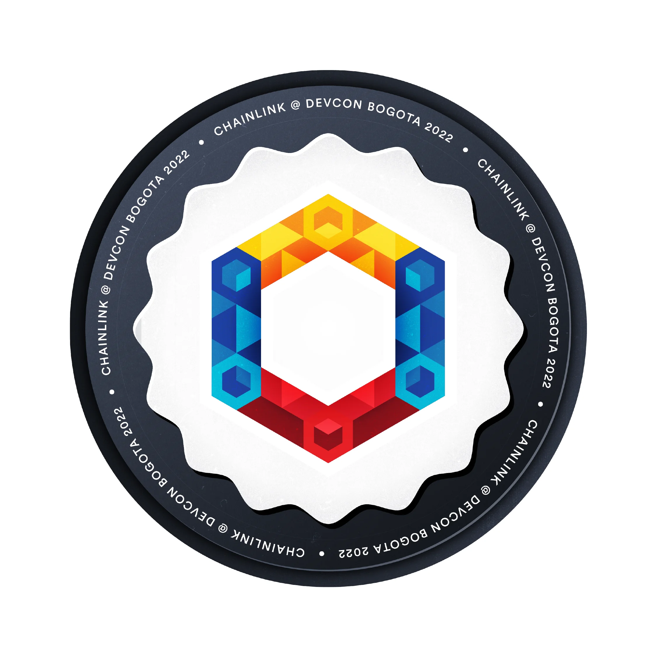
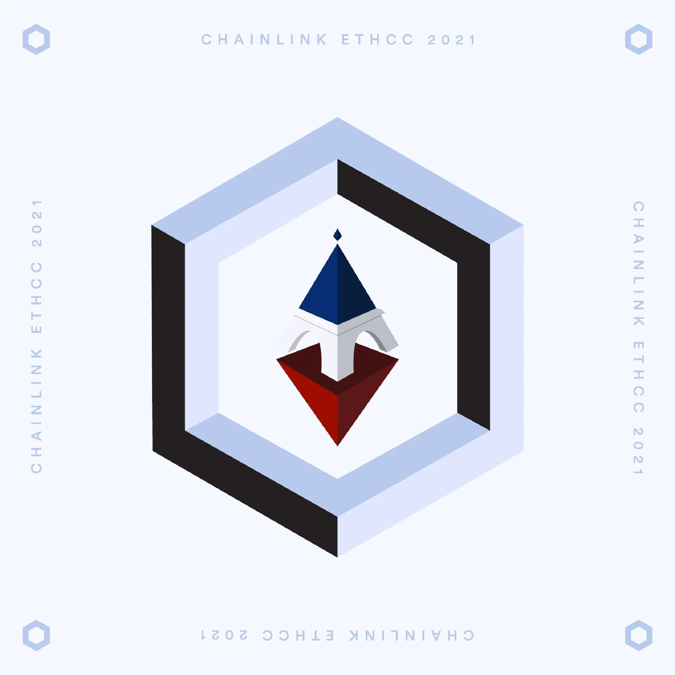
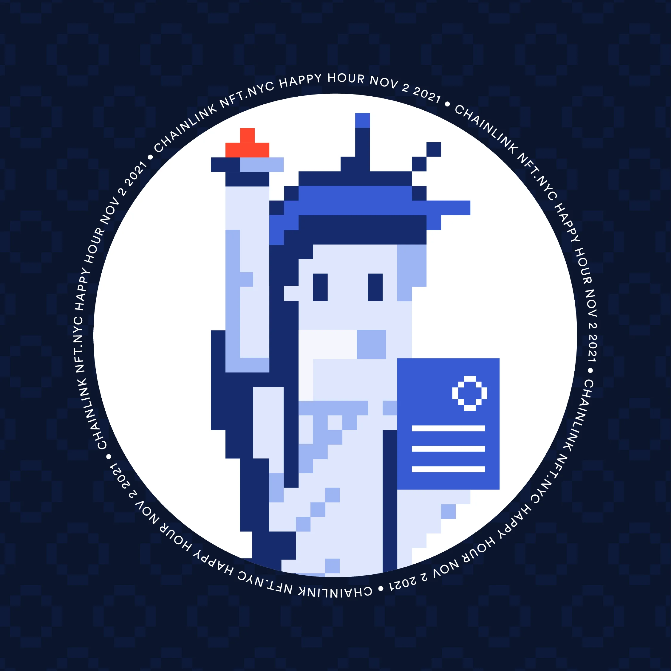
Considering Chainlink's frequent participation in blockchain events, we developed a flexible system that enabled the brand to adapt and create unique and customized experiences for the different occasions, while highlighting Chainlink's decentralized nature. We developed a micro brand system for sponsored events, which included a distinctive lockup, color palette, and typography, inspired by the main event brand but with a Chainlink twist.
These micro-brands for sponsored events not only covered digital collateral, prints, and merchandise but also became part of a limited and exclusive digital and physical collectibles, adding a unique value and further engagement to the experience.
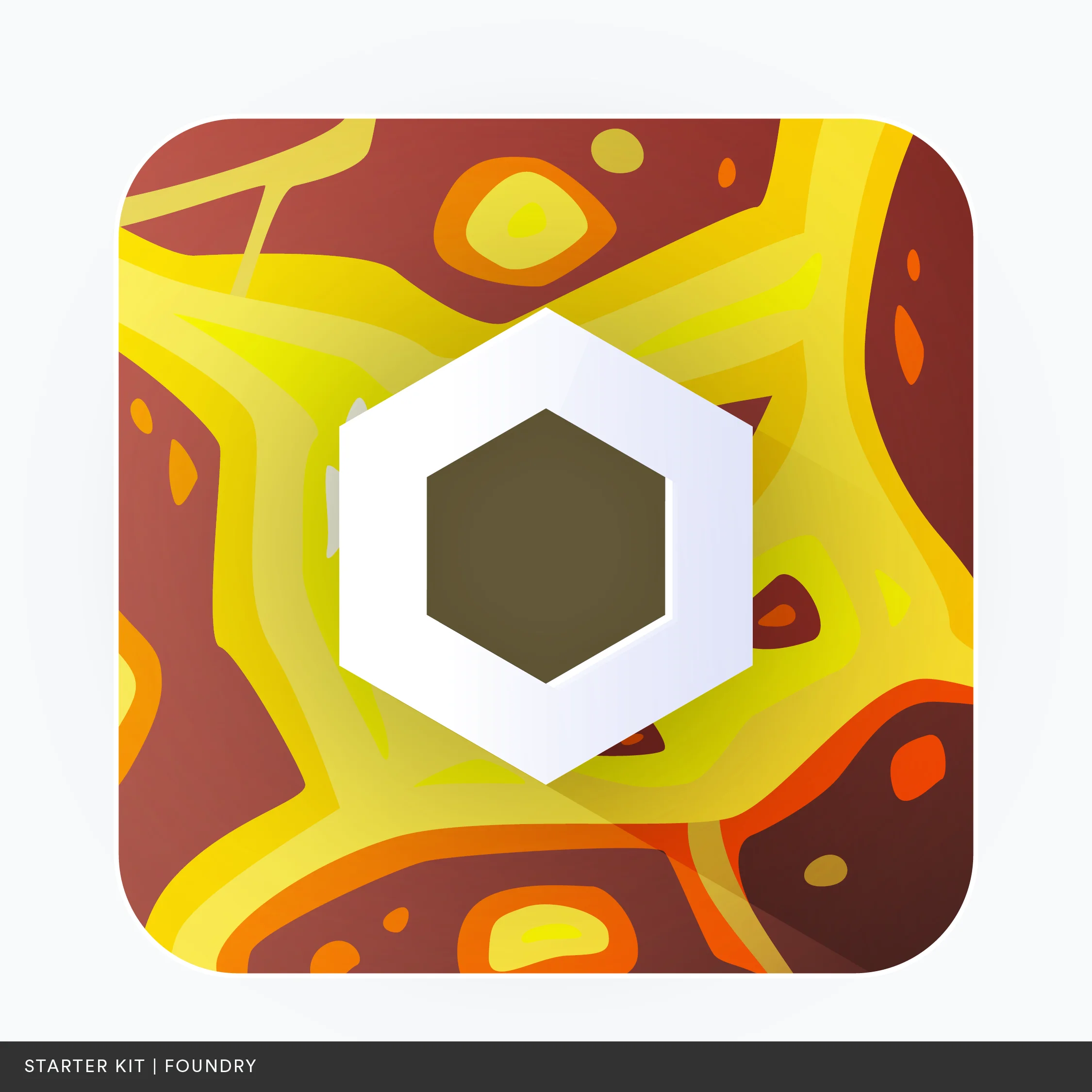
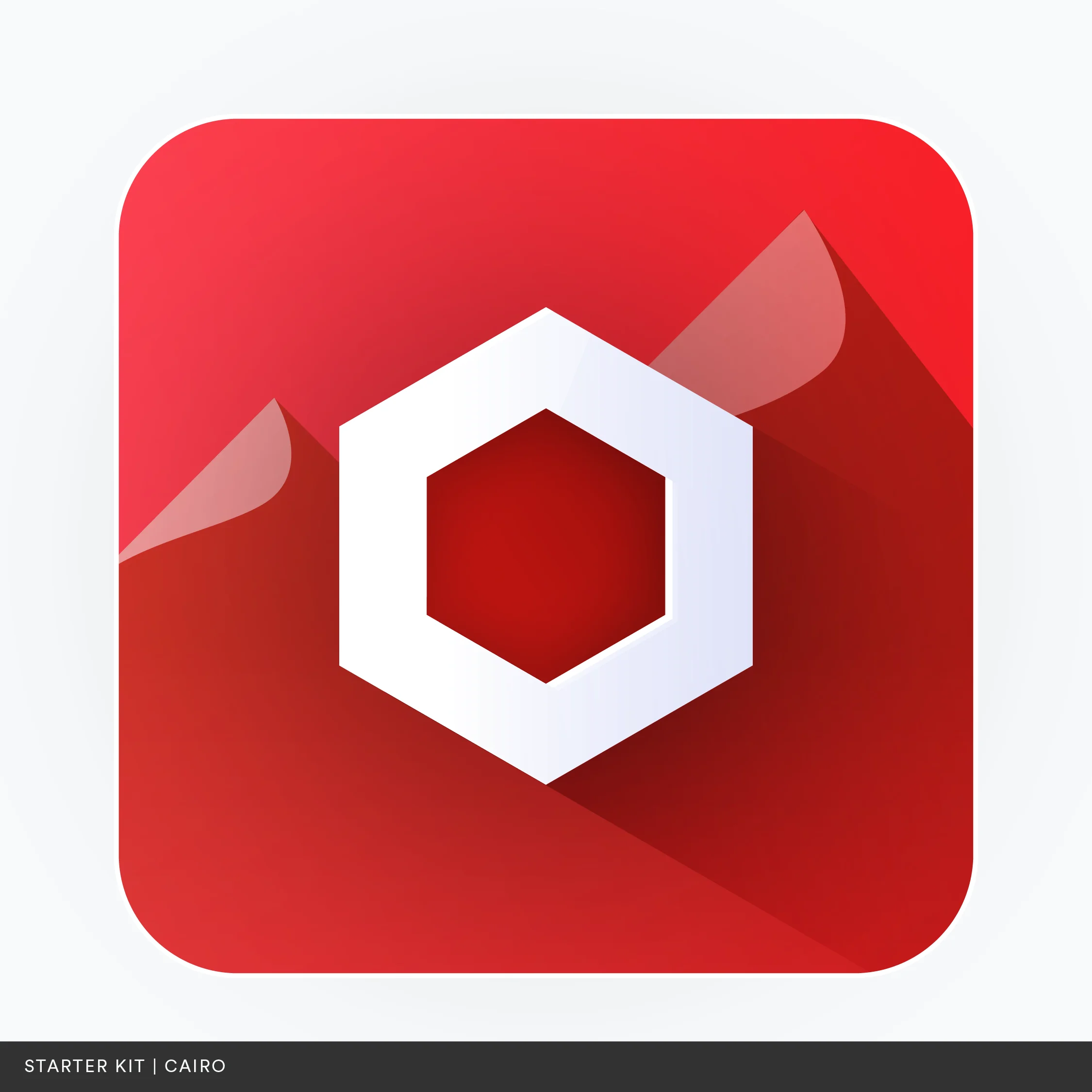
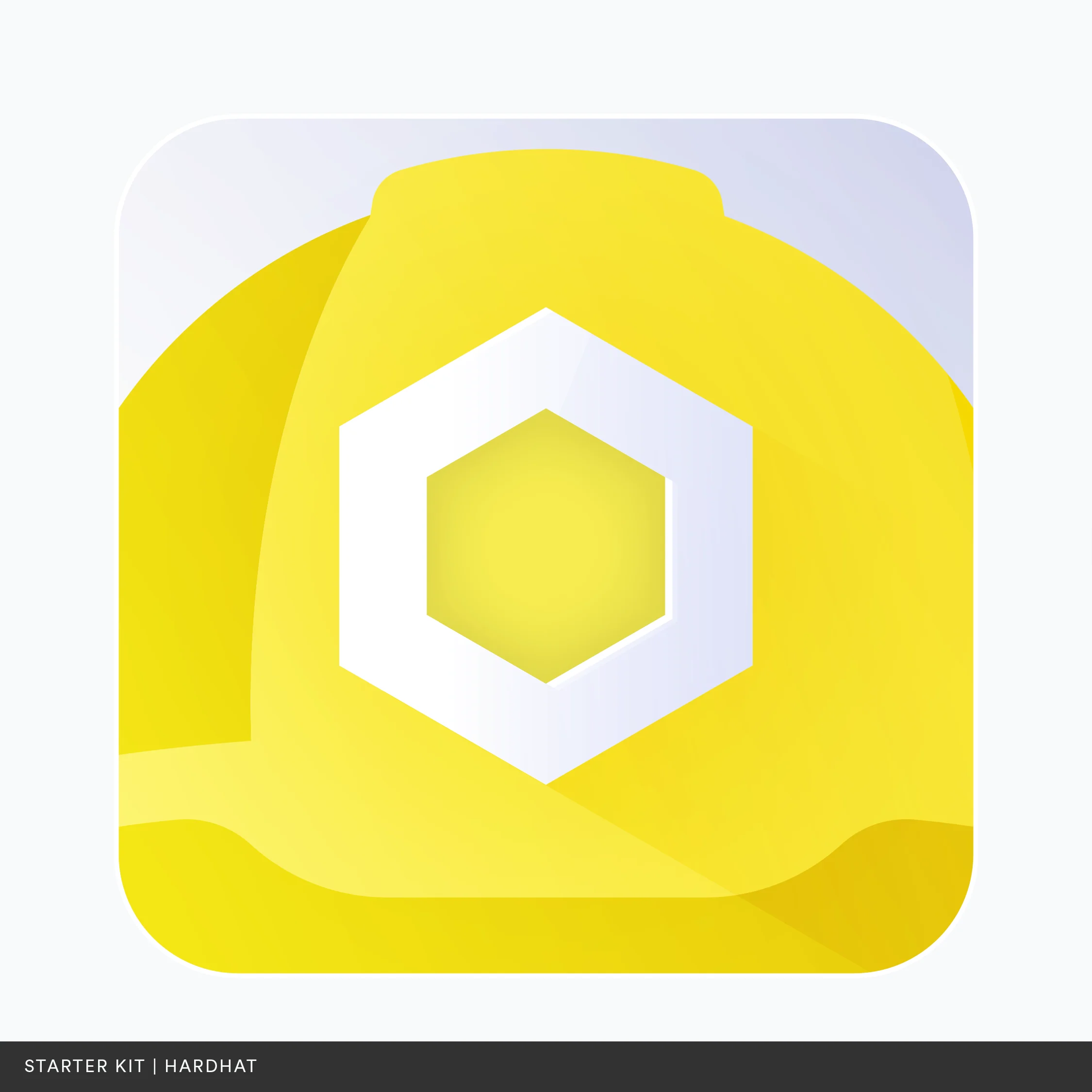
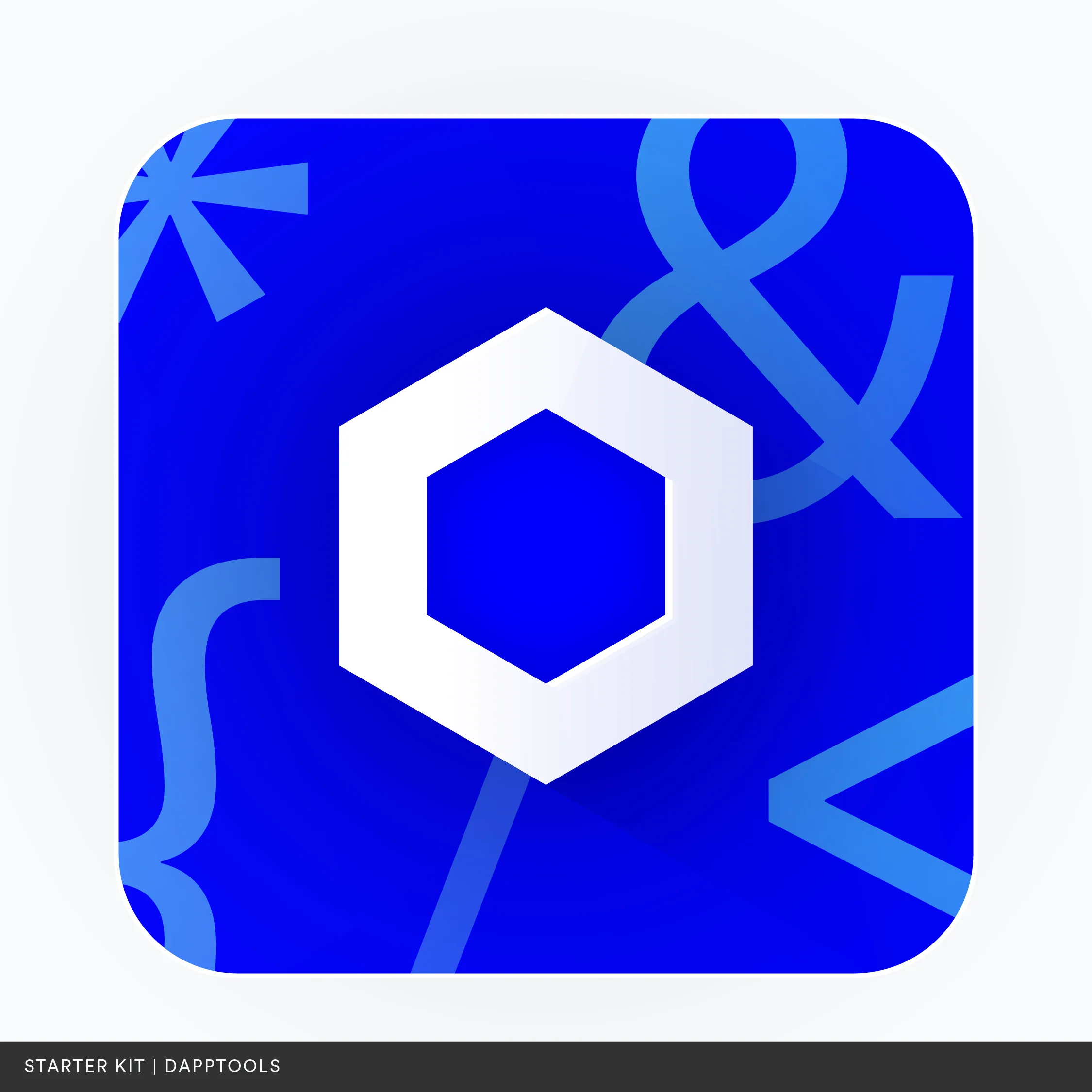
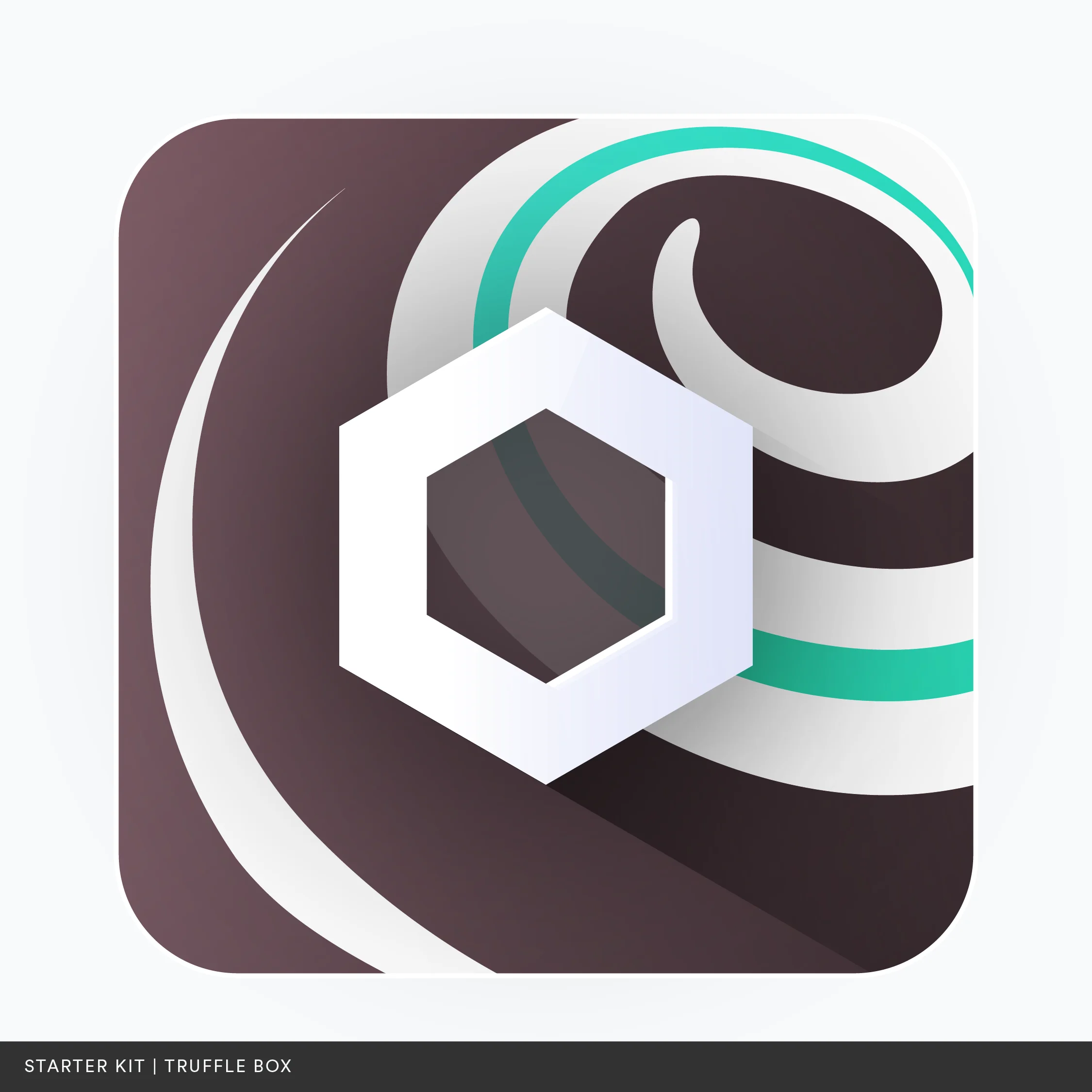
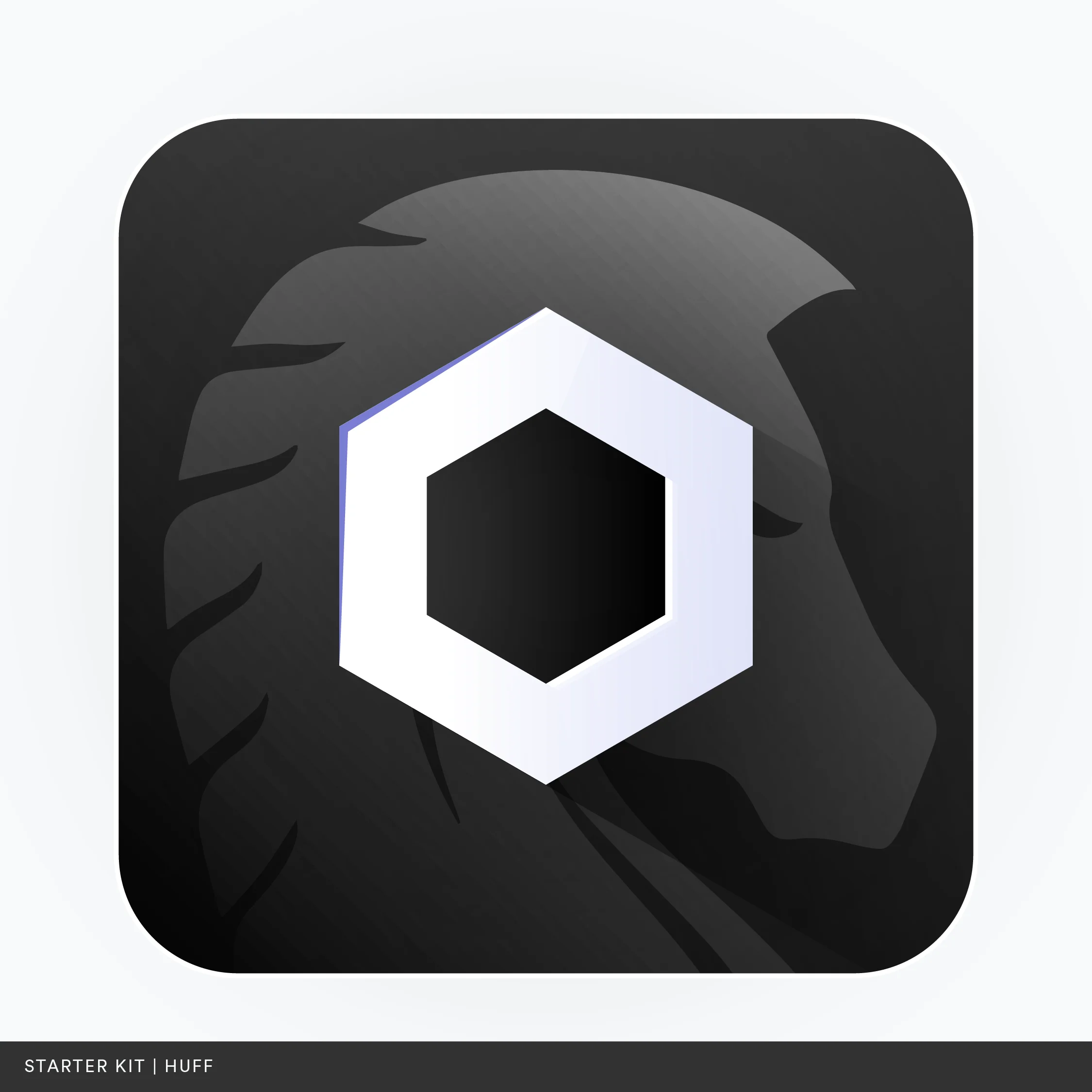
To encourage developers to utilize Chainlink's services for their decentralized applications, Chainlink offers starter kits for various languages and frameworks within the smart contract ecosystem.
Hosted on Github, these kits feature a unique lockup that subtly blends the branding of the respective language or framework. This blending of familiar branding elements facilitates quick identification and relatability, creating a visually appealing and unified experience within Github. This design approach not only improves navigation and usability but also fosters a stronger association between Chainlink and the various languages and frameworks.
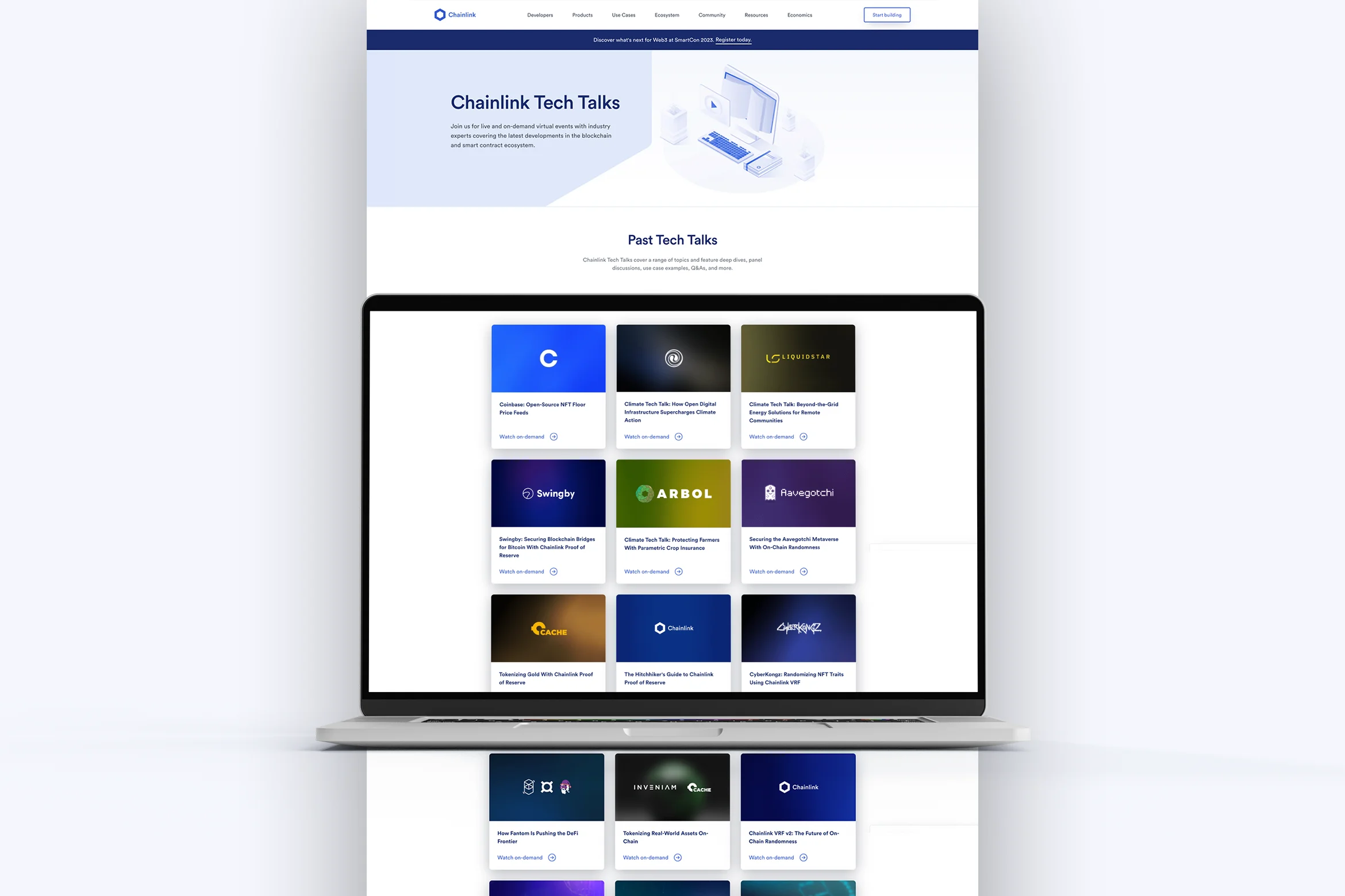
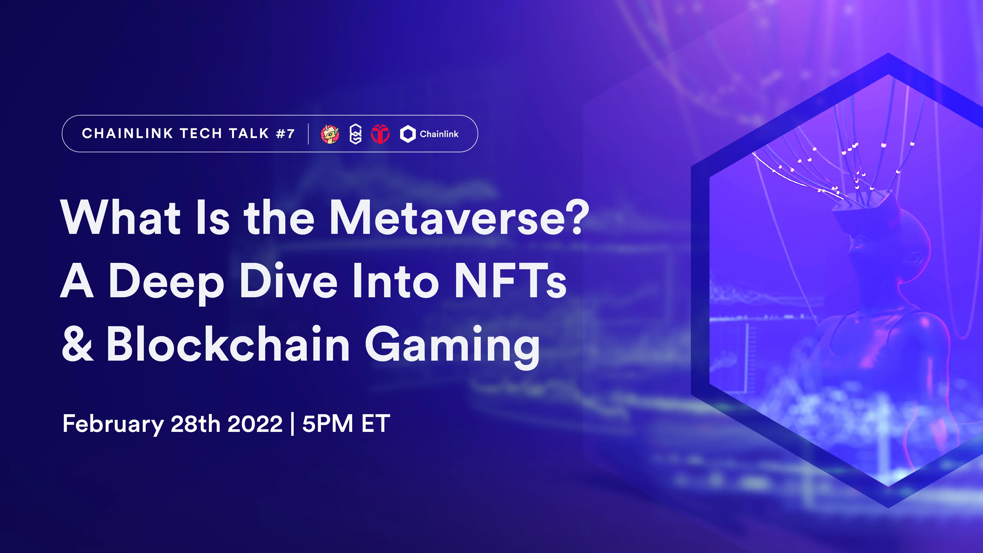
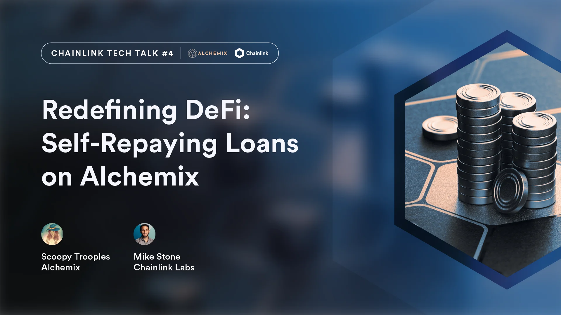
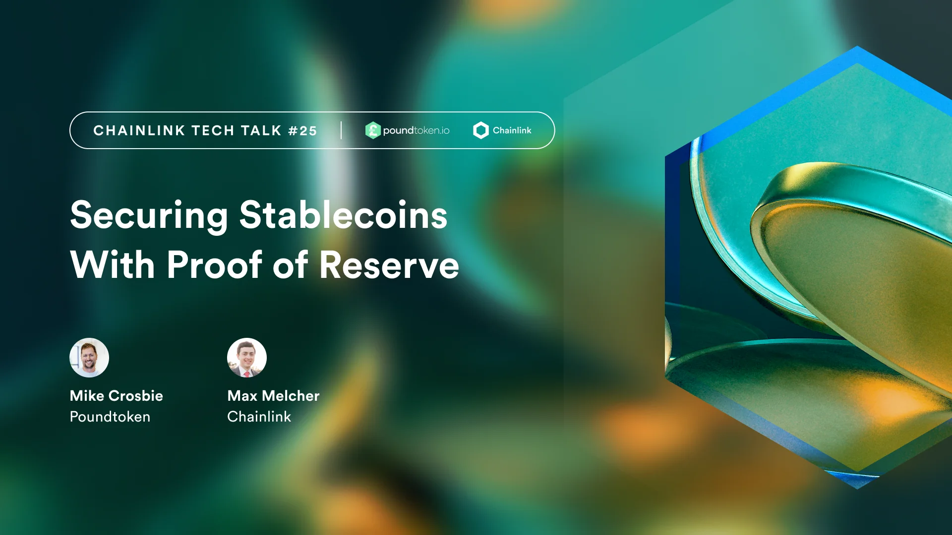
Chainlink's Tech Talks invite industry experts into a live or on-demand virtual space to discuss the latest in blockchain and smart contract ecosystems. These episodes are freely available through Chainlink’s web properties and social media channels.
Co-marketed with other integrated projects, we developed a visually appealing system that caters to the high volume of content. We chose a fixed layout that blends Chainlink's brand elements with the visuals and colors of the co-branded project. Whenever relevant, we incorporated photography, adding a touch of the physical world to these tech-focused discussions.
Additionally, the Tech Talks brand extension included a media pack, which was used in video production, and helped to deliver a consistent multidimensional brand experience for viewers and attendees.
Chainlink's hackathons are exciting platforms where developers bring their creativity to life, leveraging Chainlink's tools to design innovative blockchain applications. Serving as a gateway into the world of Web3 careers, these events also provided crucial educational content to thousands of participants across each edition.
To ensure a consistent yet adaptable visual identity, we conceived a versatile brand system that harmonizes strict design principles with flexible elements, making each hackathon a unique but unmistakably Chainlink experience. For more information and insights about the Chainlink Hackathon brand system, please visit this link.
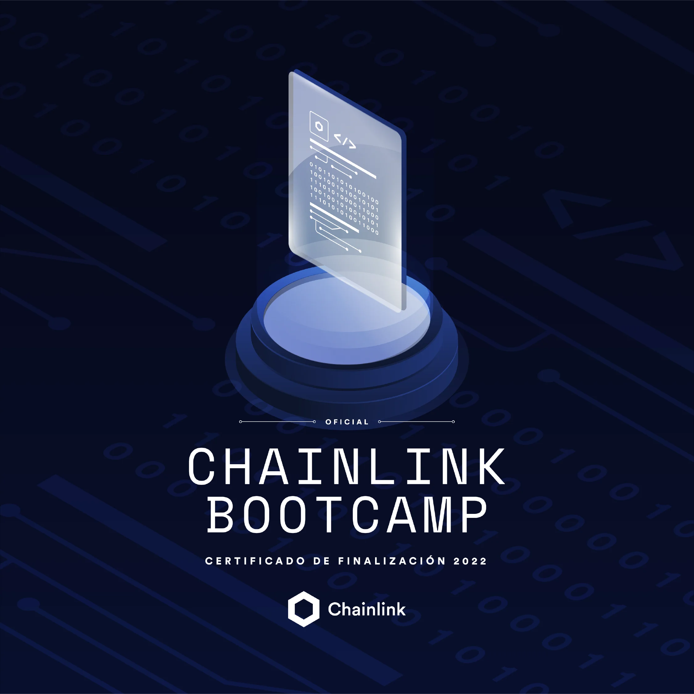
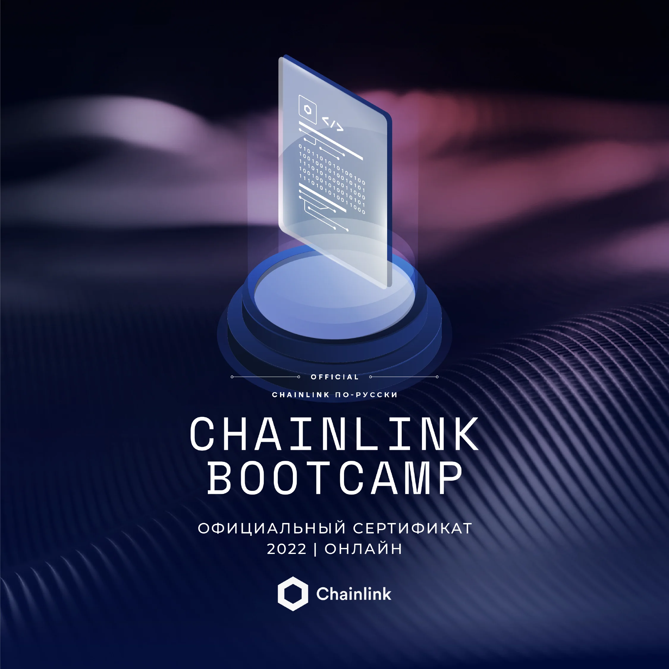
Educating developers in their smart contract journey is at the core of Chainlink’s mission. The Chainlink bootcamp is a developer program that provides blockchain developers with an easy-to-use framework for writing hybrid smart contracts, and direct access to Chainlink Developer Advocates through on-demand, instructor-led sessions.
Bootcamp, often co-sponsored with leading blockchain projects, featured a unique brand identity tailored to its technical audience. We determined color schemes variations based on the level of complexity or sponsoring brand, and utilized the monotype selection from Chainlink's brand for typography.
Upon completion, participants were rewarded with a unique NFT as a certification, adding a sense of exclusivity.
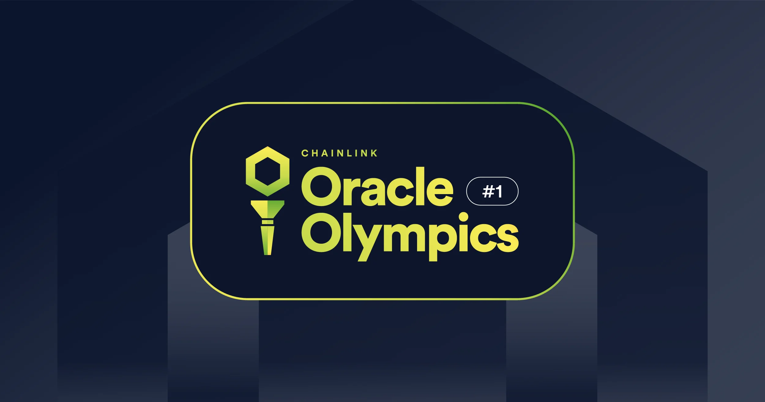
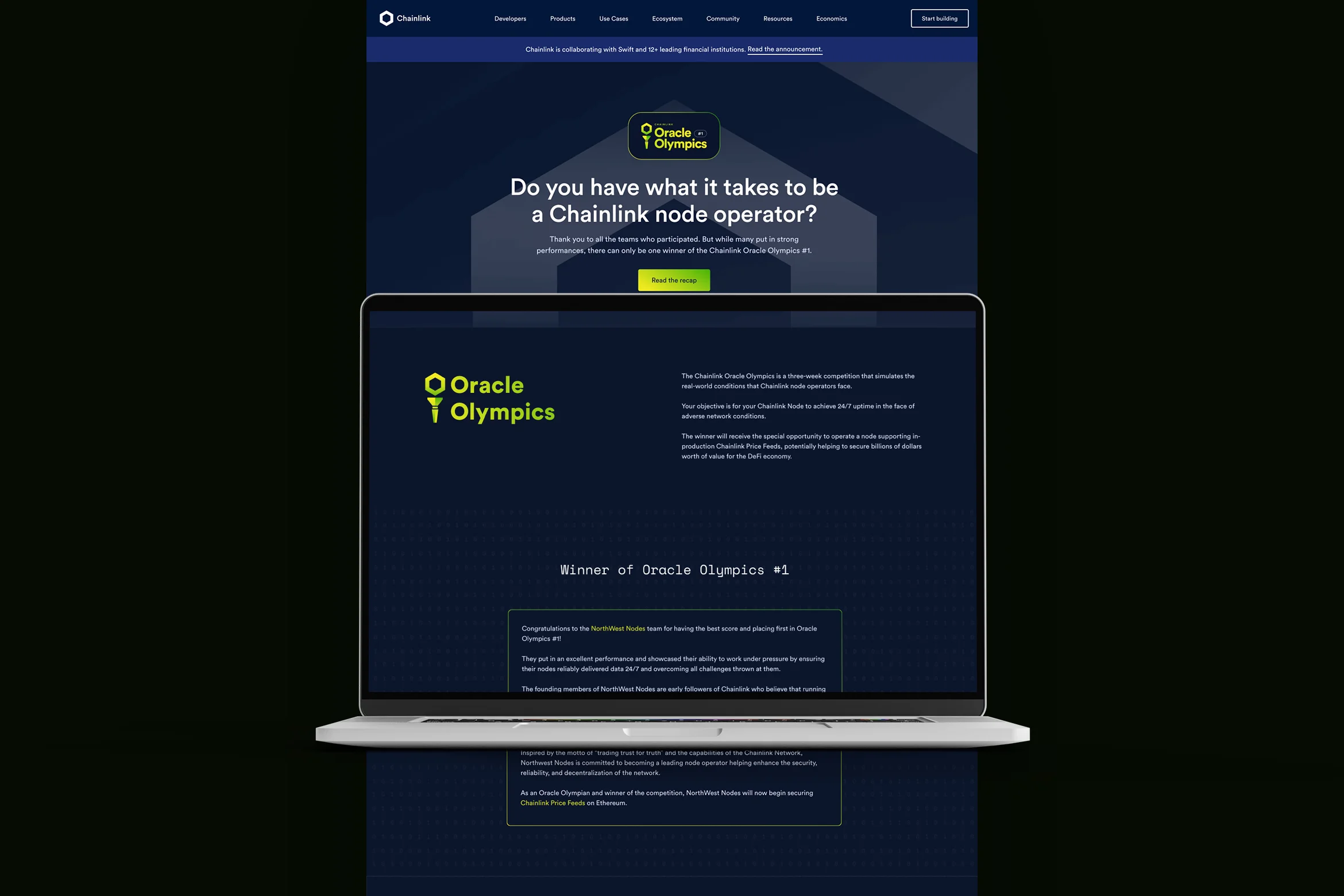
The Chainlink Oracle Olympics replicate the real-world challenges encountered by Chainlink node operators. This competition permits teams to showcase their skills through stringent tests and provides insights into the demands of operating on the Chainlink Network. Winners receive the special privilege of operating a node supporting Chainlink Price Feeds.
Our brand system for the Oracle Olympics was meant to be distinctive, focusing on a branded web landing page that delivered a visually engaging experience for participants and viewers, distinguishing it from other initiatives.
Chainlink’s YouTube channel provides a diverse range of content, targeted at Chainlink's multifaceted audience. For developers, tutorial and educational series took center stage, and for these, we presented a unique brand extension, embodied through animated bumpers. These introductions served as visually pleasing identifiers for each series, enhancing the viewer's experience and facilitating their engagement with topics of interest.