Chainlink Hackathons

Chainlink hackathons, held twice a year, have gained immense popularity within the Chainlink community, drawing multiple thousands of signups and hundreds of project submissions on each edition. These events offer developers a unique opportunity to utilize Chainlink products to create groundbreaking blockchain applications and help them kickstart their Web3 careers, while also offering hours of educational content aimed to empower a new generation of hackers to build on blockchain and oracle infrastructure. Additionally, the hackathons create a platform for developers to network, engage, and collaborate with like-minded professionals in the technical community.

As Chainlink's Creative Director, my role involved defining a visual brand strategy for the hackathons, crafting a distinct and impactful identity for each edition that would resonate with attendees and contribute to the events' continued success.

COMPANY
Chainlink
YEAR
2021/2023
TYPE
Brand, Motion, Web

Key challenges

A house of brands.

The Chainlink hackathons required more than just unique branding to withstand the test of time. Rather than focusing solely on a unique main brand for all hackathons, the challenge was to create a comprehensive system with predefined rules of do's and don'ts that would ensure narrative continuity and cohesion across editions. Establishing a recognizable pattern would enable us to foster familiarity within the Chainlink community over time while supporting the creation of an enduring experience for each individual edition.

Scalable brand development.

The brand system needed to be flexible and adaptable, as it required the development of two unique brand identities per year. Each identity had to be exciting and fresh, capturing the attention of the Chainlink community and generating enthusiasm for the events, but at the same time, consistent.

Leverage the hacker spirit.

The hackathons are designed to be fun and exciting experiences for attendees, and the brand system needed to reflect this. It was vital to capture the essence of the hacker spirit, while still maintaining a connection to the main Chainlink brand, which is generally more solemn.

Inspire through design.

The brand identity for Chainlink hackathons needed to inspire creativity and innovation among participants. Crafting a visually engaging and stimulating design that motivated attendees to explore new ideas and push boundaries in their projects was a key challenge in establishing a successful brand system.

Time-sensitive development.

Chainlink hackathons, being recurring events, required a brand system that could be developed efficiently and in a timely manner to meet deadlines. Balancing the need for high-quality design with the practical constraints of time-sensitive projects was crucial for the success of the overall system.

Solution

Starting with guidelines.

Very early in the process, we established a set of clear guidelines that defined both locked and flexible elements within the Hackathon brand system. The locked elements, such as Chainlink's key color and typeface, ensured a strong connection with the parent brand, either as primary or secondary components. Meanwhile, flexible elements, like hackathon logotypes and their primary visual style, allowed each Hackathon to have its own creative freedom and identity. By setting these guidelines, we ensured a consistent and cohesive brand experience while still allowing room for creative exploration and expression in each hackathon edition.

A tailored system.

The brand system for Chainlink hackathons was meticulously crafted to suit the specific applications and use cases across all communications related to the events, such as digital collaterals, web presence, and motion design. By defining the real reach of the visual identity, we were able to focus our design decisions with the user in mind, delivering intentionality and impact in the final result.

Bounded creative playgrounds.

Creative licenses were strategically defined and documented to strike the right balance between distinction and connection to the parent brand. This approach helped us craft memorable visual identities for each hackathon that resonated with the Chainlink community, allowing us to consistently  create unique yet consistent brand identities, all while leaving room to forward-thinking design techniques and trends

A team-driven journey.

To develop each brand, we employed a highly collaborative approach for the hackathon branding, involving the entire team in the creative process. Following a well-defined creative process with distinct brainstorming, consolidation, and expansion phases, we fostered a dynamic and inclusive environment where innovative ideas and perspectives from various team members could contribute to the brand development of each of the hackathon editions.

Chainlink Fall 2021 Hackathon

The Chainlink Hackathon Fall 2021 marked the first time our team applied the newly established process and system for the event's visual identity. Our goal was not only to deliver a stunning brand, but also to refine the workflow and ensure maximum efficiency throughout the process.

The brand

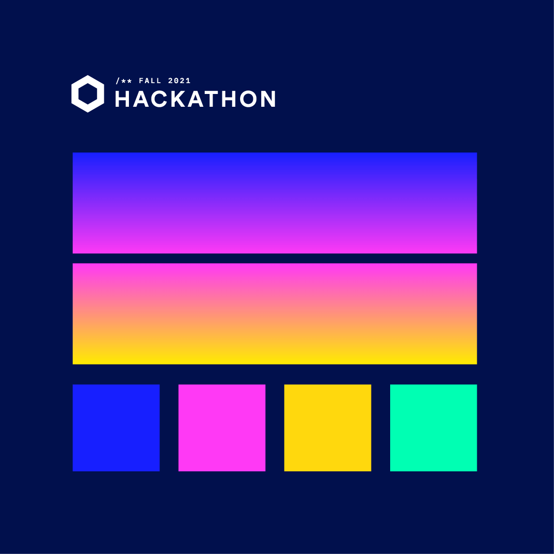
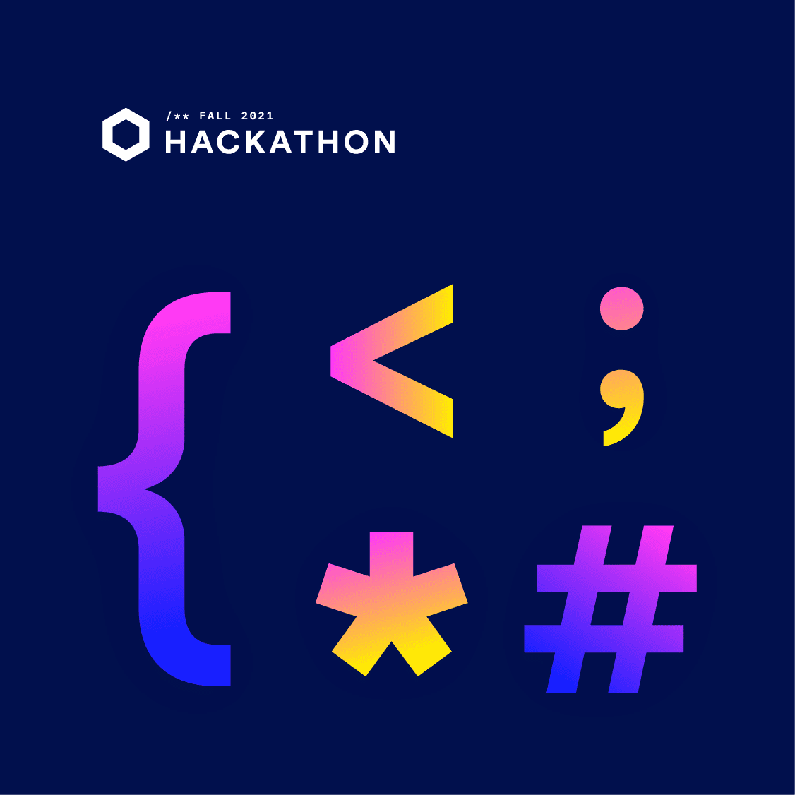
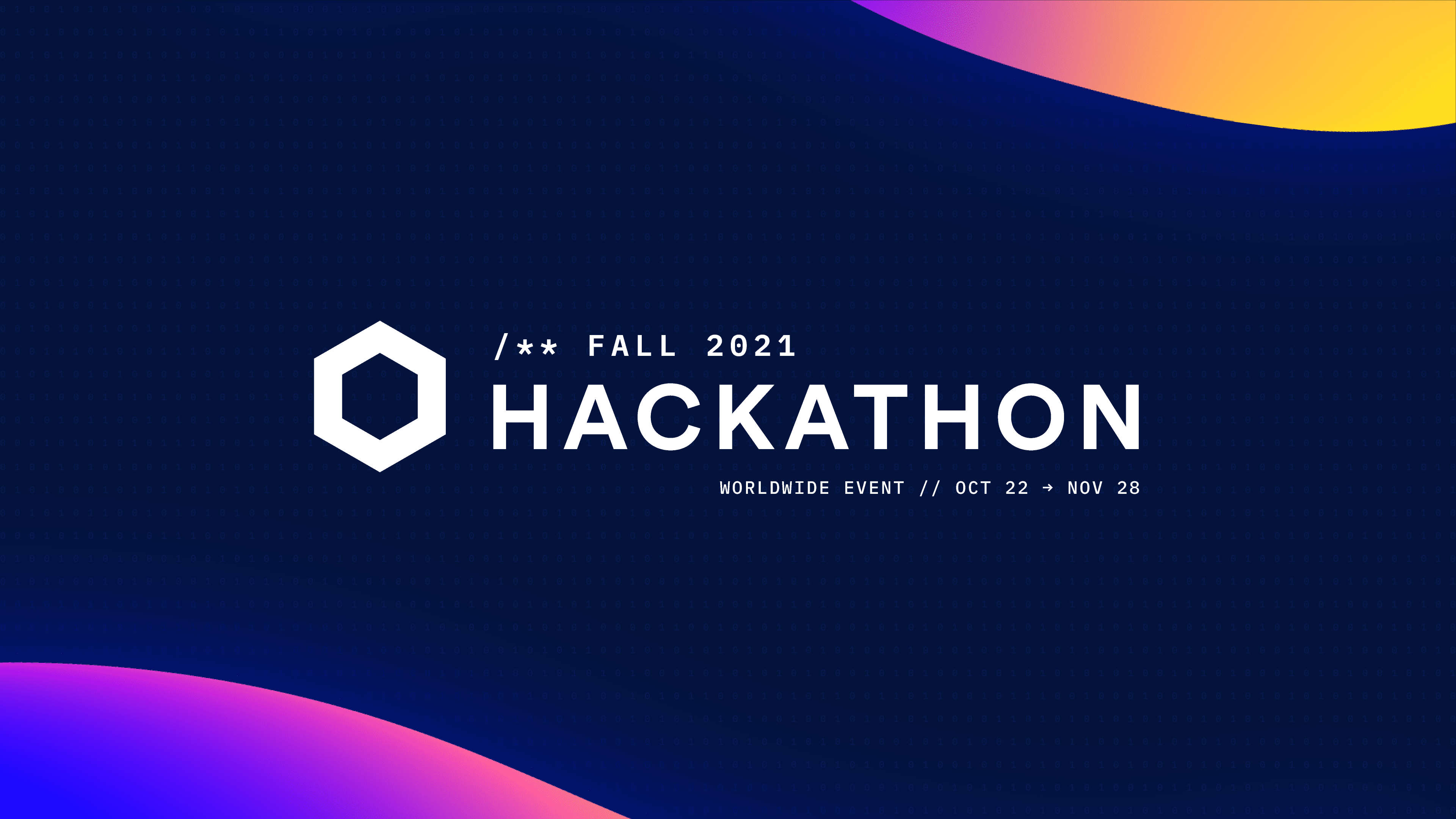
For this edition, we chose a vibrant neon color palette to create an exciting atmosphere. A bold gradient stroke, representing a ray of light, was used in both still and video applications to symbolize the creativity of the hackathon participants. The dark mode design was in harmony with the fall theme of the event, while oversized coding elements were incorporated throughout the branding to emphasize its nature.

For this edition, we chose a vibrant neon color palette to create an exciting atmosphere. A bold gradient stroke, representing a ray of light, was used in both still and video applications to symbolize the creativity of the hackathon participants. The dark mode design was in harmony with the fall theme of the event, while oversized coding elements were incorporated throughout the branding to emphasize its nature.

Chainlink Hackathon Fall 2021, colors
Chainlink Hackathon Fall 2021, symbols
Chainlink Hackathon Fall 2021 | Colors & Symbols

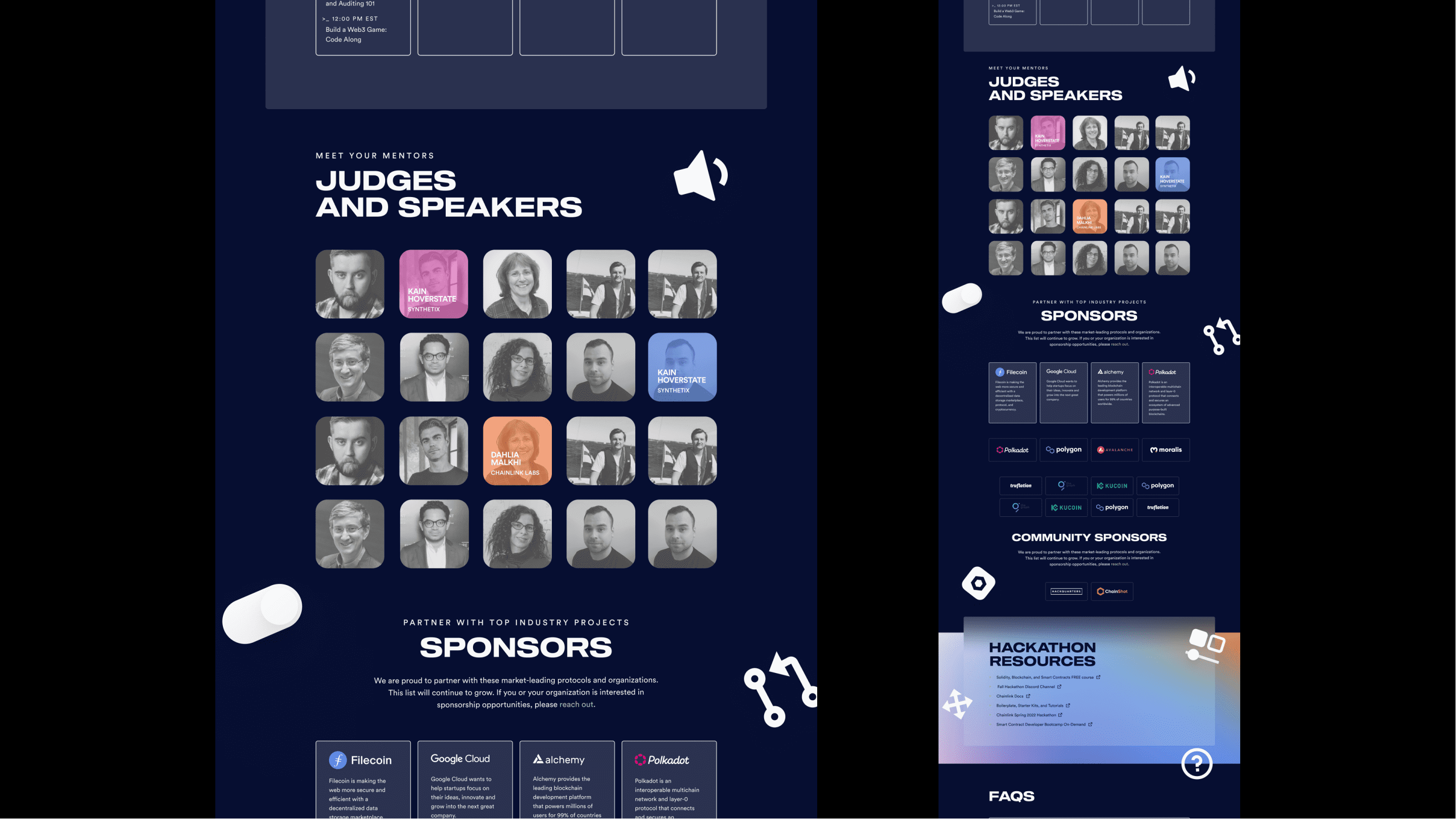
Web application

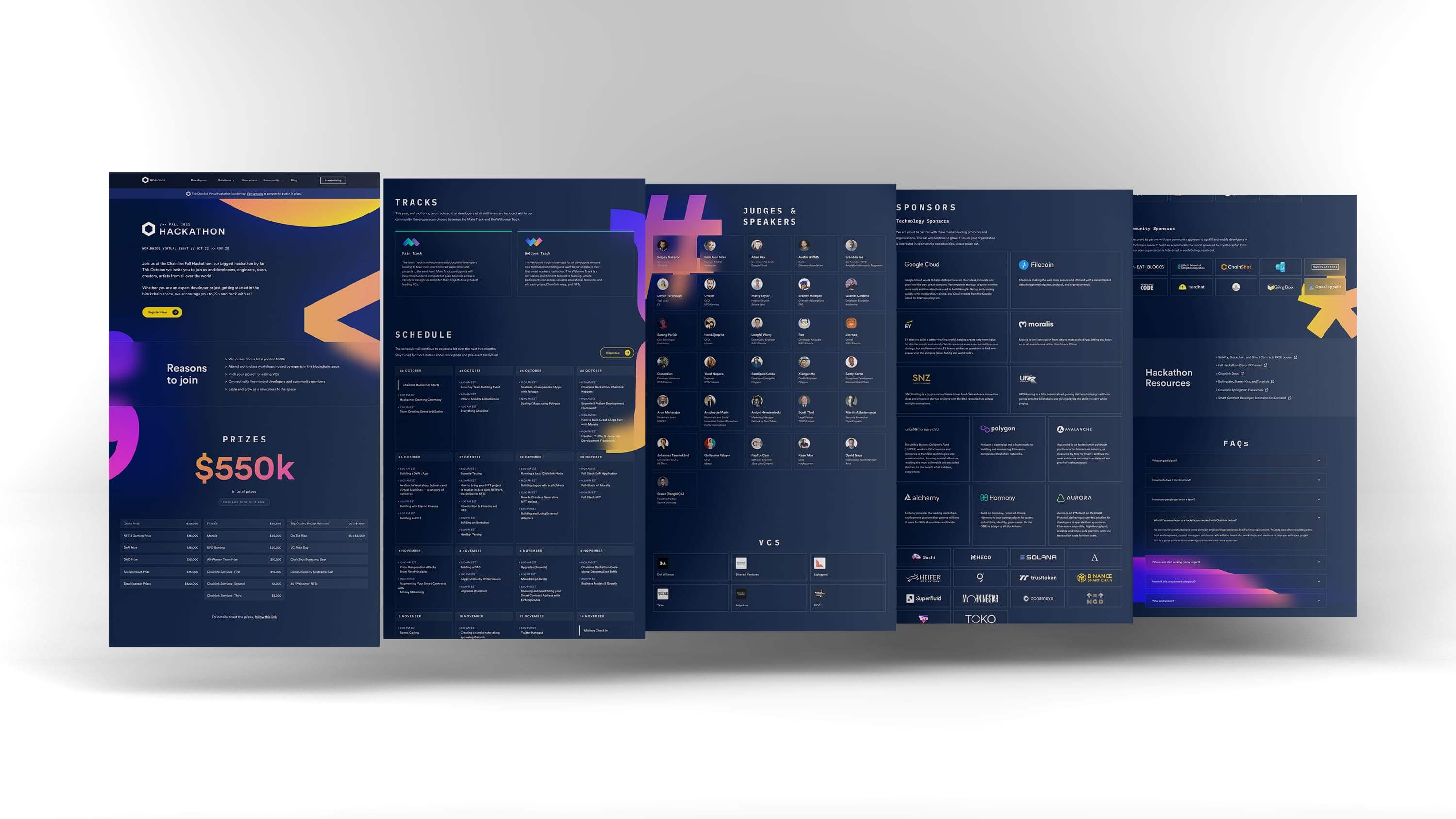
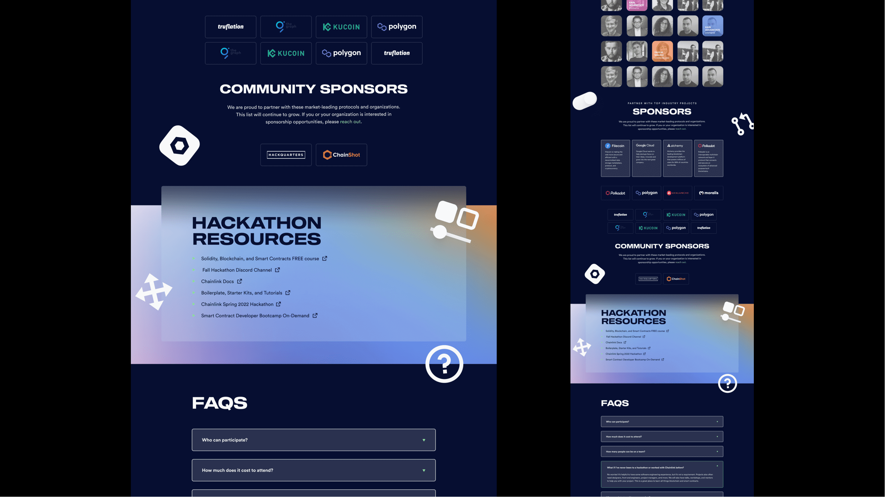
On the web application, we utilized frosted glass to create depth and contrast between body text and images. This added an elegant touch and made the interface visually captivating.

Promotional animation

Additionally, a promotional animation was created to generate buzz around the Hackathon and encourage people to register. This dynamic piece played a significant role in capturing the attention of potential participants.

Chainlink Hackathon Fall 2021 | Promotional Video

Result

The Chainlink Hackathon Fall 2021 proved to be a success, with over 7,800 sign-ups and 280+ project submissions. Developers from around the world came together to showcase their passion and talent for building the next generation of hybrid smart contracts. Over $550k in total prizes was awarded to teams that demonstrated exceptional creativity in both their ideas and execution, giving rise to new use cases across blockchain verticals such as DeFi, NFTs, DAOs, and more. The event's success validated the effectiveness of our visual identity and reinforced the importance of a well-defined workflow and system for future Chainlink Hackathons.

Chainlink Spring 2022 Hackathon

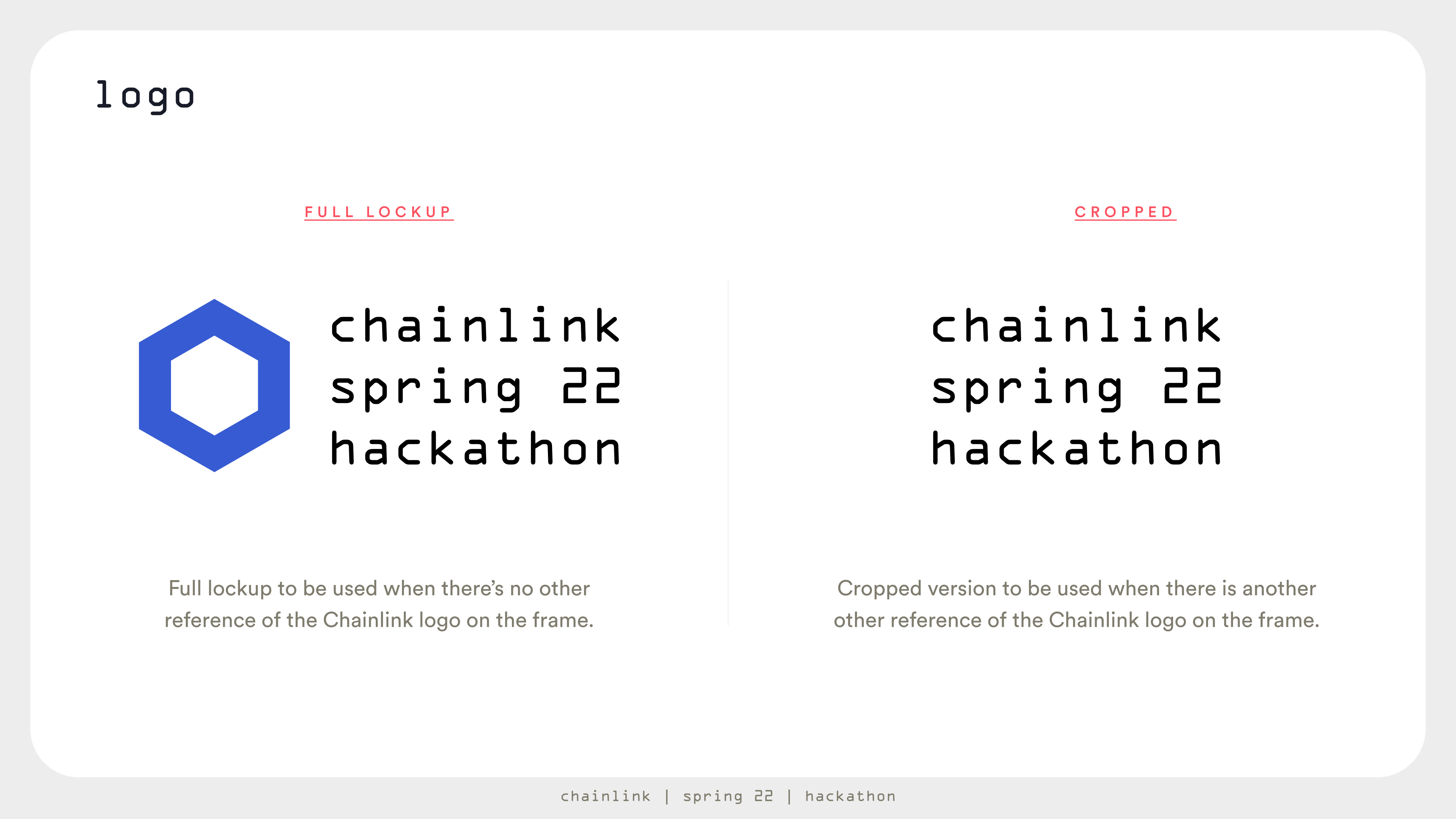
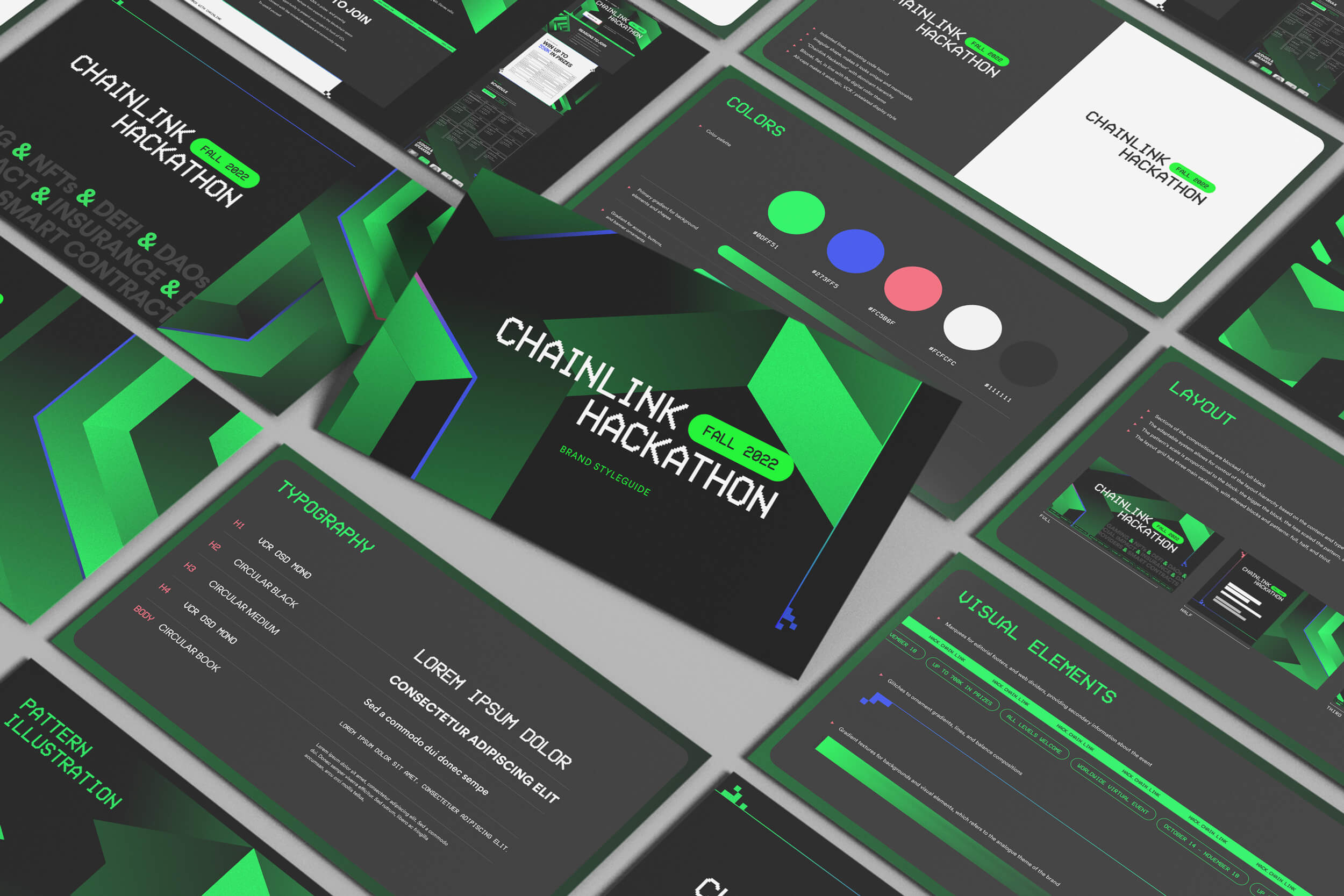
Brand style guide

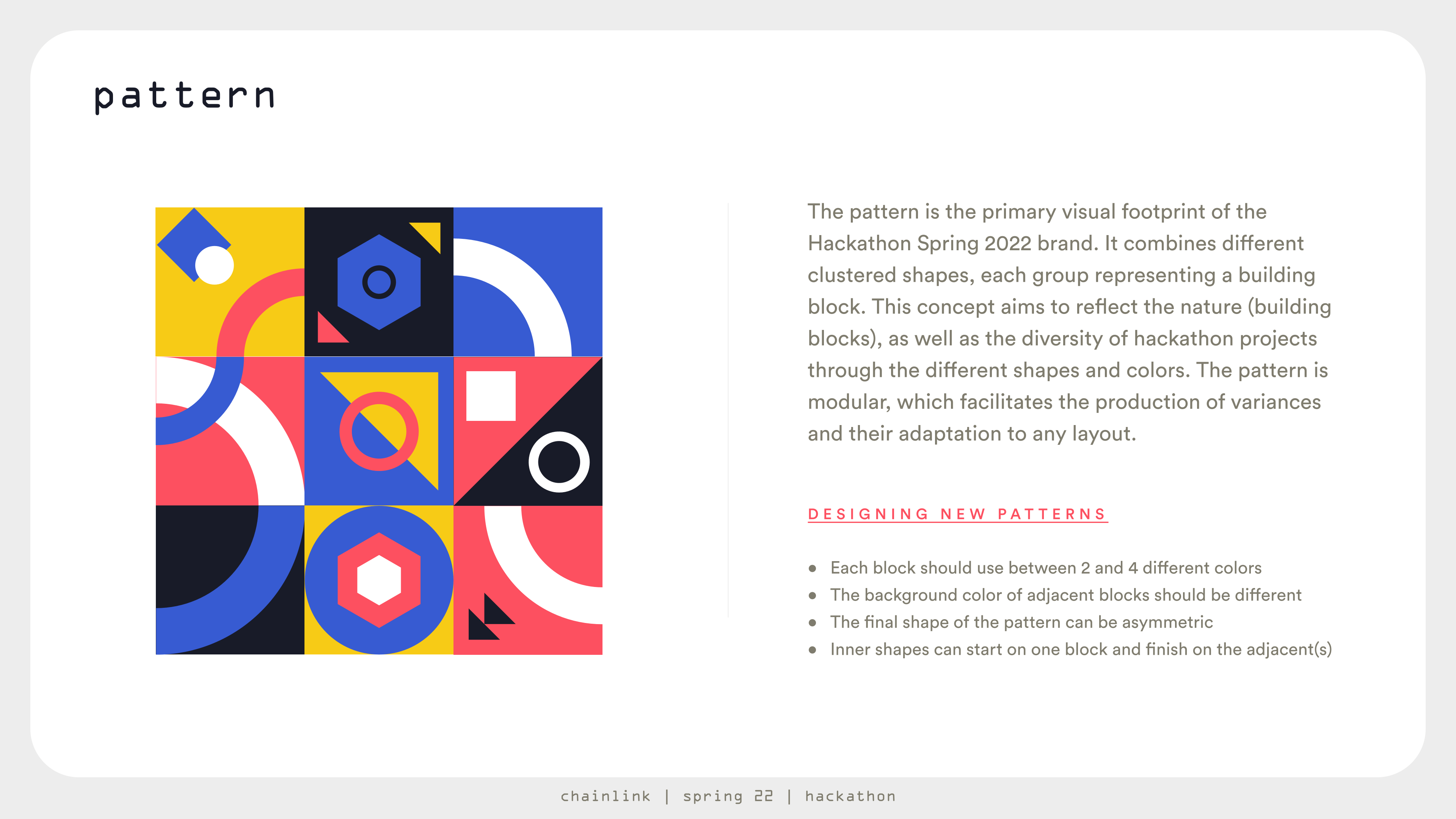
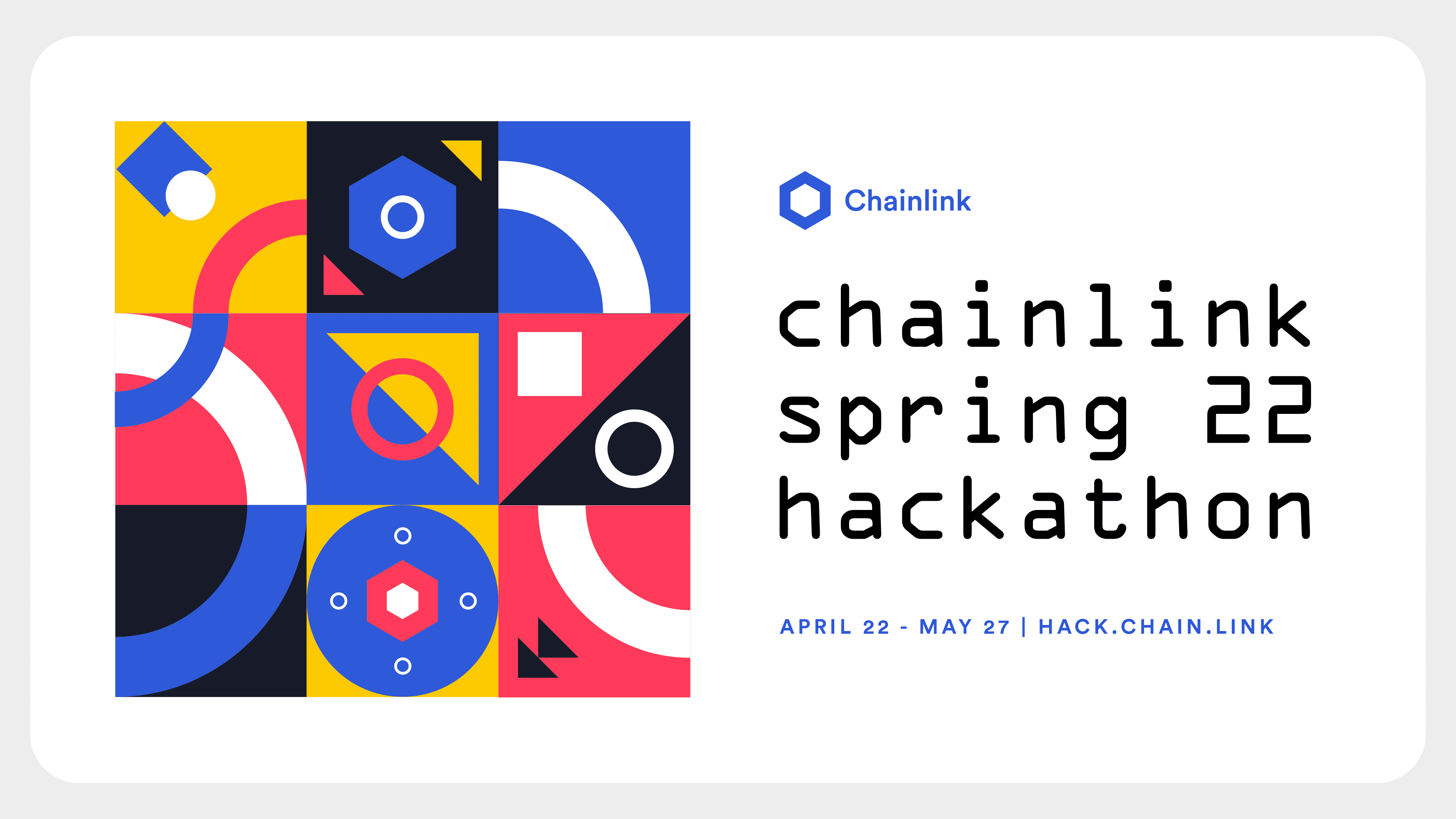
The Chainlink Spring 2022 Hackathon style guide provided a comprehensive outline of the visual identity usage, as well as the rationale and guidelines for all relevant visual elements, with a particular emphasis on the pattern. The pattern served as the primary visual footprint of the Hackathon Spring 2022 brand, and it featured a combination of distinct clustered shapes, with each group symbolizing a building block. This concept resonated with the hackathon's creative spirit, showcasing the diversity of hackathon projects and illustrating how they come together to form a rich and evolved ecosystem. The modular nature of the pattern facilitated the production of various adaptations for different layouts.

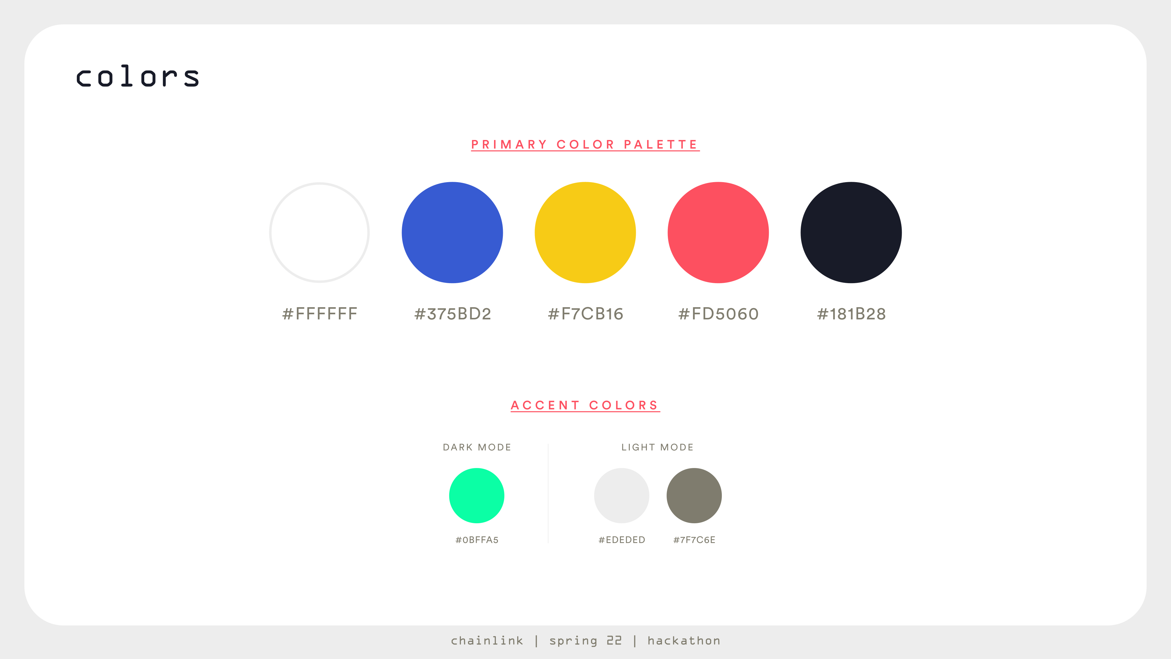
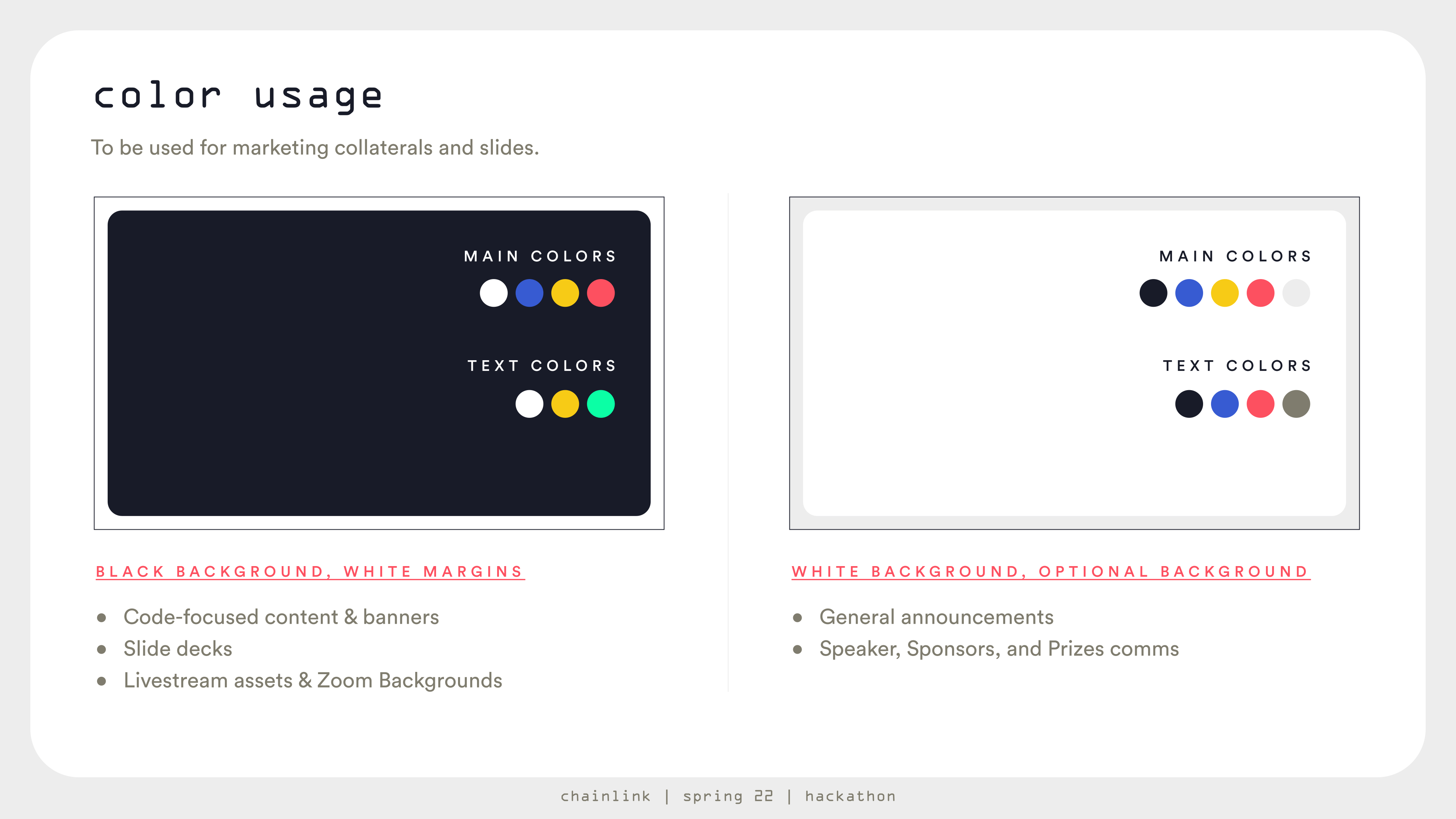
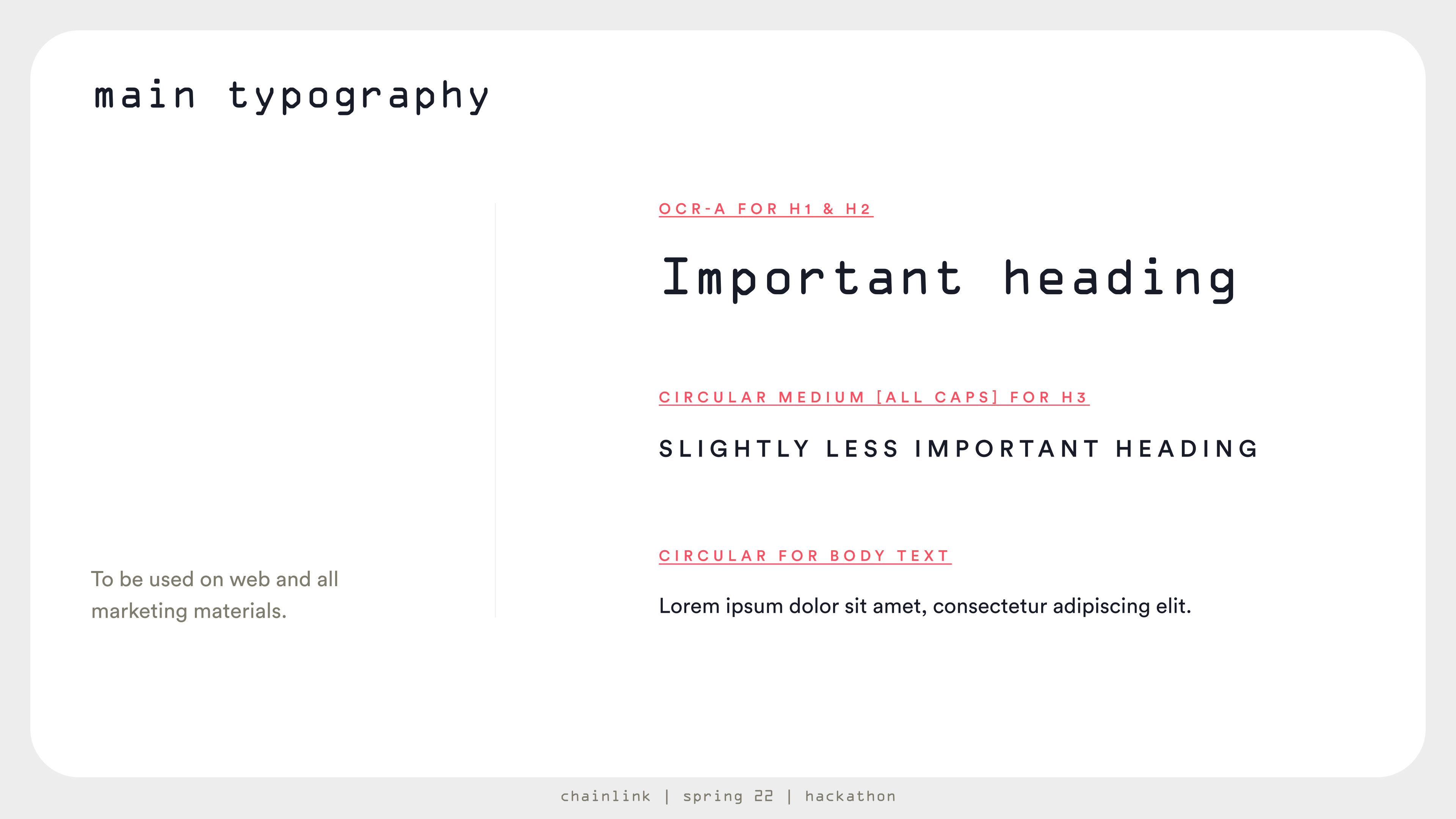
In addition to the pattern, the style guide also covered essential details about the logo, color usage, layouts, grids, and typography, ensuring the Hackathon's visual identity remained consistent across multiple applications and platforms. The color palette for the Hackathon Spring 2022 was vibrant and energetic, perfectly complementing the spring theme and infusing the event with a sense of excitement and enthusiasm. The Chainlink blue was retained as the key secondary color, and Circular, Chainlink’s typography, was used as a secondary typeface to maintain a connection with the parent brand. This comprehensive style guide allowed for the creation of a cohesive and memorable visual experience for all attendees and participants, effectively conveying the spirit and values of the Hackathon Spring 2022 event.

Chainlink Hackathon Spring 2022, logoChainlink Hackathon Spring 2022, color paletteChainlink Hackathon Spring 2022, color usageChainlink Hackathon Spring 2022, typographyChainlink Hackathon Spring 2022, editorial layoutChainlink Hackathon Spring 2022, grid layouts
Chainlink Hackathon Spring 2022 | Brand style guide. Download (4.2mb)

Digital collateral

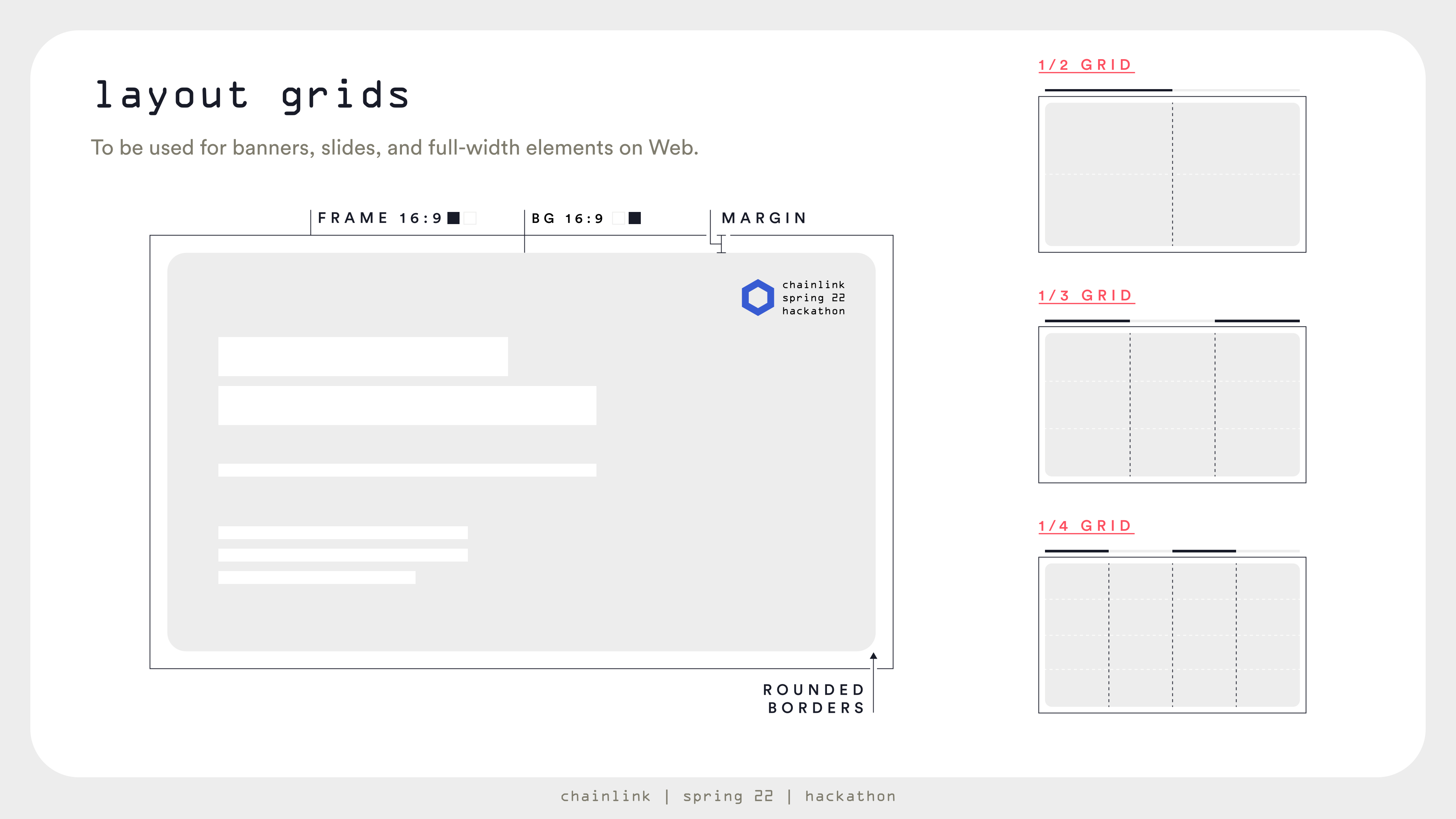
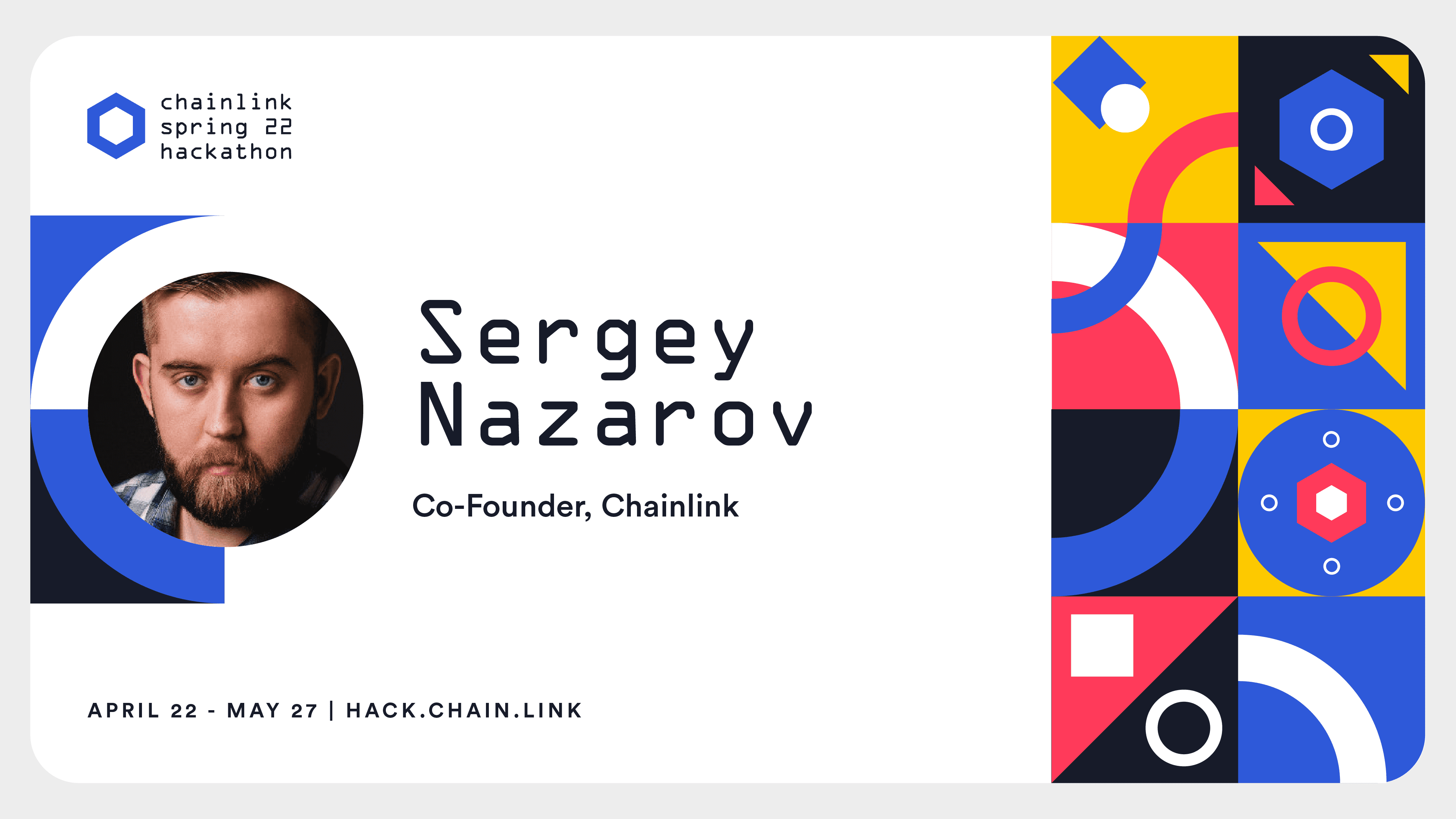
Digital collateral was designed following a predefined layout with stipulated margins. The layouts were available in 2, 3, and 4 columns to provide flexibility and adaptability for various assets. With readability as the top aim of every collateral, this approach the creation of visually consistent digital collateral that adhered to the brand style guide while still allowing for customization based on the content requirements.

Promotional animation

To promote event registration, a dynamic, rhythmic, and visually appealing promotional animation was created, which also helped define the motion style guidelines. It was designed to capture and retain the attention of viewers, ensuring that the Hackathon's key messages and themes were effectively communicated. 

Chainlink Hackathon Spring 2022 | Promotional Video

Other assets

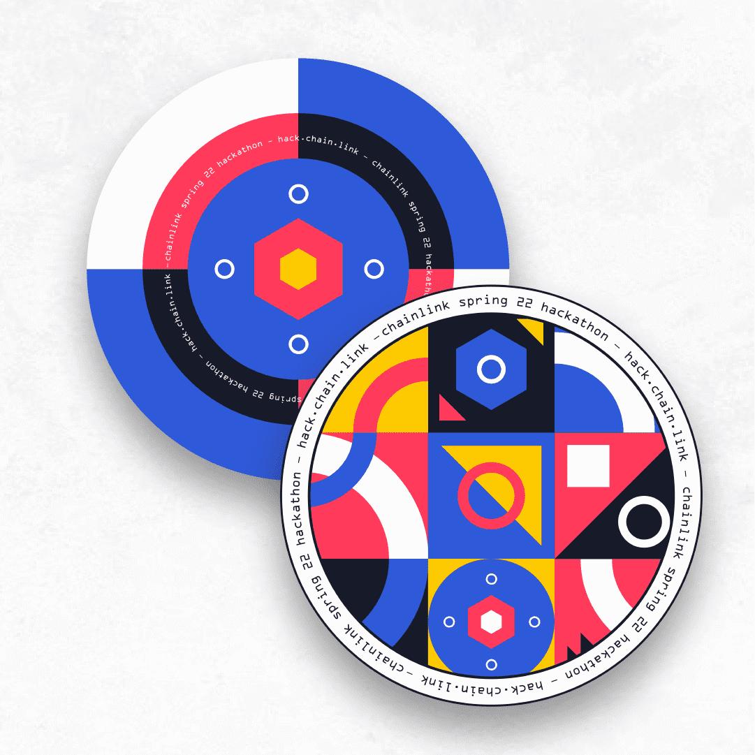
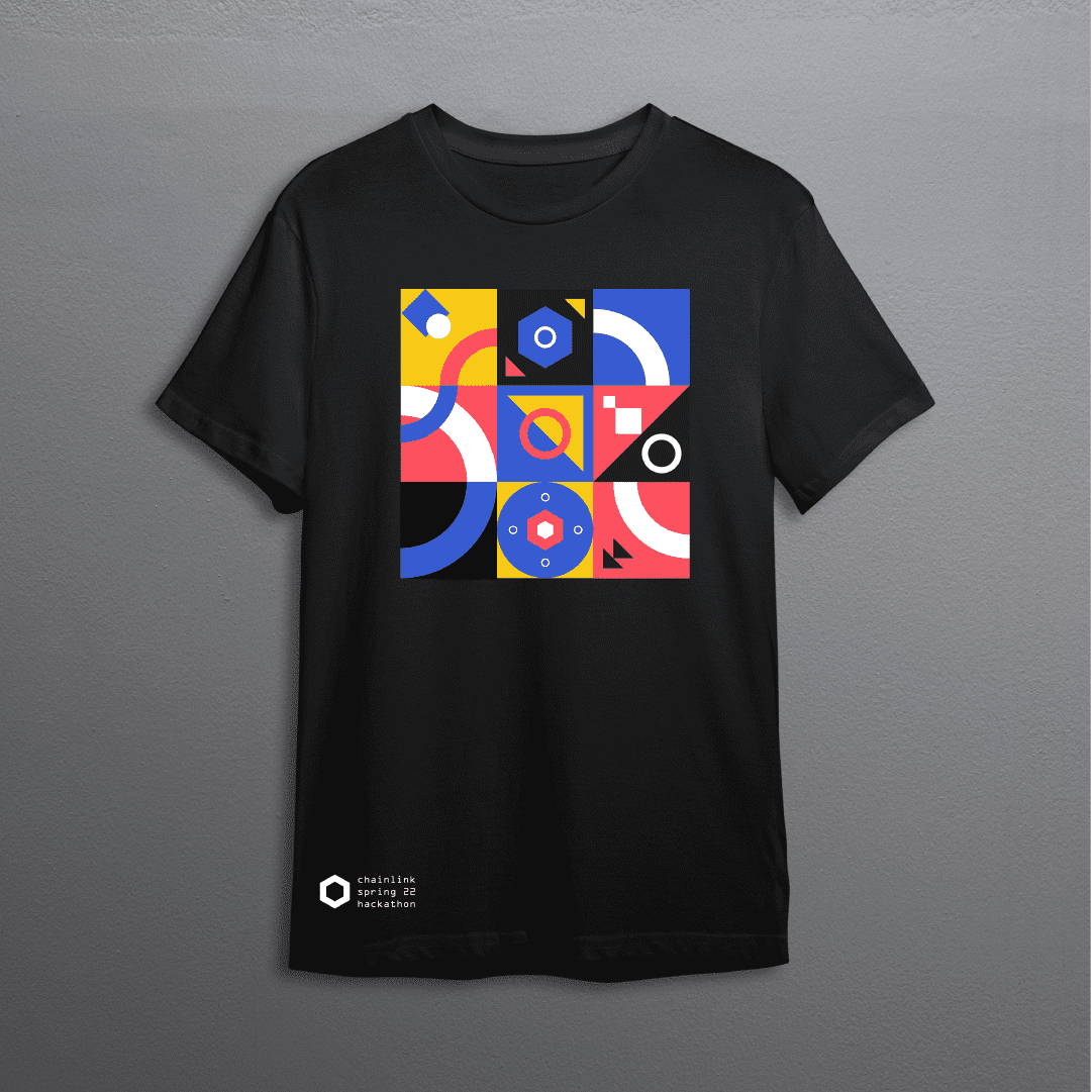
For the Hackathon, additional assets were designed, such as T-shirts and POAPs. Whether digital or physical touchpoints, the brand scaled to provide a consistent experience for attendees, ensuring that all event-related materials and merchandise were consistent and tailored to the specific experience.

Web application

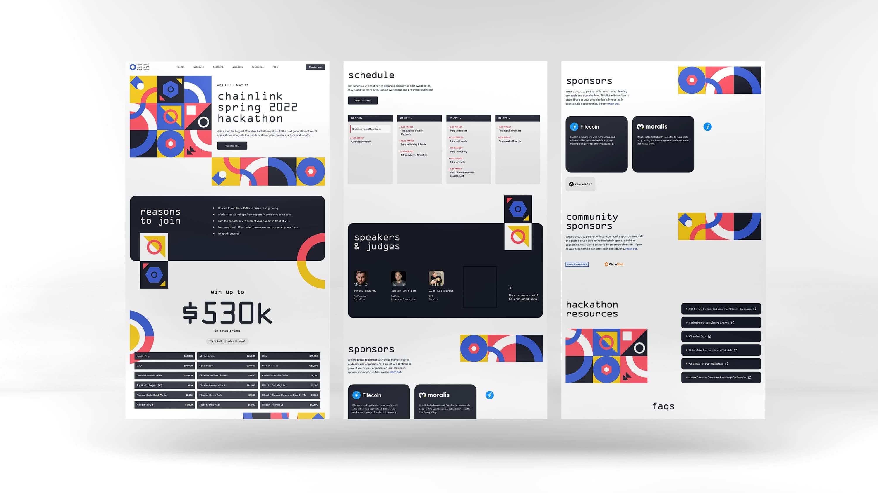
The web application combined various layouts to present information in a user-friendly manner. The page rhythm was determined by the background color, while the structure and content presentation adhered to the style guide's instructions on layouts and grids. This approach created a visually cohesive and easy-to-navigate web presence that effectively showcased the Hackathon's offerings and events.

Livestream assets

Livestreams were a significant investment for this edition, resulting in the production of a comprehensive media pack that included bumpers, lower thirds, and transitions, amongst others. These assets were used in over 50 hours of content, ensuring that the Hackathon's visual identity was consistently represented in every detail at every stage of the way, 

Chainlink Hackathon Spring 2022 | Livestream assets: bumpers, lower-thirds, and transition.

Result

The Chainlink Spring 2022 Hackathon broke records across all metrics, with over 8,500 signups and 340 project submissions. Developers, creators, artists, and mentors from around the world came together to showcase their passion and talent for building Web3 applications.

The meticulously crafted brand style guide played a pivotal role in achieving these impressive results, as it provided a cohesive and memorable visual identity that resonated with the Chainlink community and beyond.
Chainlink Fall 2022 Hackathon

Brand style guide

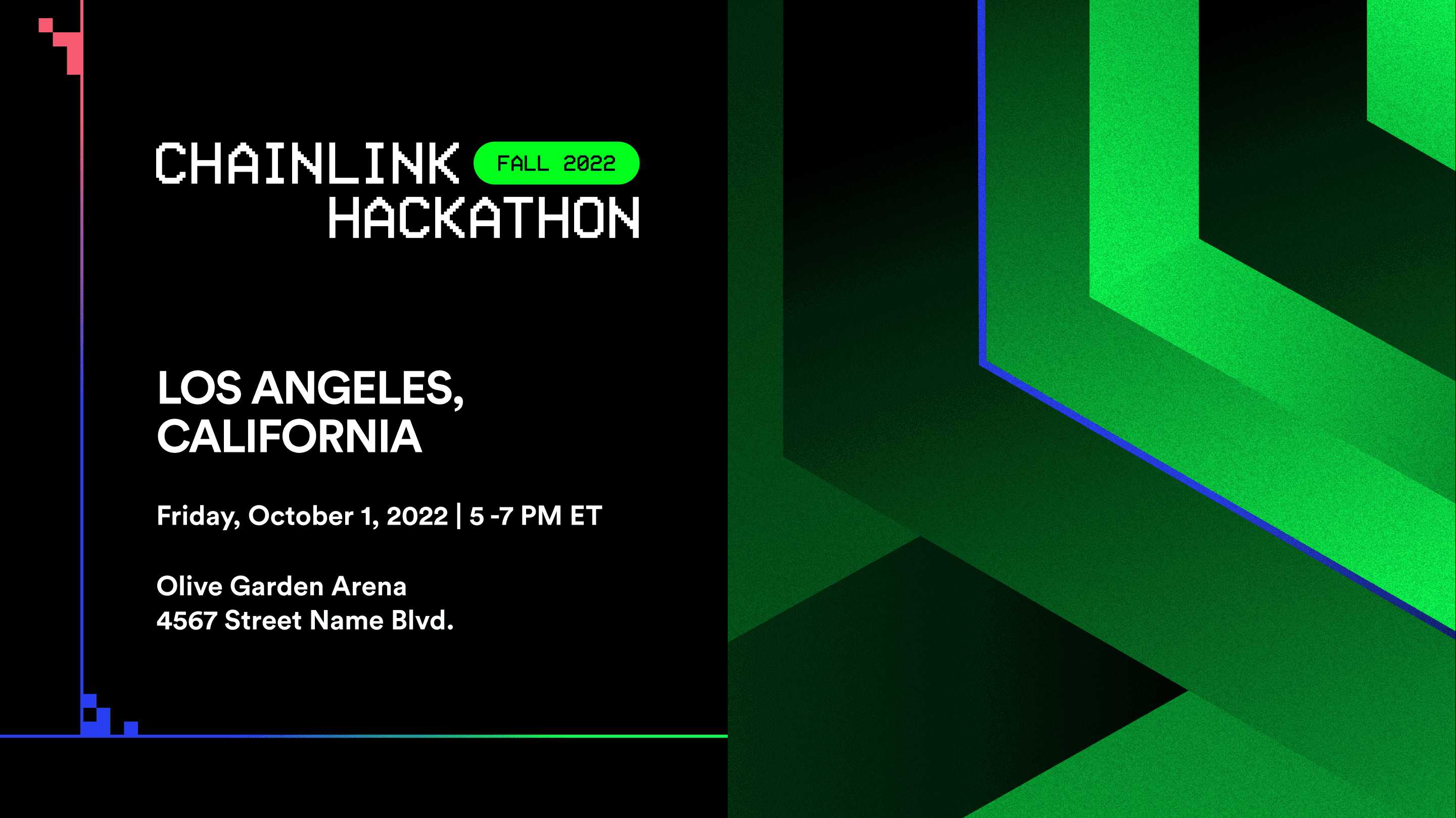
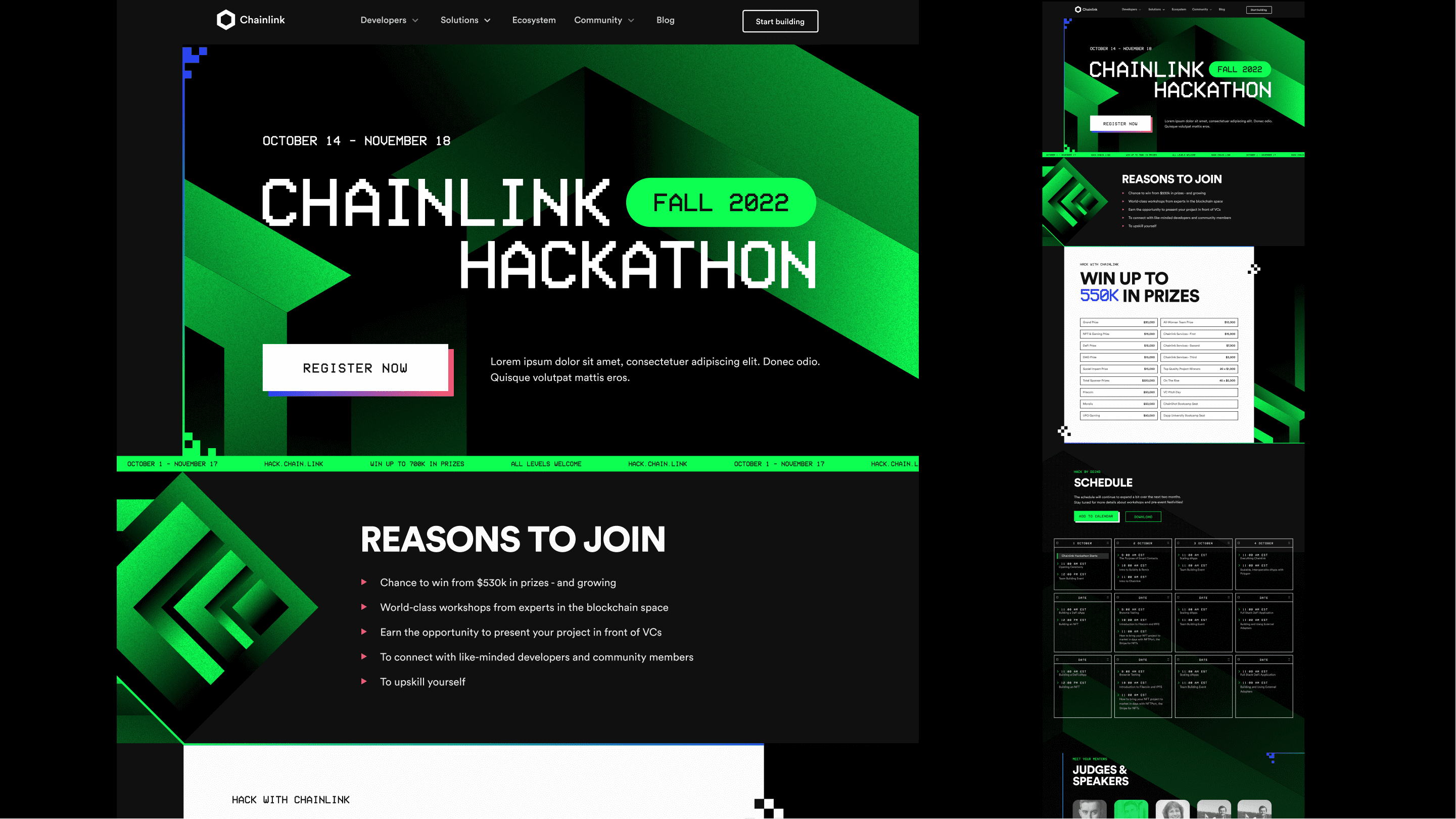
The Chainlink Fall 2022 Hackathon embraced a dark mode style, featuring a style that not only appealed to developers but also harmonized with analog technology and modern aesthetics, evoking a sense of nostalgia and innovation with the goal of creating a visual experience that was both familiar and refreshing.

The design direction leaned heavily on the terminal green color, reminiscent of the early days of personal computers. By incorporating real Chainlink code snippets and utilizing a retro pixelbit typeface, the brand aimed to capture the attention of both new and experienced hackers in the ecosystem.

The key art, an M.C. Escher-inspired cube, represented a maze or puzzle waiting to be solved – much like the hackathon projects that sought to address unique challenges in the industry using Chainlink's core services. The minimal two-color palette paired well with large typography, enabling bold and inspiring marketing messages. Chainlink's primary font, Circular, was retained for consistency.

Backgrounds

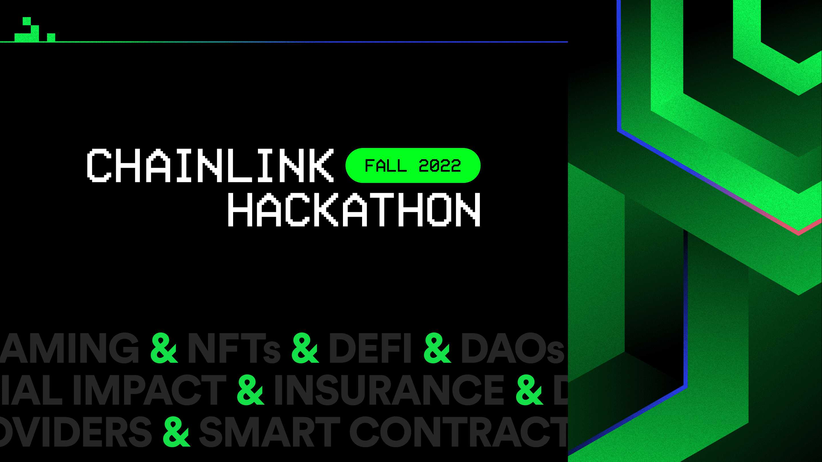
An extensive library of backgrounds was developed early in the project, streamlining the asset creation process and ensuring visual consistency across various platforms and applications. The backgrounds depicted the M.C. Escher-inspired cube artwork from various perspectives, which not only made it scalable to reproduce but also helped anchor the concepts of the design language on every piece.

Chainlink Hackathon Fall 2022, branded background Chainlink Hackathon Fall 2022, branded background alternativeChainlink Hackathon Fall 2022, branded background second alternativeChainlink Hackathon Fall 2022, branded background third alternativeChainlink Hackathon Fall 2022, branded background fourth alternative
Chainlink Hackathon Fall 2022 | Backgrounds

Digital collateral

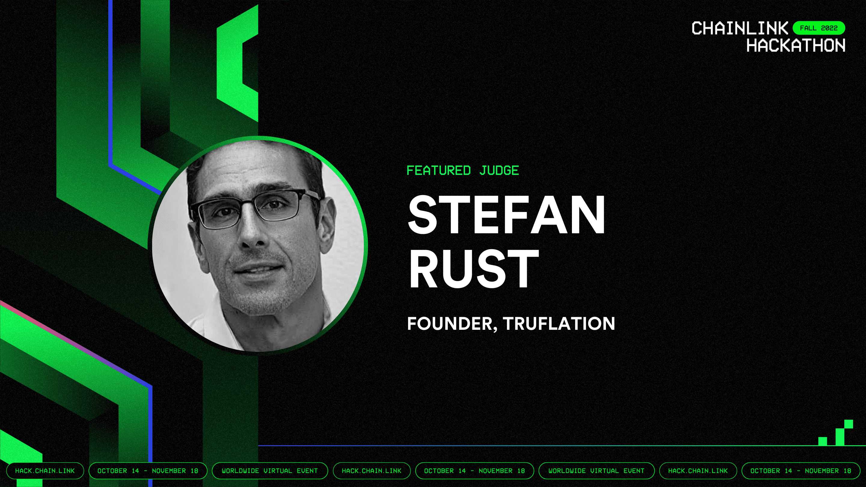
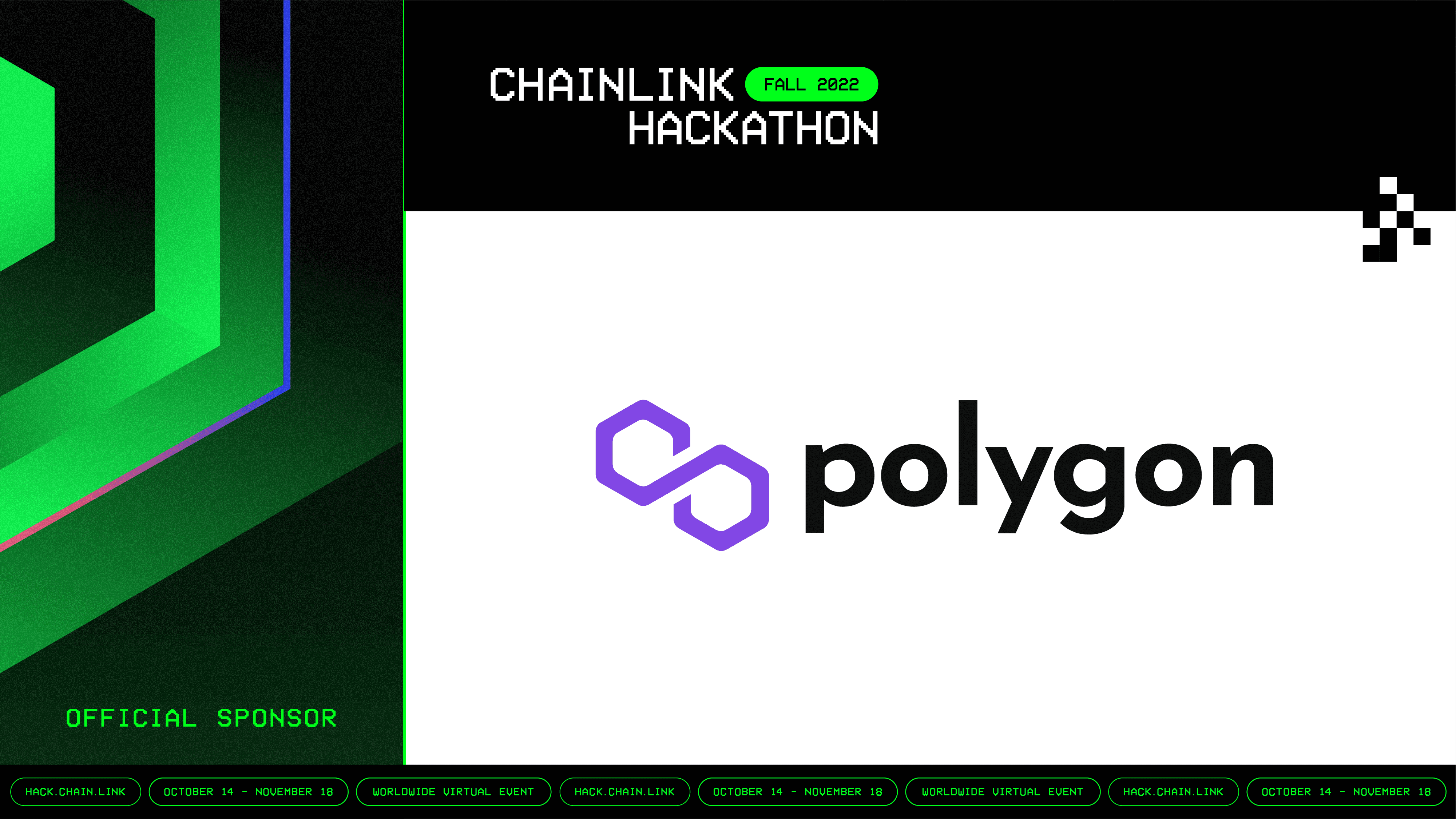
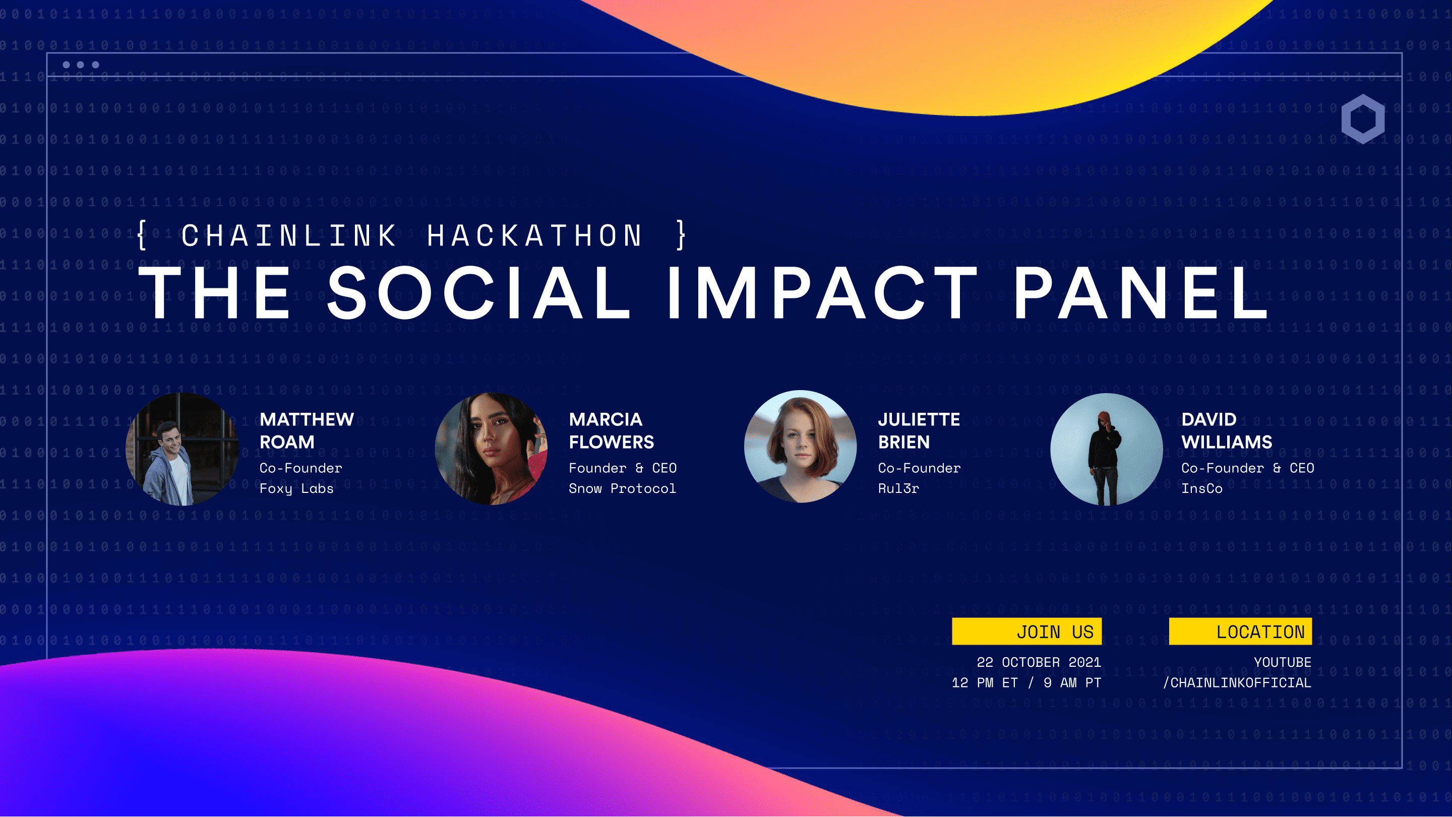
The digital collateral offerings took advantage of the versatile 2, 3, and 4-column layouts, giving the team ample options for organizing information and optimizing each asset for its intended purpose. These flexible layouts allowed for greater adaptability in showcasing the event's diverse content, ensuring that every communication piece remained engaging and visually appealing.

Chainlink Hackathon Fall 2022, generic bannerChainlink Hackathon Fall 2022, speaker cardChainlink Hackathon Fall 2022, sponsor cardChainlink Hackathon Fall 2022, watch party banner
Chainlink Hackathon Fall 2022 | Banners

POAPs

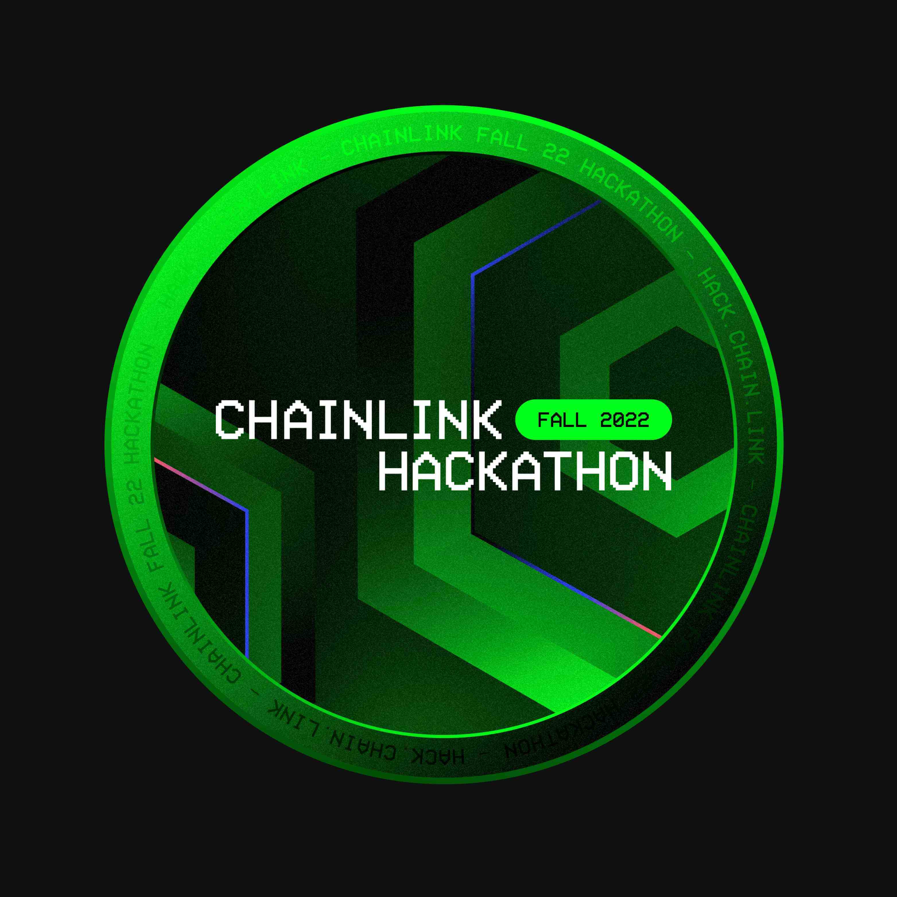
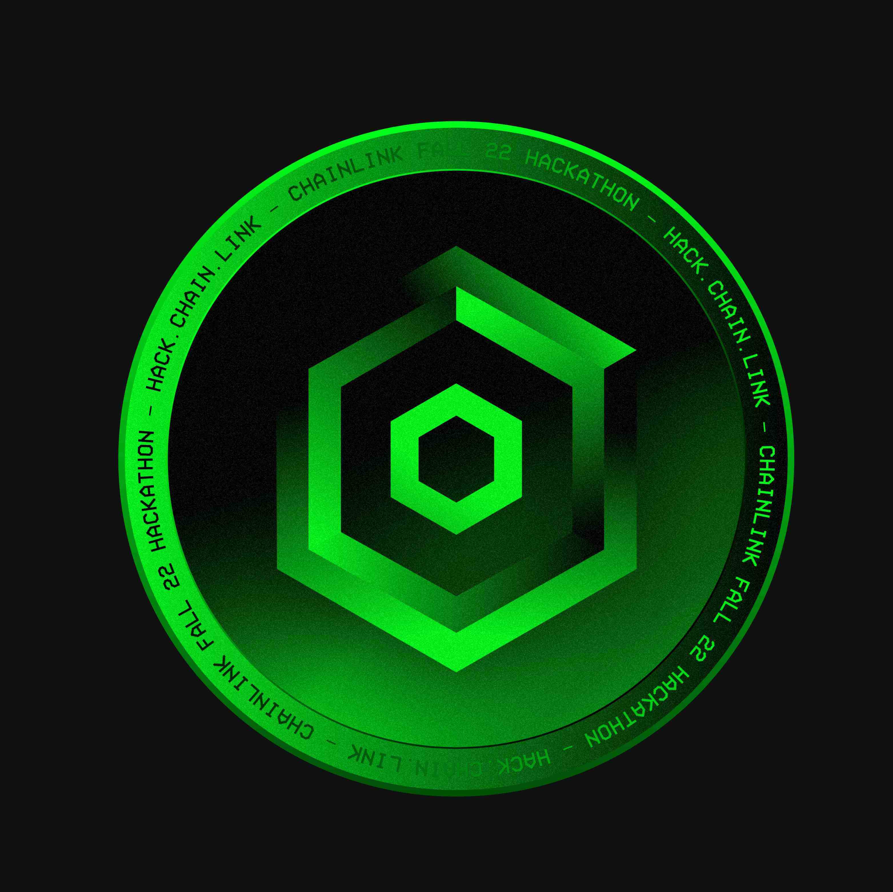
The Proof of Attendance NFTs, designed with a modern and volumetric appearance, resembled physical badges. These captivating and well-received tokens delighted attendees with their contemporary and dynamic design, which combined bold shapes and vibrant colors to create a memorable and valuable keepsake for participants.

Web application

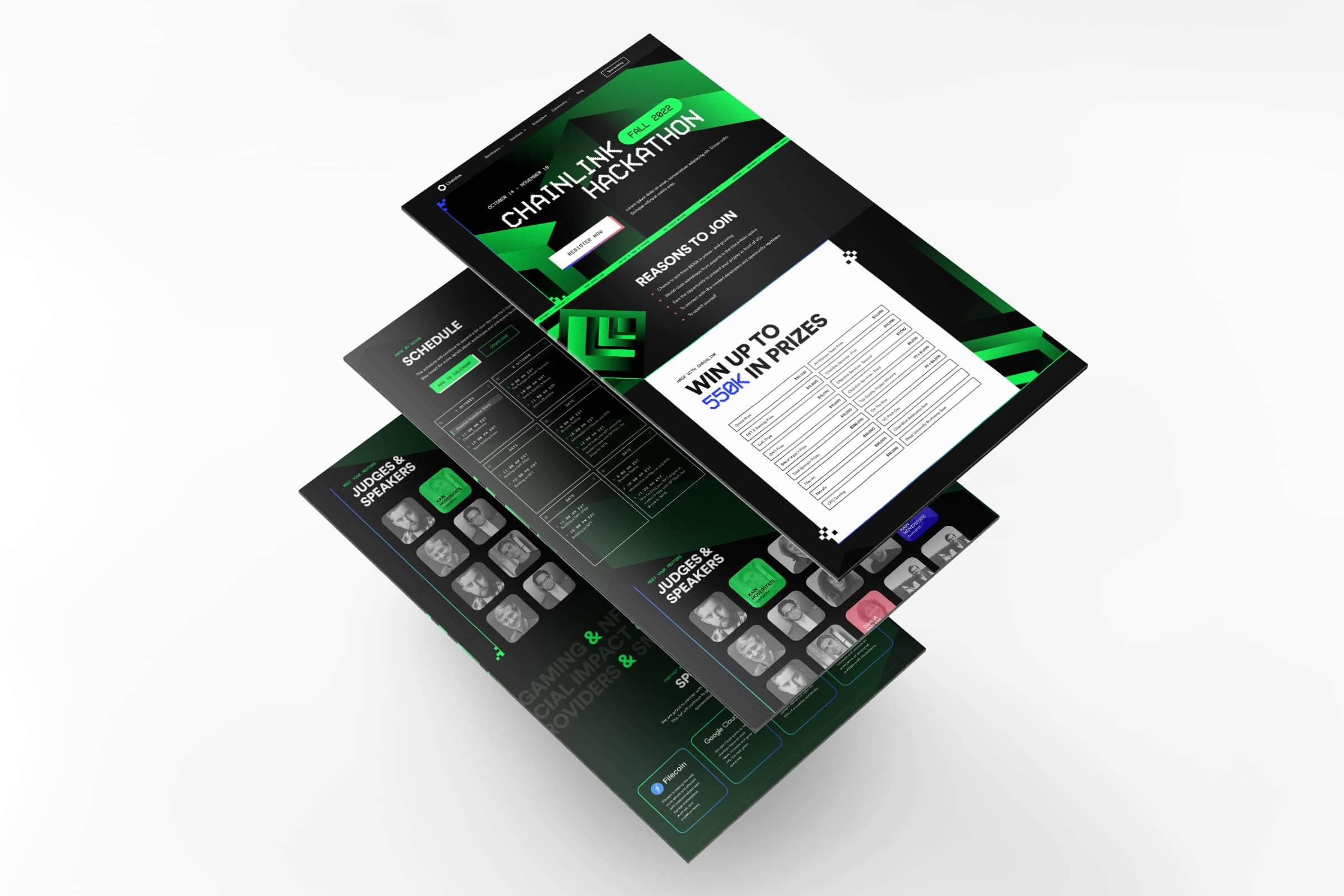
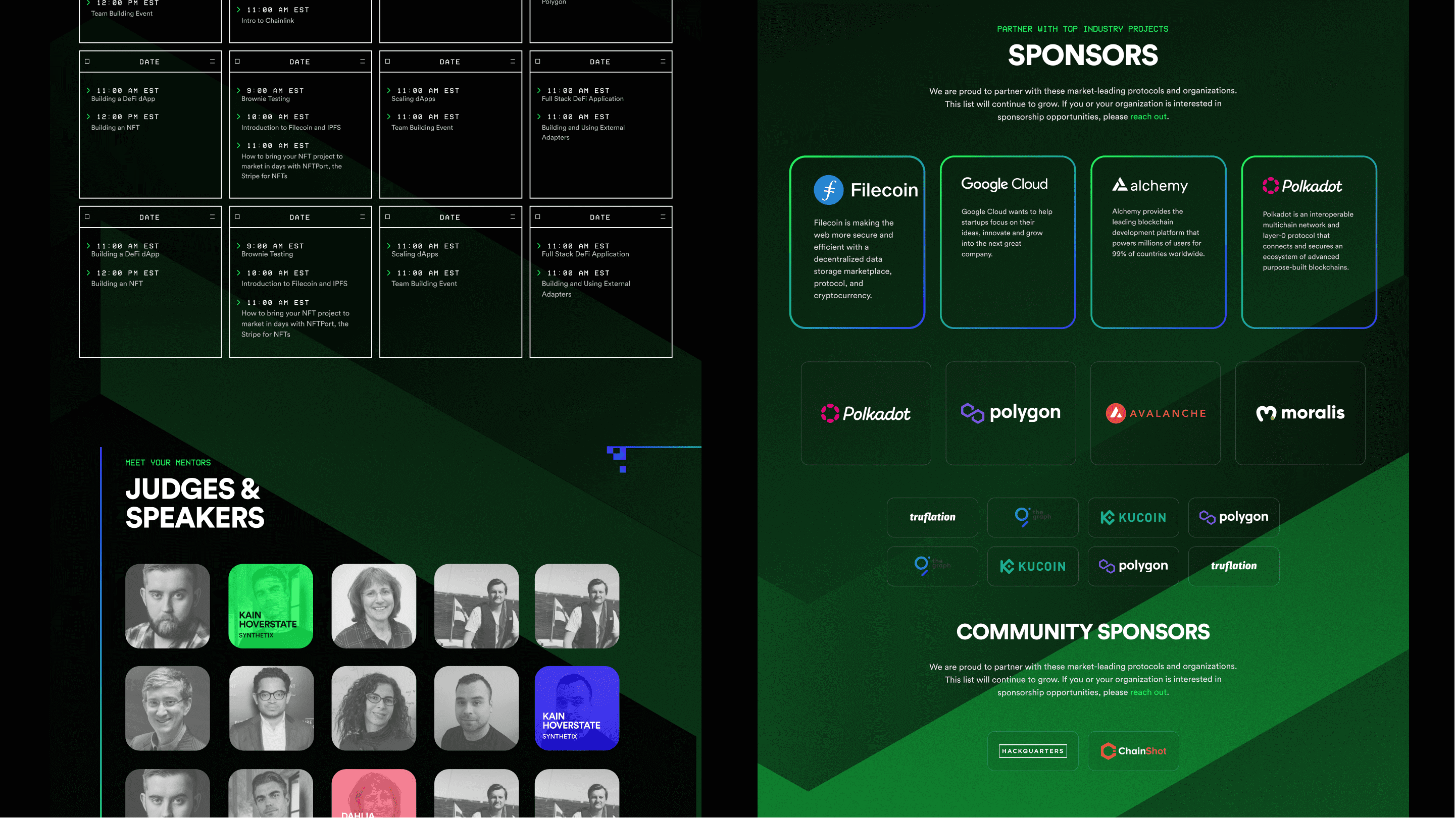
The predominantly black mode web application featured high-contrast sections, creating a visually striking and user-friendly interface. The layout echoed the console concept and incorporated pixelated elements as section borders and dividers. Combined with the heading typeface, these features helped solidify the retro visual style, while also providing an intuitive and immersive browsing experience for users.

Result

The Chainlink Fall 2022 Hackathon surpassed all previous records, attracting over 10,000 signups and receiving more than 380 project submissions from teams worldwide. The event provided over 30 hours of development tutorials, empowering a new generation of hackers to build on blockchain and oracle infrastructure. Many participants have since leveraged their hackathon projects to jumpstart their careers in the Web3 space, demonstrating the event's lasting impact on the developer community and the wider blockchain industry.

The visually striking and captivating brand style played a crucial role in the event's success, as it resonated with attendees and helped create a memorable and engaging experience that continued to inspire the growth and innovation of the Chainlink ecosystem.

Chainlink Spring 2023 Hackathon

Brand style guide

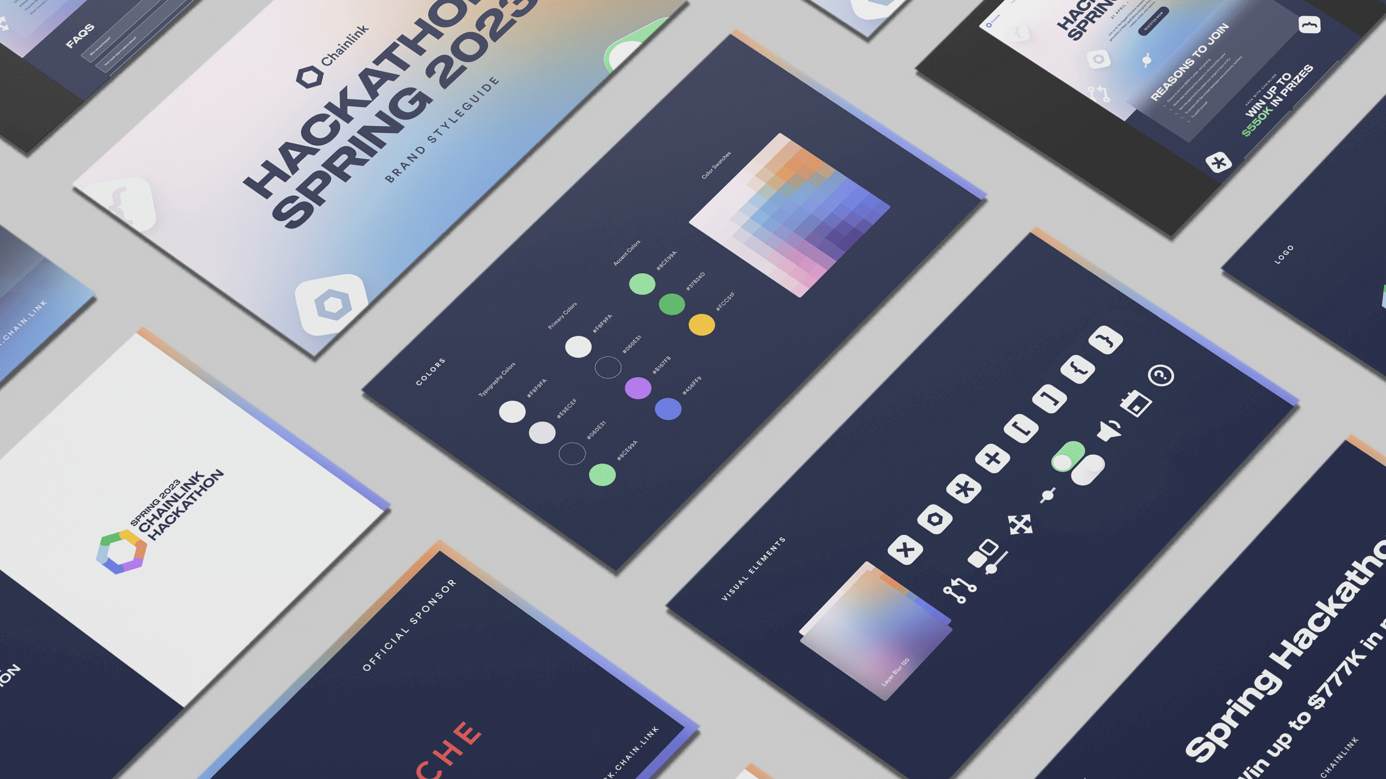
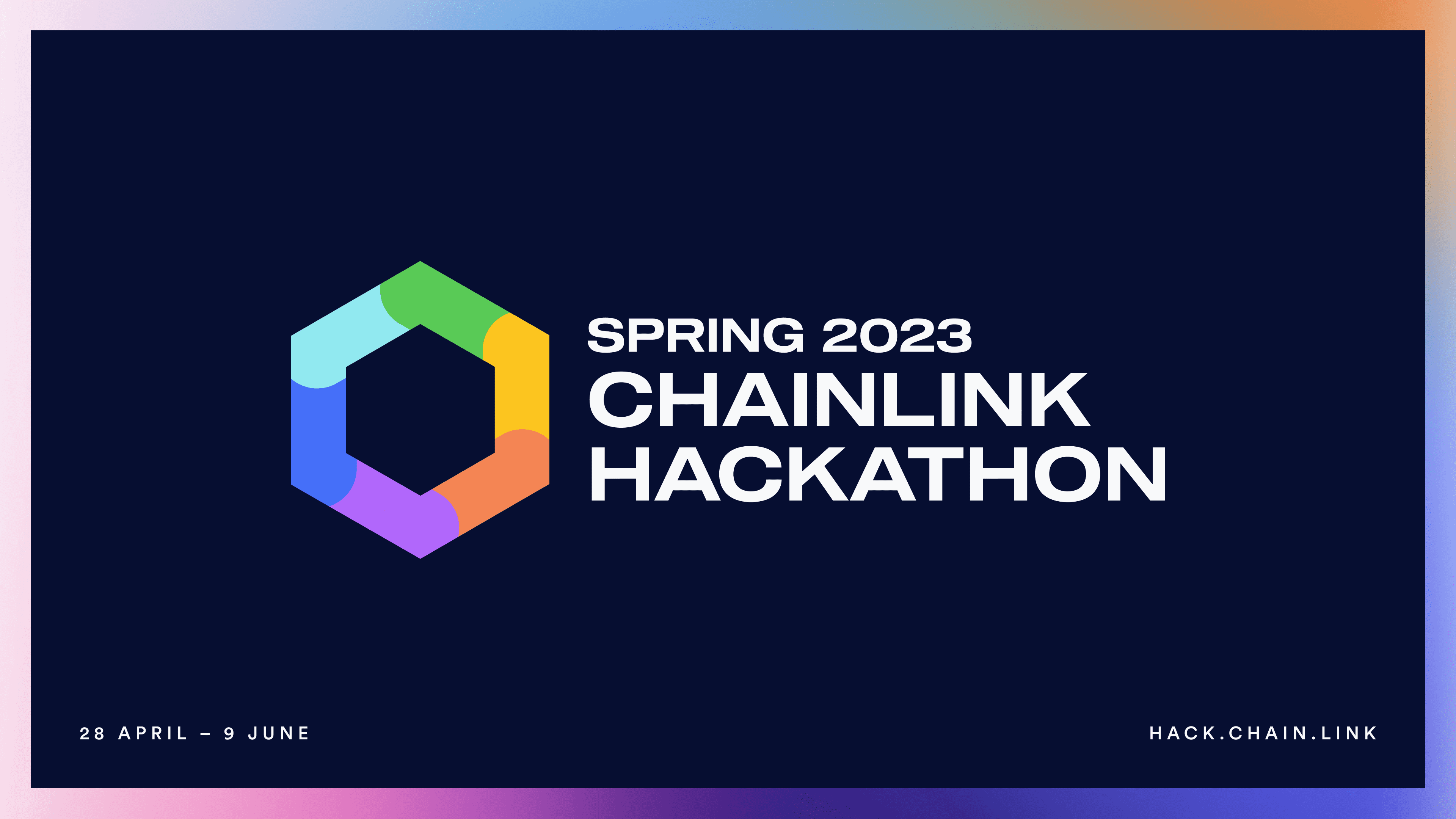
The Chainlink Spring 2023 Hackathon brand style guide aimed to create a modern, approachable, exciting, inspiring, and trendy visual identity that would resonate with participants and the wider community. 

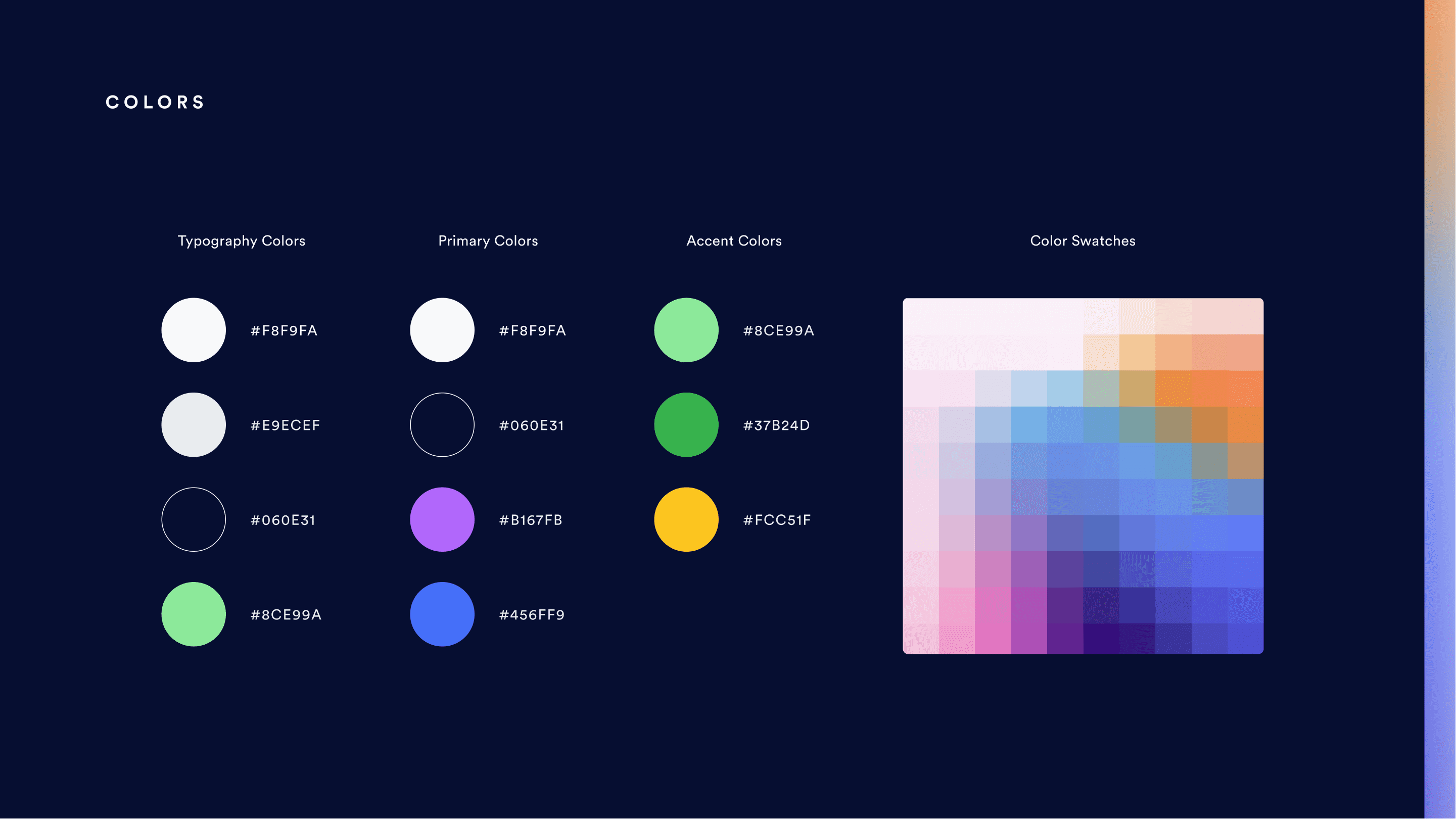
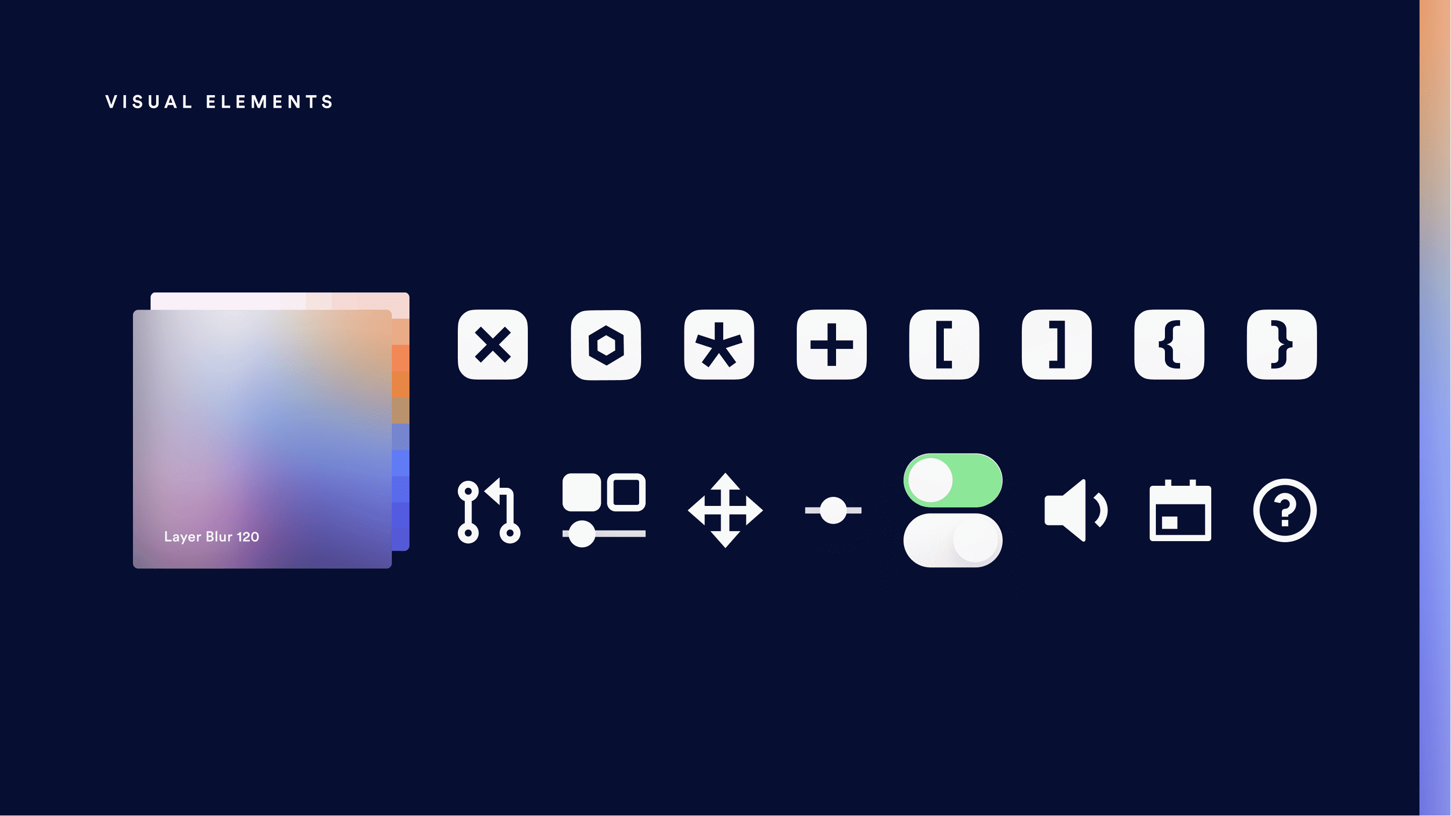
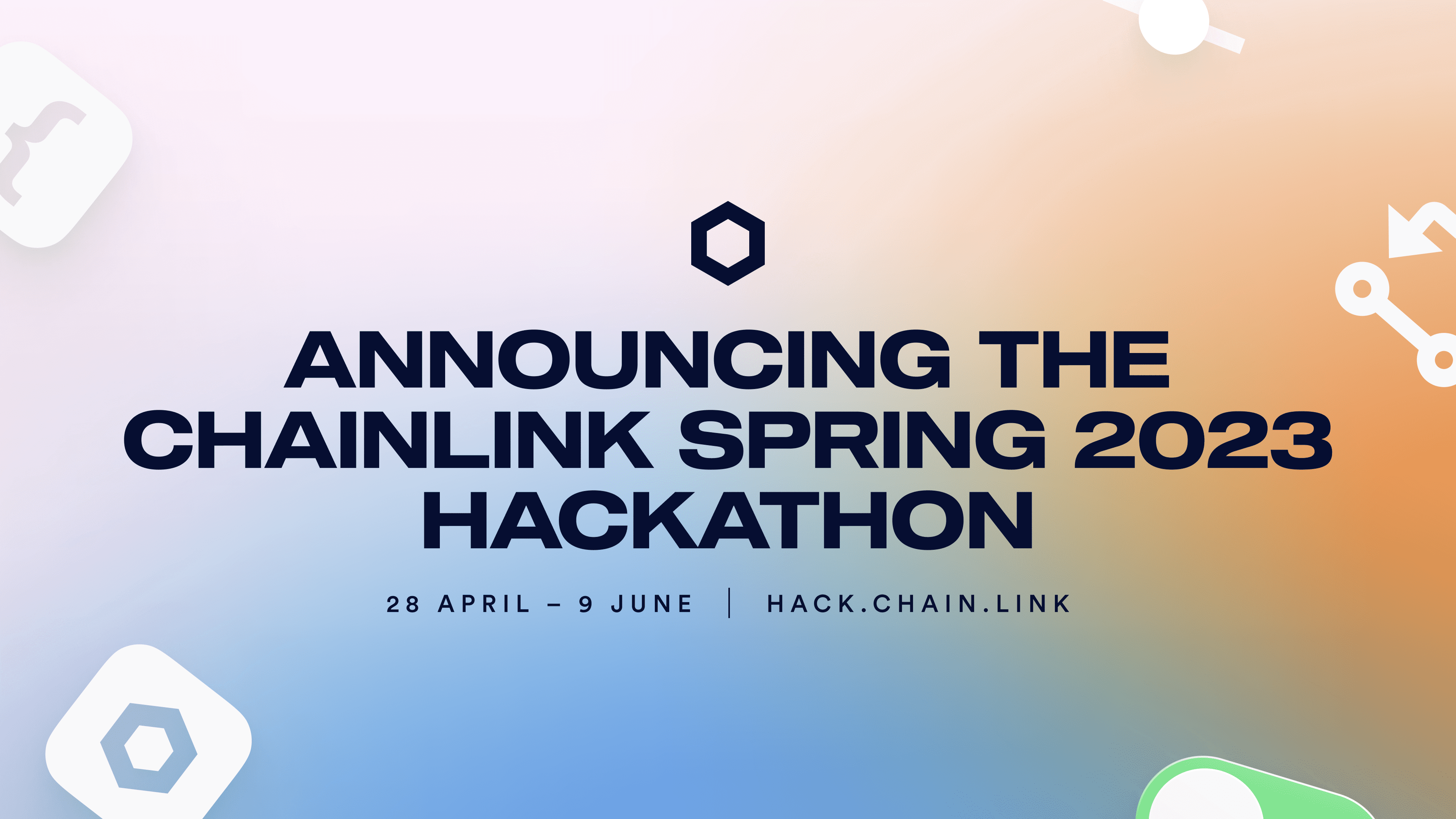
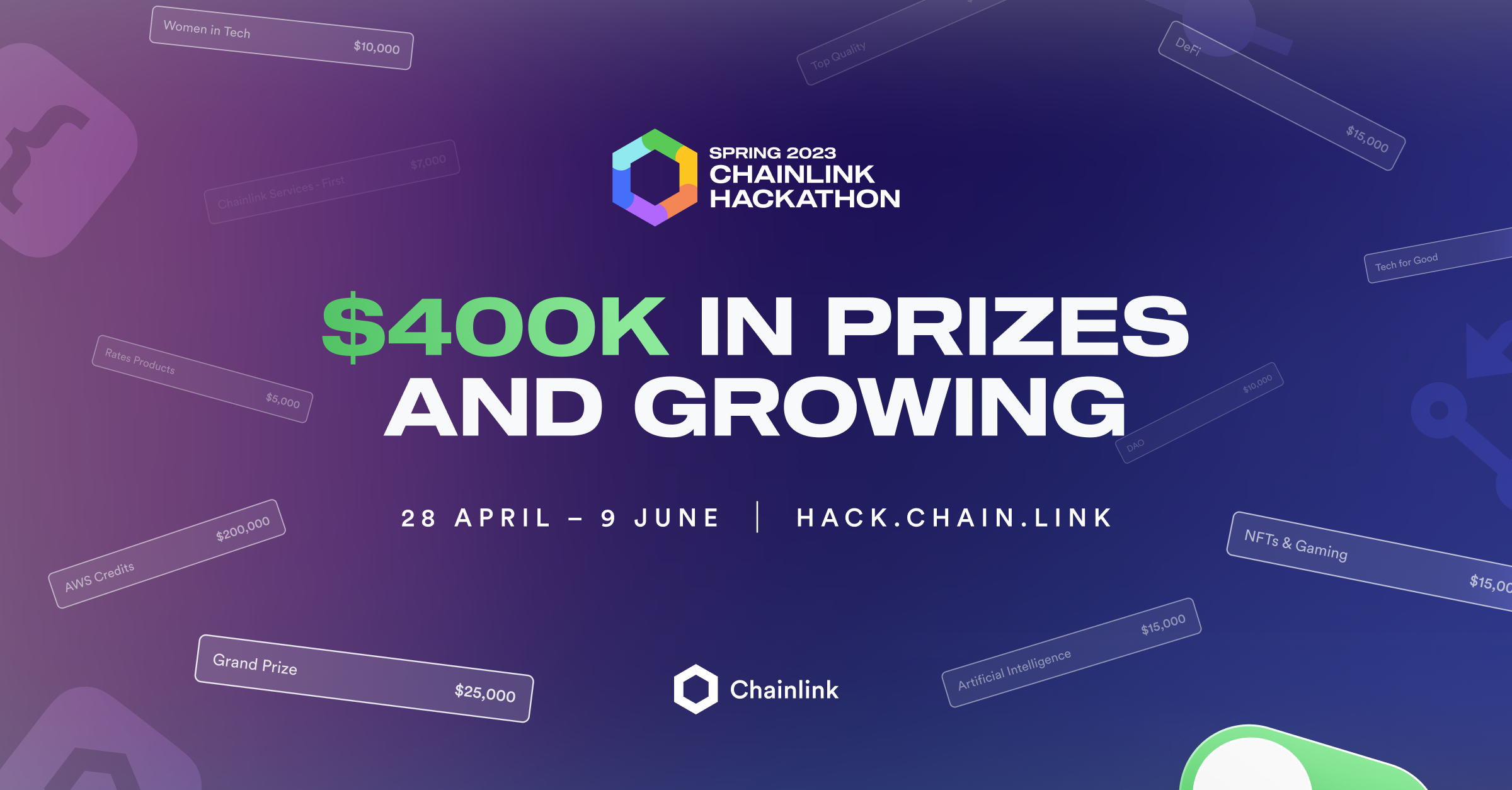
To evoke the spring season, the design utilized mesh gradients, predominantly featuring warm colors. Contrasting cold color spectrums were incorporated for dark mode pieces, creating a visually diverse palette that catered to various applications and platforms. Additionally, The frosted glass texture added depth and visual interest to the design, while maintaining a clean and contemporary appearance. The combination of gradients, textures, and color schemes resulted in a visually cohesive and memorable identity for the Chainlink Spring 2023 Hackathon.

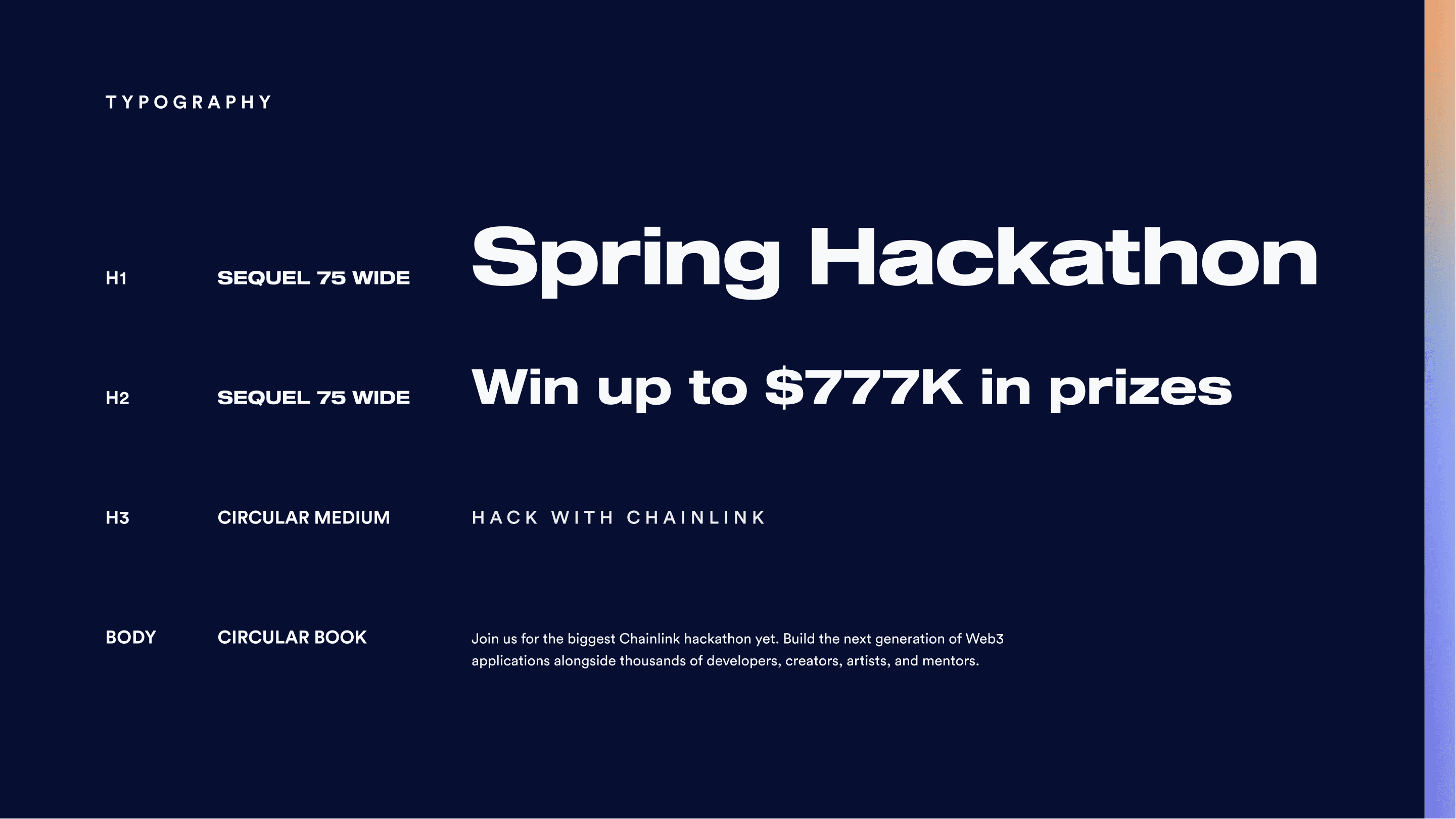
The decision to use Circular as the primary body font aligned the Hackathon brand with the parent Chainlink brand, while also providing a legible and versatile typeface. To complement the Circular font, a wide modern font was used for headings, adding an extra layer of contrast and helping to reinforce the art direction northstars of this edition.

Developer characters and key project logos were also utilized in the visual style as floating elements, which not only provided a unique opportunity to create animations, but also added visual interest and helped balance artboards.

Digital collateral

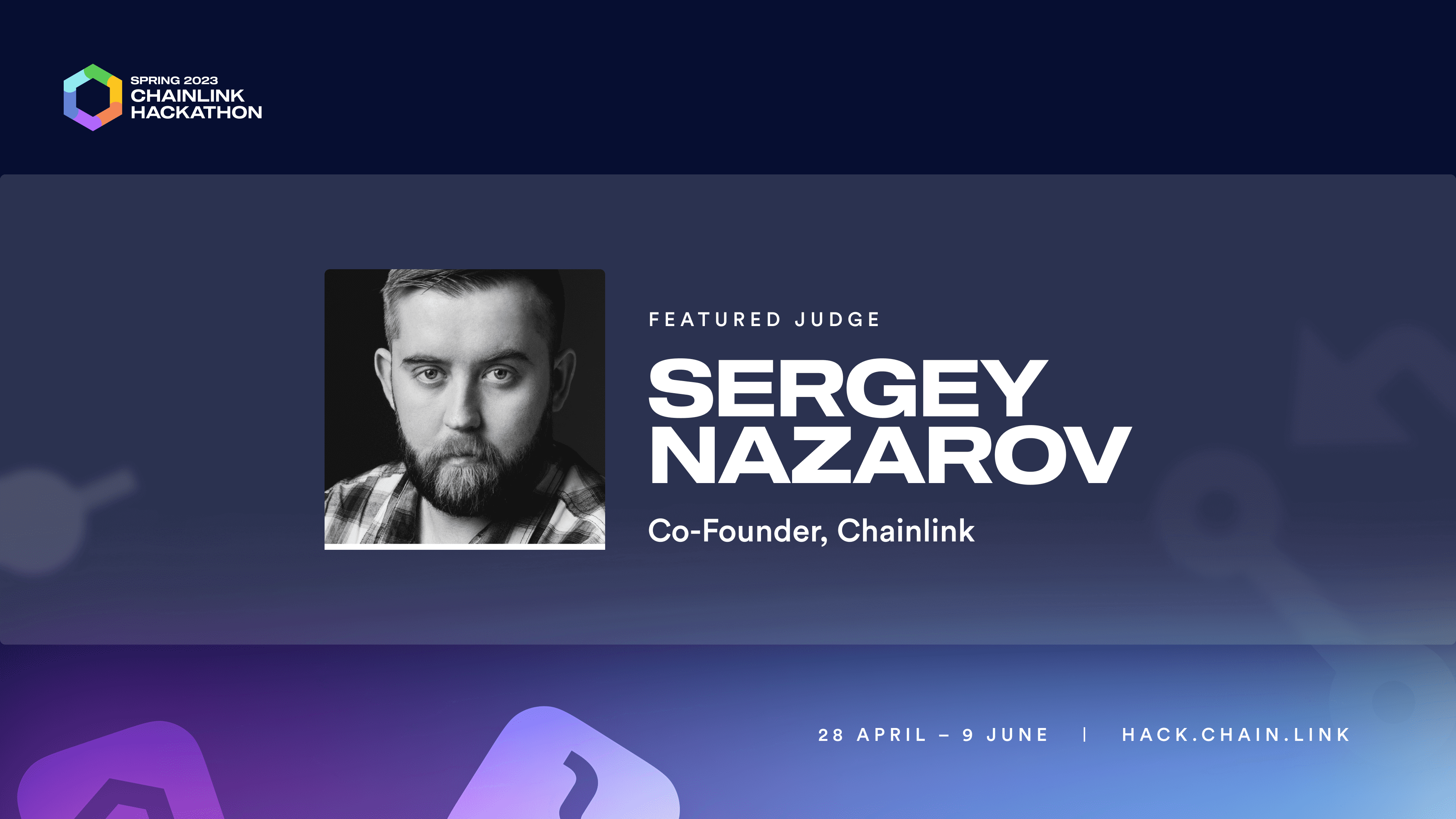
The digital collateral for the Chainlink Spring 2023 Hackathon was designed with versatility and adaptability in mind, offering both light and dark layout options that utilized different spectrums of the color palette. This approach allowed the creation of a variety of assets, each tailored to the specific outlet's audience, and ensured optimal information architecture across all digital channels. The combination of typefaces, color schemes, and visual elements resulted in a rich assortment of assets that effectively communicated the Hackathon's brand identity and key messages.

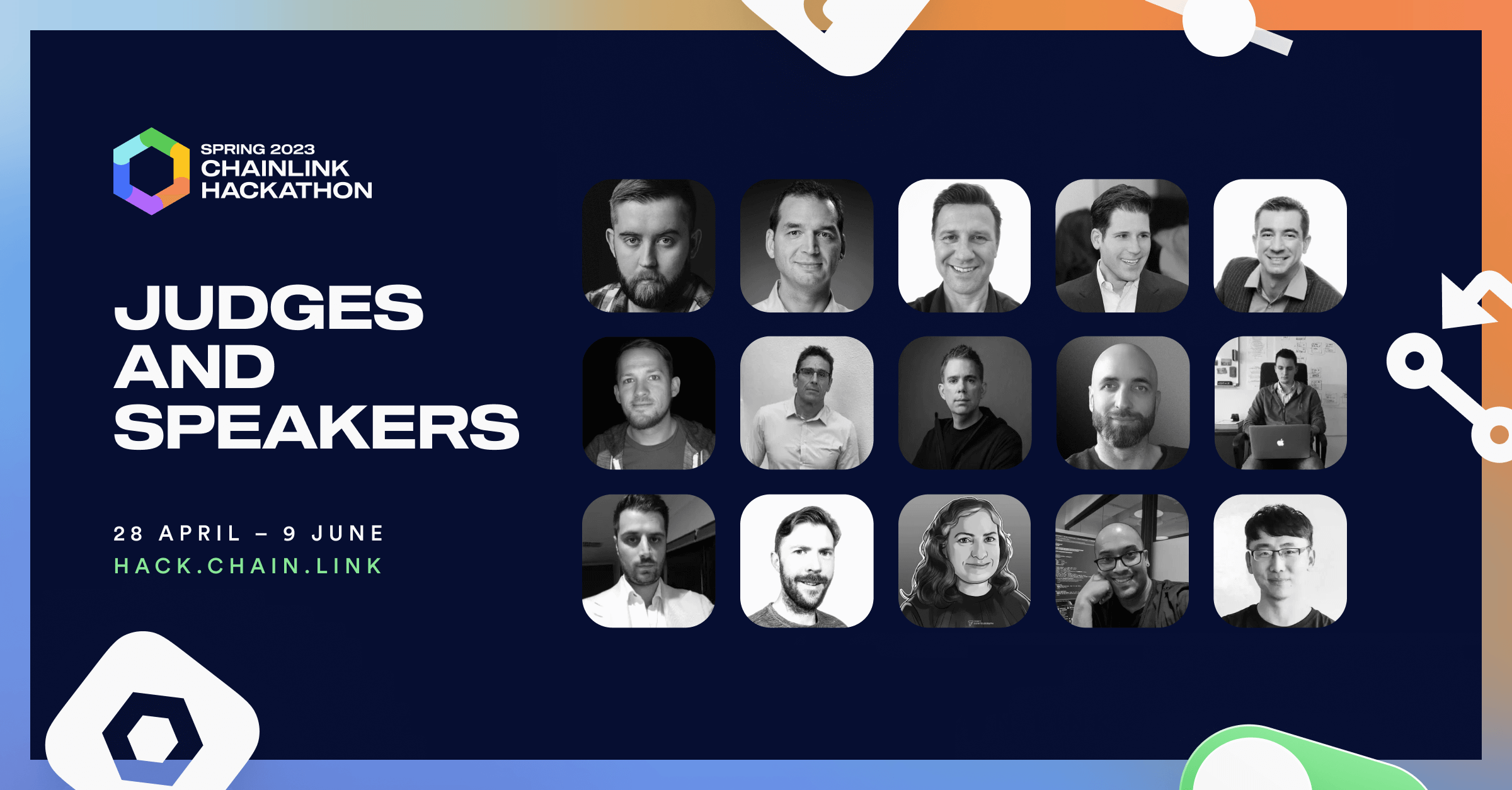
Chainlink Hackathon Spring 2023, announcement bannerChainlink Hackathon Spring 2023, speaker cardChainlink Hackathon Spring 2023, banner showing speakresChainlink Hackathon Spring 2023, sponsor cardChainlink Hackathon Spring 2023, banner showing sponsor logos
Chainlink Hackathon Spring 2023 | Banners

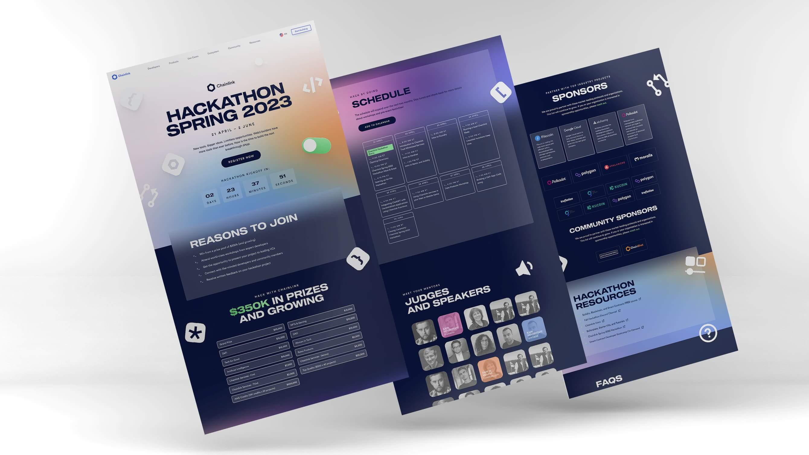
Web application

The web application for the Chainlink Spring 2023 Hackathon placed a strong focus on interactive elements and animations, offering an engaging and dynamic user experience. The rhythm of the page design was determined by the contrast of gradients and full-colored backgrounds, while accent colors were used to drive emphasis and guide users' attention to key information. The overall design was visually striking and consistent, ensuring that the Hackathon's identity remained cohesive and memorable for all attendees and participants.

The web application for the Chainlink Spring 2023 Hackathon placed a strong focus on interactive elements and animations, offering an engaging and dynamic user experience. The rhythm of the page design was determined by the contrast of gradients and full-colored backgrounds, while accent colors were used to drive emphasis and guide users' attention to key information. The overall design was visually striking and consistent, ensuring that the Hackathon's identity remained cohesive and memorable for all attendees and participants.

Result

The Chainlink Spring 2023 Hackathon is set to take place throughout Q2 2023, and the anticipation surrounding the event is growing rapidly. The response from the Chainlink community to the event's visual identity has been overwhelmingly positive, with participants and members expressing their enthusiasm and excitement for the engaging and modern design.

Outcome

Over the past editions of the Chainlink Hackathons, the creative and thoughtful approach to visual identity has played a crucial role in their success. By consistently delivering unique and engaging branding experiences, each Hackathon has managed to captivate the attention of developers, creators, and Web3 enthusiasts from around the world. The distinct visual styles, while tied together by a cohesive system, have resonated with the participants and the Chainlink community alike, fostering familiarity and excitement throughout the events.
Each Hackathon's visual identity, with its carefully crafted color palettes, typography, and design elements, has successfully reflected the themes, spirit, and values of the respective events. The meticulous design process, from the initial brainstorming to the final execution, has ensured that every touchpoint, be it digital collateral, web applications, or physical assets, delivered a memorable and consistent experience to the attendees.

The positive response from the community and the record-breaking participation numbers across all Hackathons demonstrate the effectiveness of these visual identities in attracting and inspiring hackers to showcase their talent and passion for building the next generation of hybrid smart contracts and Web3 applications. In total, these four Hackathons have attracted over 34,000 signups and 1,300 project submissions, showcasing the wide range of talent and innovation present in the Chainlink ecosystem. 

More projects