SmartCon Brand System

During 2020, as Chainlink Head of Design I was responsible for developing a branding strategy for SmartCon, Chainlink's flagship yearly event. The aim was to create a functional, consistent, effective and memorable brand system that captured the innovative spirit of the conference while conveying a sense of excitement and trust, while helping position SmartCon as the leading event of the blockchain industry.

COMPANY
Chainlink
YEAR
2020/23
TYPE
Brand

Key challenges

Staying true, but relevant.

The brand system needed to be future-proof, with the ability to adapt to upcoming trends and new technologies, all while delivering a consistent and recognizable experience that would contribute to establishing SmartCon as a leading event of the industry. At the same time, the system also needed dynamic, ensuring that the brand remained true to its own identity while creating a unique, fresh and memorable experience for attendees for each of the editions. This would be a key factor to avoid visual fatigue and increase engagement for attendees year after year.

Consistency across different platforms.

With the event being both digital and physical, the brand system needed to be consistent across various channels, and scalable throughout a wide array of collaterals, ranging from email marketing to swag. The brand system needed to be optimized to deliver a world-class experience on every single touchpoint throughout both physical and digital attendees.

Chainlink’s footprint.

SmartCon is a key event for Chainlink, and this was a factor that needed to be strategically conveyed in the system. While the SmartCon identity needed to be tailored specifically to the event nature of the project and optimized for its specific target demographic, it was equally important to create a strong connection with Chainlink, its visual identity, and core values.

Solution

Static and flexible elements.

Static and flexible elements were strategically distributed throughout the brand, with the goal of designing a system that is adaptable across different editions of the event, but at the same time, consistent and somehow predictable. A locked set of assets, such as the typography, key colors, and logotype, contributed to remain consistent to the event's core identity and values. A flexible set of dynamic elements, such as secondary colors and illustration styles, allowed us to create new and distinguishable experiences for attendees for each of the SmartCon’s editions.

A future-proofed brand.

Strategically combining static and flexible elements also provided a healthy balance between innovation and tradition. The branding was designed to provide opportunities to include a wide array of elements or techniques all while remaining adaptable to emerging industry trends and new technologies.

Focus on layouts.

The layout of the branding system was designed with scalability in mind, taking into account the various types of assets and collaterals that would need to be created for the event. A grid system was established for each type of asset, from the event website and social media channels to merchandise and event signage. This grid system allowed for a consistent layout and design language to be used across all assets, regardless of their size or format.

Inspired by Chainlink.

The branding system for SmartCon strategically incorporated specific resources from Chainlink's brand system as static elements, such as primary colors and an authored logotype. Additionally, the flexible portion of the brand is consistently inspired by Chainlink's visual identity, such as binary code as primary element, and isometric-styled illustrations.

Focusing on documentation.

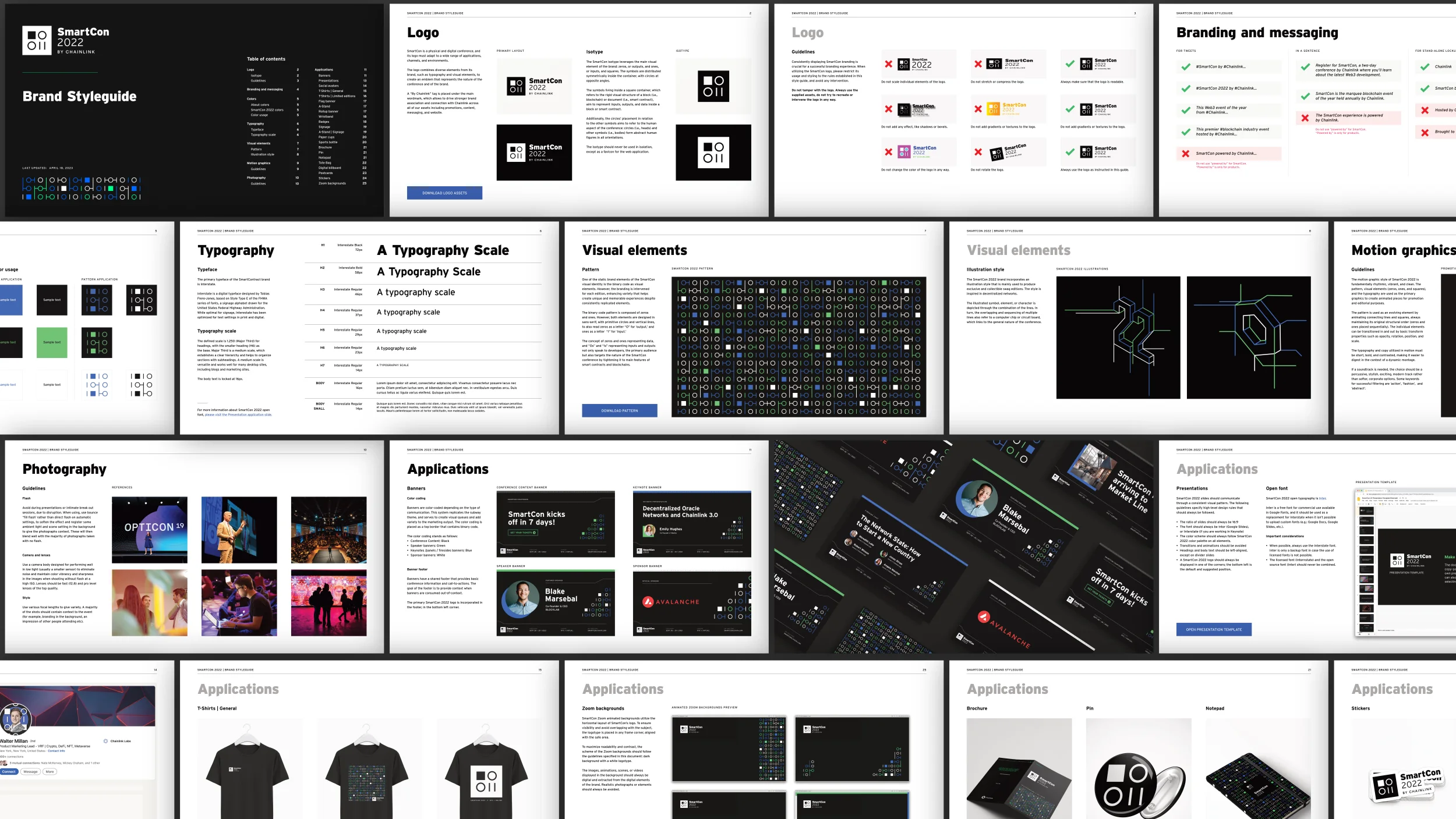
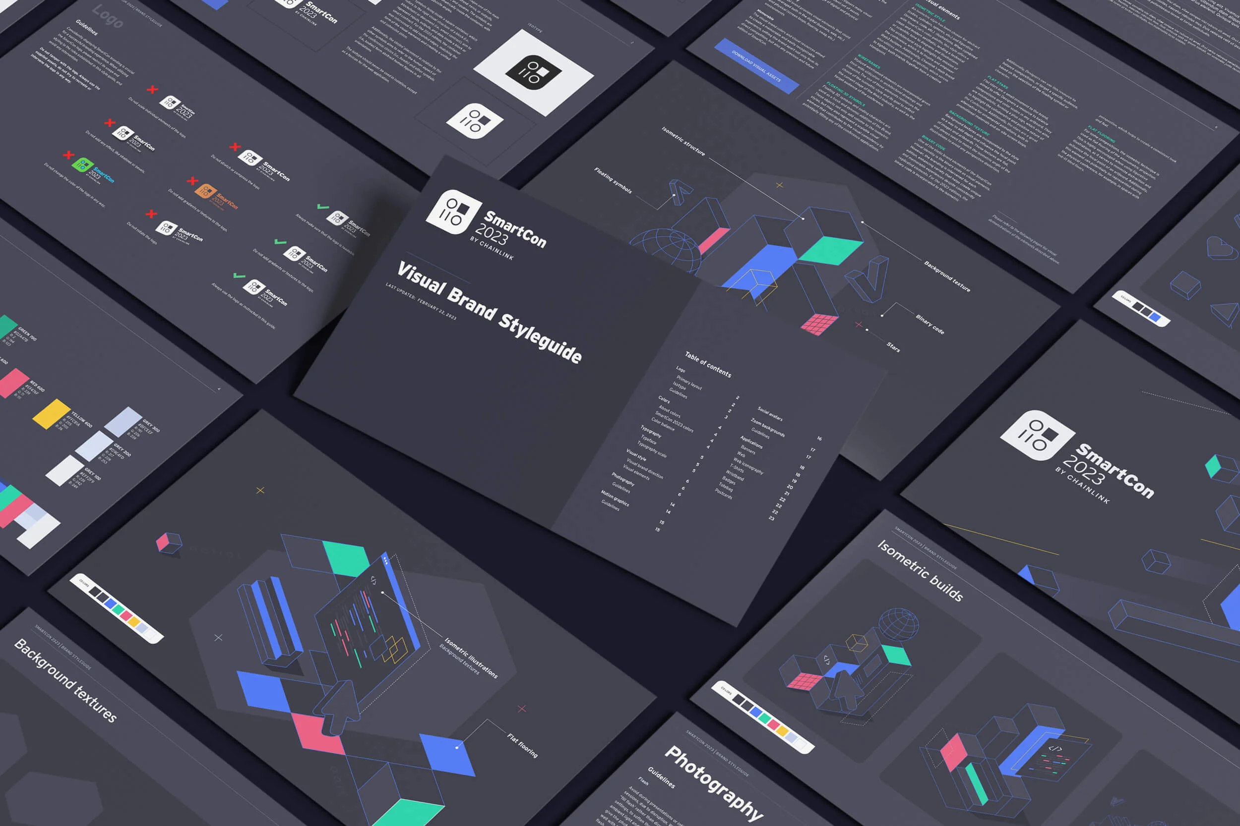
Thorough documentation was key to ensure the consistency of the brand throughout the years. All branding rules and guidelines accessible through specific style guide documents, which included guidelines for typography, color palettes, imagery, and other design elements, as well as instructions for usage and scalability rules. The documentation allowed for clear and consistent communication among all team members and vendors involved in the branding process, while ensuring that the system was executed intentionally throughout the years, and SmartCon remained consistent and recognizable across all touchpoints, in all of its editions.

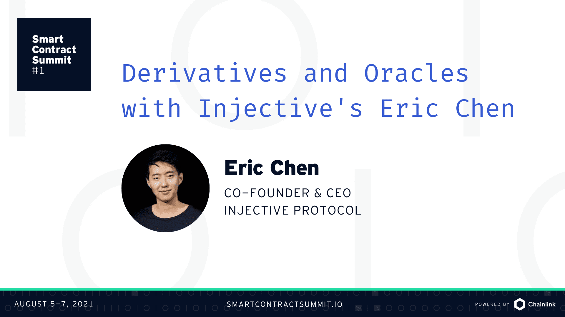
SmartCon 2020

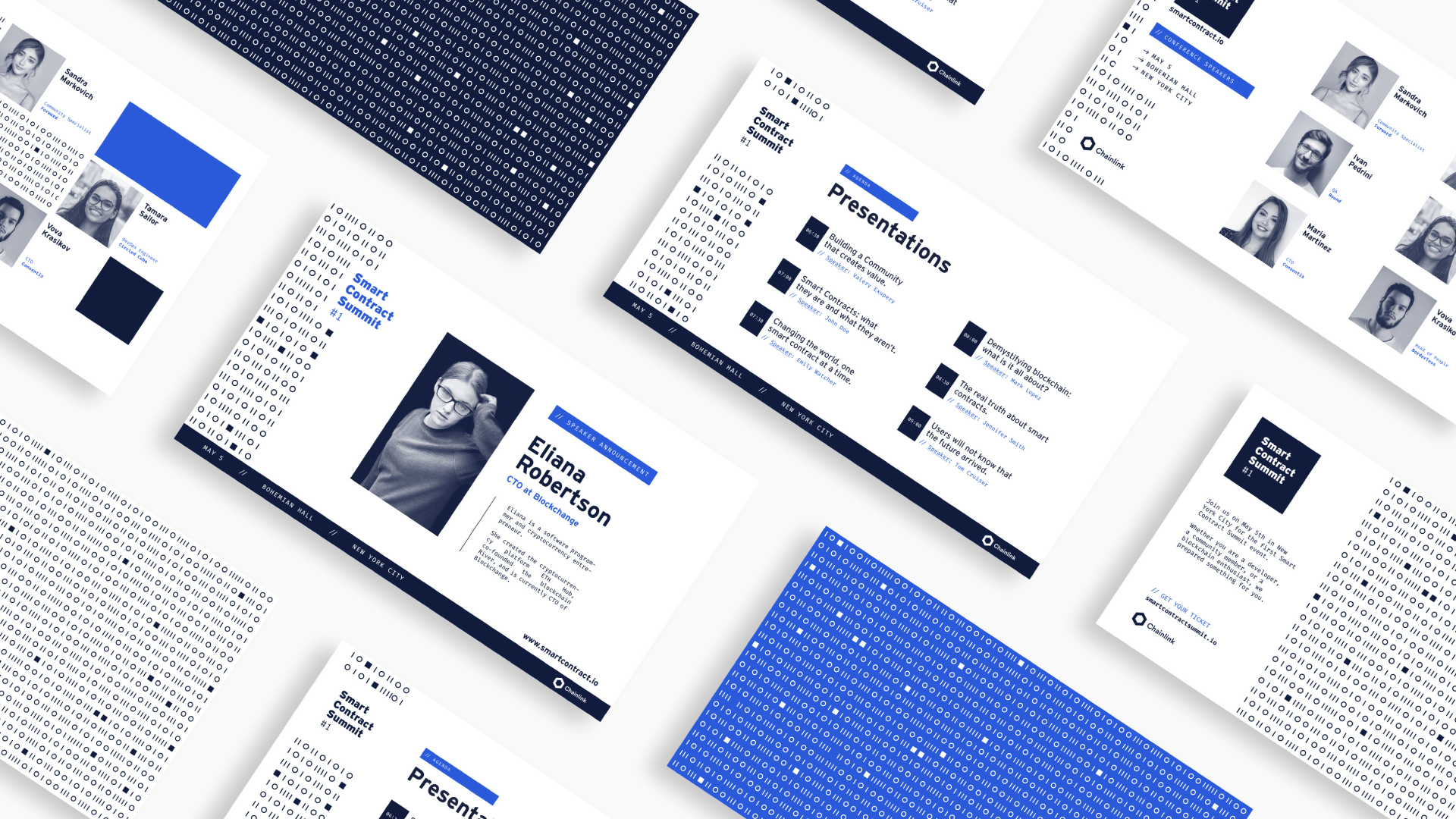
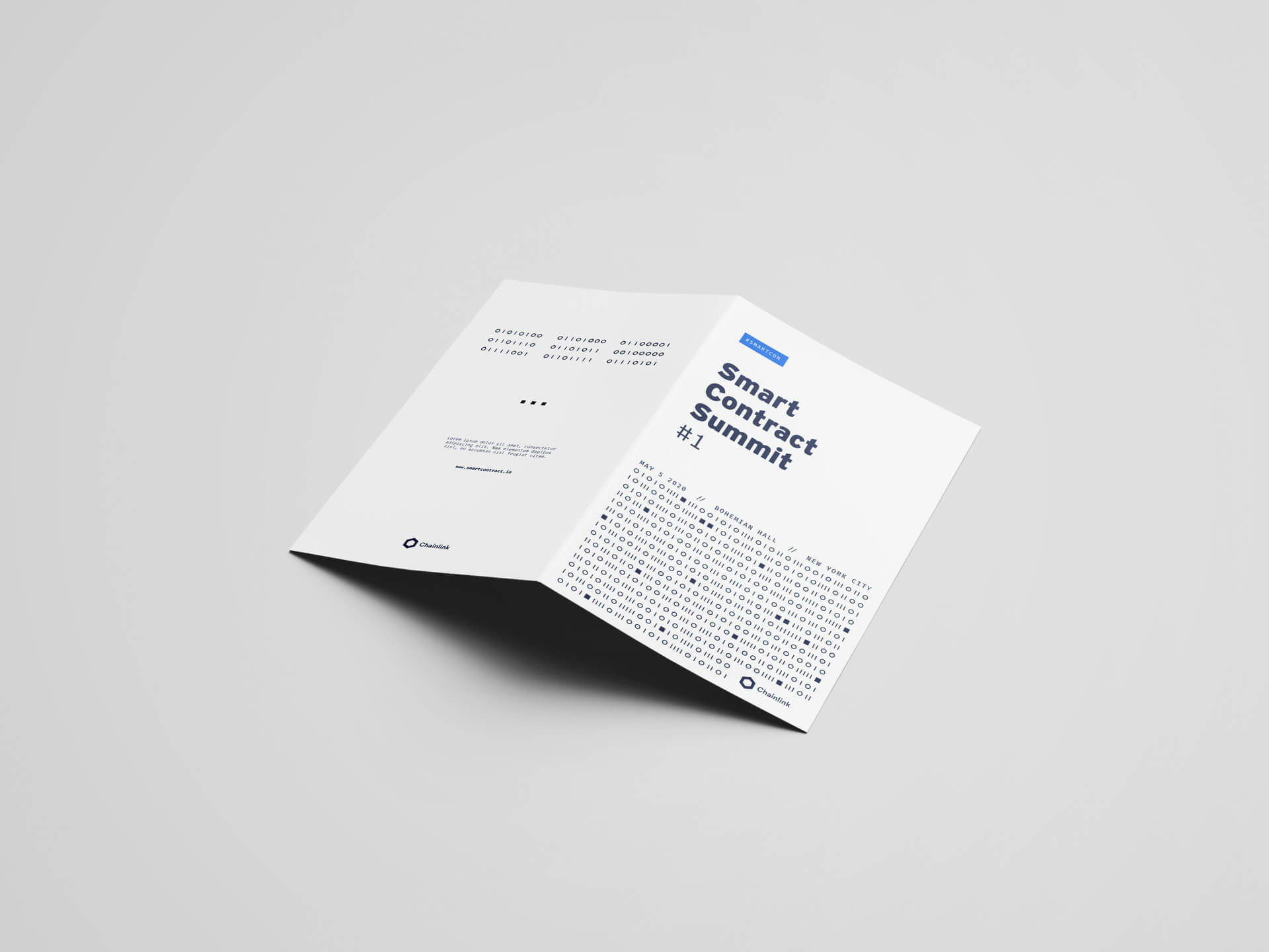
SmartCon 2020 was the first edition of the conference and marked the first time that the brand was presented to the world. As such, it was crucial to establish a clear connection with Chainlink's overall brand identity. To achieve this, the branding strategy for the event was designed to be bi-tonal, with blue as the key color. This color choice was consistent with Chainlink's overall brand identity and helped to reinforce the connection between the conference and the company.

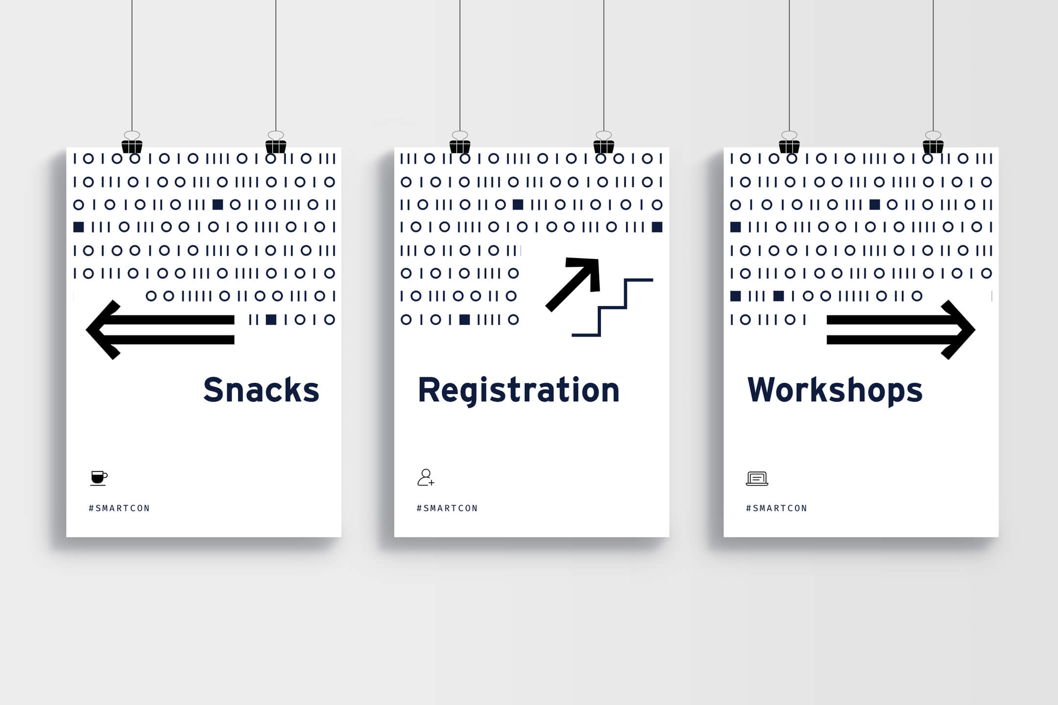
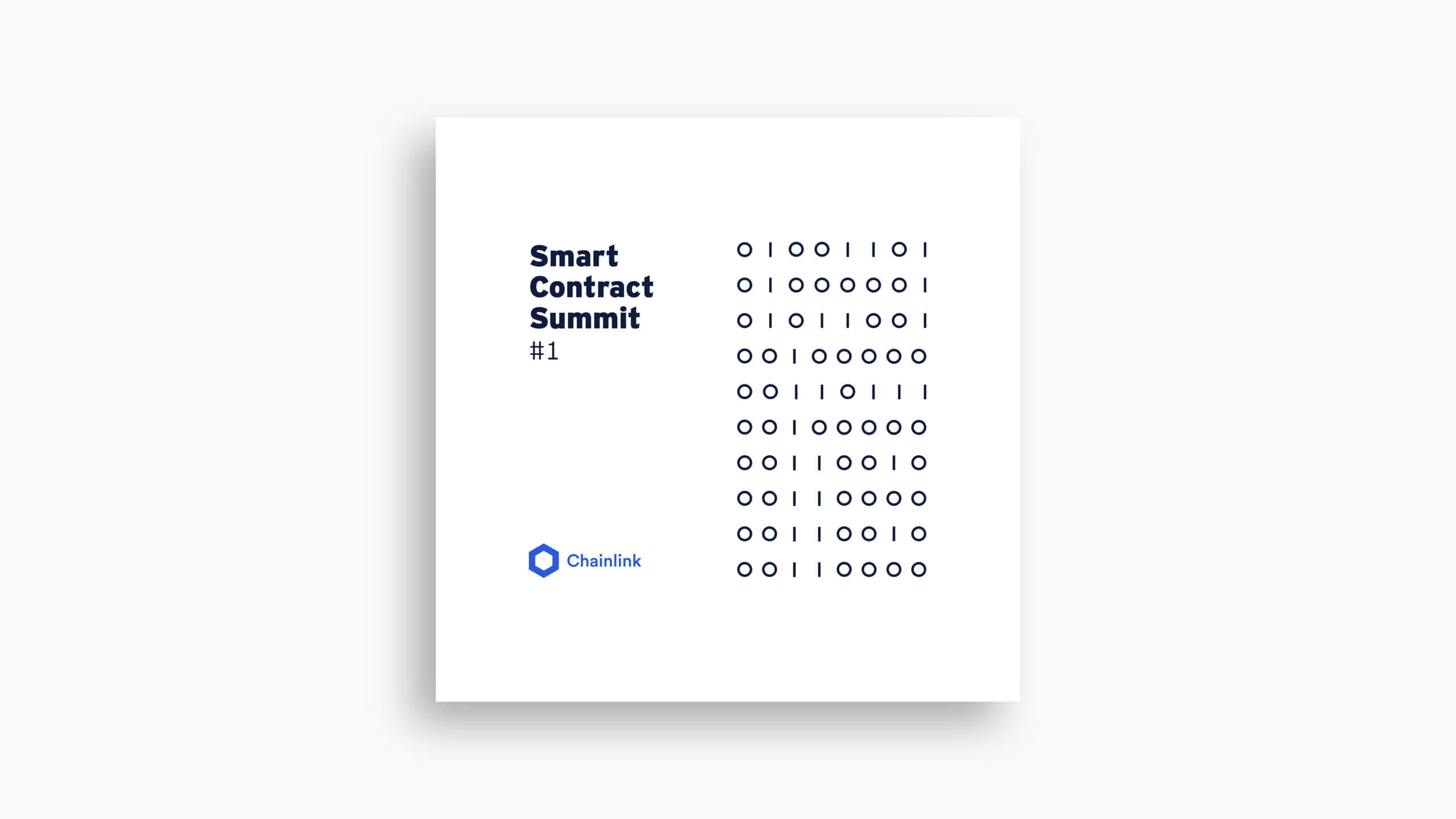
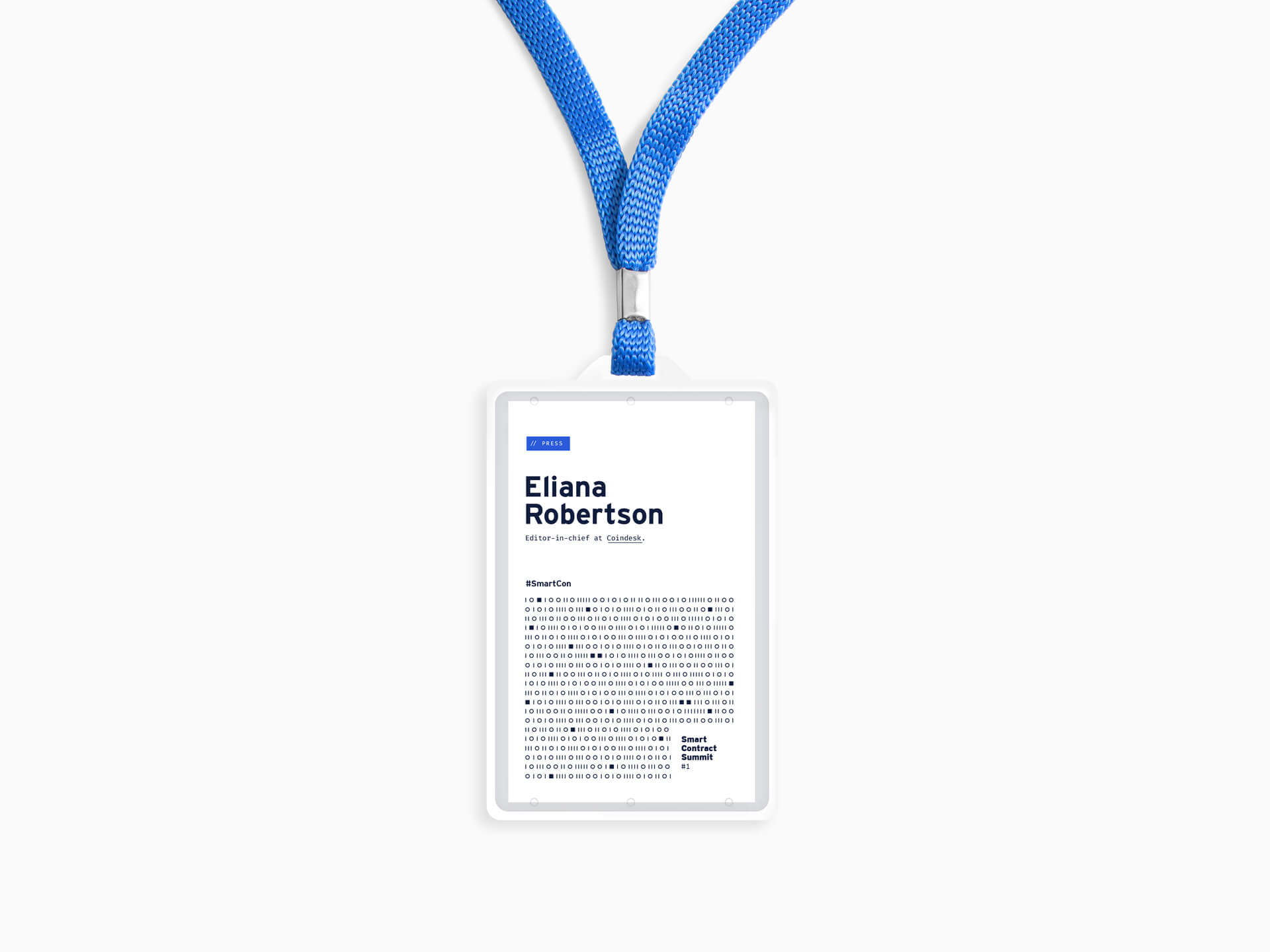
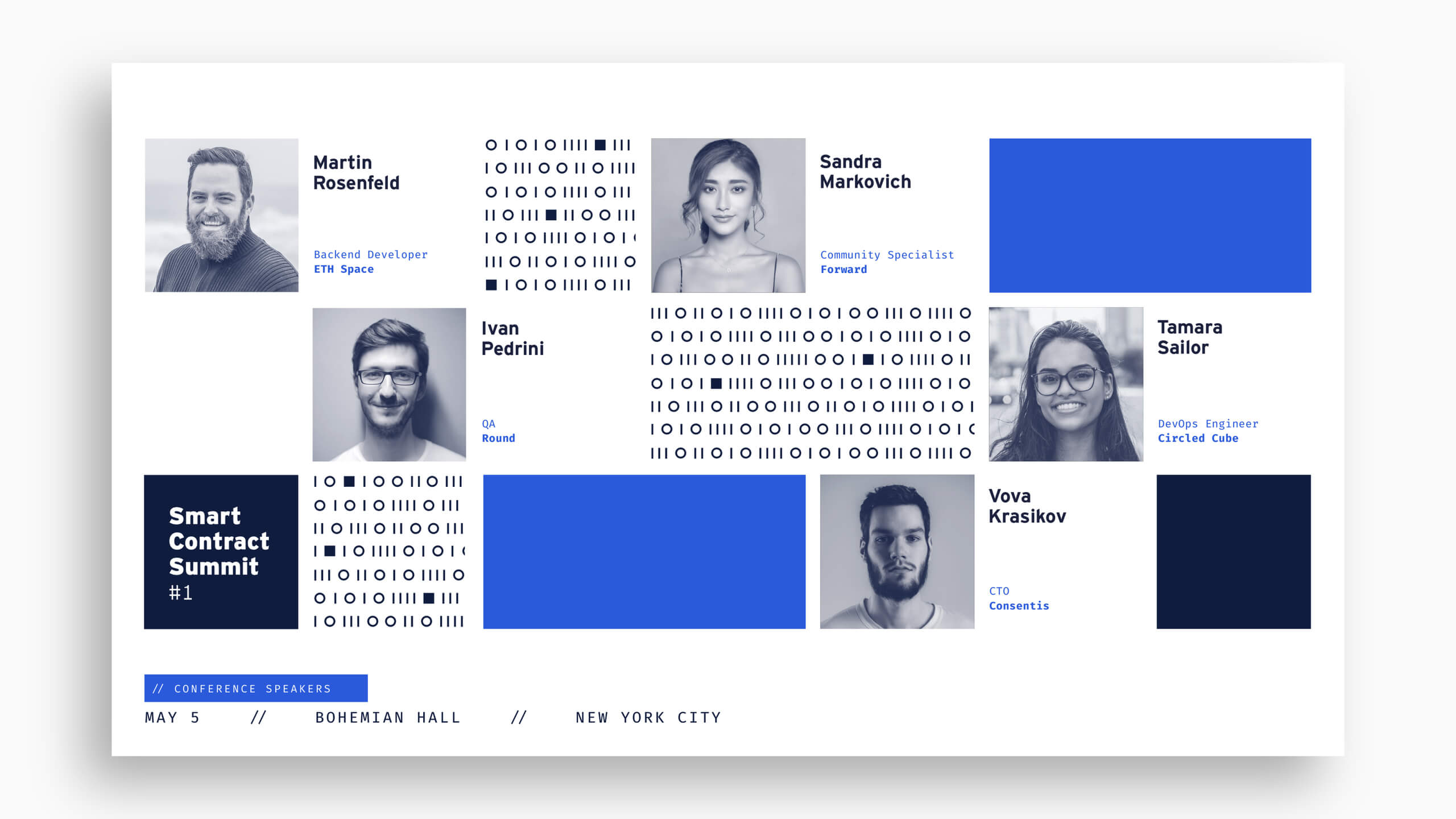
The use of binary code was a central element of the branding for SmartCon 2020, as it highlighted Chainlink's mission and the technical nature of the conference. It was also used to hide messages in promotional materials, creating engaging easter eggs for the highly technical Chainlink community.

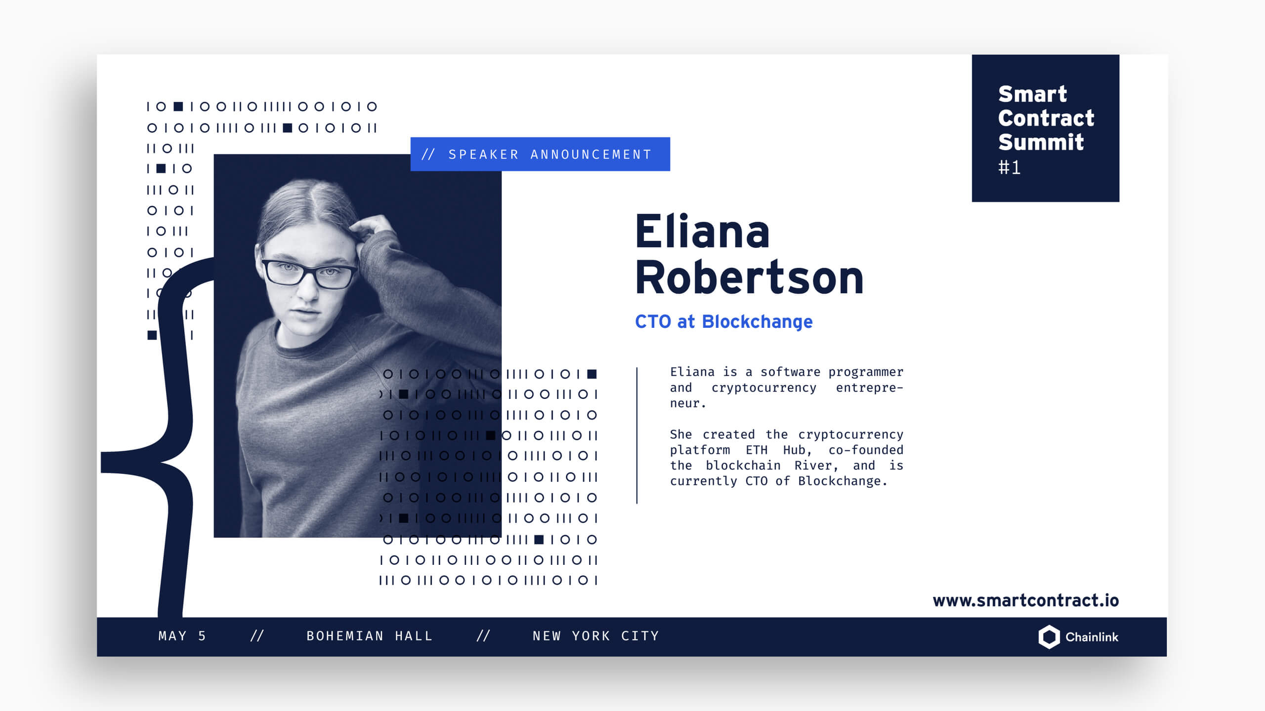
Coding characters, such as brackets and curly braces, were also incorporated to make explicit the target audience and the technical subject matter of the conference, which was particularly important since this was the first edition of the event.

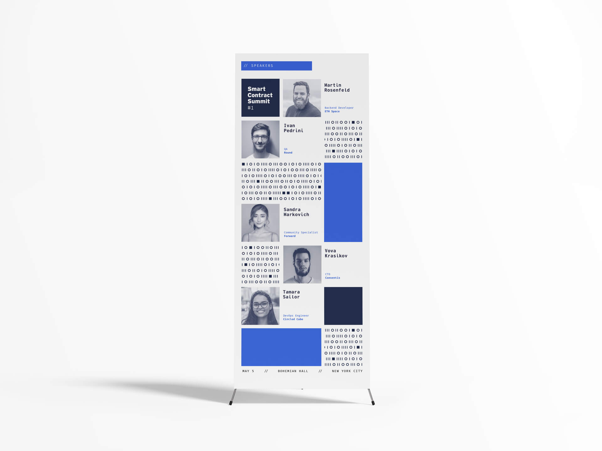
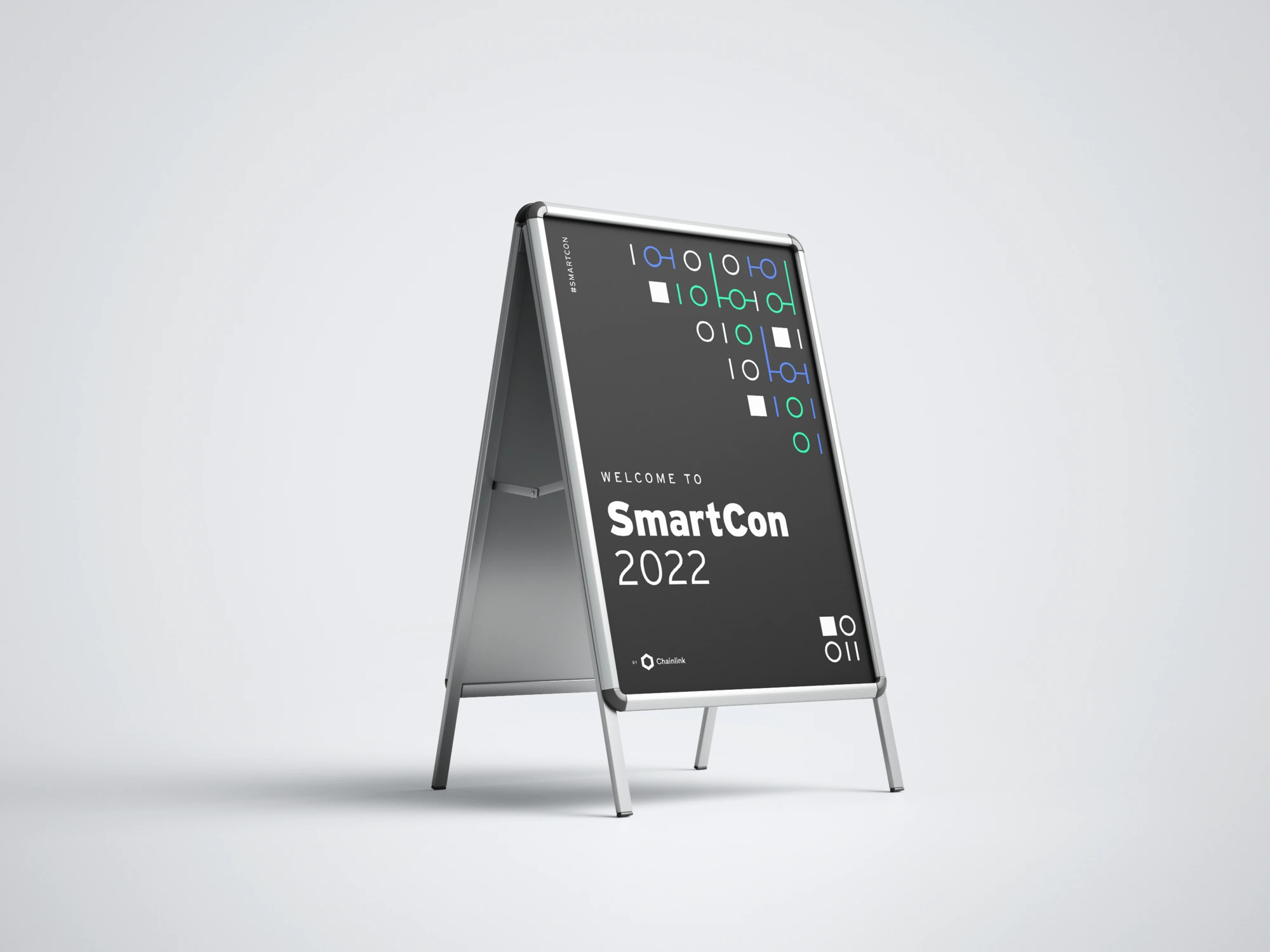
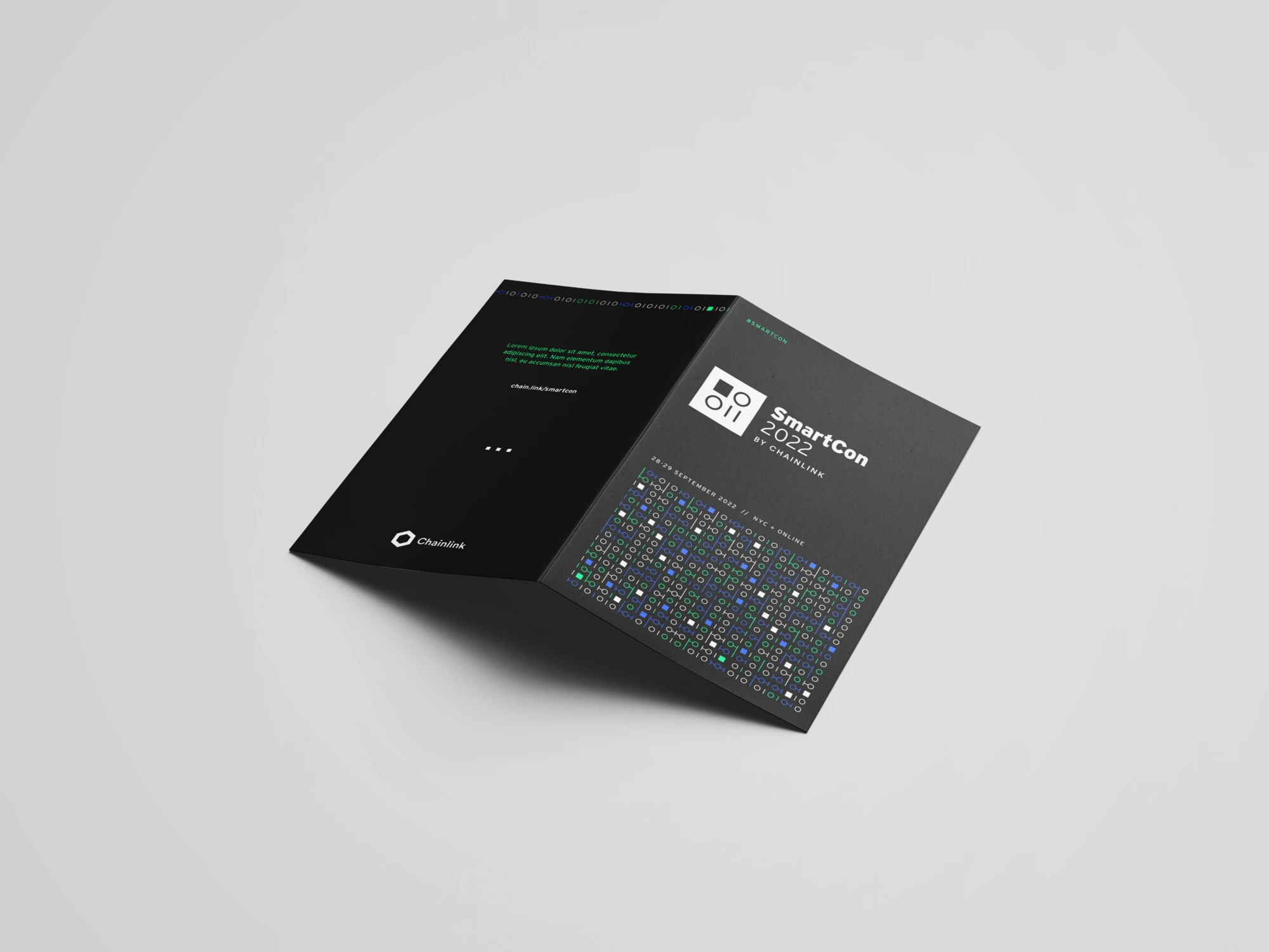
SmartCon 2020 | Brochure, signage, digital banner, and easter egg card

Chainlink's overall brand system was incorporated in a new and unique way through an modular system of layouts, which was innovative to Chainlink's brand. This helped to establish a visual identity that was distinct from Chainlink's main brand identity while still remaining consistent with its core values and messaging.

The SmartCon 2020 branding system was designed with scalability in mind, ensuring that it remained consistent and recognizable across all touchpoints. This included a wide range of assets, such as event signage and banners, promotional animations, and livestream assets.

SmartCon 2020 | Animated loop

The overall effect of the branding for SmartCon 2020 resulted in a clear and cohesive visual identity that accurately represented Chainlink's brand and the nature of the conference, and was a key contributor to the overwhelming success of the conference.

As the first edition of the conference, SmartCon 2020 set the tone for future iterations of the event and established a strong visual identity for the brand going forward.

SmartCon 2021

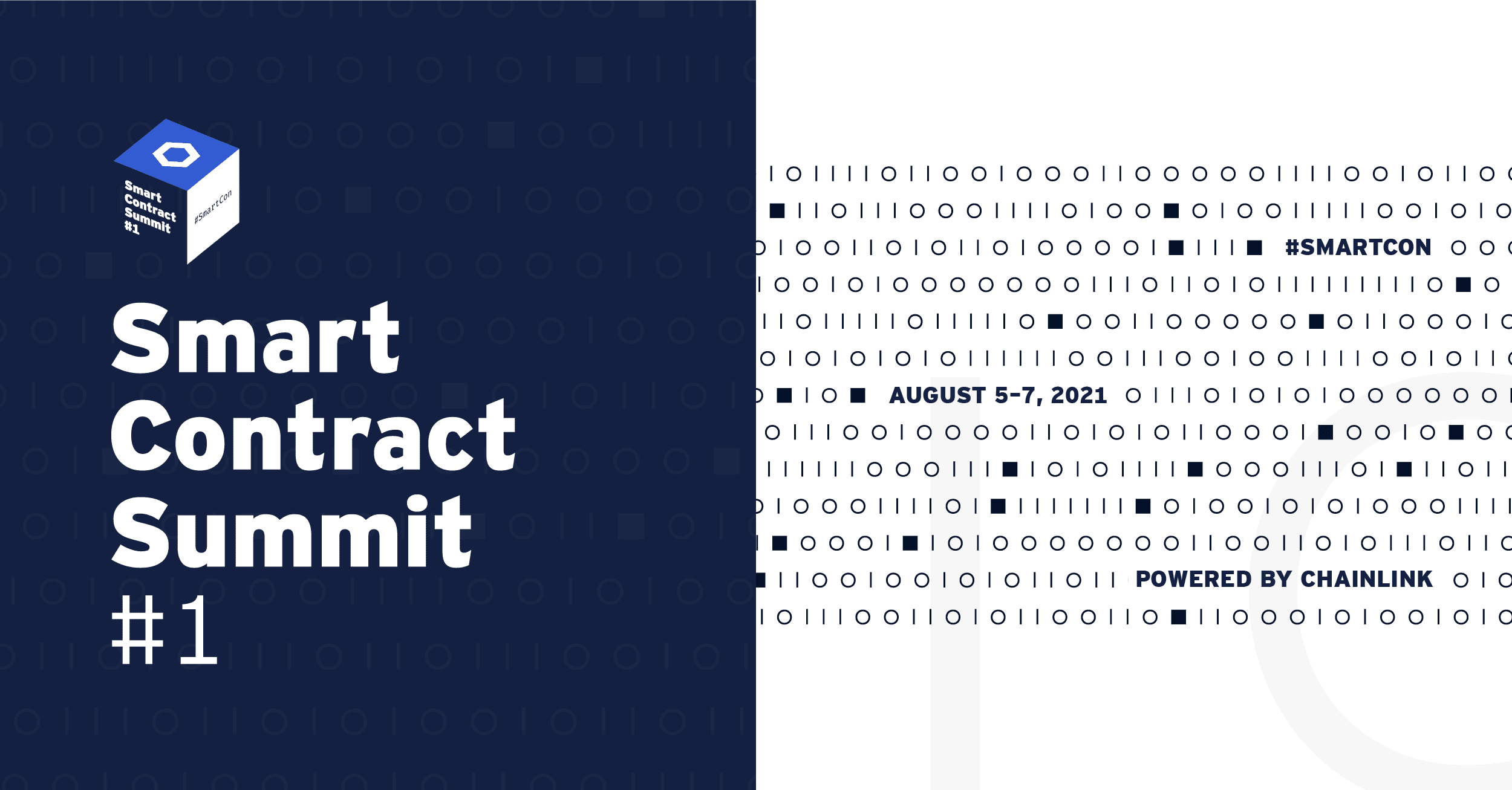
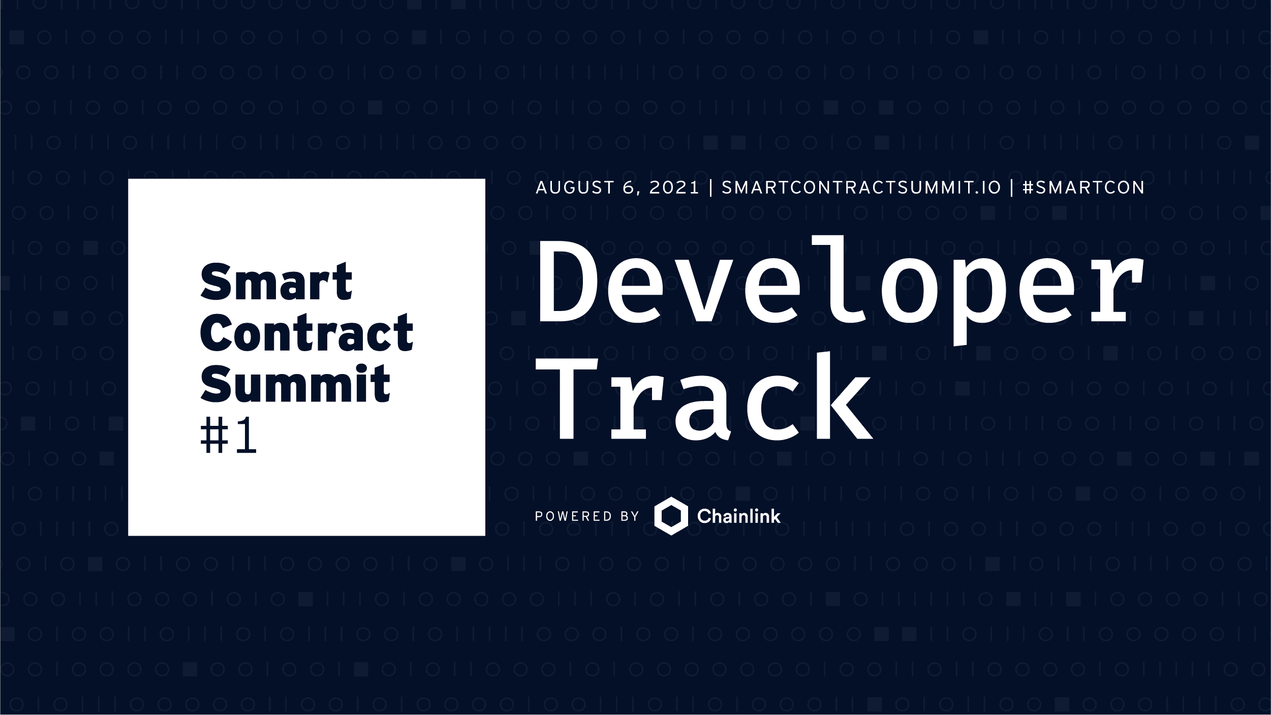
SmartCon 2021, a cutting-edge virtual event held in early August 2021, centered around cross-chain technology, which informed and inspired the design elements of the brand. The creative direction emphasized a hybrid ecosystem, blending highly contrasted color schemes to symbolize different environments or chains, and fluid binary code to represent cross-chain communication. Additionally, the contrasted visual language was also a reflection of the diverse conference audience, with the light mode resonating with the general public and the dark mode engaging developers and technical attendees.

SmartCon 2021 | Brand themes

Beyond the binary code, a foundational aspect of the SmartCon brand, an interactive cube was utilized as a central visual motif. This dynamic cube offered an engaging method for presenting key conference details, enlivening various applications, such as the website and a plethora of captivating animations, and served as the foundation to establish the animation language.

SmartCon 2021 | Rotating cube

For this virtual edition of SmartCon, animation played an essential role. Our team developed a visually compelling motion design system applicable to a wide range of use cases, from promotional materials to livestream assets. The system integrated glitch effects and dynamic movement, blending fluid background motion with bold typography and seamless glitchy transitions. The promotional video seamingly incorporated these brand elements.

SmartCon 2021 | Promotional animation

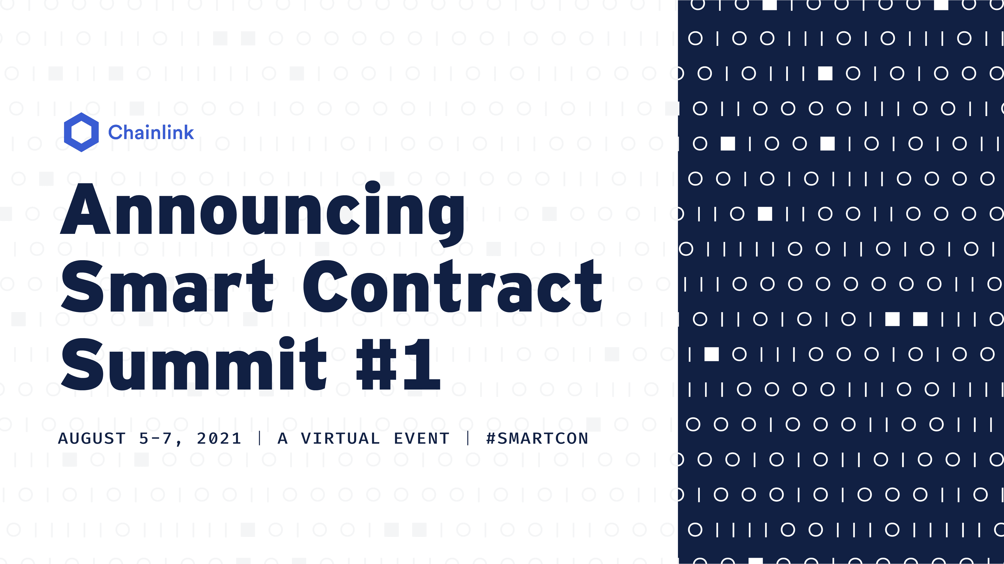
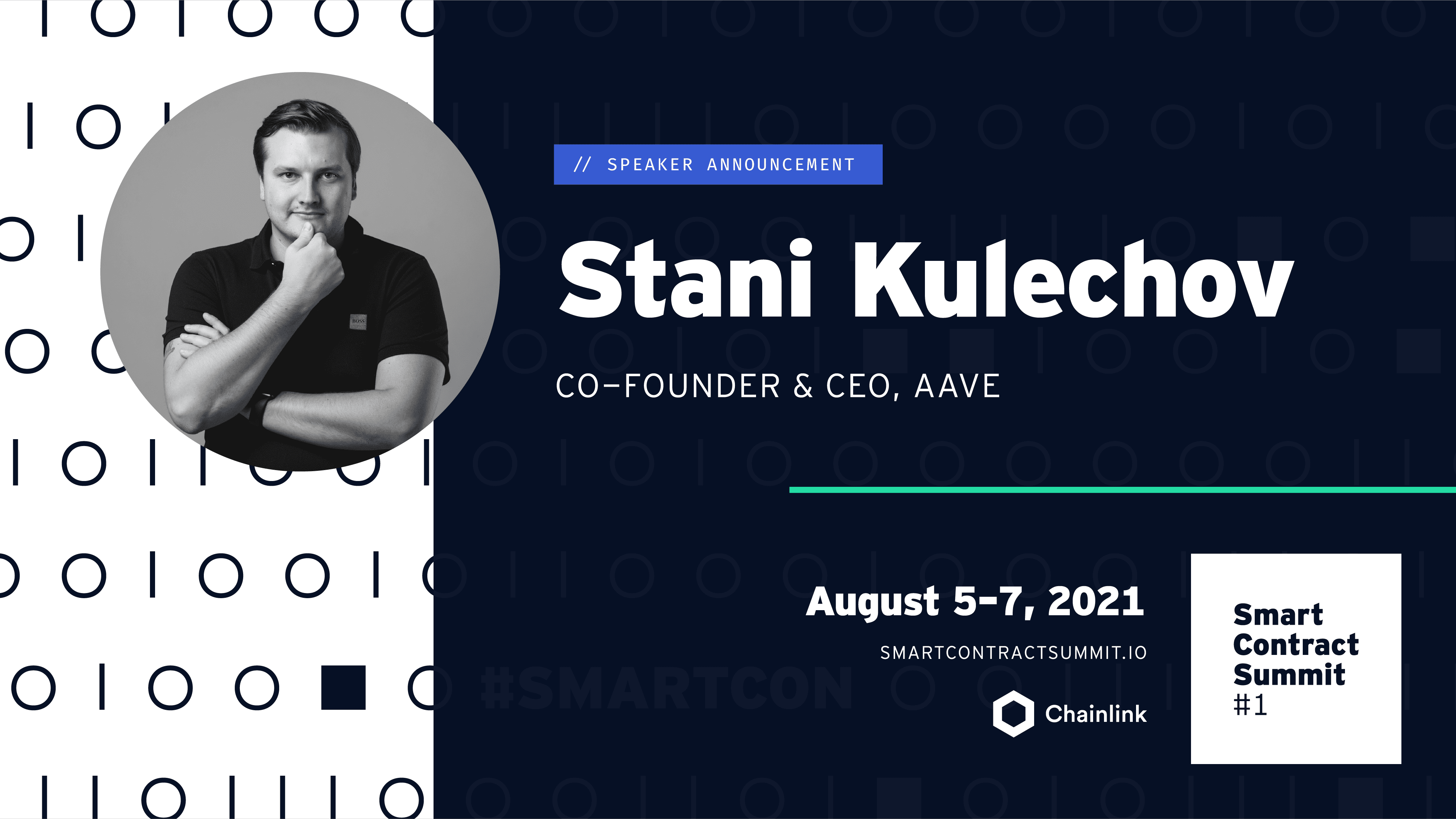
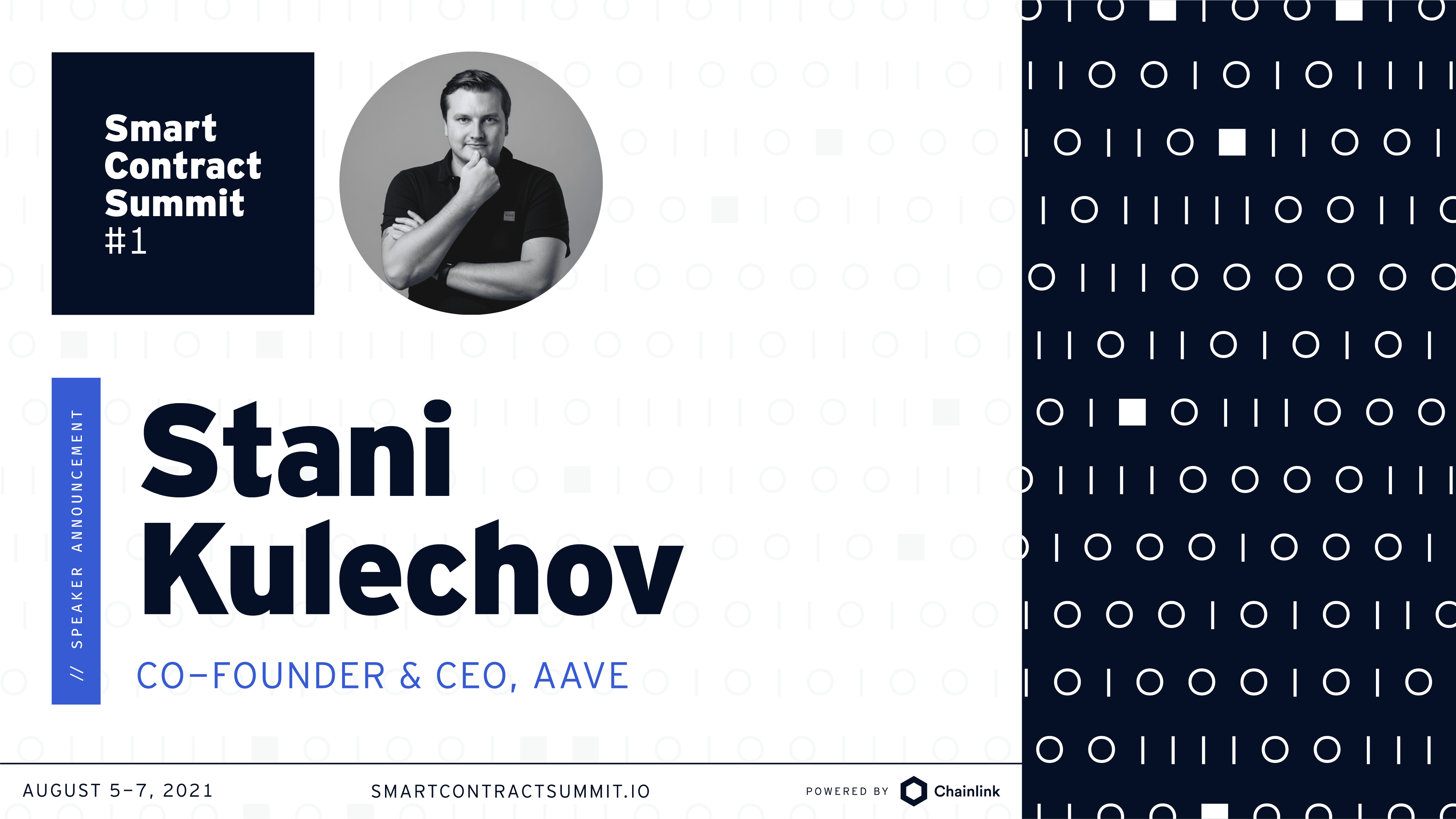
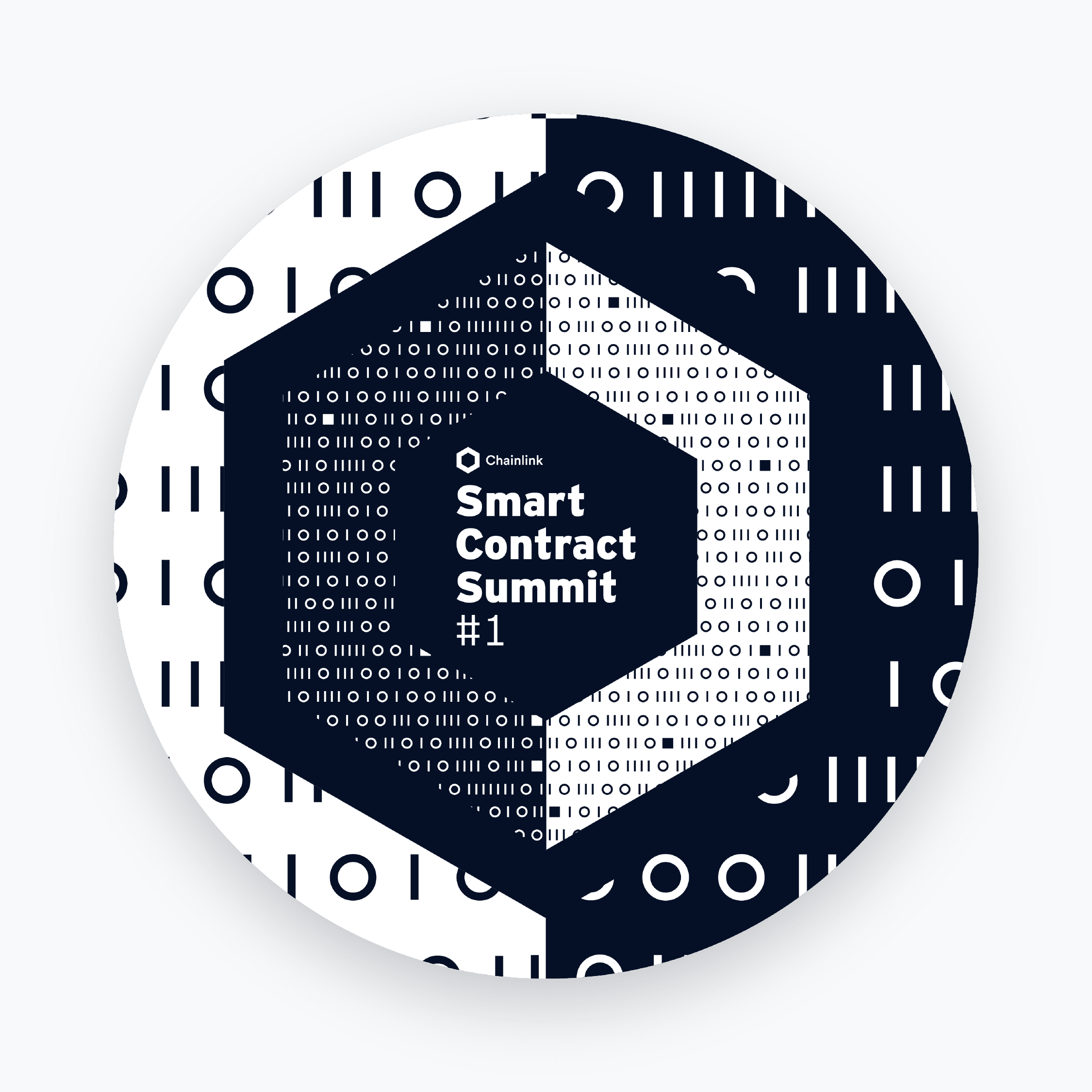
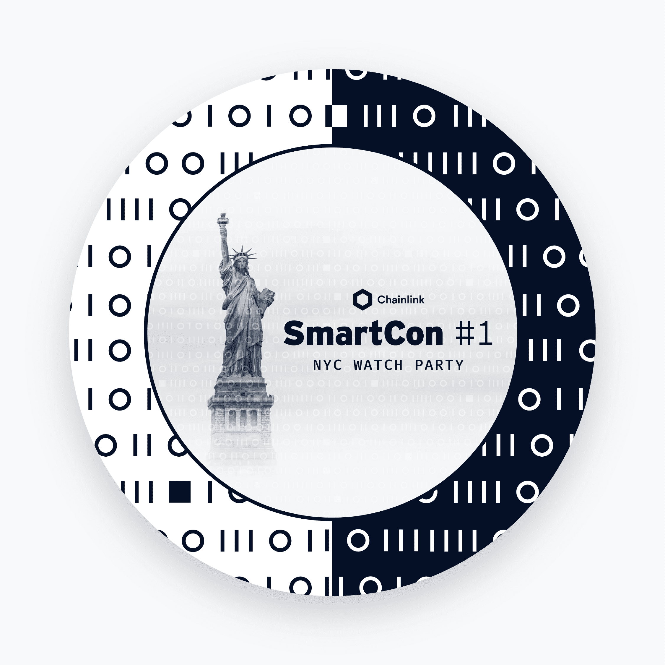
The highly contrasting style of the art direction extended to static collateral, including banners, POAPs, and featured images. Utilizing versatile two-grid layouts with adjustable widths, our team achieved flexibility in organizing content tailored to specific use cases.

SmartCon 2021, announcement bannerSmartCon 2021, generic bannerSmartCon 2021, speaker cardSmartCon 2021, speaker card with alternate layoutSmartCon 2021, general poapSmartCon 2021, watch party poap
SmartCon 2021 | Collection of digital banners and POAPs

In targeted scenarios, we leveraged the individual components of the overarching art direction, either dark or light, enabling the visual language to optimize the output based on the distinct audience segments and content type.

To complement the marketing materials, the team devoted considerable effort to developing a comprehensive media package for the livestream experience, recognizing the critical role it played in a virtual conference setting. The focus on delivering high-quality livestream assets added substantial value to the overall experience, ensuring seamless and engaging touchpoints with attendees throughout the event. 

SmartCon 2021 | Opener & Closing animation

The livestream media pack included dynamic openers that would set the tone for each of the days, unique closing loops, sponsor-highlighting branded intermissions to showcase and acknowledge key partners, seamless transitions, and multi-layout speaker frames that accommodated various presentation styles and panel configurations. 

SmartCon 2021 | Transitions

The event was a resounding success, drawing a global audience of over 15,000 attendees from more than 140 countries. Participants gained invaluable insights from 200+ industry-leading founders, researchers, and developers exploring groundbreaking innovations and collaborations in the blockchain ecosystem.

By prioritizing the livestream experience, our team successfully created a cohesive and immersive virtual environment, leaving a lasting impression on the attendees and setting a benchmark for future editions of SmartCon.

SmartCon 2022

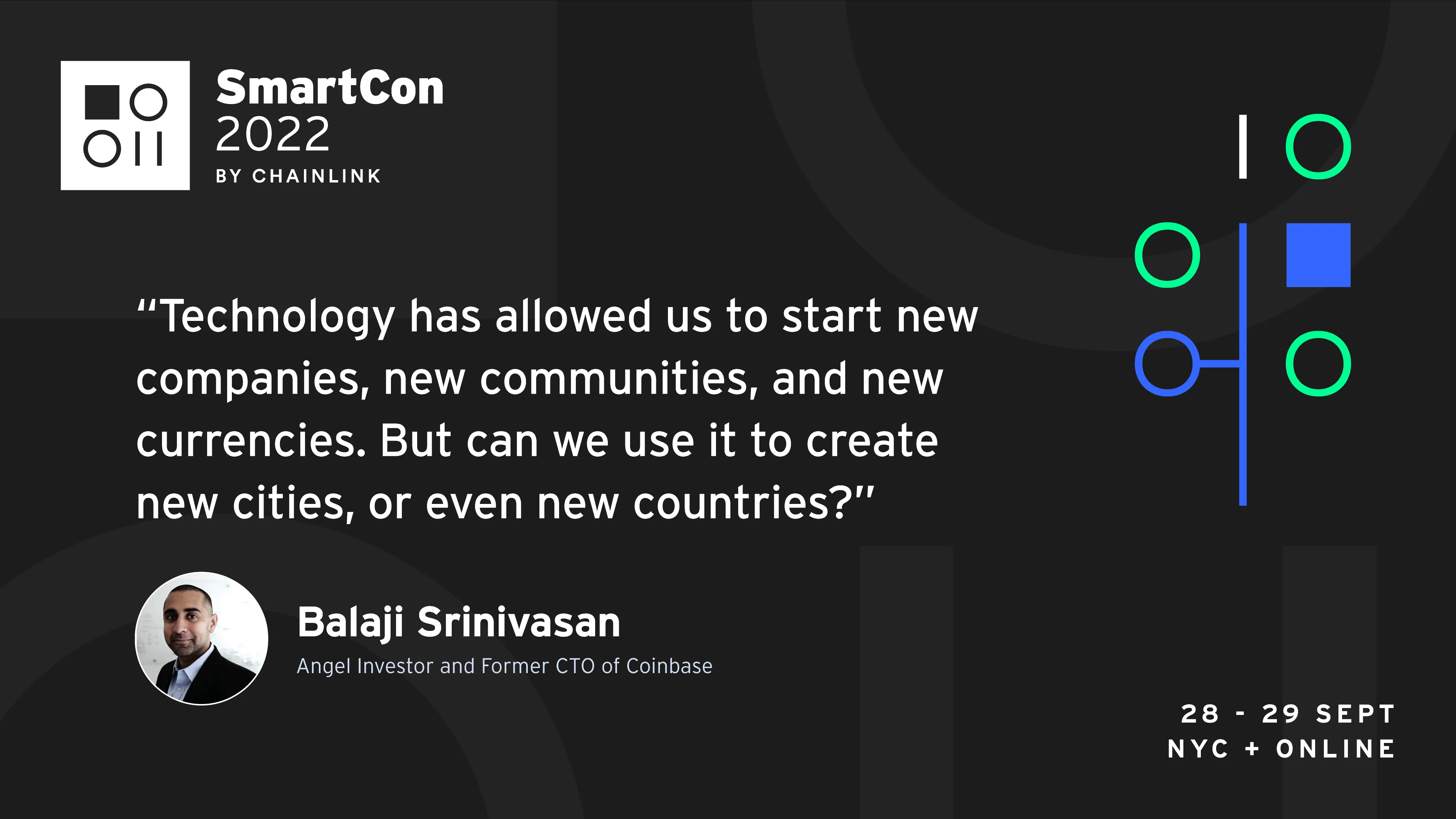
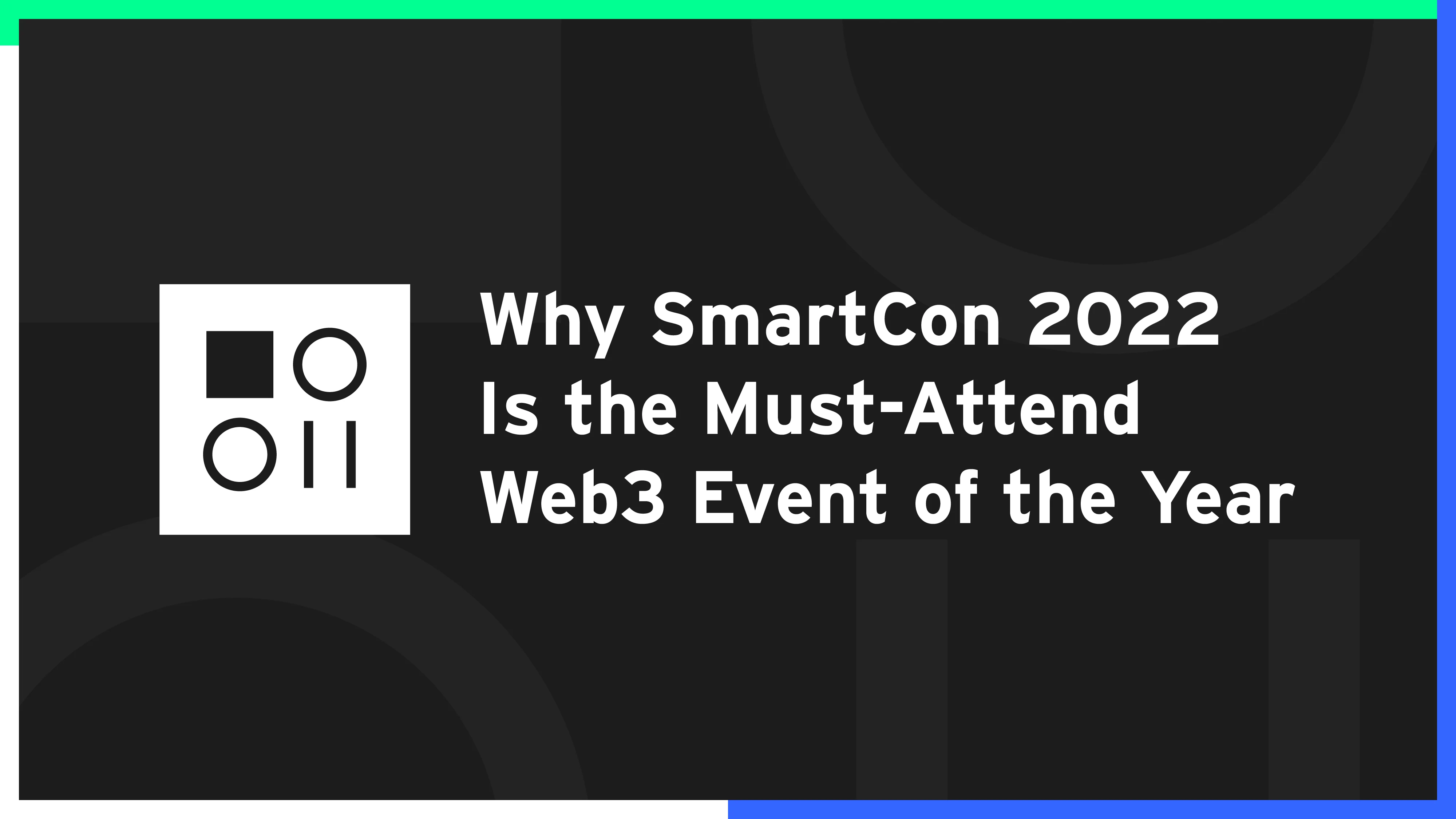
SmartCon 2022 took place at the end of September in New York City. The location played a crucial role in shaping the art direction for this edition and heavily inspired the “connection” concept that the team pursued throughout the creative explorations, and that greatly influenced the whole brand, primarily through its pattern and illustration style. The vibrant and dynamic color scheme was chosen to represent the energy of New York while maintaining the digital essence of the event. The theme for SmartCon 2022 was mainly designed in dark mode, serving as a reference to the city's lively nightlife and a deliberate decision to add elegance to both physical and virtual experiences.

Pattern

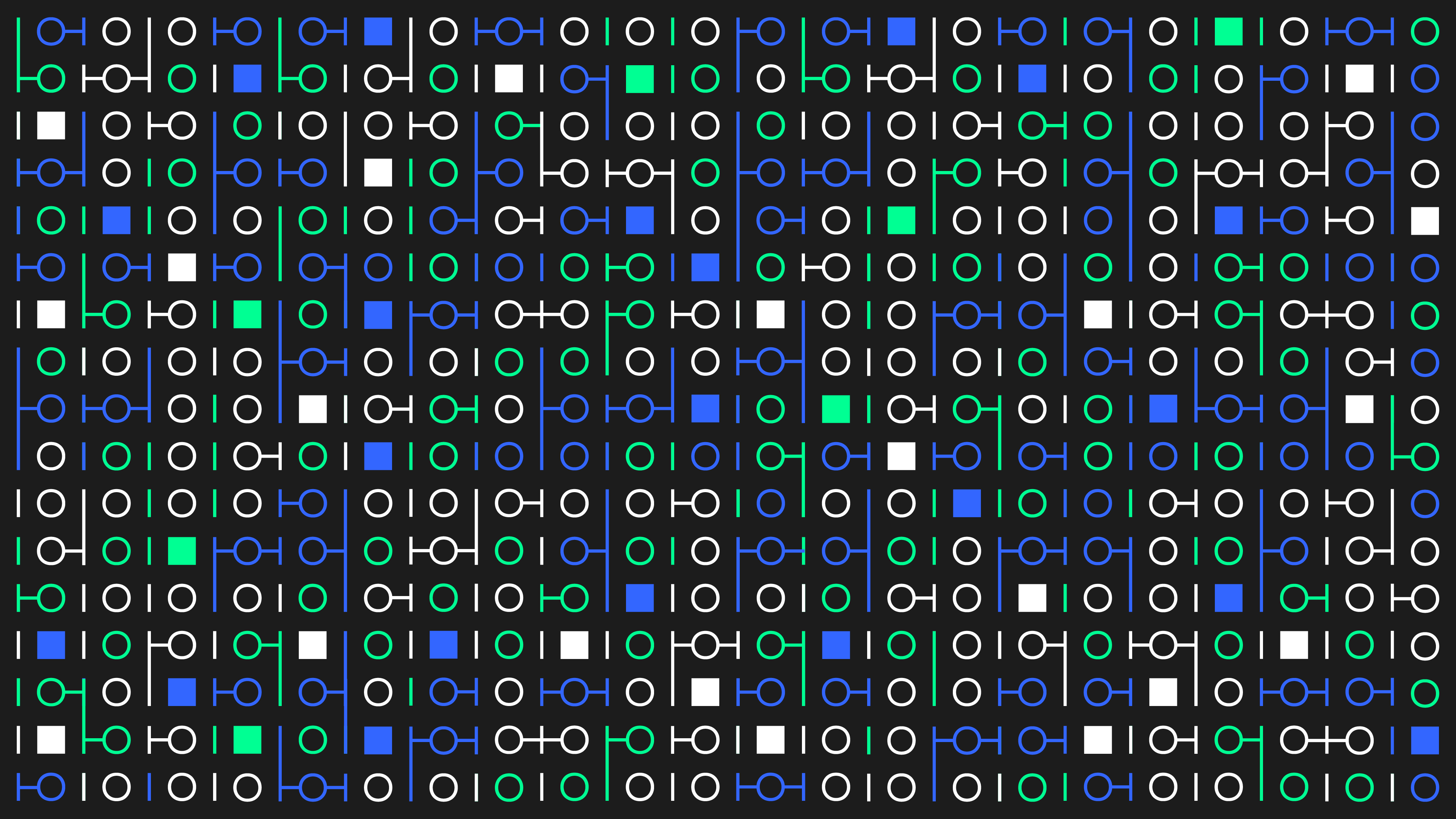
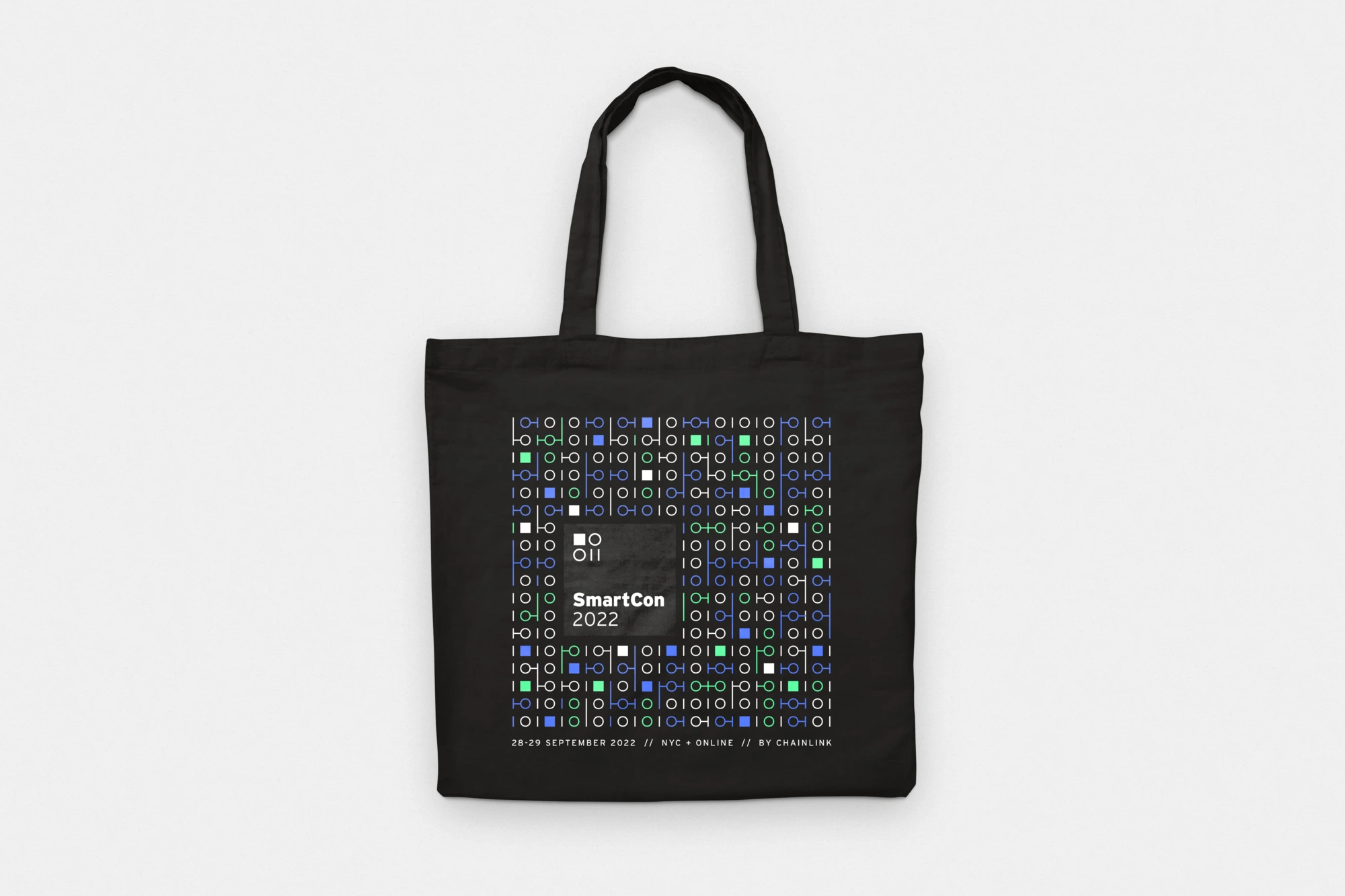
A key component of the SmartCon 2022 brand was its pattern. In line with the primary principles of the overarching SmartCon brand, binary code remained a static element. However, for this edition, the binary code was creatively altered by extending certain elements to establish connections between them.

This resource allowed us to strengthen our key concept to highlight the nature of the conference, as well as create a visual analogy of New York City's complex subway network, which added a subtle touch of local flavor to the brand.

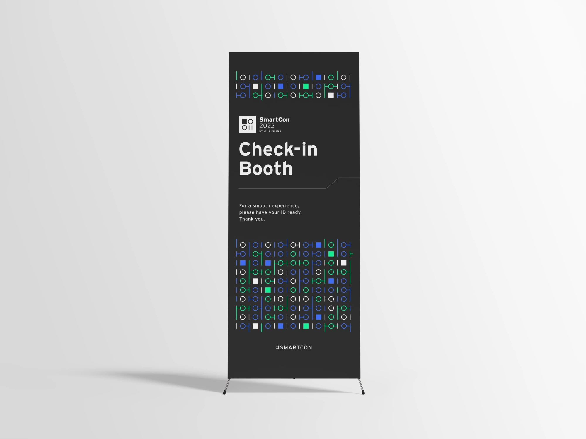
The pattern served as a fundamental component of the brand, consistently implemented across both digital and physical applications for a cohesive visual identity.

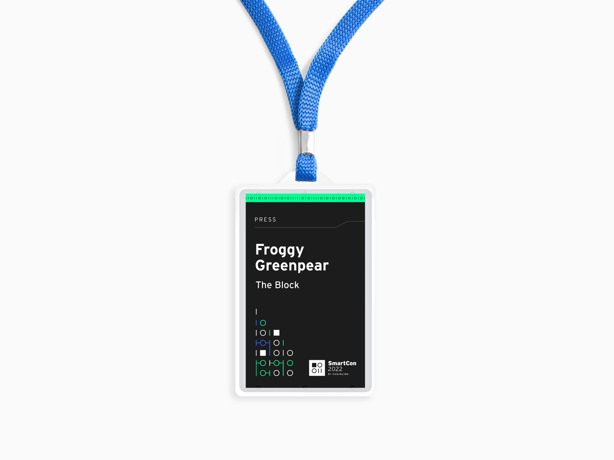
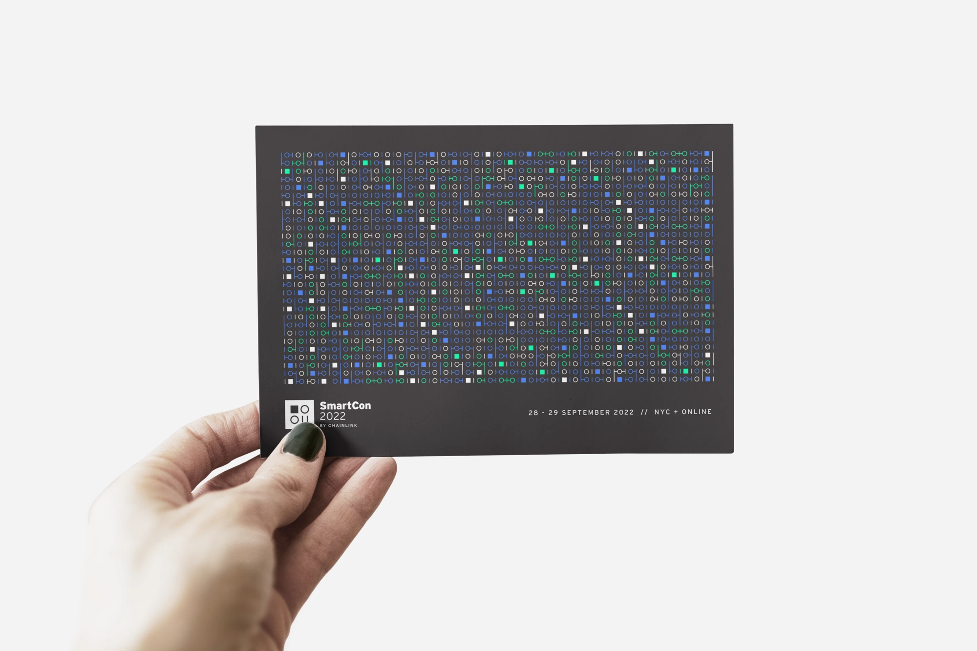
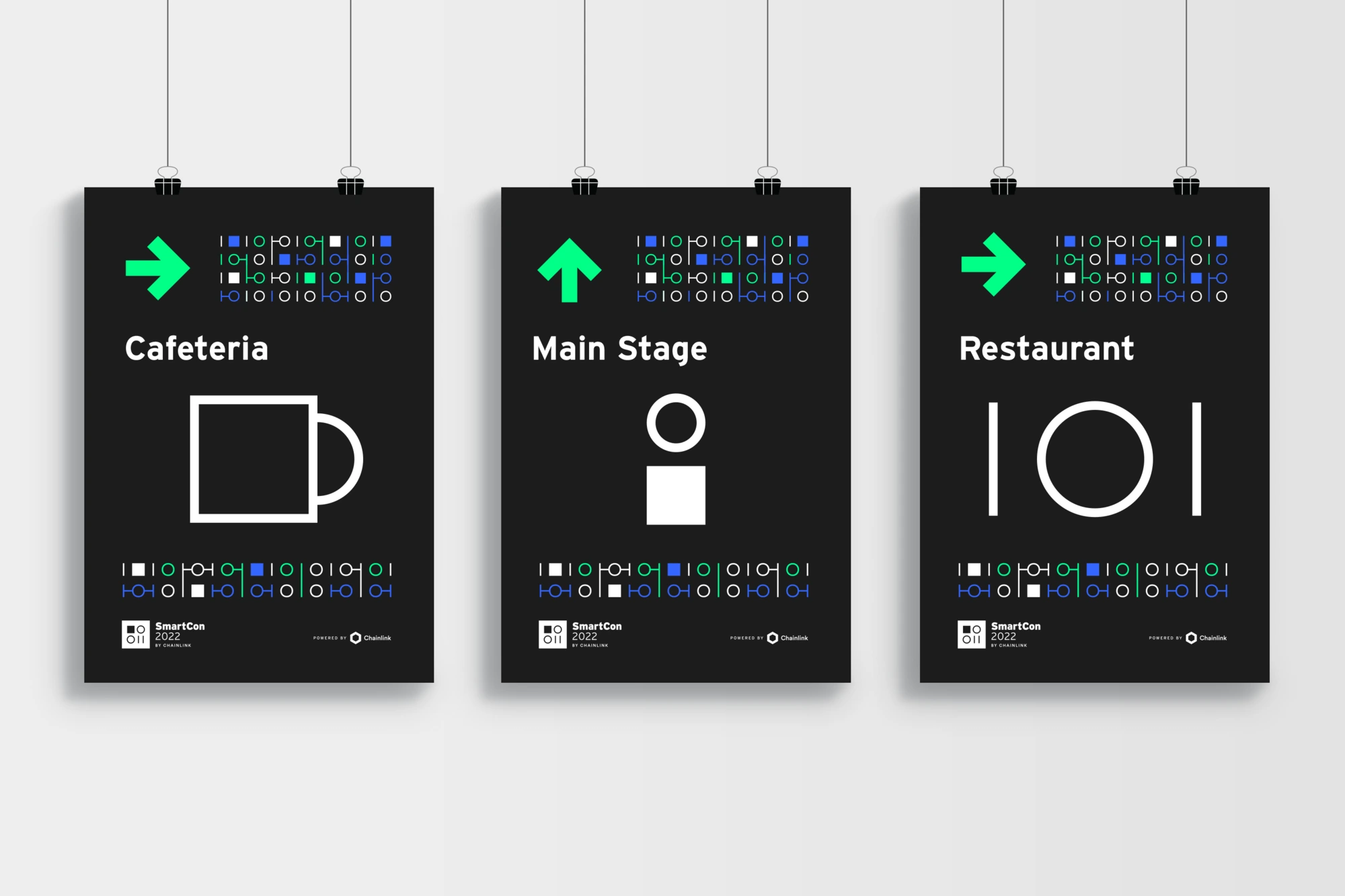
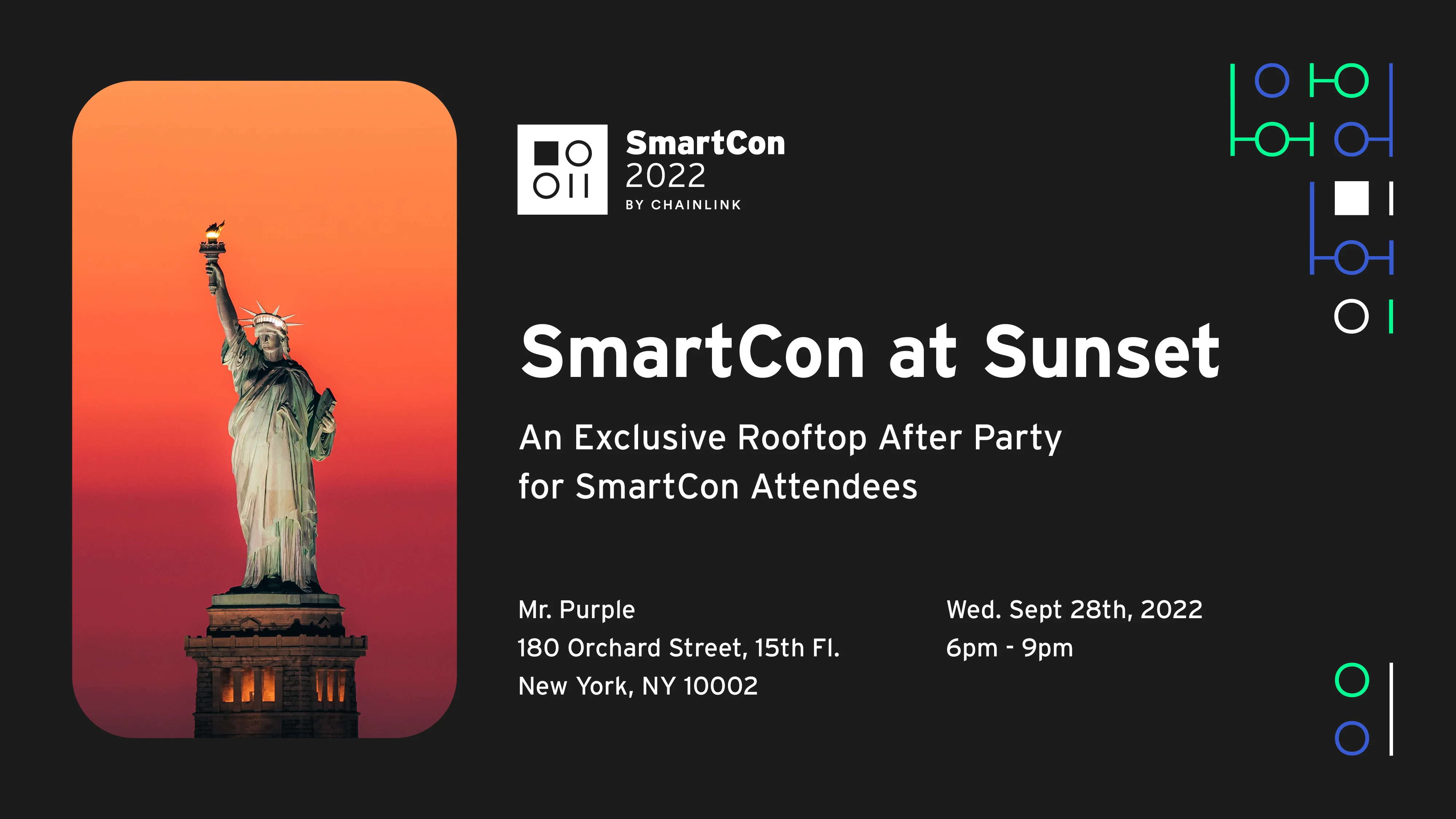
SmartCon 2022 | Various applications using the pattern

Illustration style

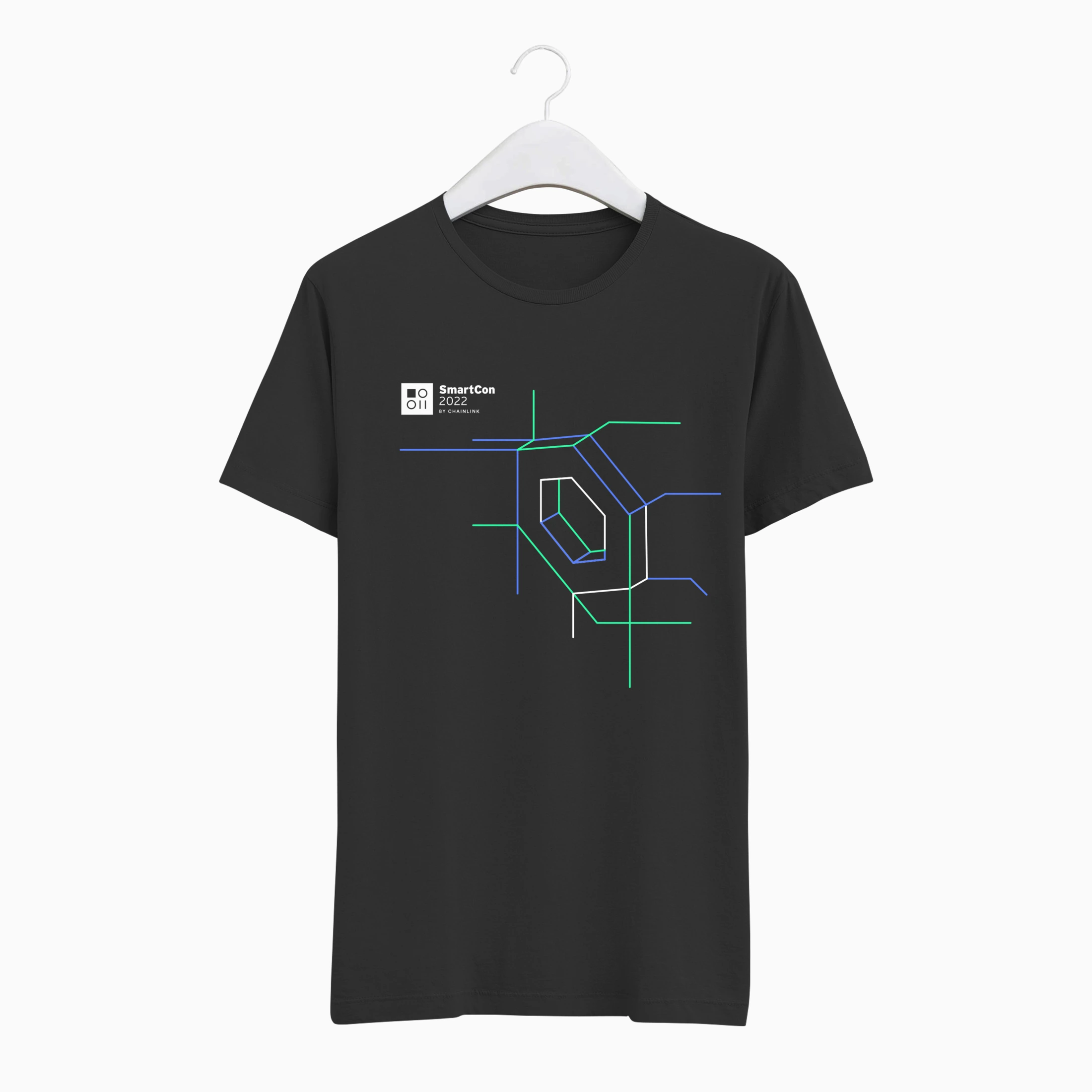
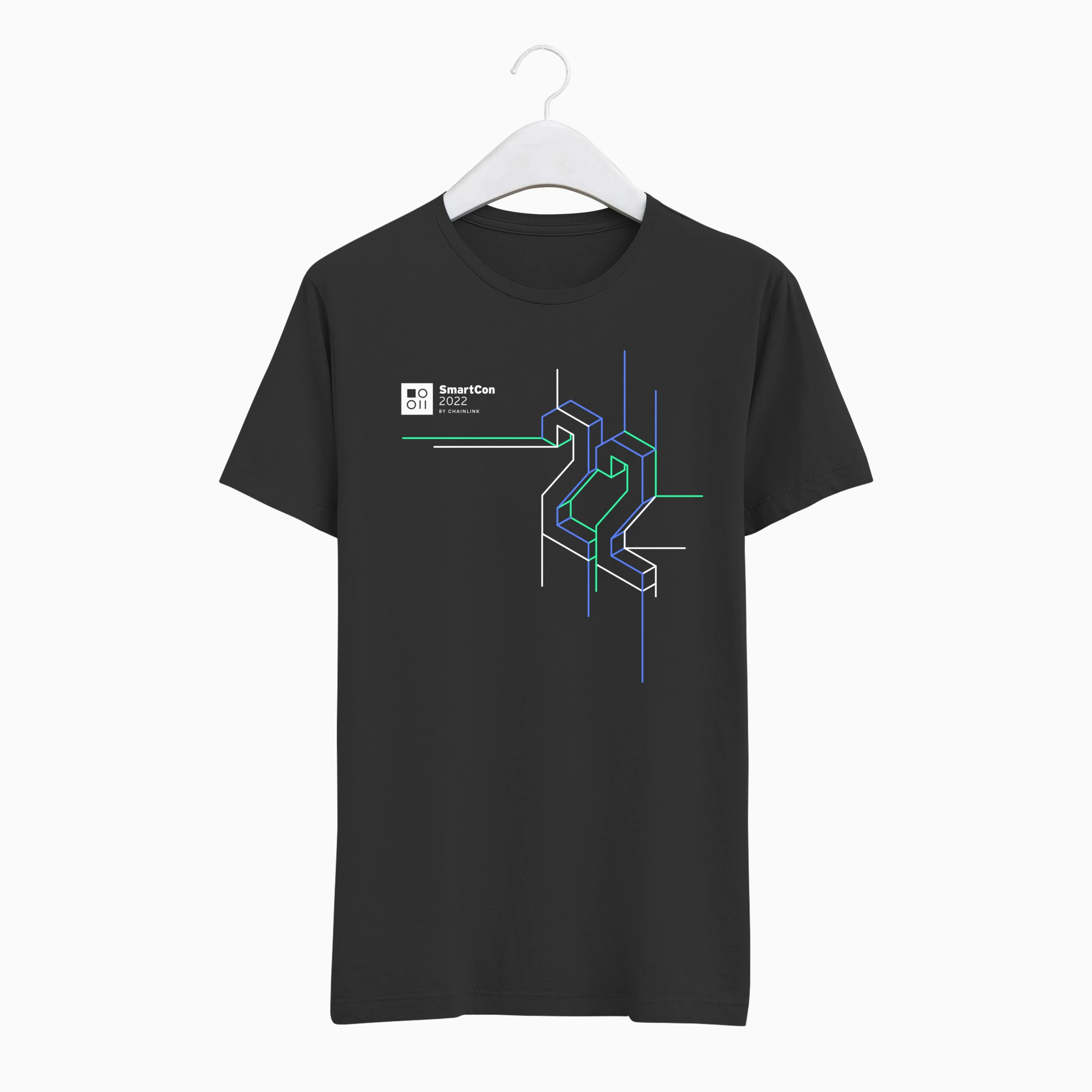
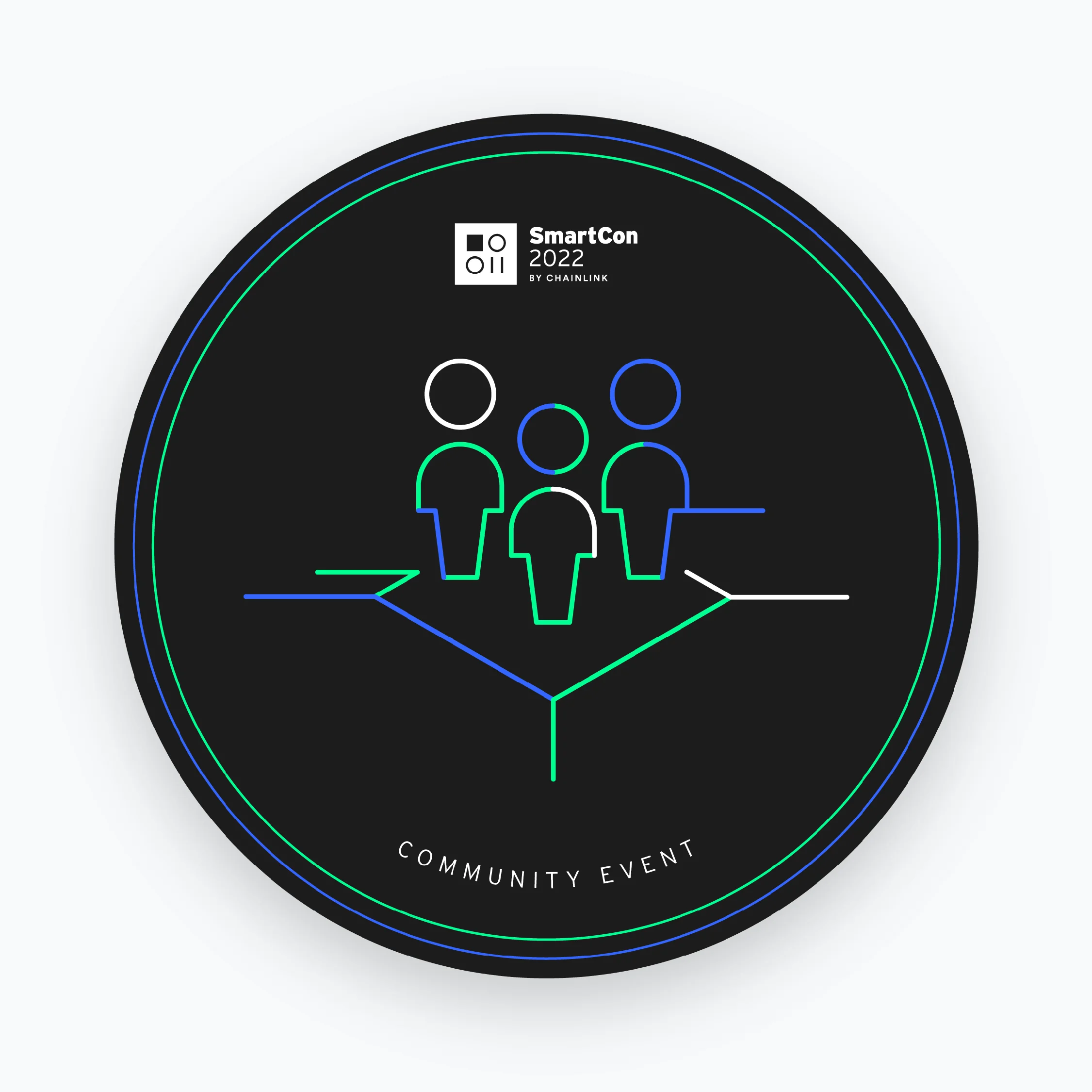
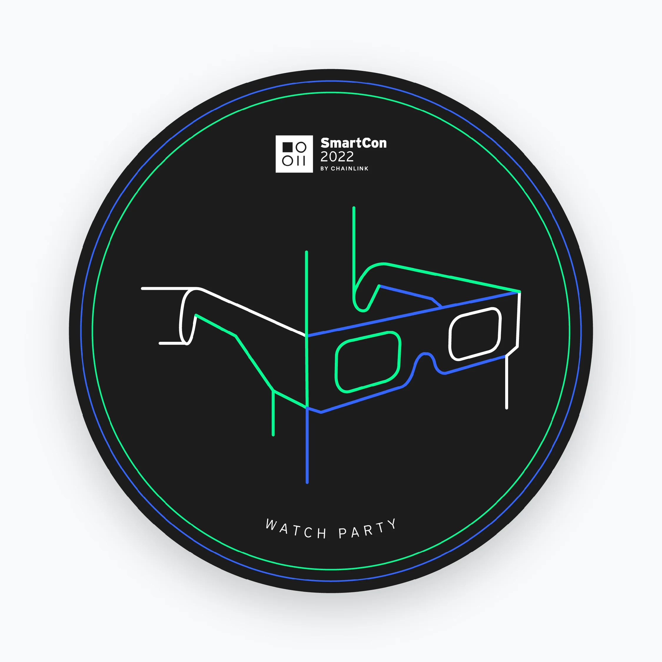
Illustration was a crucial component in conveying the overall art direction for the brand. The illustrated symbols, elements, or characters were creatively designed using overlapping multicolored lines. These lines not only captured the local essence of the conference through references to the NYC subway system but also alluded to computer chips and circuit boards, effectively connecting with the conference's core theme. 

The illustrations were employed across various digital and physical applications, including signage, stationery, swag, web assets, POAPs, and animations, amongst others.

SmartCon 2022 | Various applications using illustrations

Digital collateral

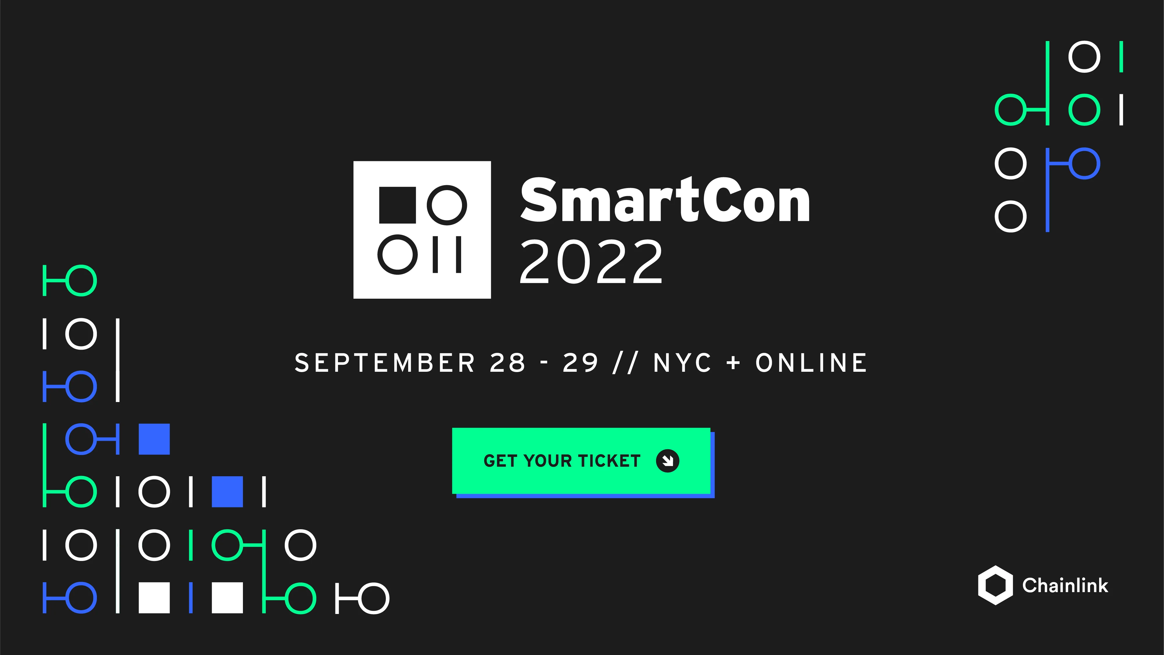
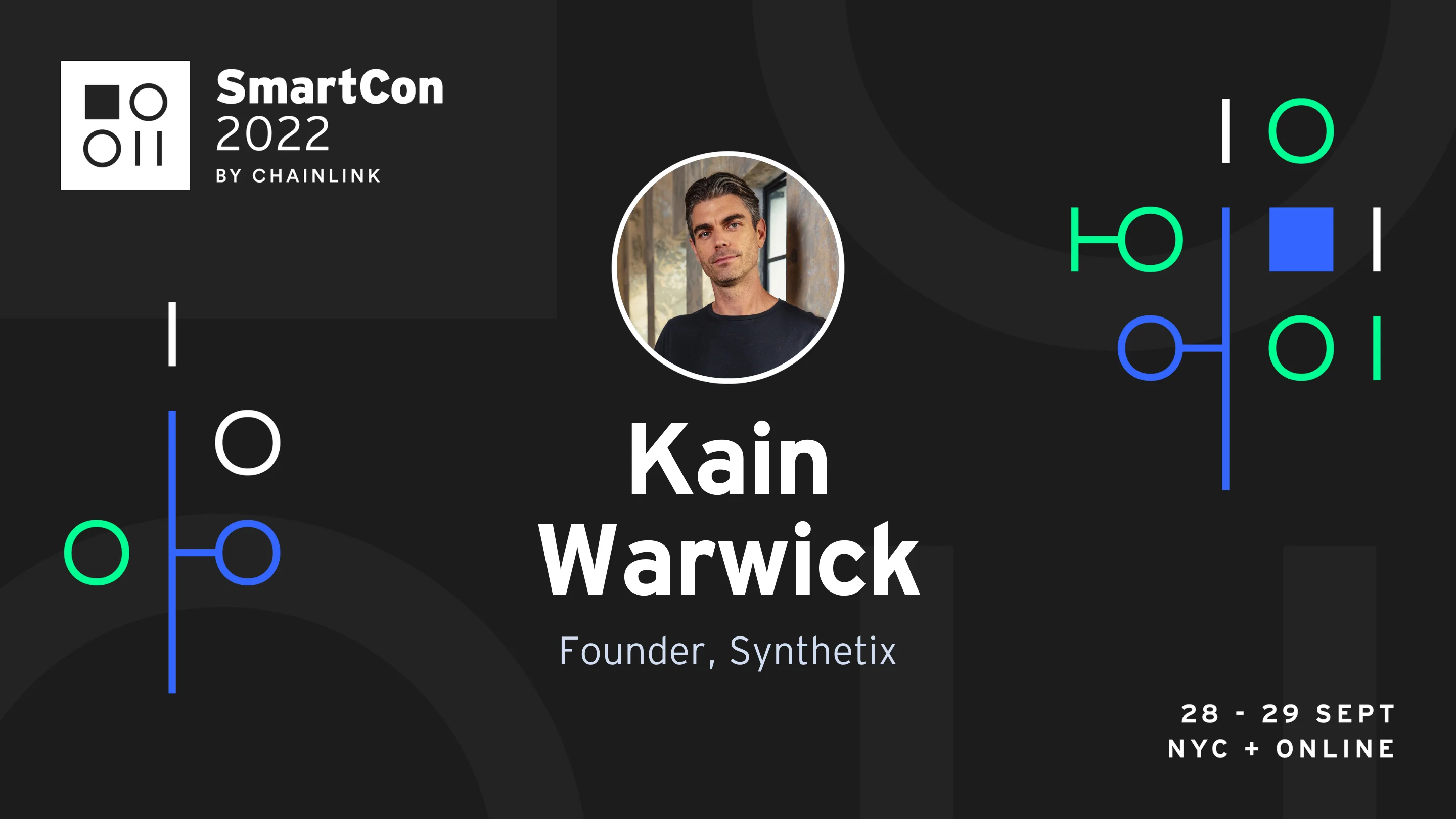
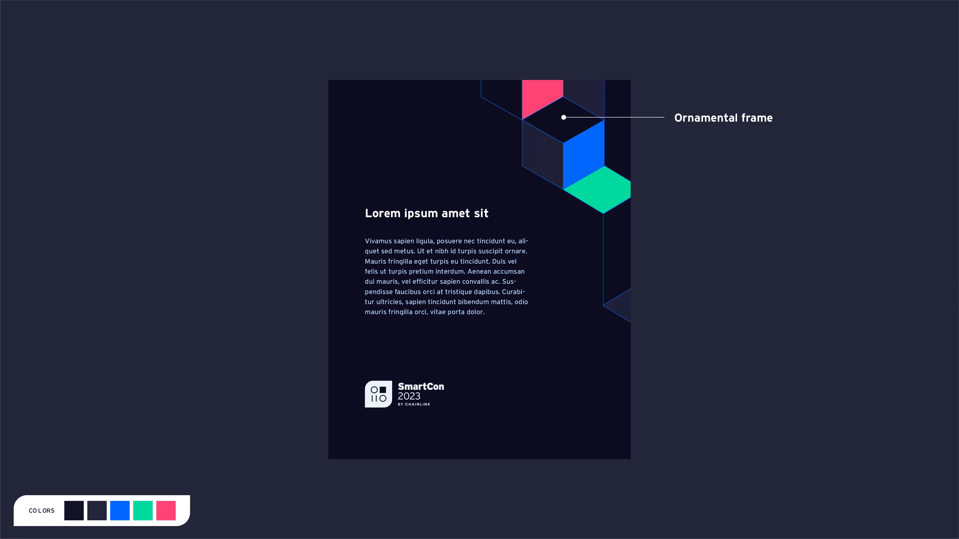
For digital collateral, we adapted some of the core elements of the brand to create an optimized sub-system for this particular application. Firstly, the pattern was segmented into smaller, irregular sections, helping the team balance compositions and guide the viewer's attention towards essential information. In addition, to prevent visual fatigue and enhance bold communication pieces, we introduced a multi-colored frame that replaced the pattern for key event communication pieces. Furthermore, the pattern was also adapted to be used as a large-scale, low-contrast background texture, which added depth to flat backgrounds.

This expansion of the brand elements enabled us to maintain variety while staying true to the brand and optimizing resources for specific outputs.

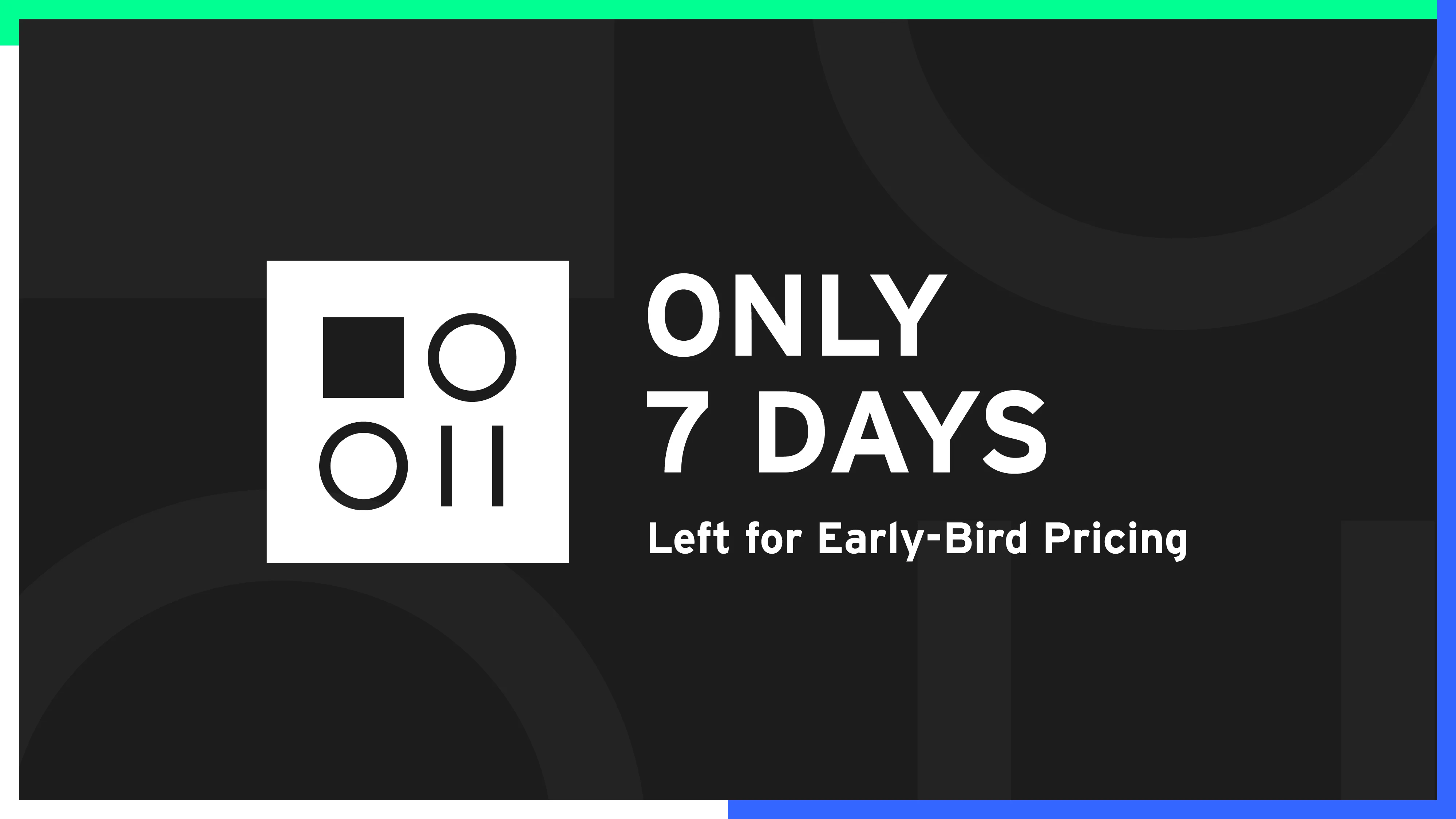
With these guiding principles, the team created a diverse range of banners and featured images, including speaker, sponsor, and quote cards, announcement and countdown banners, event promotions, thumbnails, blog post covers, and more.

SmartCon 2022, generic branded bannerSmartCon 2022,speaker cardSmartCon 2022, quote cardSmartCon 2022, blog post bannerSmartCon 2022, event cardSmartCon 2022, countdown banner
SmartCon 2022 | Various banners

Motion graphics

The SmartCon 2022 motion design style, which was mainly used with promotional and editorial objectives, featured a rhythmic, lively style with seamless transitions. The pattern, visual elements, and typography served as key visuals and core graphics.

Animations evolved the pattern by connecting lines and squares while preserving the original structure of sequential zeros and ones. Basic transformation properties, such as opacity, rotation, position, and scale, facilitated smooth transitions for individual elements. Typography and copy were designed to be bold and highly contrasted for easy comprehension in a dynamic setting. The selected soundtracks were modern, percussive, and energetic, emphasizing action, fashion, and abstraction over a subdued corporate tone.

SmartCon 2020 loop

Website

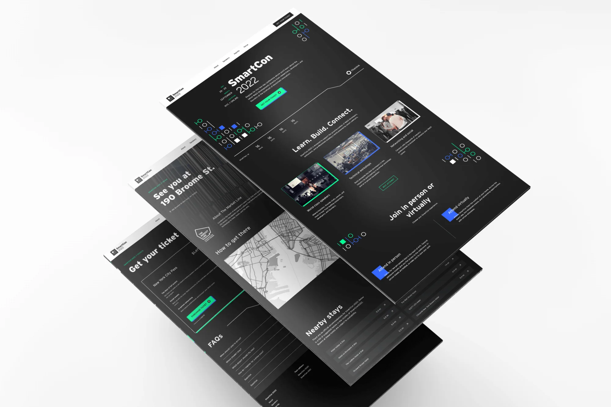
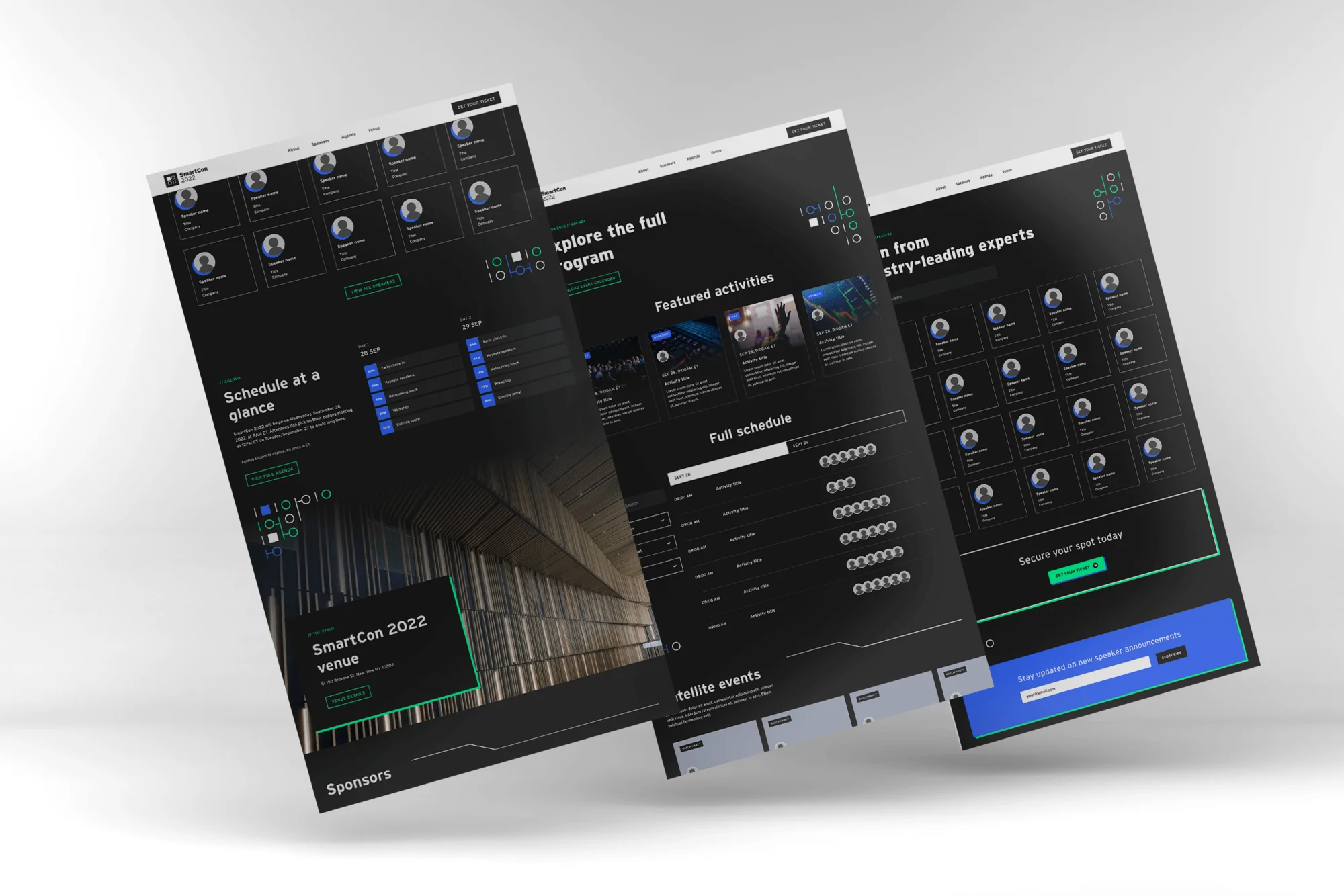
The website served as the central hub for conference information, prominently displaying all brand elements and design principles from the overarching system. Utilizing a 6-column grid, the pages featured unique and irregular layouts, with prominent imagery and bold typography. Open graphs and iconography incorporated the illustration style, while hero elements and background accents showcased the subdivided pattern. To draw attention to essential components, opaque drop shadows were applied, effectively spotlighting these elements.

The website was developed using Webflow, with the dynamic content database being managed directly through Airtable. This was seamlessly integrated with various Collections via Zapier, creating an efficient and streamlined content management system. These automations were meticulously documented, allowing the owning teams to have complete autonomy over content management and updates, ensuring they could operate at their preferred pace.

Result

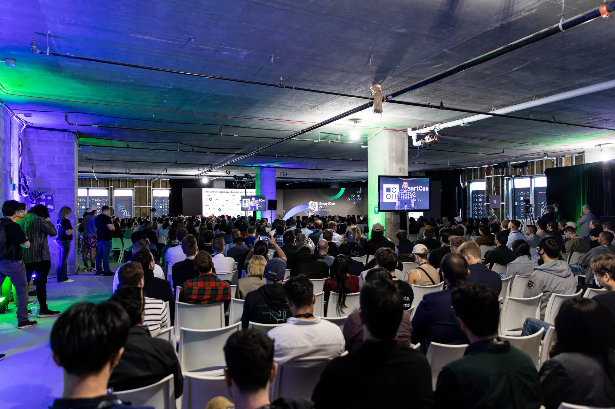
The conference featured an extensive program with over 150 speakers and 100 presentations, attracting more than 1,600 in-person attendees and an impressive 20,000+ virtual participants. The seamless integration of digital and physical experiences showcased the power of well-executed event branding, resulting in a memorable and impactful gathering for all involved.
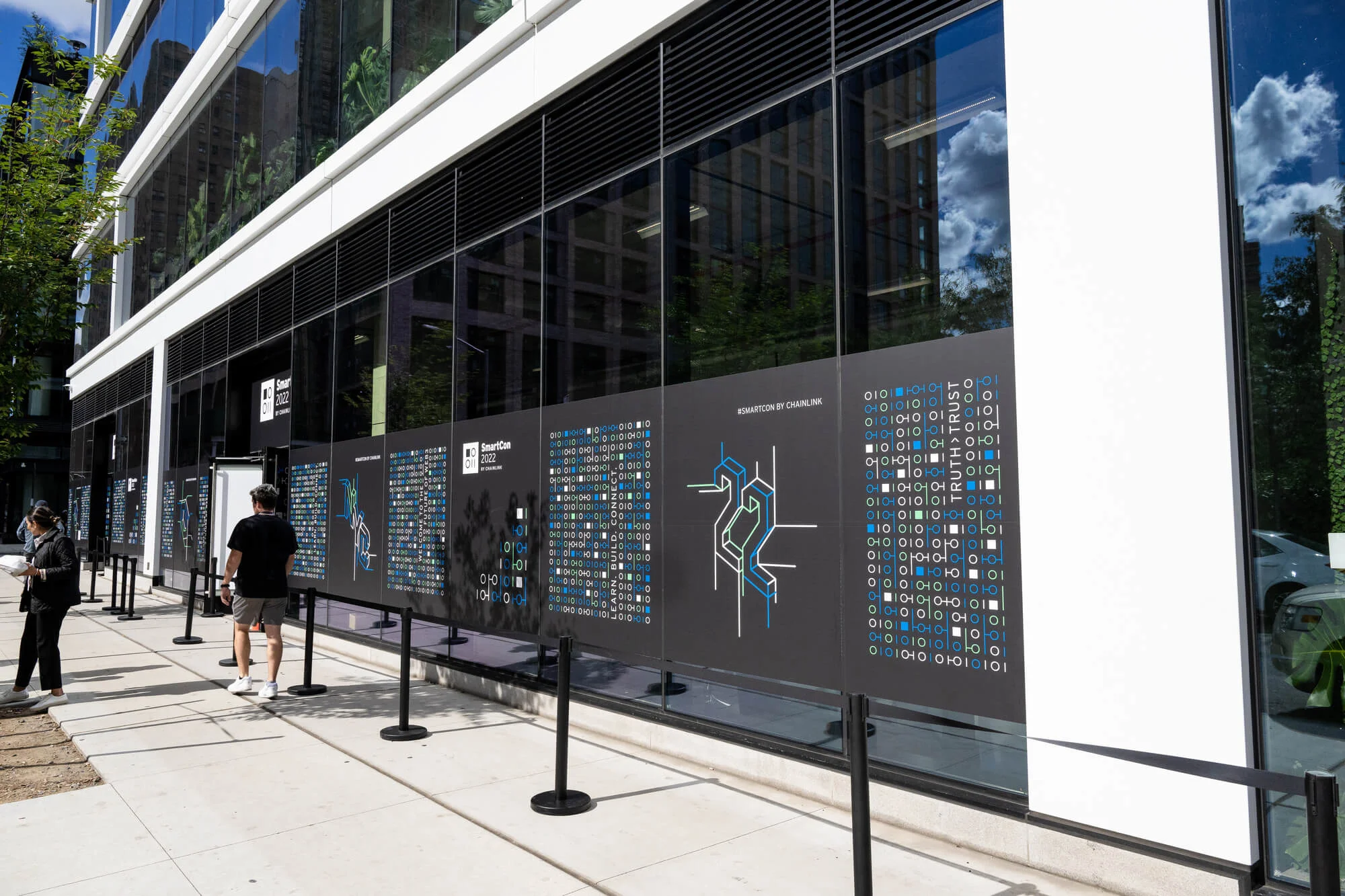
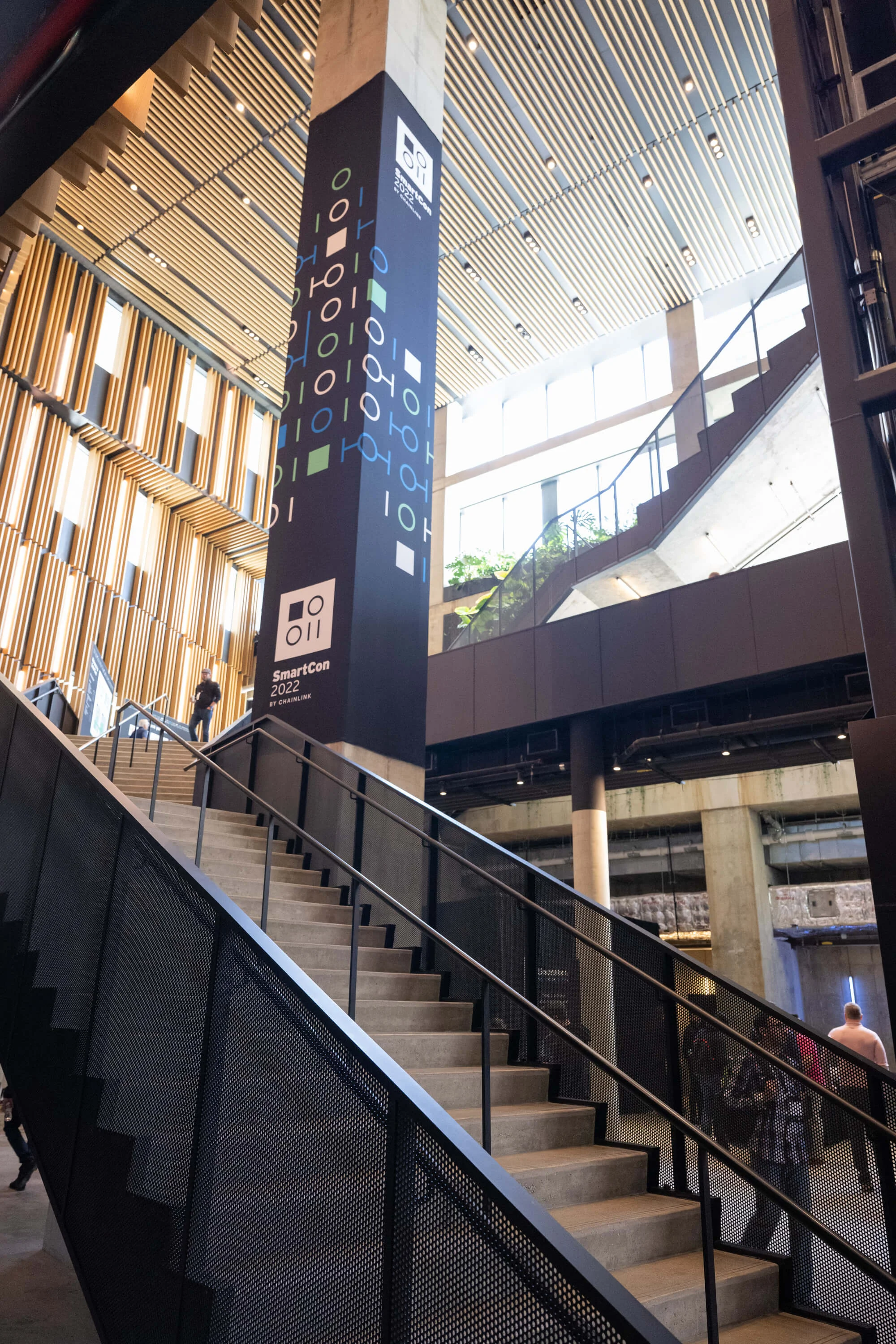
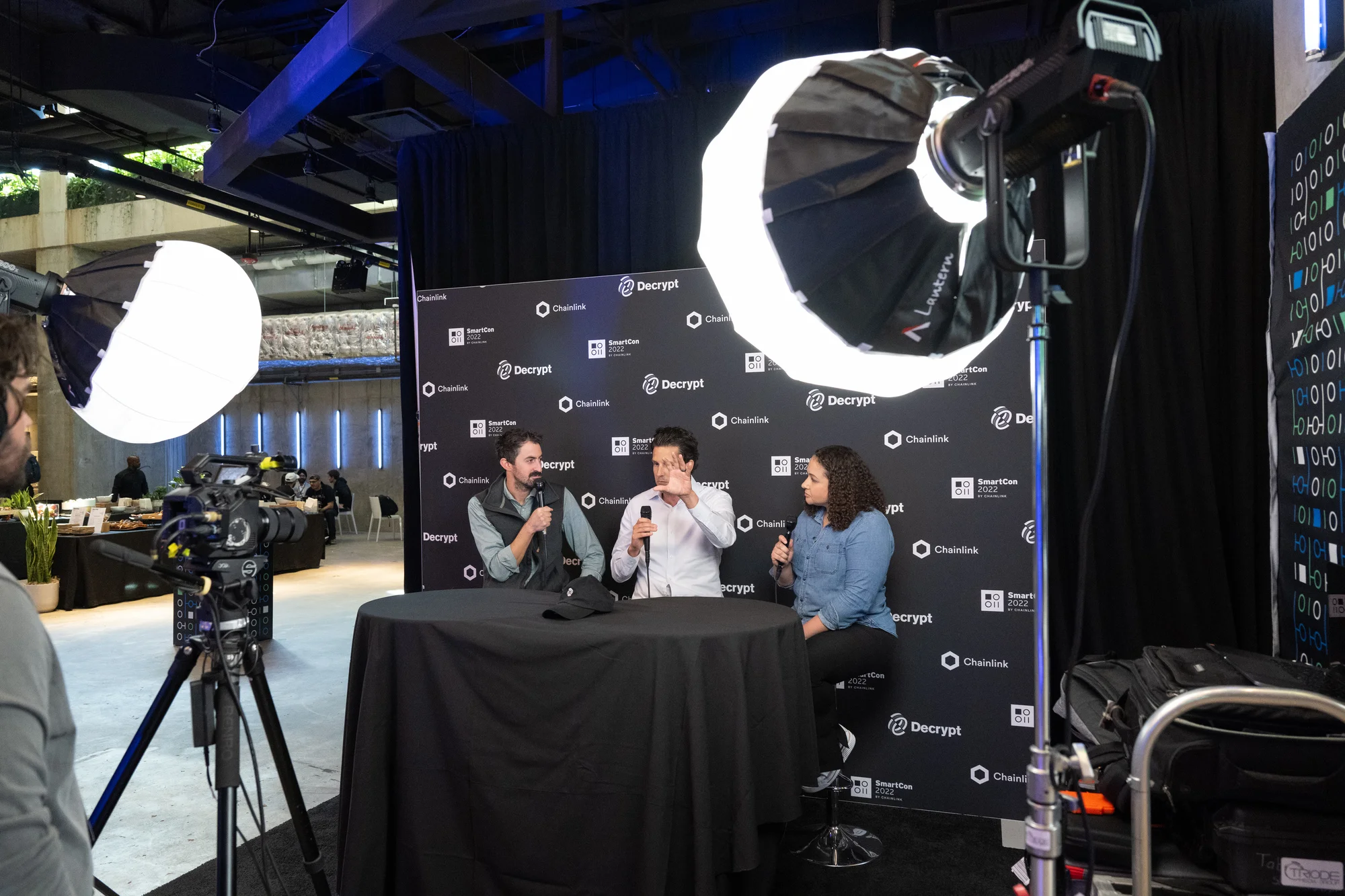
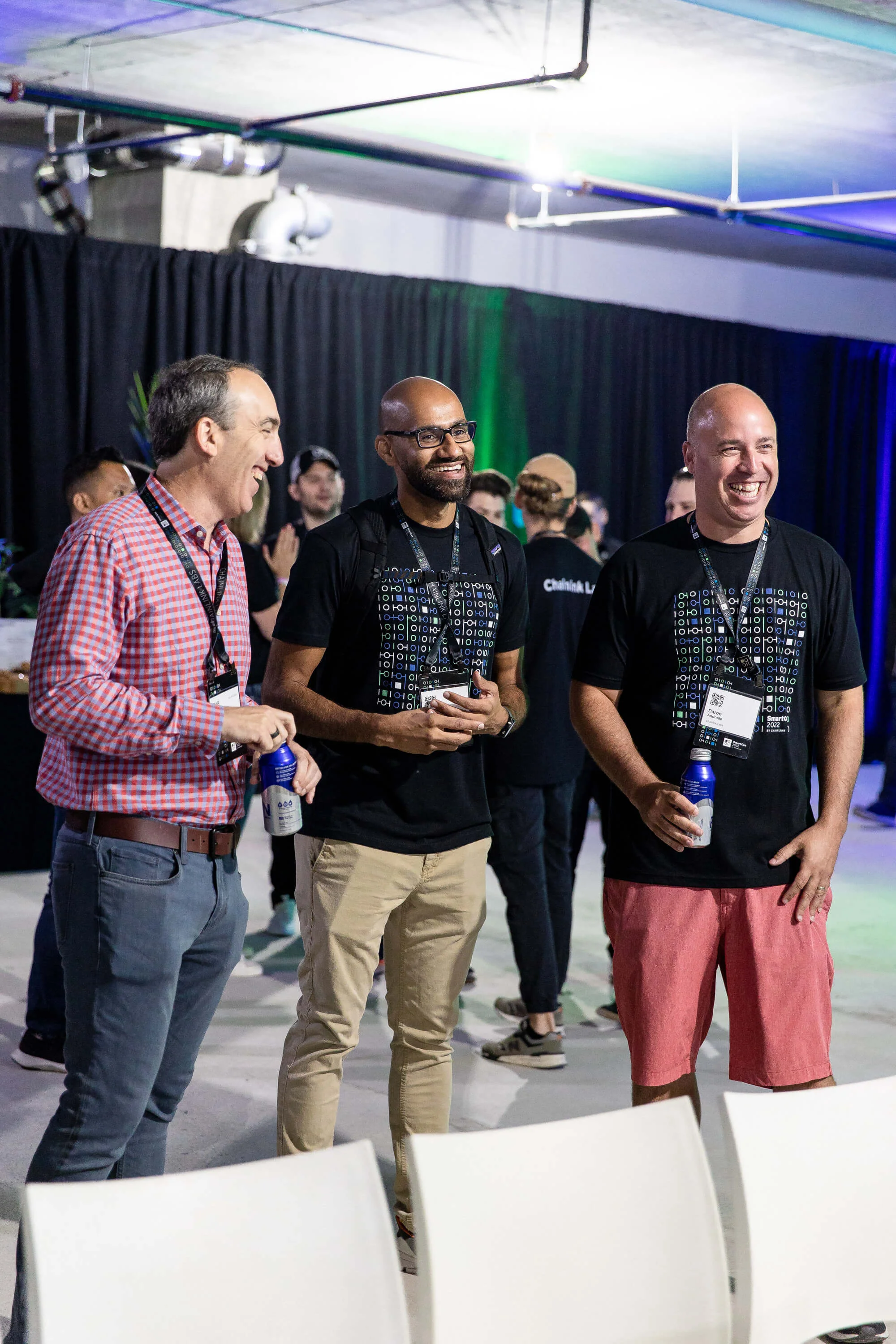
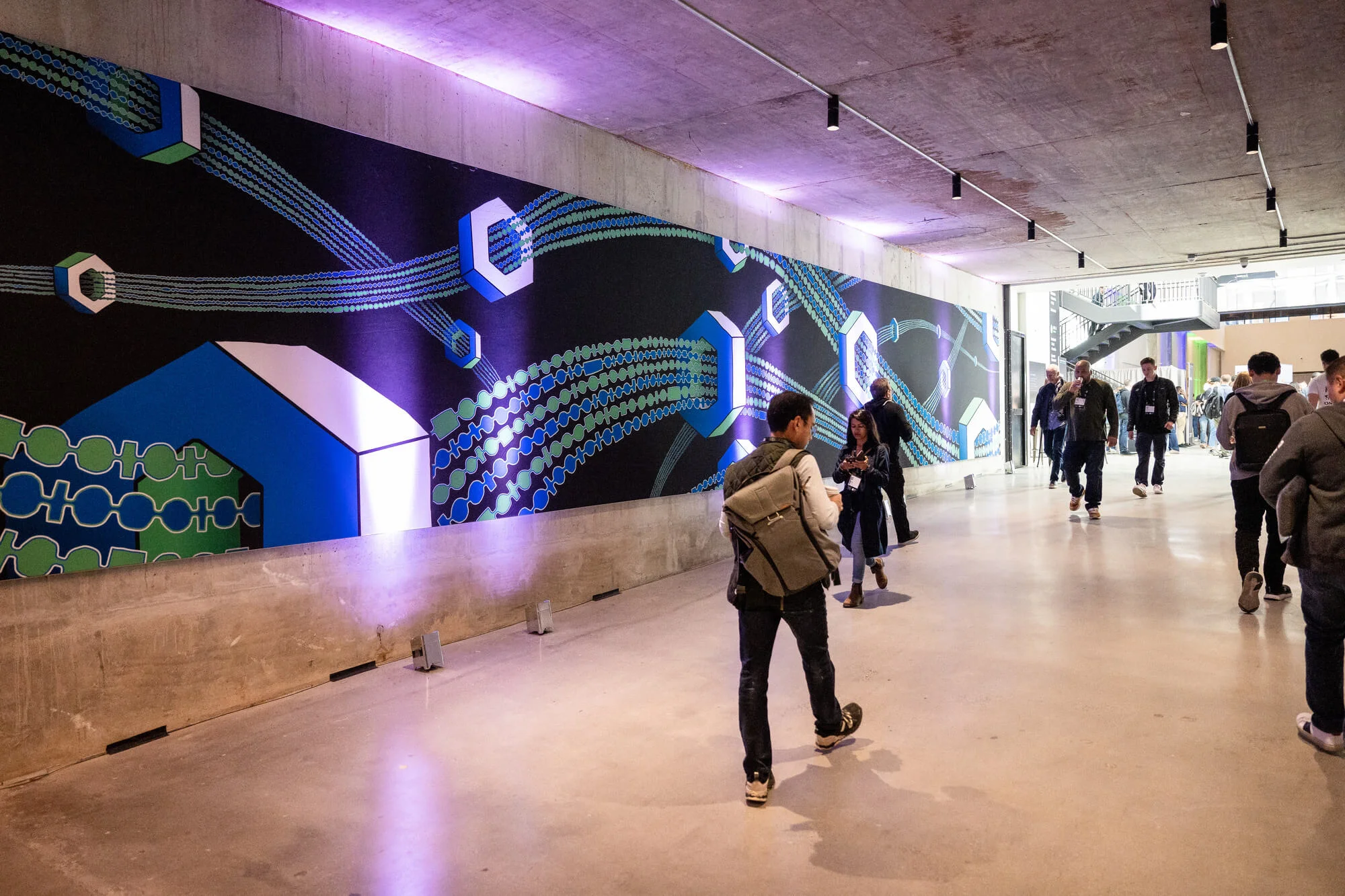
SmartCon 2022, photo of the signage in the entrance of the venueSmartCon 2022, photo of the main stairs with branded signageSmartCon 2022, photo of the decrypt boothSmartCon 2022, photo of crew with branded t-shirtsSmartCon 2022, photo of the main hallway with branded art in the wallSmartCon 2022, photo of an audience in the main stage

SmartCon 2023

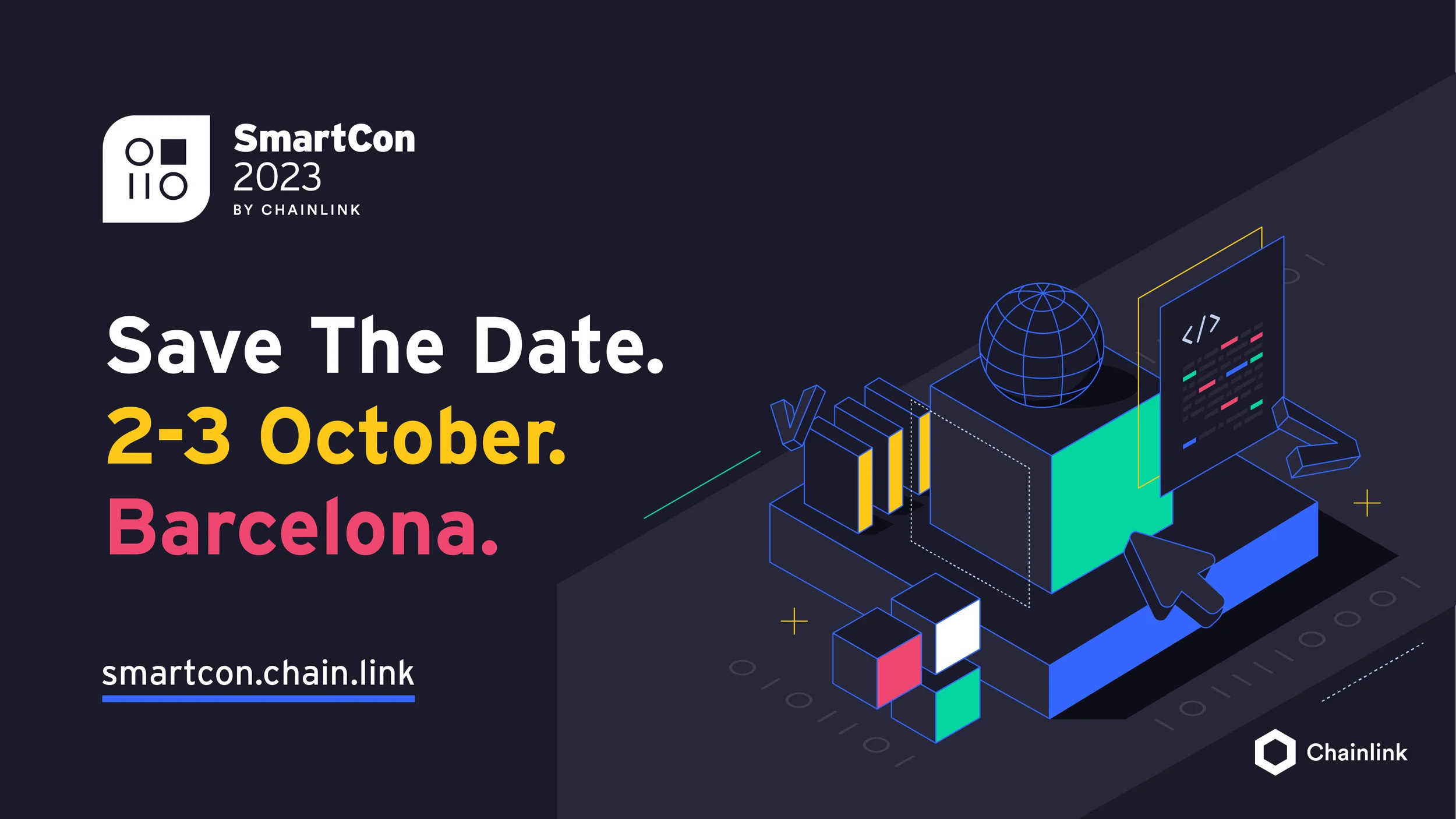
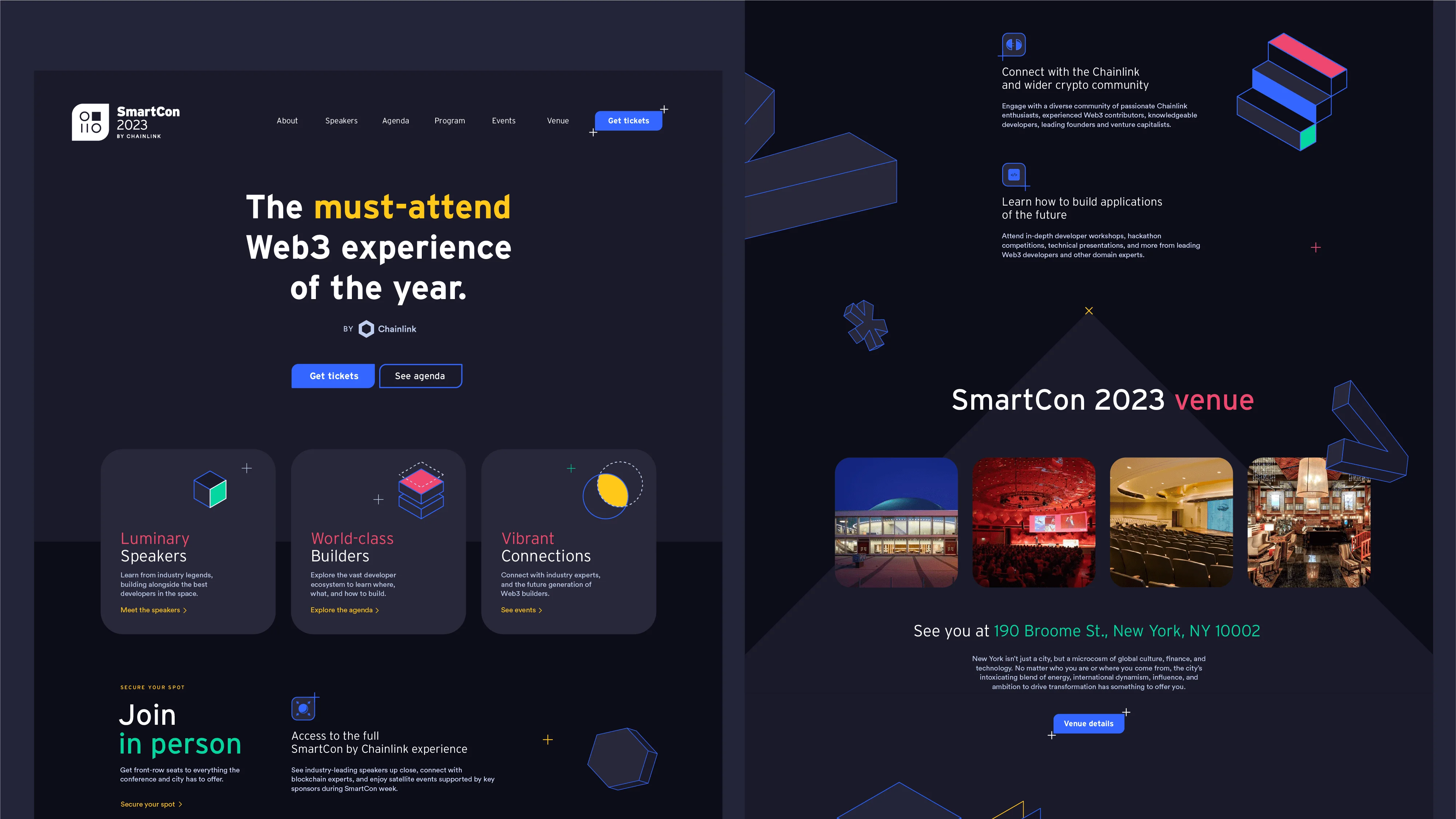
SmartCon 2023 is an event set to take place in Barcelona during October 2023. The visual style for this edition was directed to be exciting, welcoming, capturing the essence of the vibrant city. The chosen dark mode, featuring highly contrasted saturated colors, aimed to create a dynamic and trendy atmosphere, while also remaining accessible and immersive for attendees.

Logotype

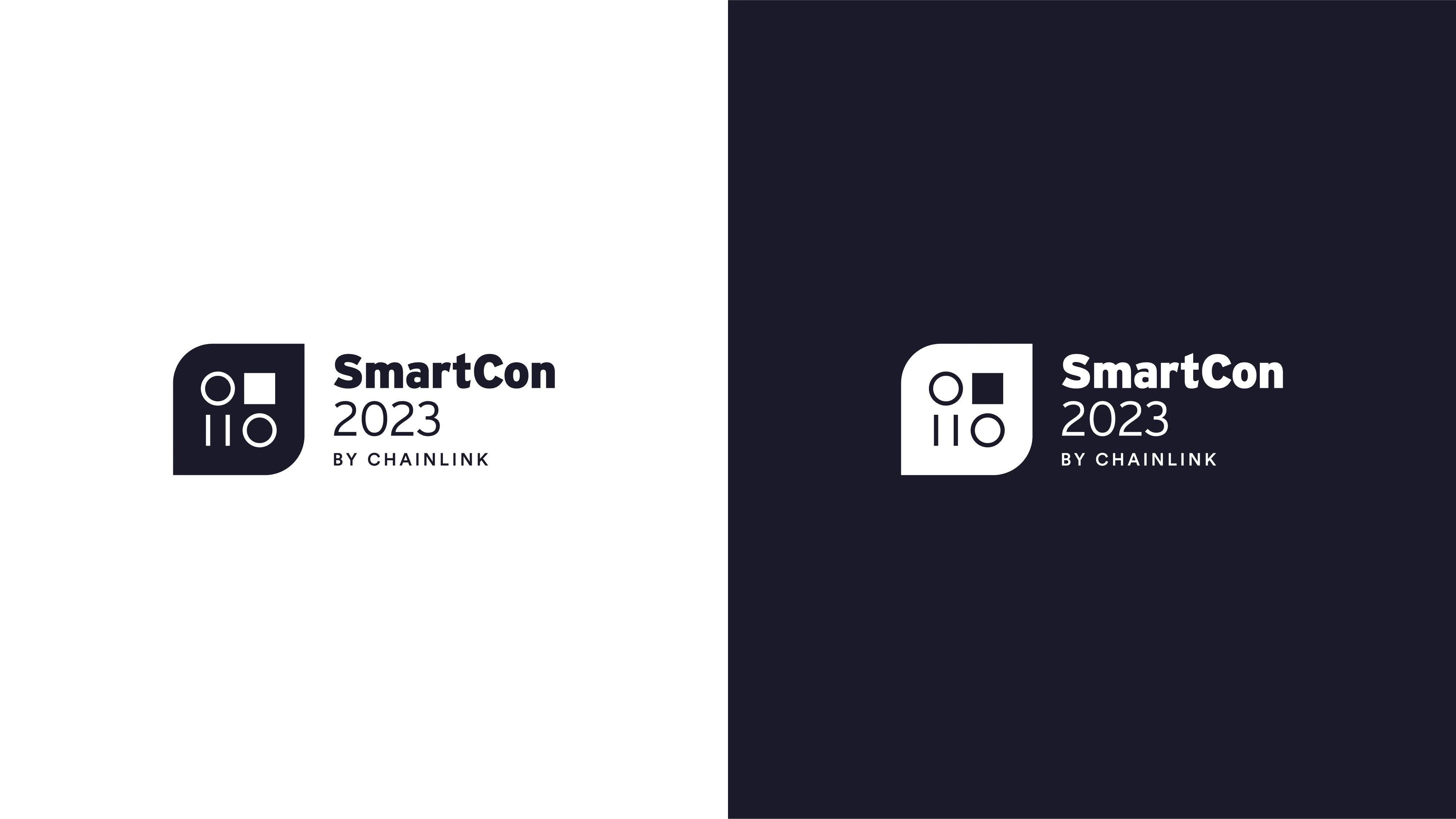
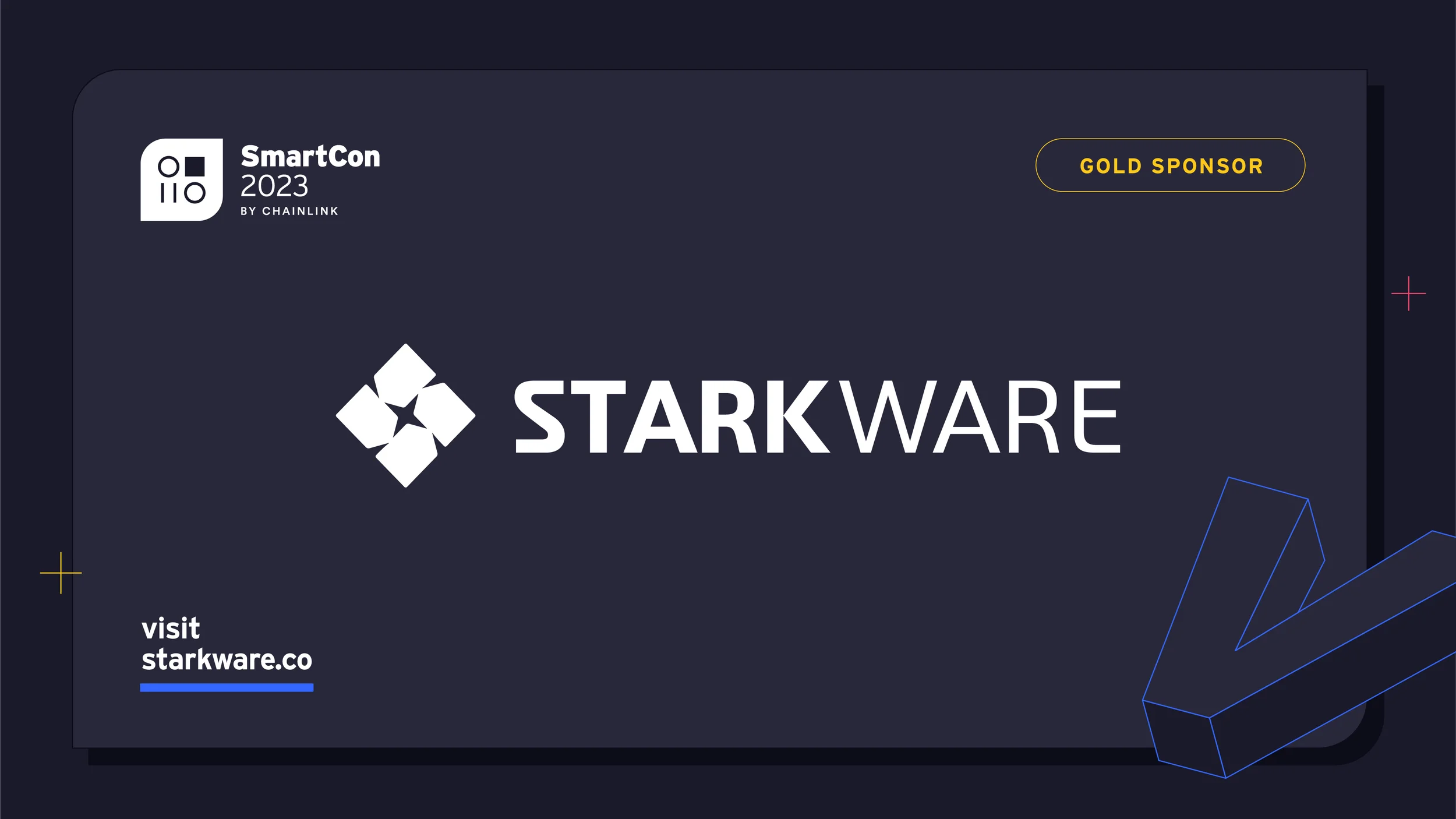
In order to subtly evolve while preserving brand continuity, we made a minor adjustment to the logo. Two corners of the squared container were rounded, and the binary codes within were inverted to align with the new overall shape, placing the zeroes on the rounded corners' side. This approach allowed for a refreshed look without the need for a complete reinvention, maintaining the recognizability and legacy of the SmartCon brand. Additionally, this visual element was echoed throughout the brand, such as in buttons, lending a unique touch that contributes to overall consistency.
Colors

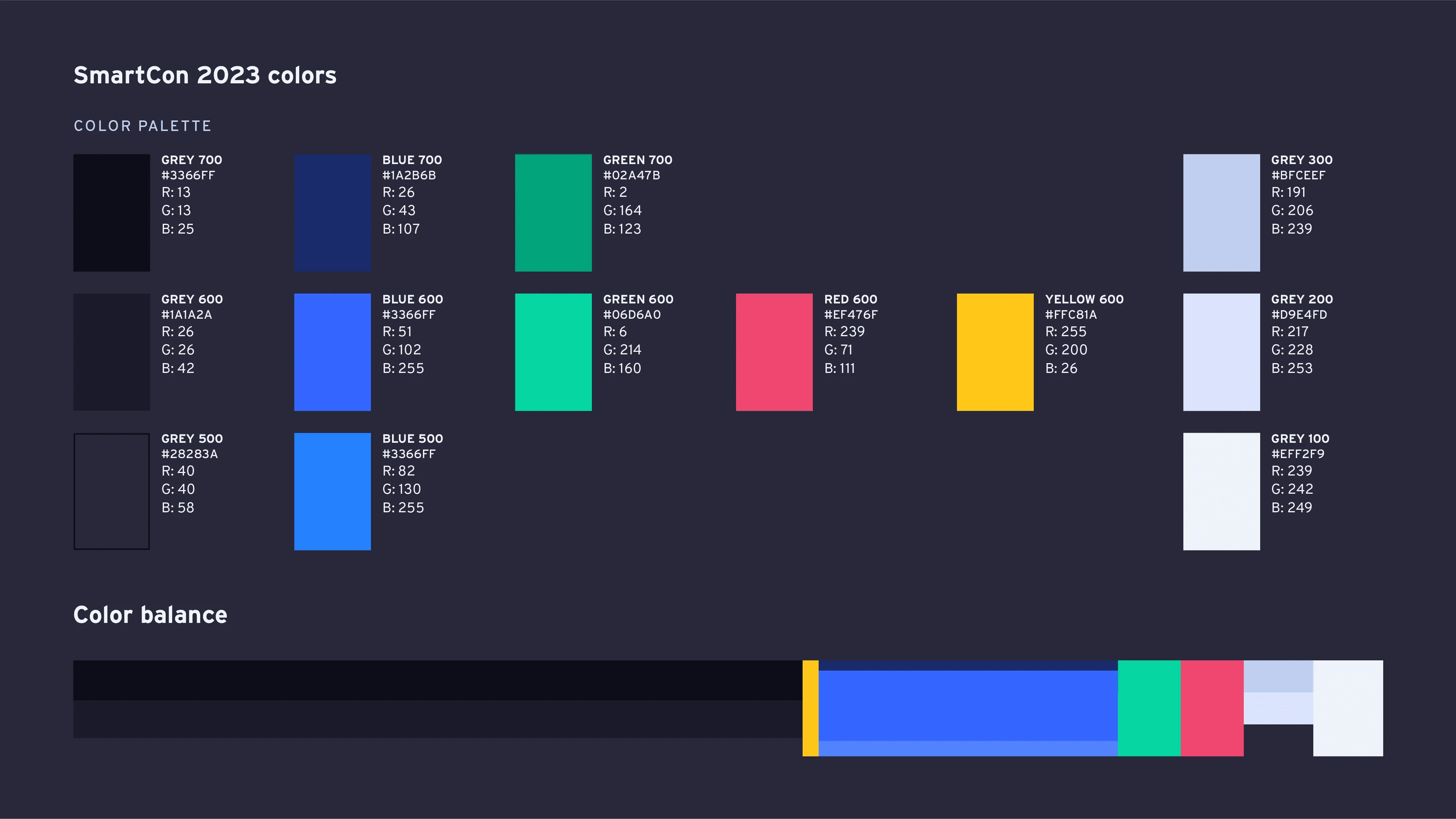
The color palette for SmartCon 2023 strikes a balance between boldness and harmony, effectively capturing the event's exciting and welcoming atmosphere.

A range of blue-hued gray backgrounds serves as the foundation, allowing other colors to stand out and enhancing the dark mode theme. Blue remains the key color, which not only connects to Chainlink but also ensures consistency with previous editions. Green, red, and yellow accent colors are highly saturated and provide excellent contrast for both digital and print applications against the dark background. These vibrant accents convey a sense of warmth, energy, and innovation, while adding variety and visual interest to the design. Additionally, a selection of lighter grays offers softer contrast and can be used to create subtle highlights within the design.

Visual style

To develop SmartCon 2023's visual style, we not only focused on the art direction of building an exciting and welcoming experience, but also followed the brand principles of scale, consistency, and memorability. The style was conceived with the physical experience in mind, ensuring that design elements could be seamlessly translated into a tangible setting, fostering brand cohesion across all touchpoints.

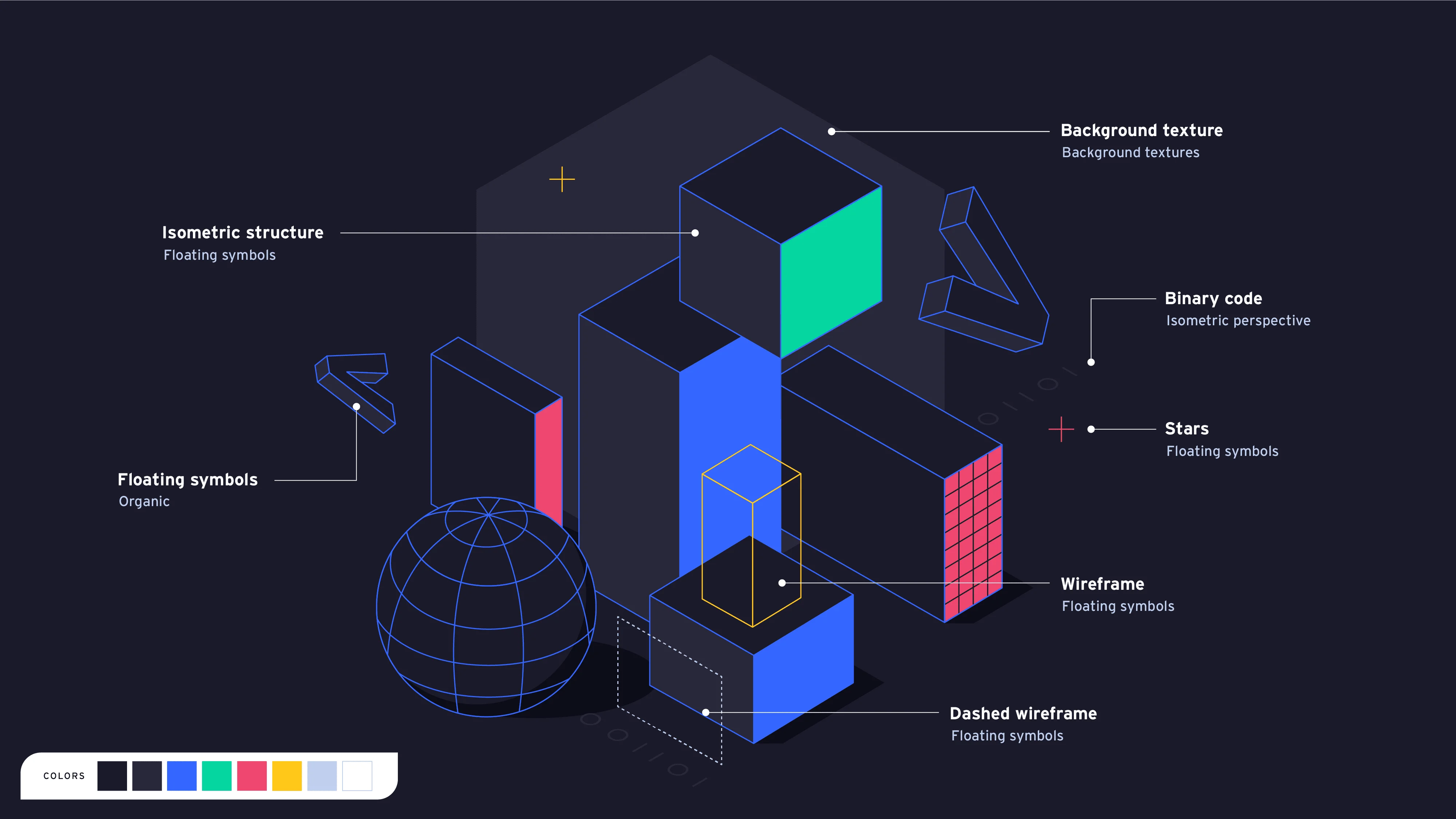
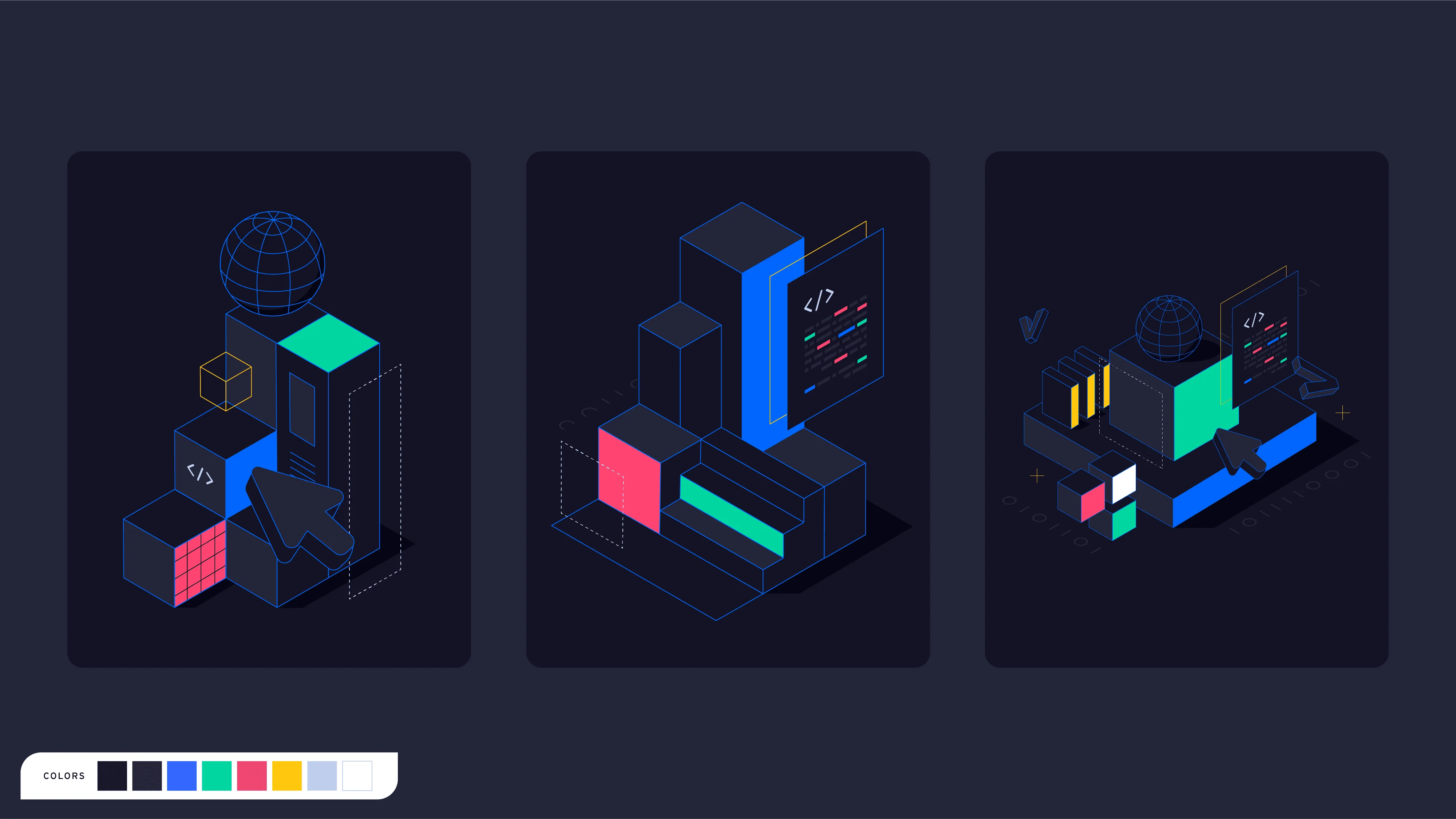
The isometric style, chosen for both abstract and figurative illustrations, complements SmartCon's color palette, creating a clean, modern aesthetic with a technical undertone. This aesthetic, commonly used in architectural drawings and blueprints, aimed to highlight the conference's mission to inspire and empower Web3 builders, while aligning with Chainlink's overarching visual style.

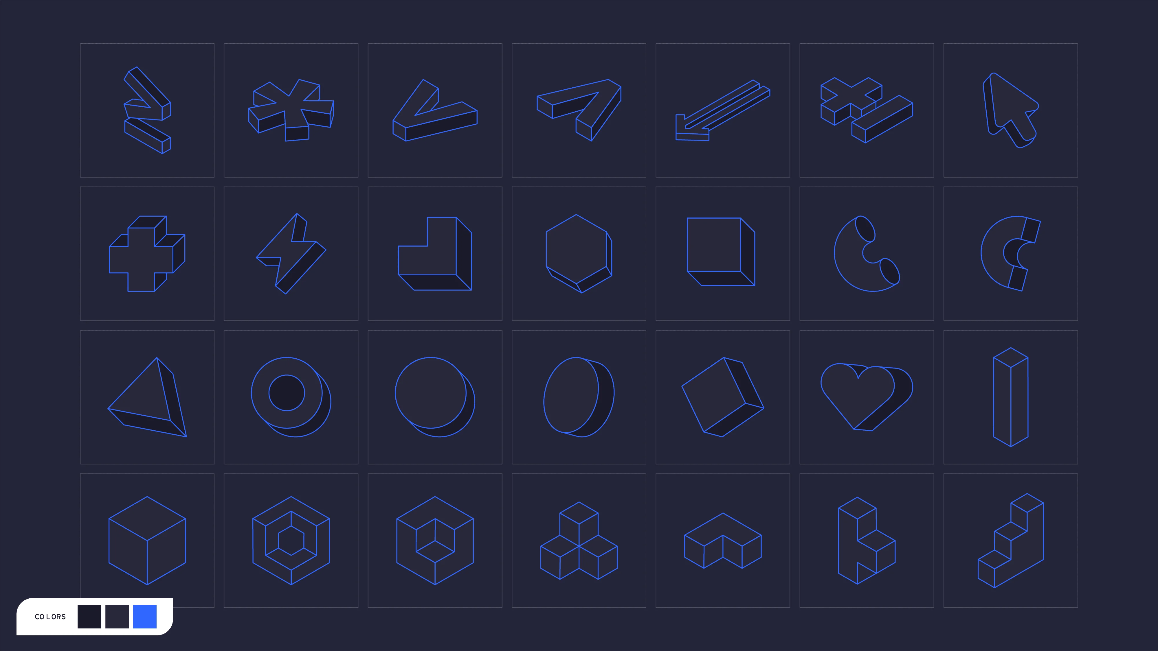
In addition, the system provided a rich set of creative resources. Floating 3D symbols, including coding characters and abstract shapes, ensured visual consistency across various digital and physical applications, acting as adaptable tools for achieving balanced compositions and infusing the visual language with fun and excitement. Moreover, these elements could be adapted to the physical world, establishing a unified brand experience across both digital and physical touchpoints.

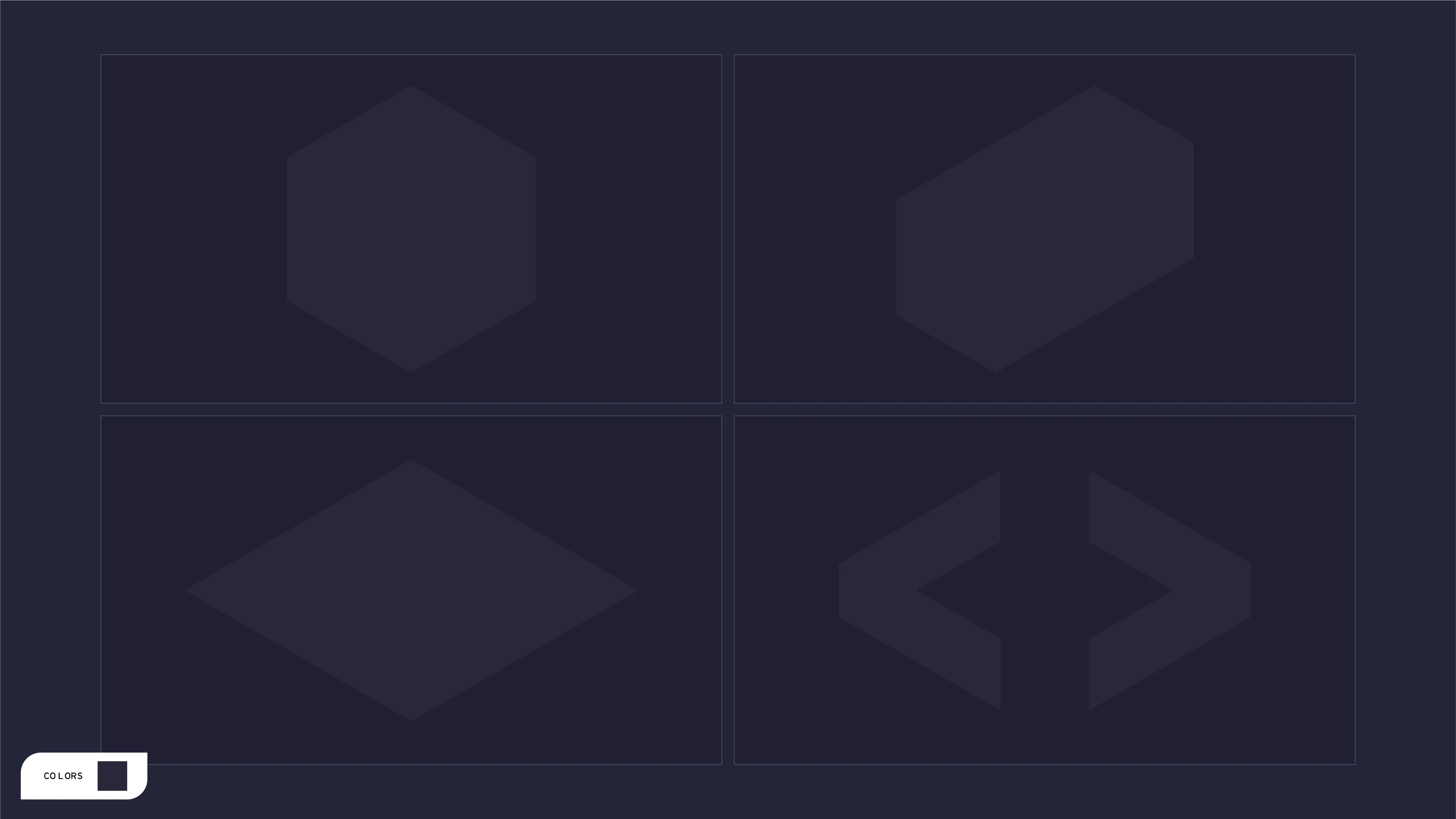
Minimalistic stars, forming a plus sign, highlighted the collaborative and positive nature of the conference while offering designers a resource to balance compositions and color scales on any artboard. Background textures were also incorporated as a way to add depth and influence the focal point of images and artboards. The textures needed to be flat and match the isometric angle of the illustrations to avoid any perspective distortion.

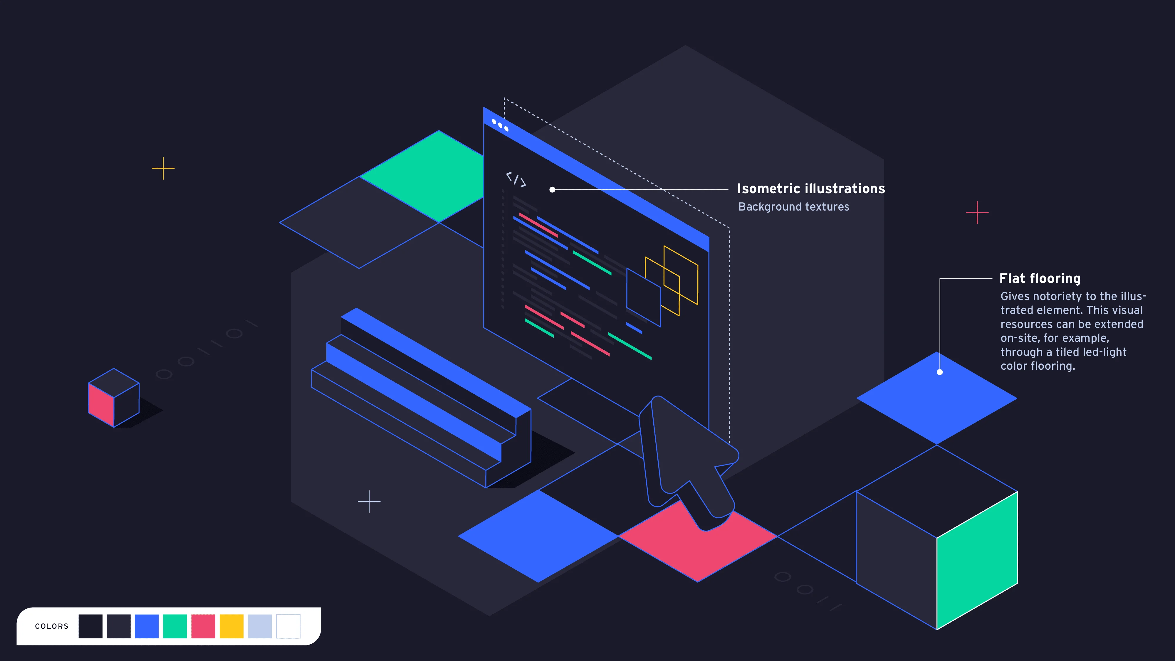
The binary code, a static element in SmartCon's visual identity, was integrated into the isometric perspective for the 2023 edition. In some compositions, the isometric technique was used as flat flooring for the axonometric projection, particularly when using figurative illustrations. This approach offered an ornamental variation of the style, suitable for more formal applications, and could potentially be integrated into the physical conference space through elements like LED-lit tiled floors.

Applications

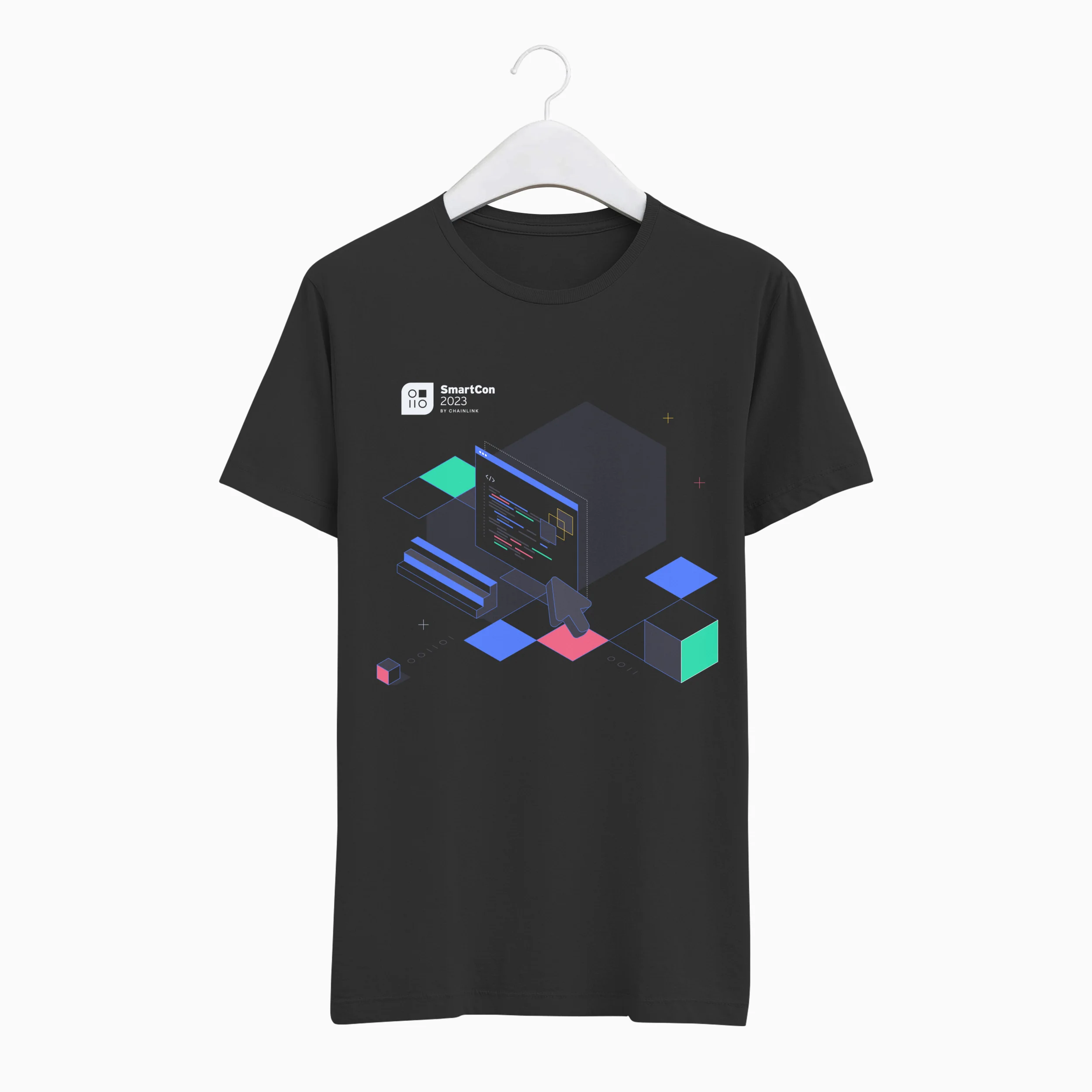
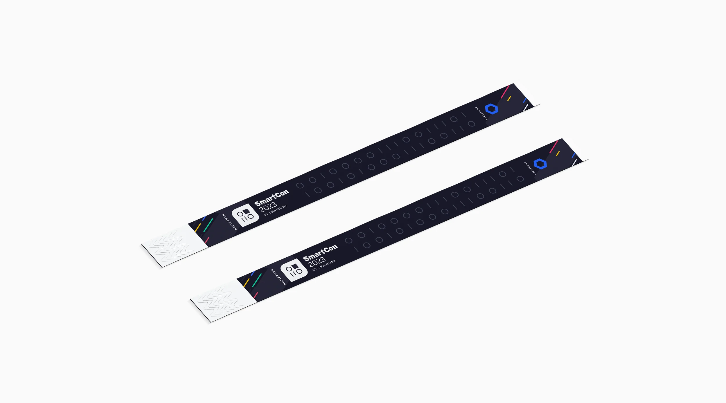
The SmartCon 2023 visual style and overall brand direction effectively scaled to accommodate a wide array of digital and print collateral, ensuring a unified and engaging experience across various platforms.

SmartCon 2023 | Various digital and print applications

Motion graphics

In the motion graphics system, space takes on a significant role. The dynamic animation style capitalizes on the isometric perspective, allowing elements to traverse the frame in a captivating manner. This approach reinforces the idea of bridging the gap between digital experiences and physical environments, further strengthening the brand's cohesive and immersive visual identity.

SmartCon 2023 | Animated loop

Web

The web application seamlessly integrates all the principles and elements of the brand, acting as a crucial medium for disseminating information and showcasing the brand's visual language to a designer audience.

Buttons and iconography containers draw inspiration from the logo's overall shape, enhancing brand cohesion down to the details and creating a subtle visual easter egg. Moreover, the illustration style has been tailored to address web-specific use cases, such as the 404 page, ensuring the visual language remains consistent and engaging across all aspects of the user experience.

Outcome

The SmartCon brand system has successfully navigated key challenges, such as maintaining relevance and consistency, achieving scalability across diverse platforms, and highlighting Chainlink's influence. The robust brand system and its combination of both static and flexible elements created a future-proofed brand capable of adapting to evolving trends and innovations while staying true to its core.

Over time, SmartCon has demonstrated its capacity to captivate and engage attendees through both their physical and digital experiences, solidifying its status as a premier Web3 event. By striking the right balance between innovation and tradition, SmartCon's brand system consistently delivers a distinctive, recognizable, and forward-looking experience for each iteration of the event, ultimately staying true to Chainlink's core values.

More projects