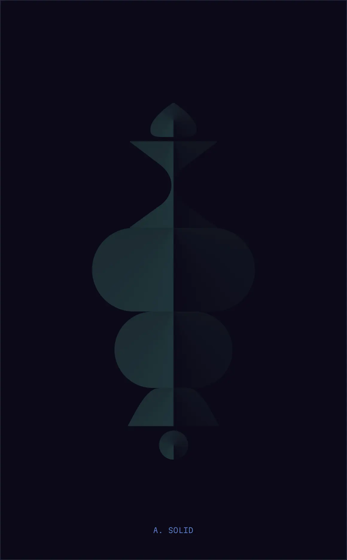
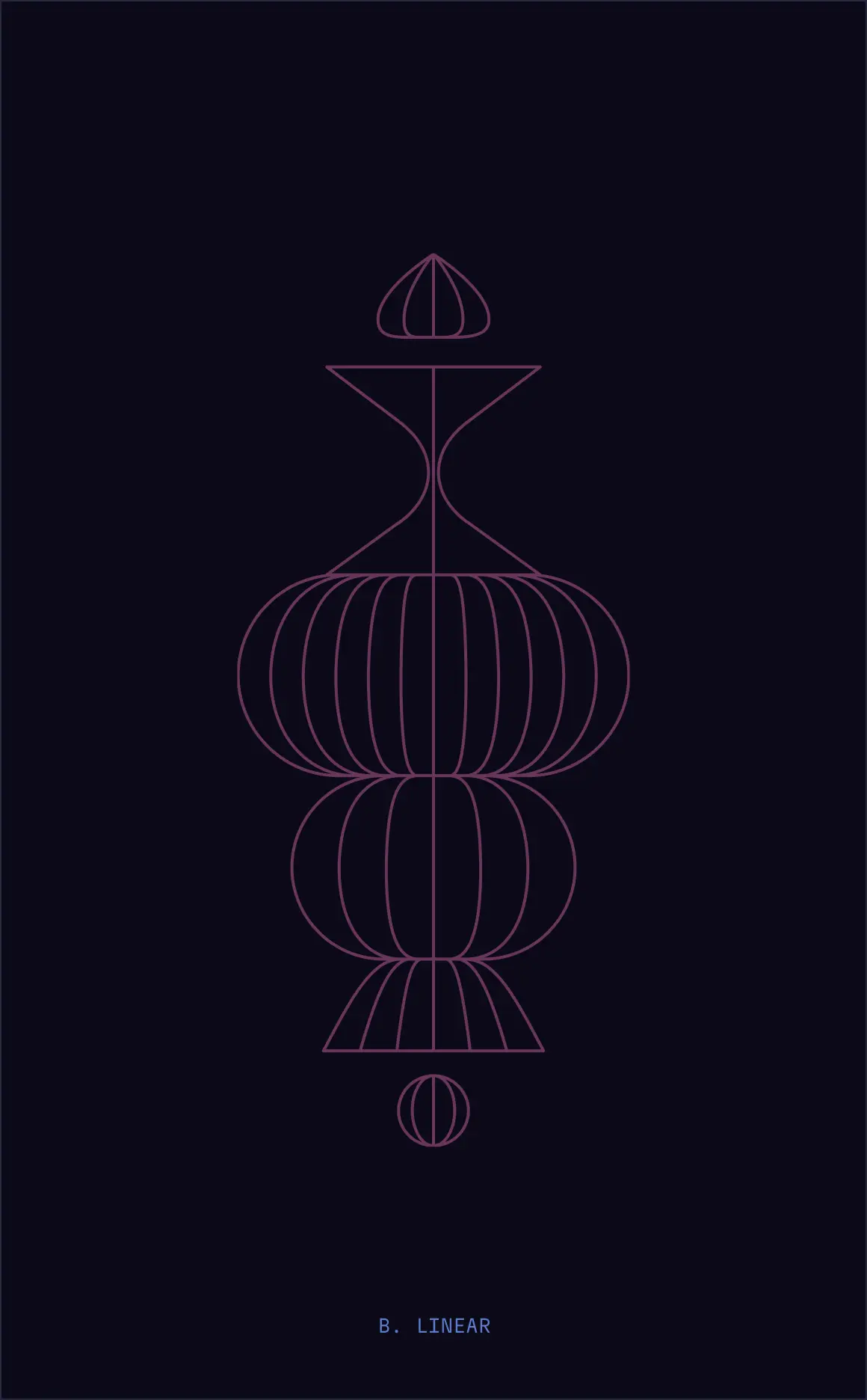
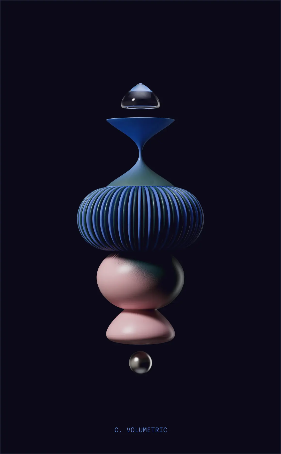
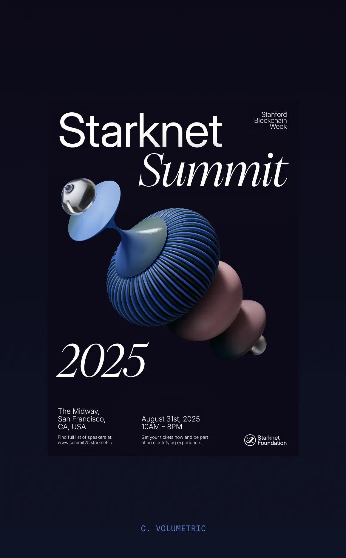
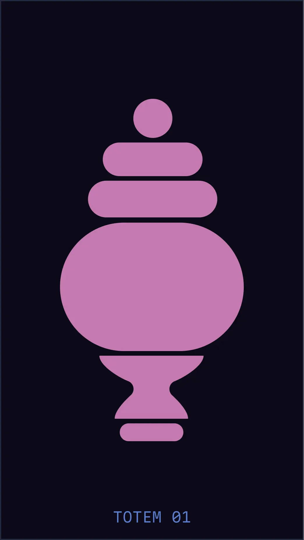
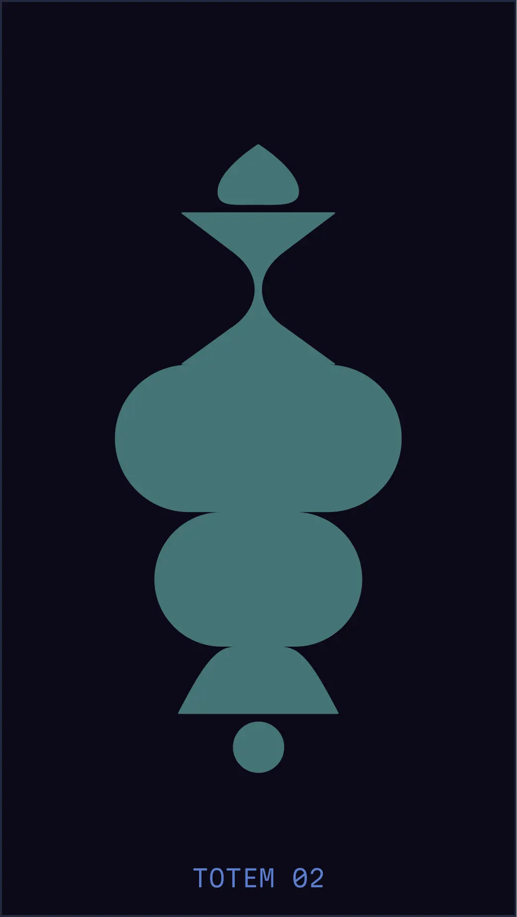
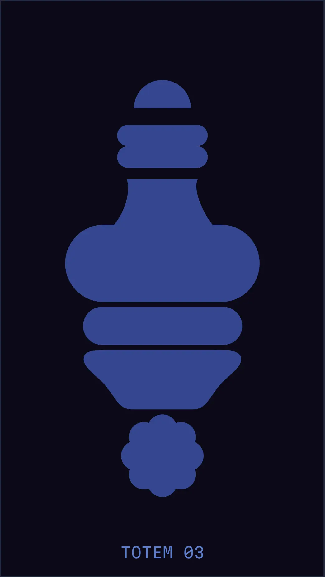
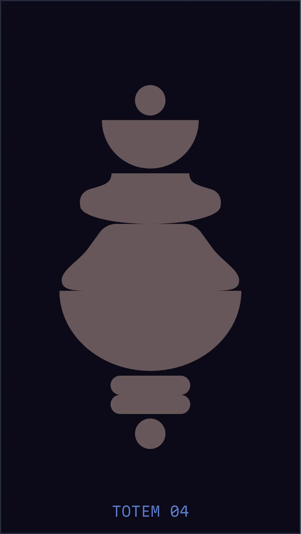
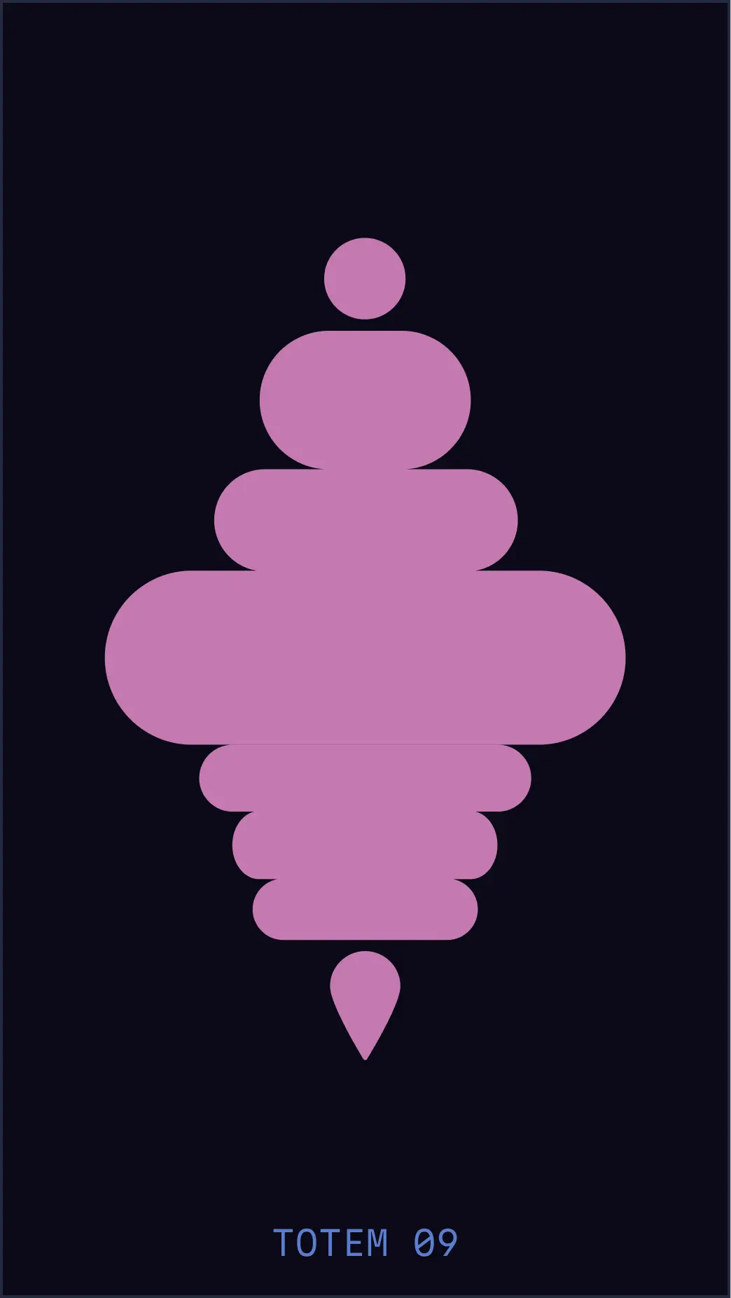
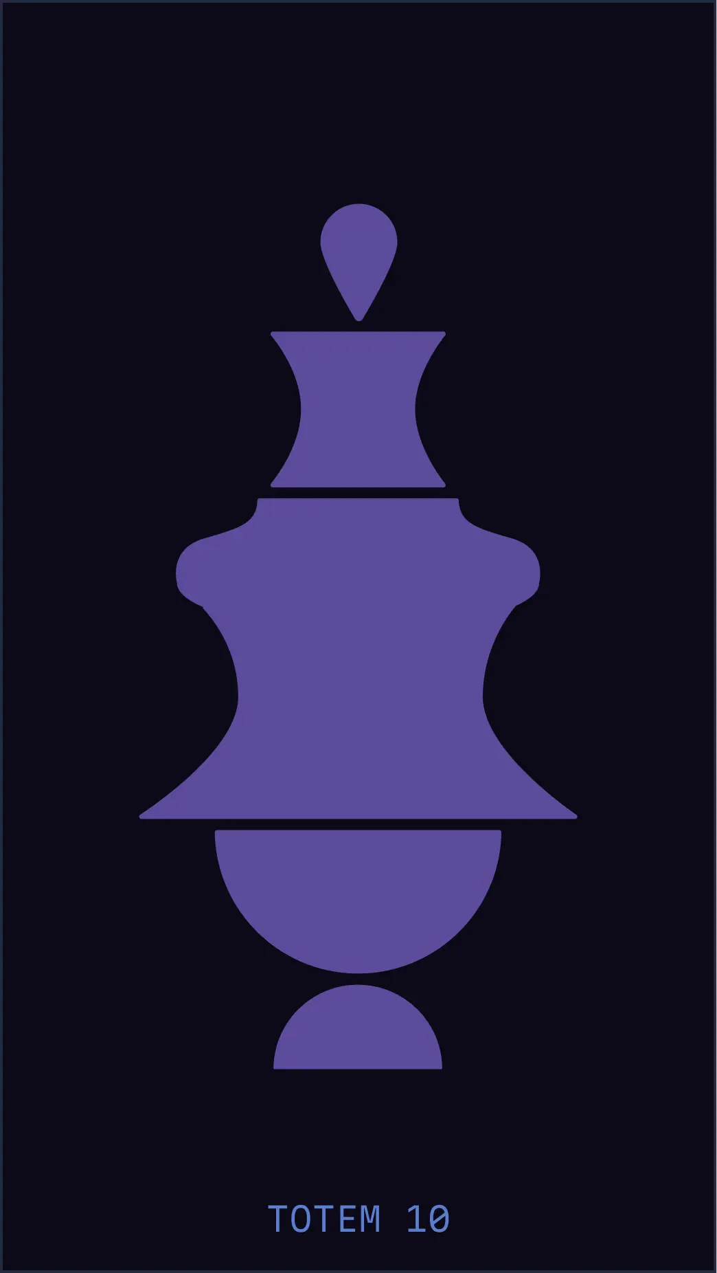
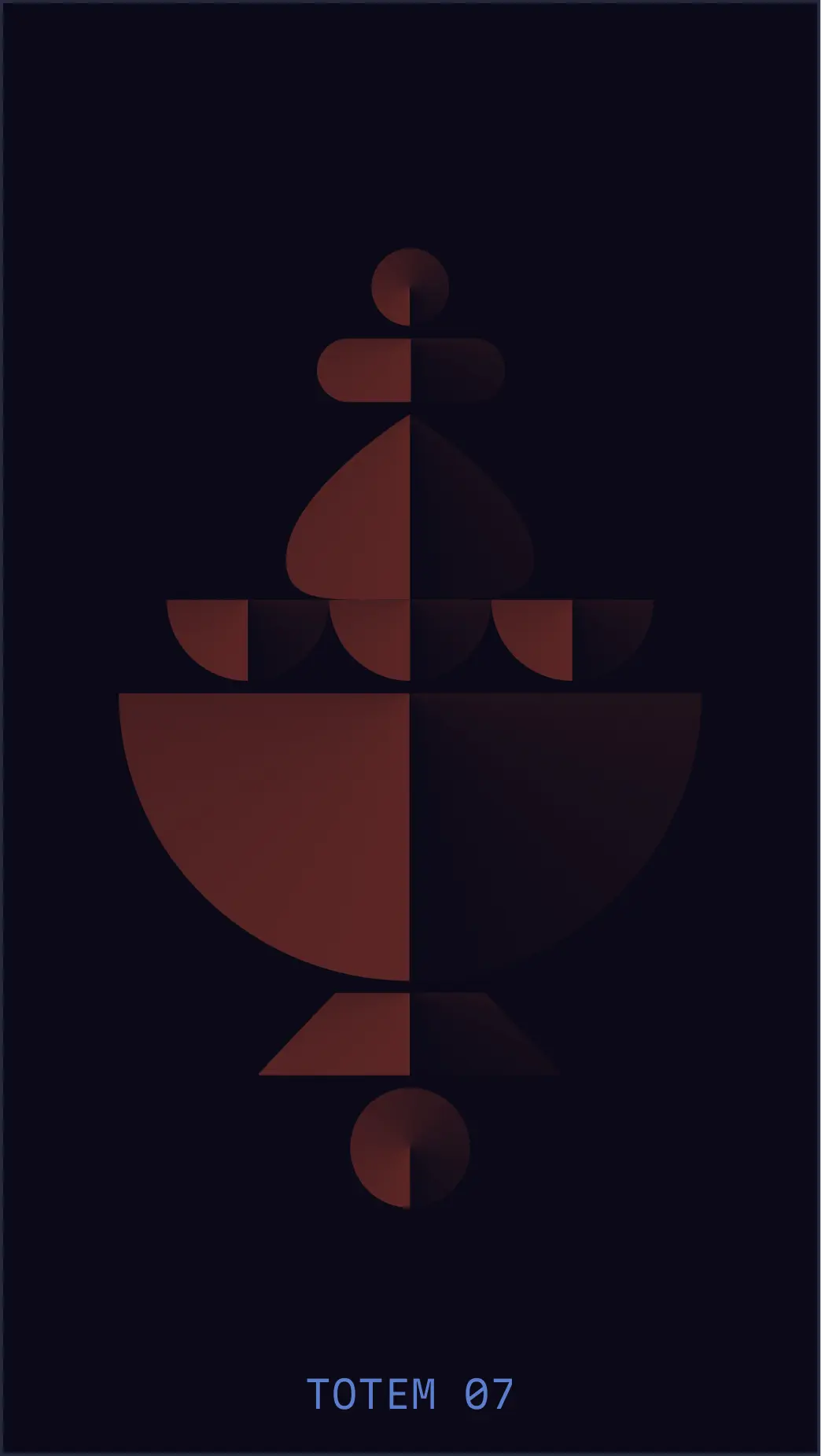
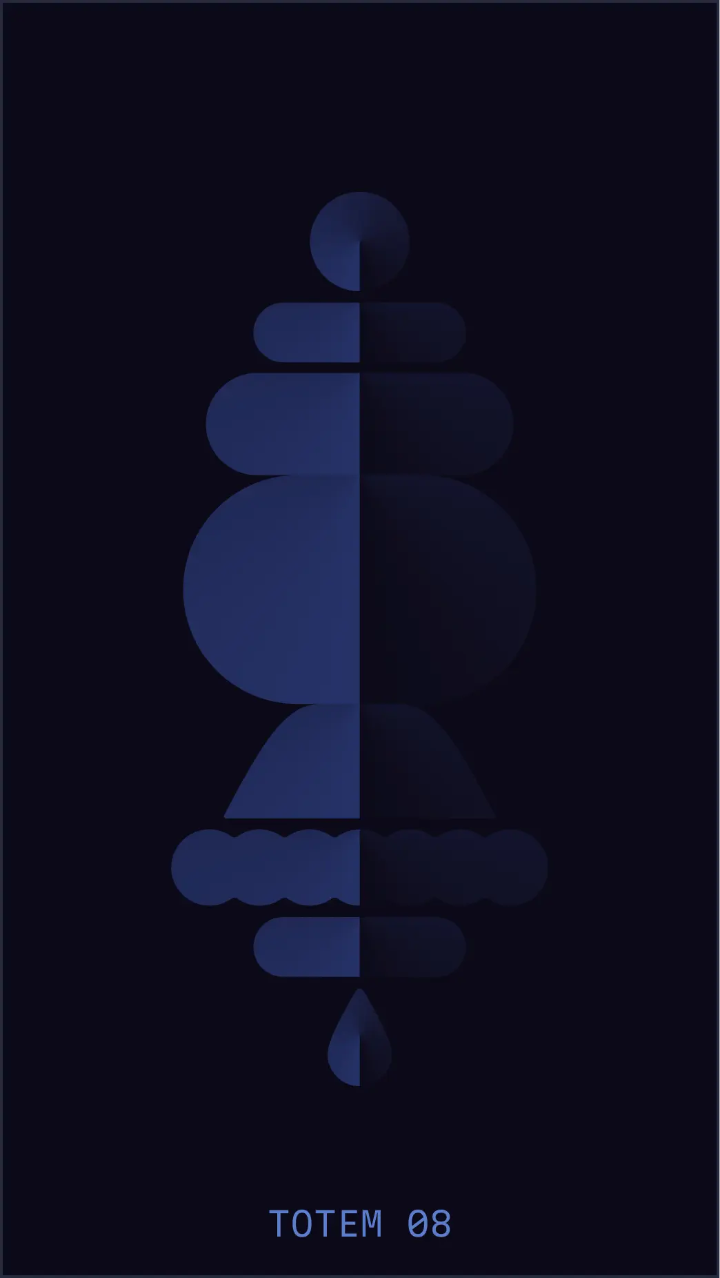
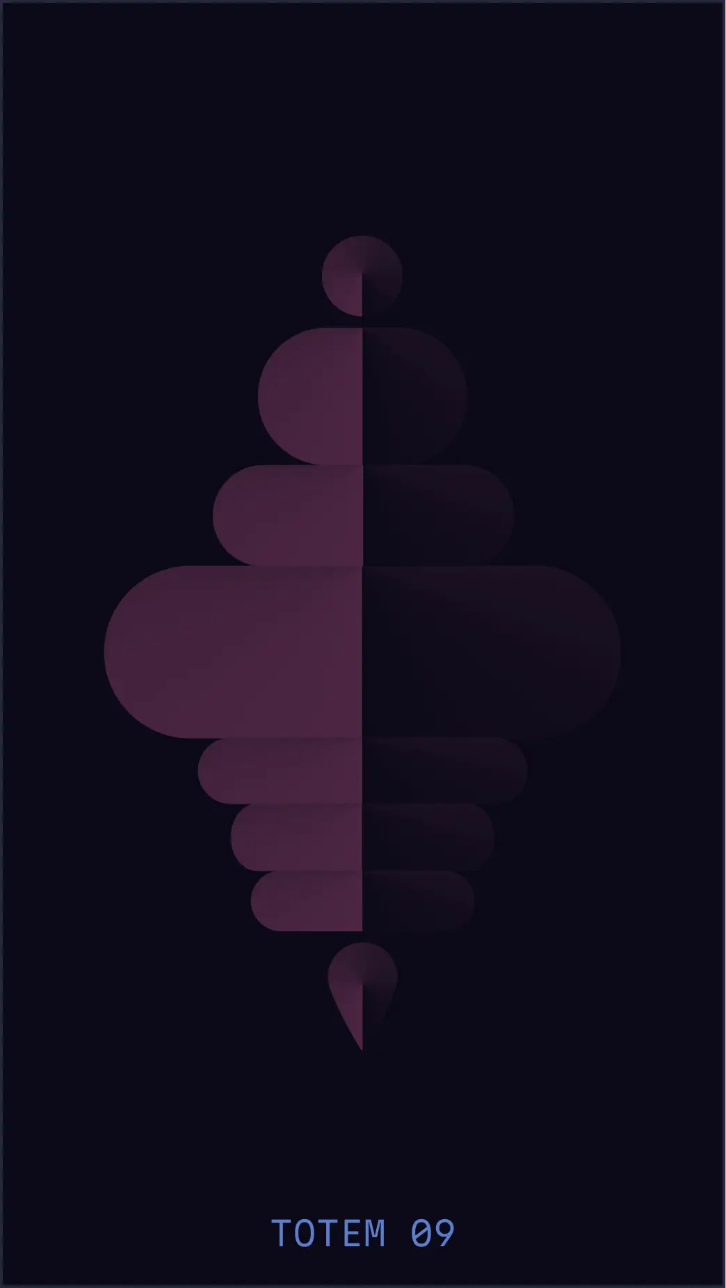
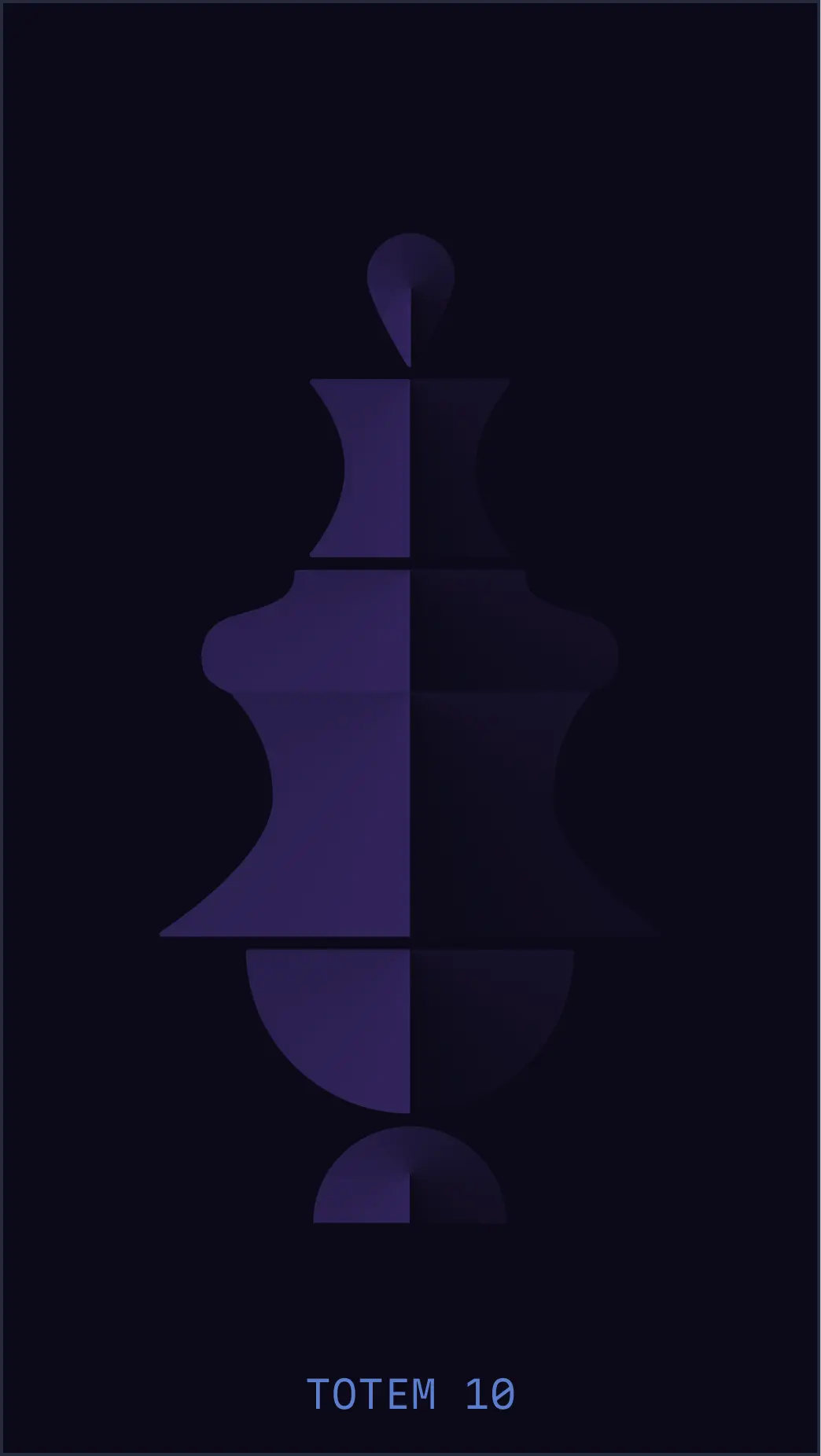
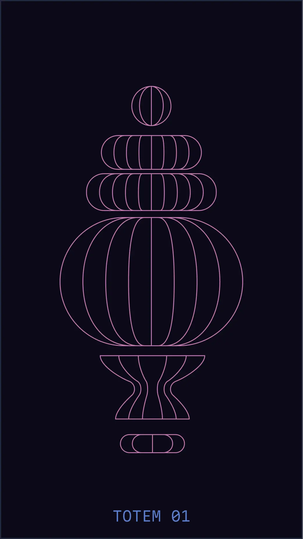
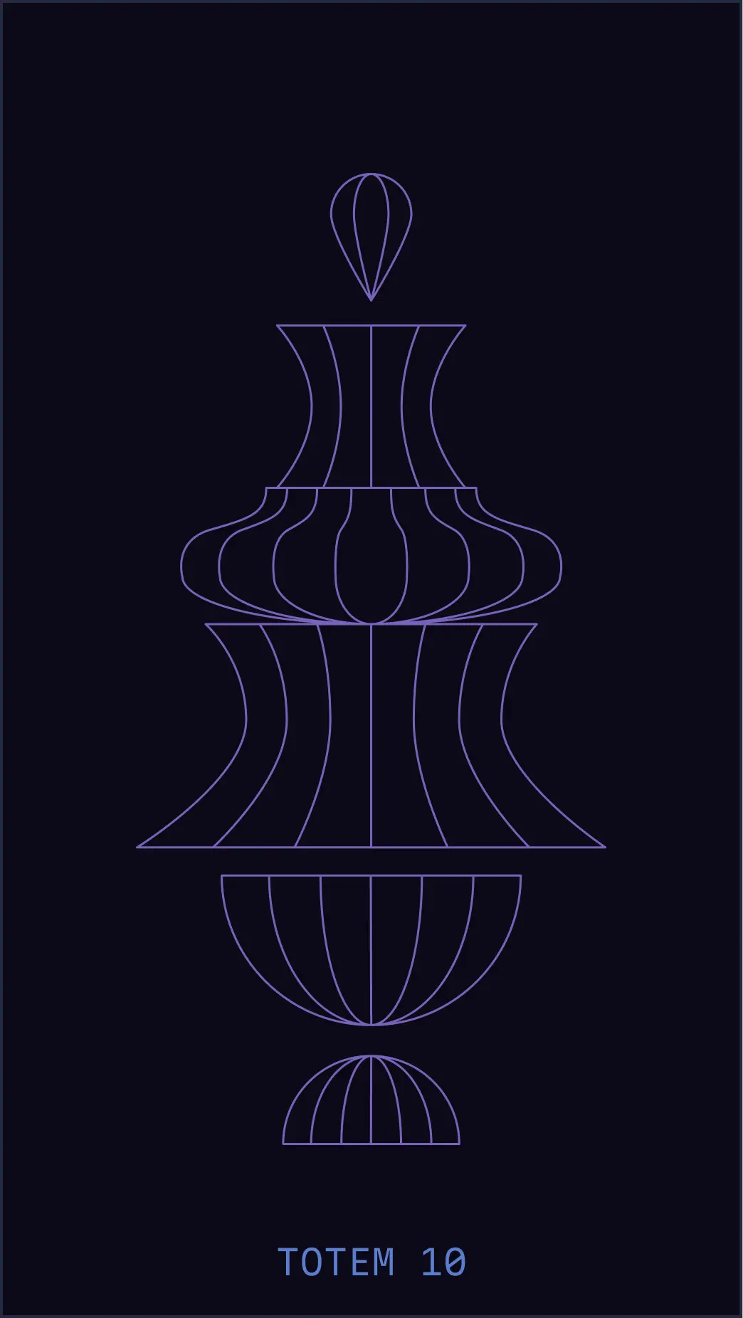
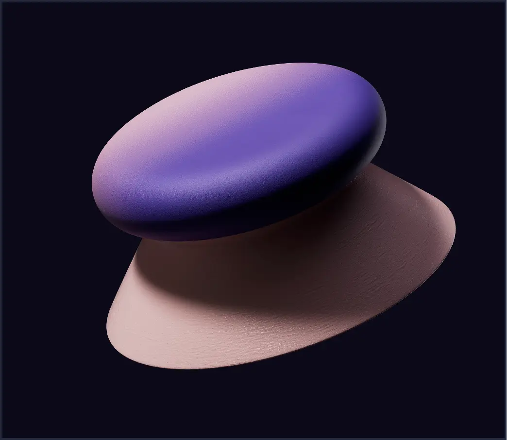
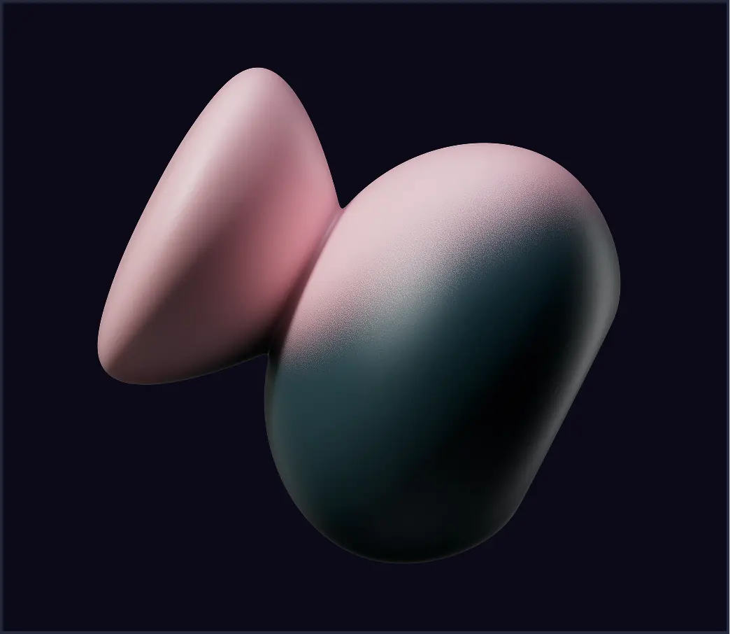
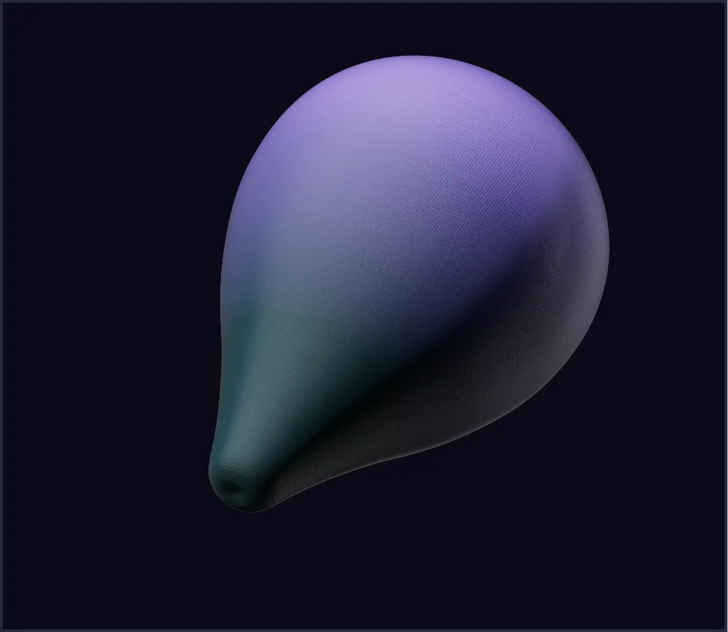
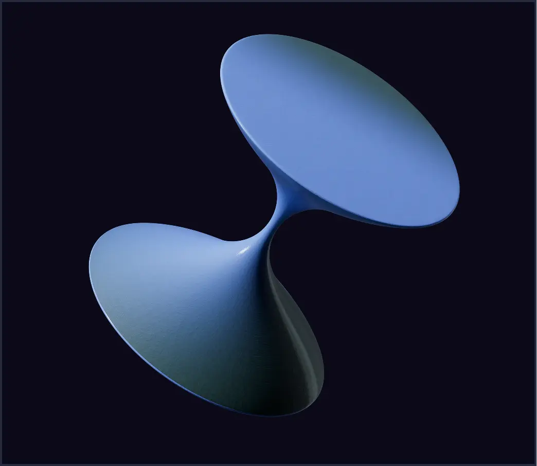
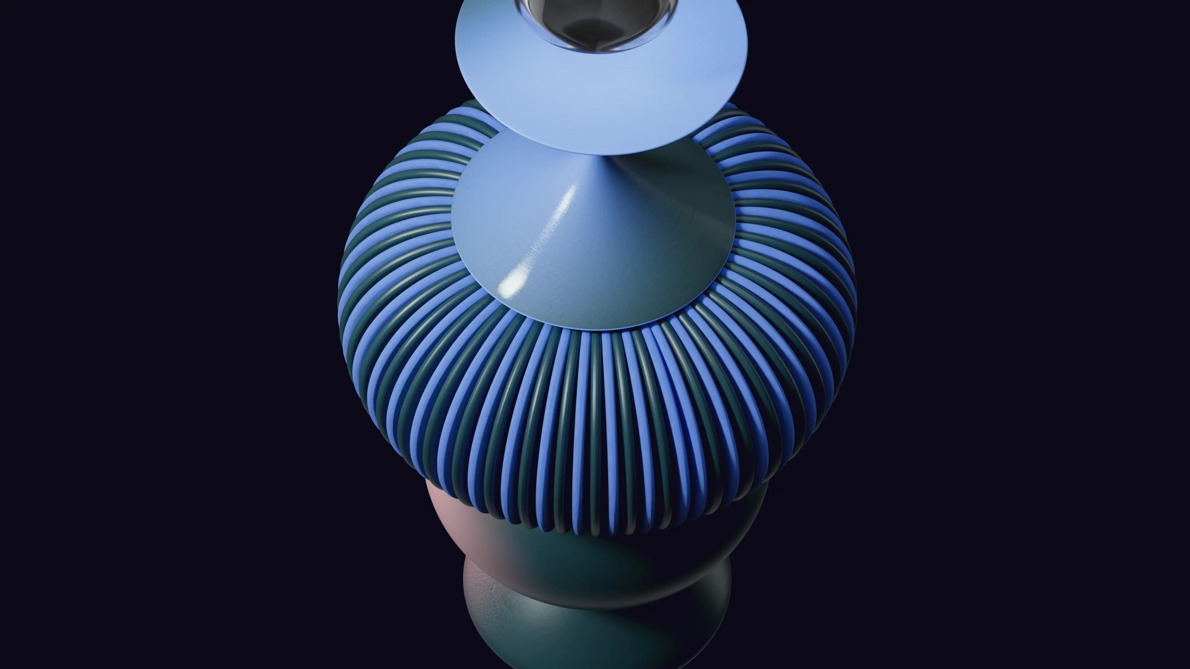
Solid Style captures the raw spark of an idea—clean, minimal, and full of potential before any structure or volume. It's the simplest of our three visual languages, laying the groundwork for the others while standing on its own.
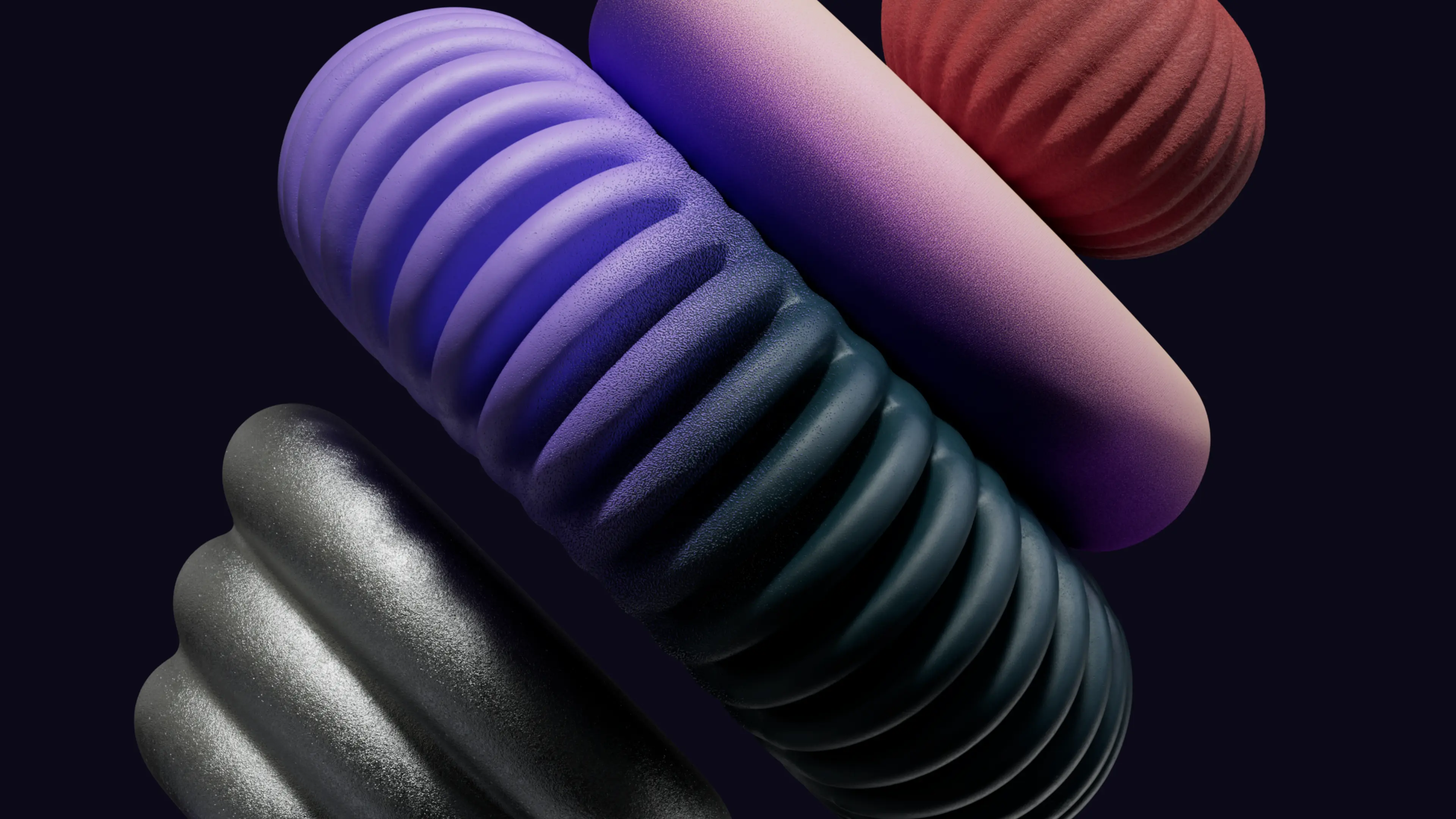
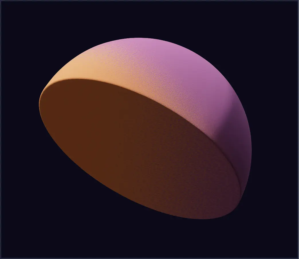
Single-color fills are used when the shapes are meant to be bold, graphic, and playful. Ideal for icons, stickers, or standout moments in layouts.
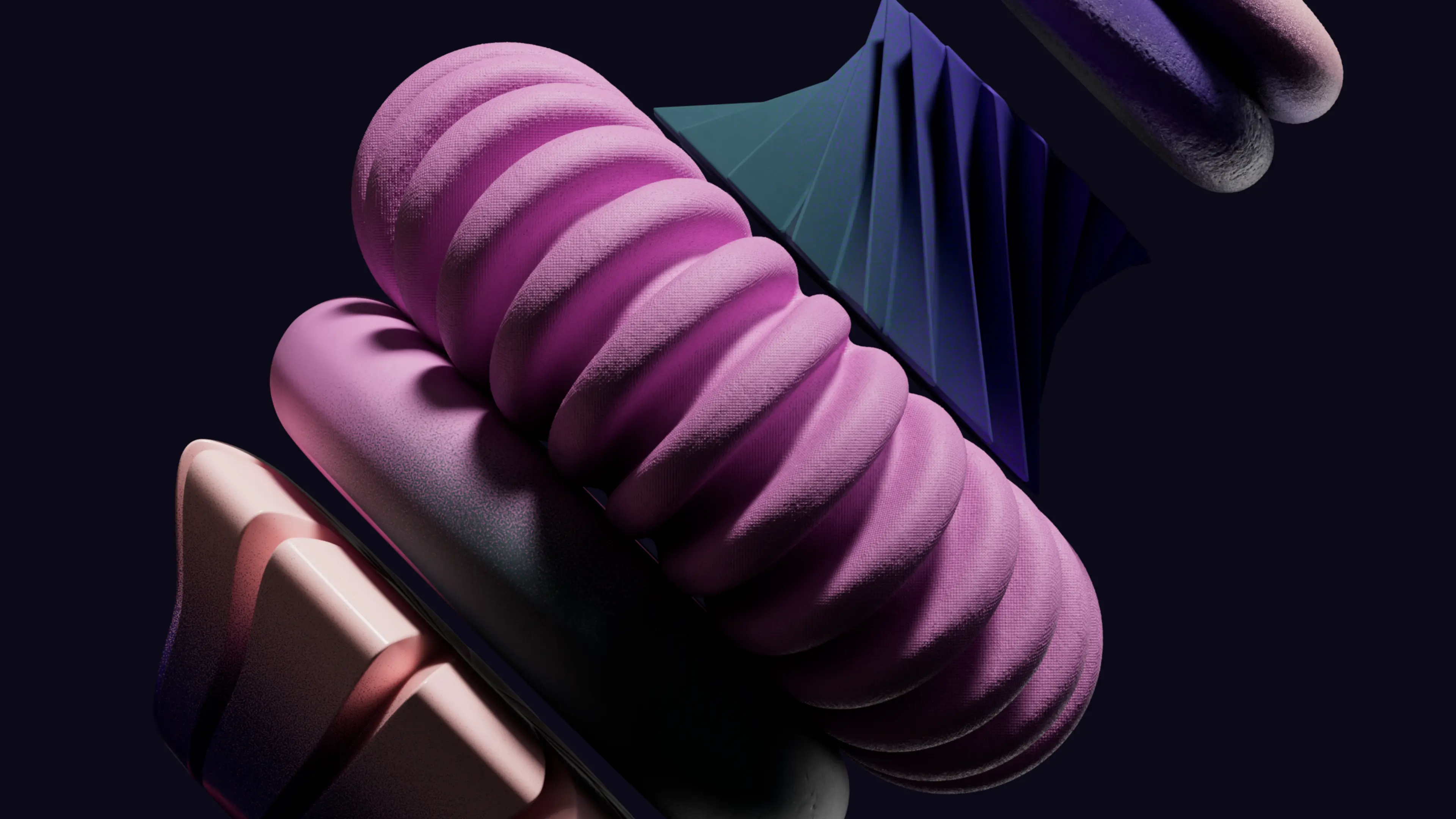
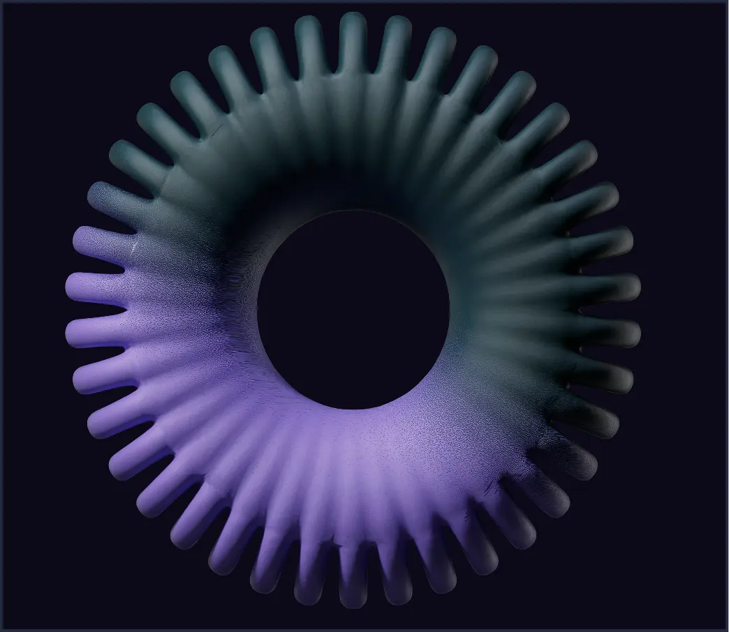
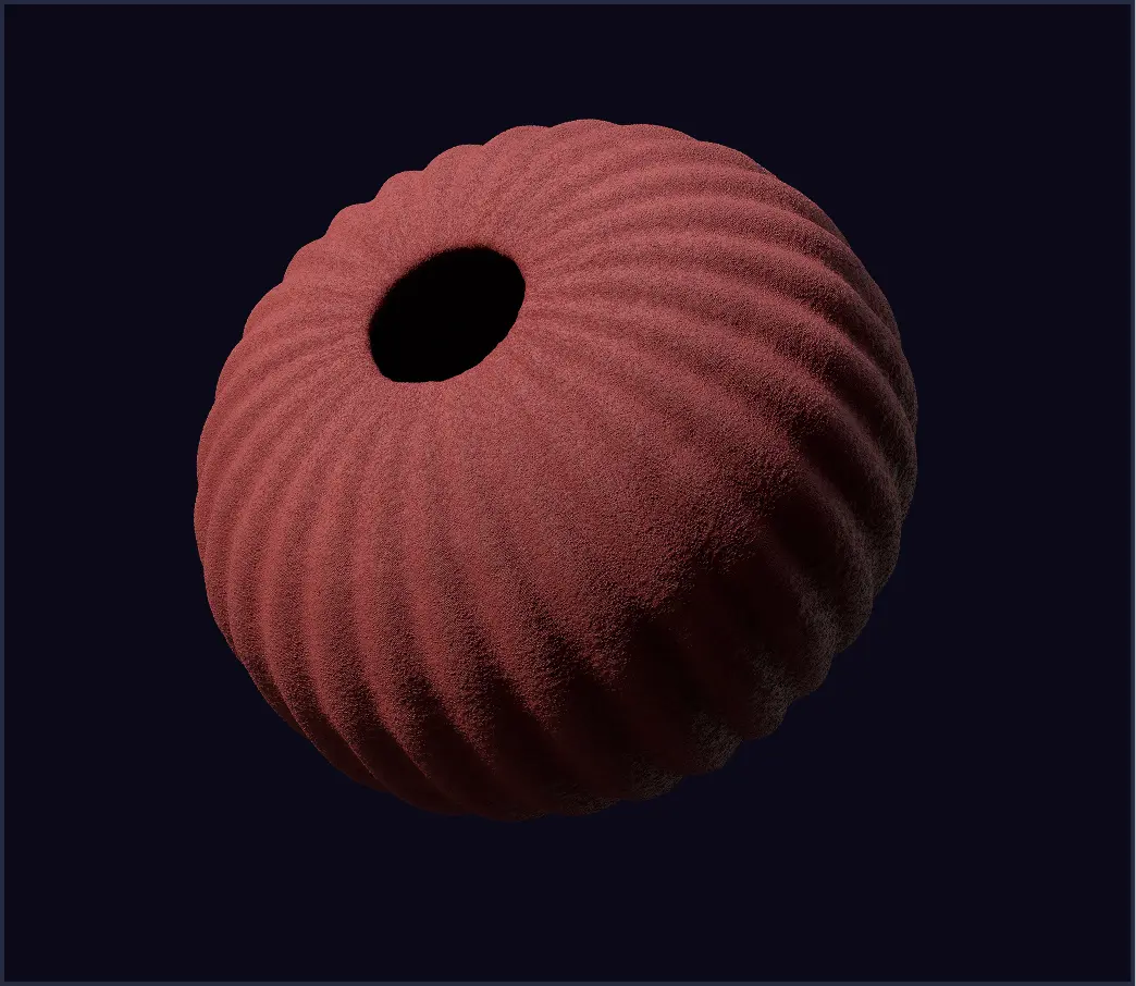
Shapes can also appear as cutouts or voids, letting background colors fill the form. This approach adds flexibility and works well in more subtle, decorative contexts.
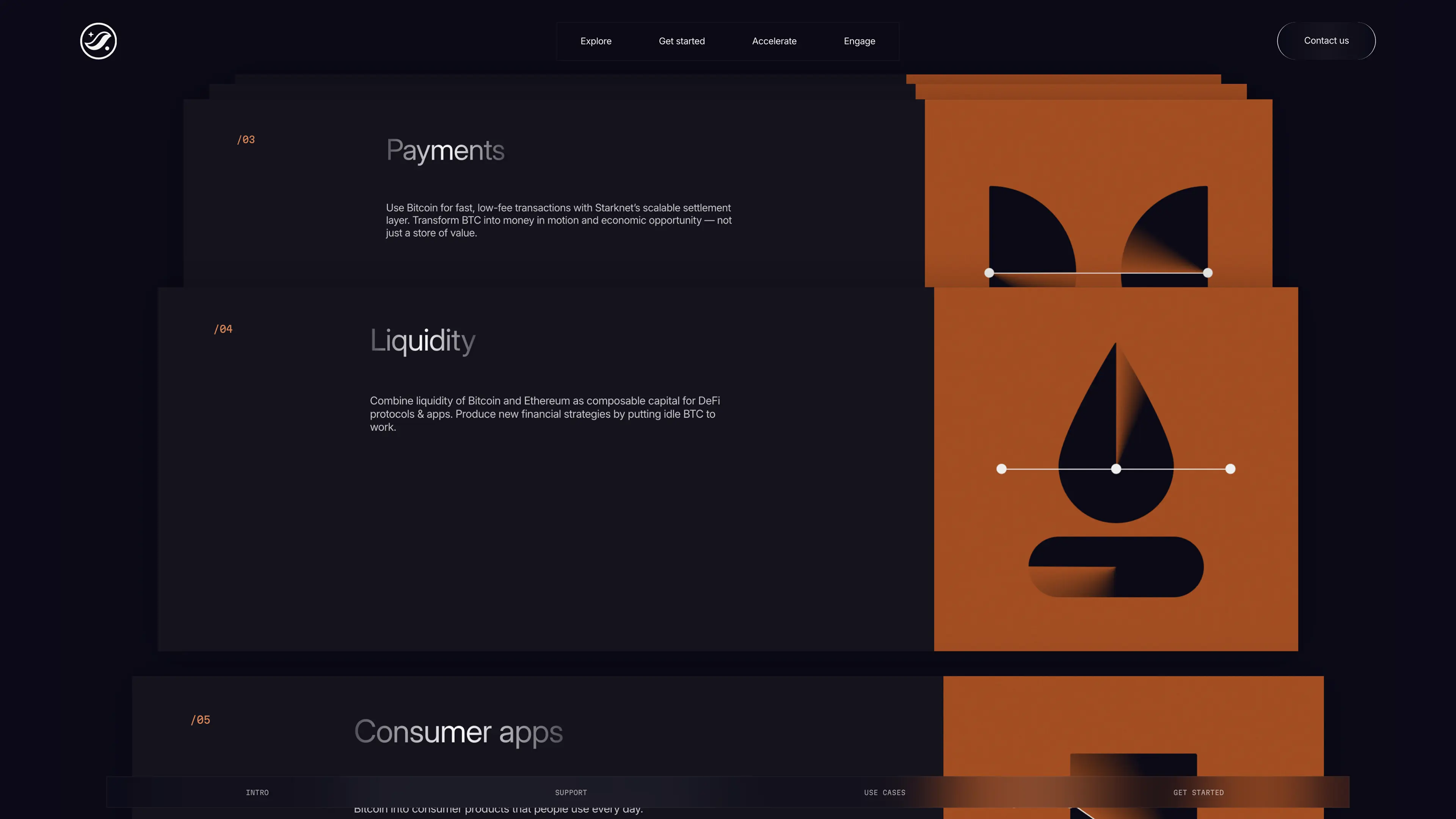
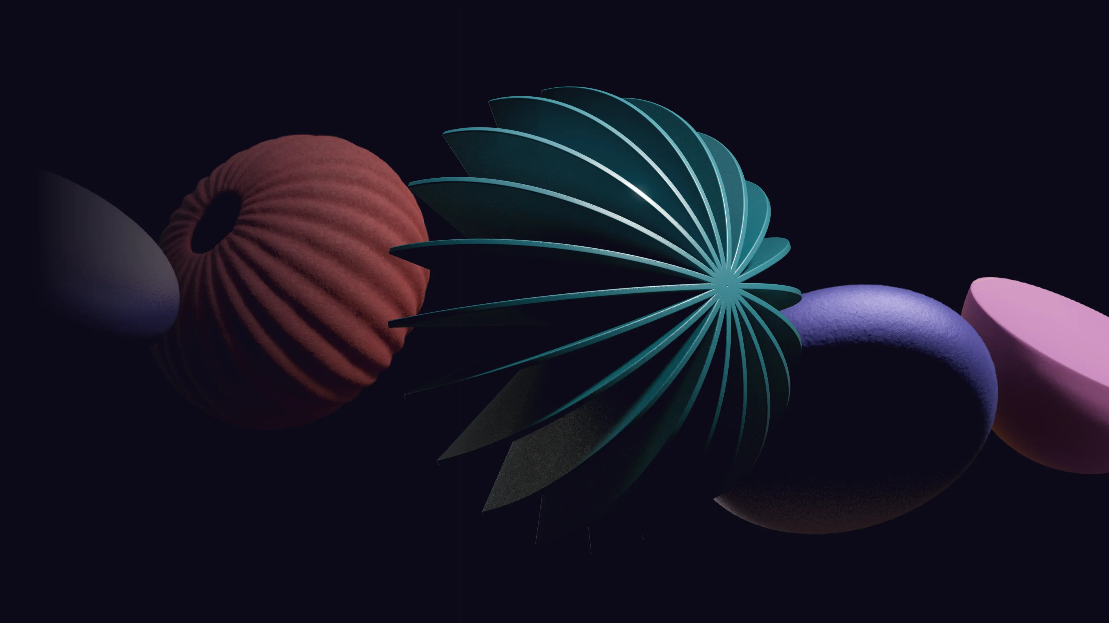
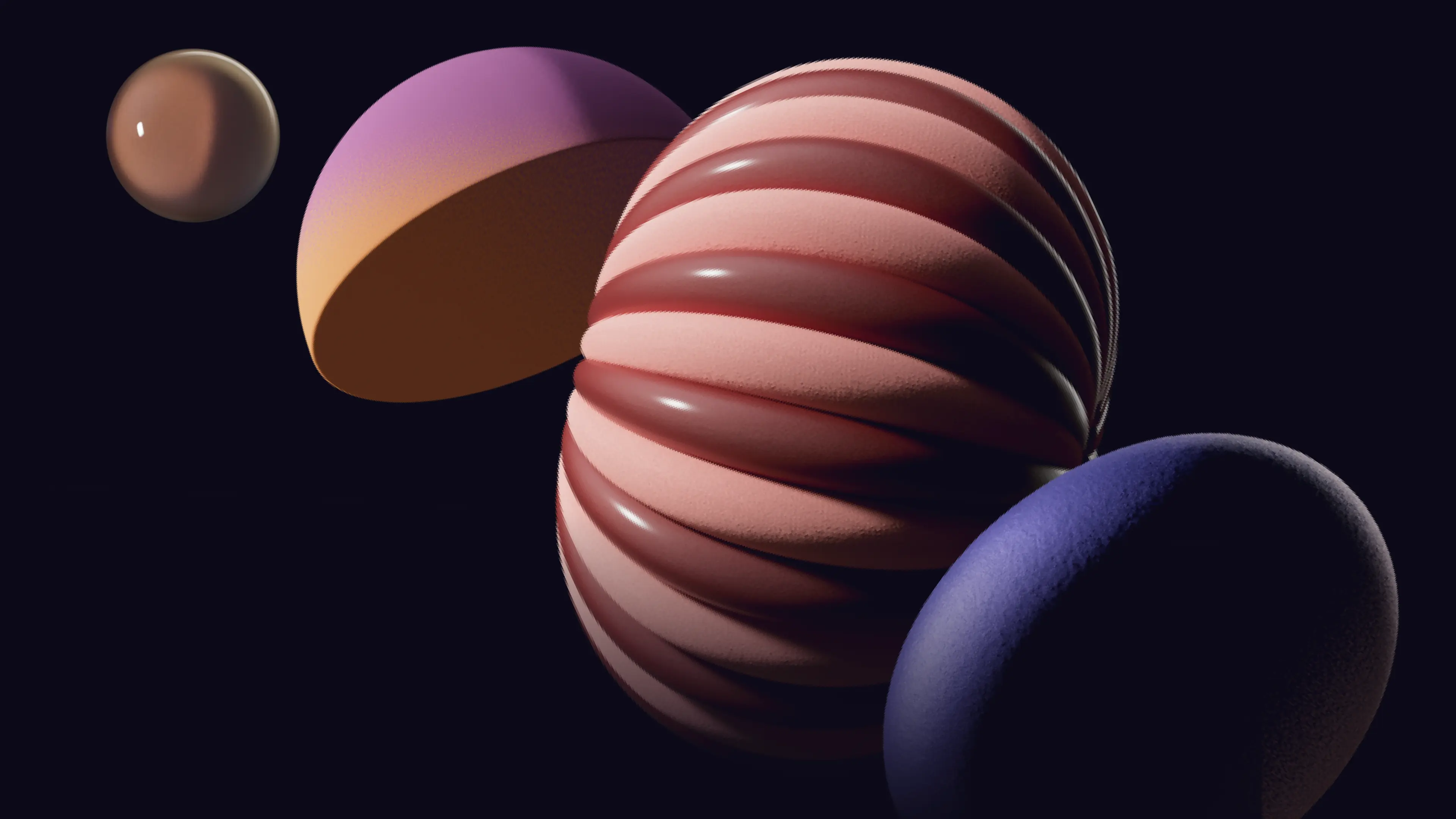
The Solid style showcases the core ways our brand shapes come to life. From early-stage program visuals to playful community avatars, Solid Style's clean, minimal aesthetic makes it particularly well-suited for contexts that prioritize clarity, accessibility, and approachability.
Pictograms built from Solid Style shapes serve as expressive, stylized icons used in editorial, illustrative, or brand-led applications. Unlike functional icons, pictograms blend visual storytelling with symbolic meaning, providing a more conceptual interpretation of ideas.
They're ideal for reports, presentations, social media, and any context that benefits from a richer, more narrative-driven visual approach. By using the same modular shapes as the rest of the system, pictograms maintain brand consistency while offering creative flexibility.
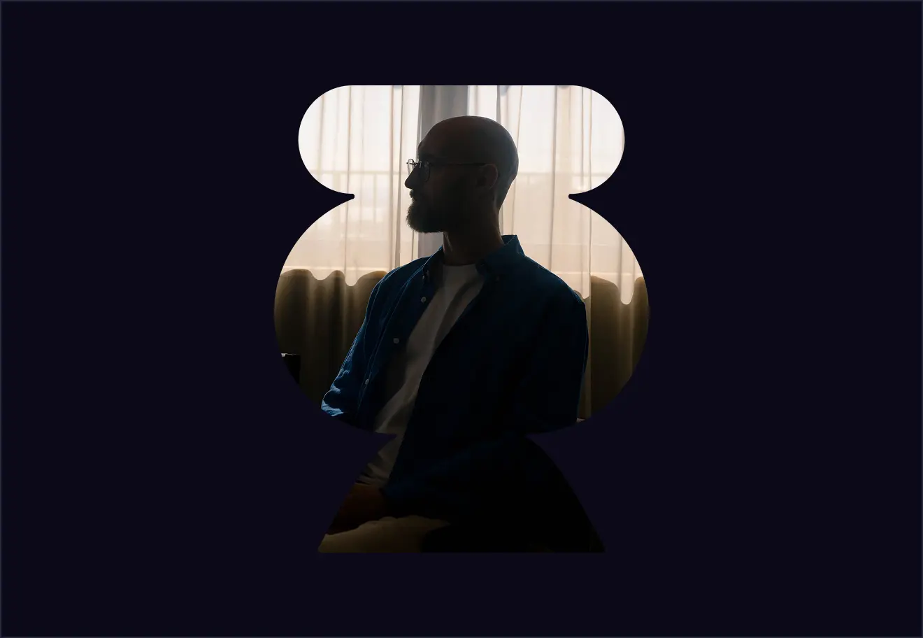
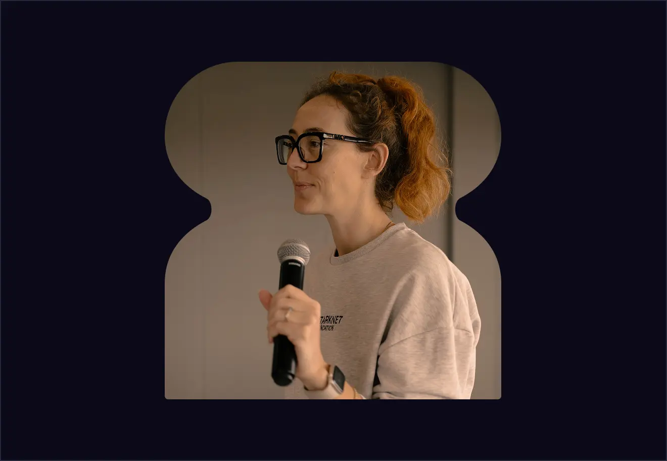
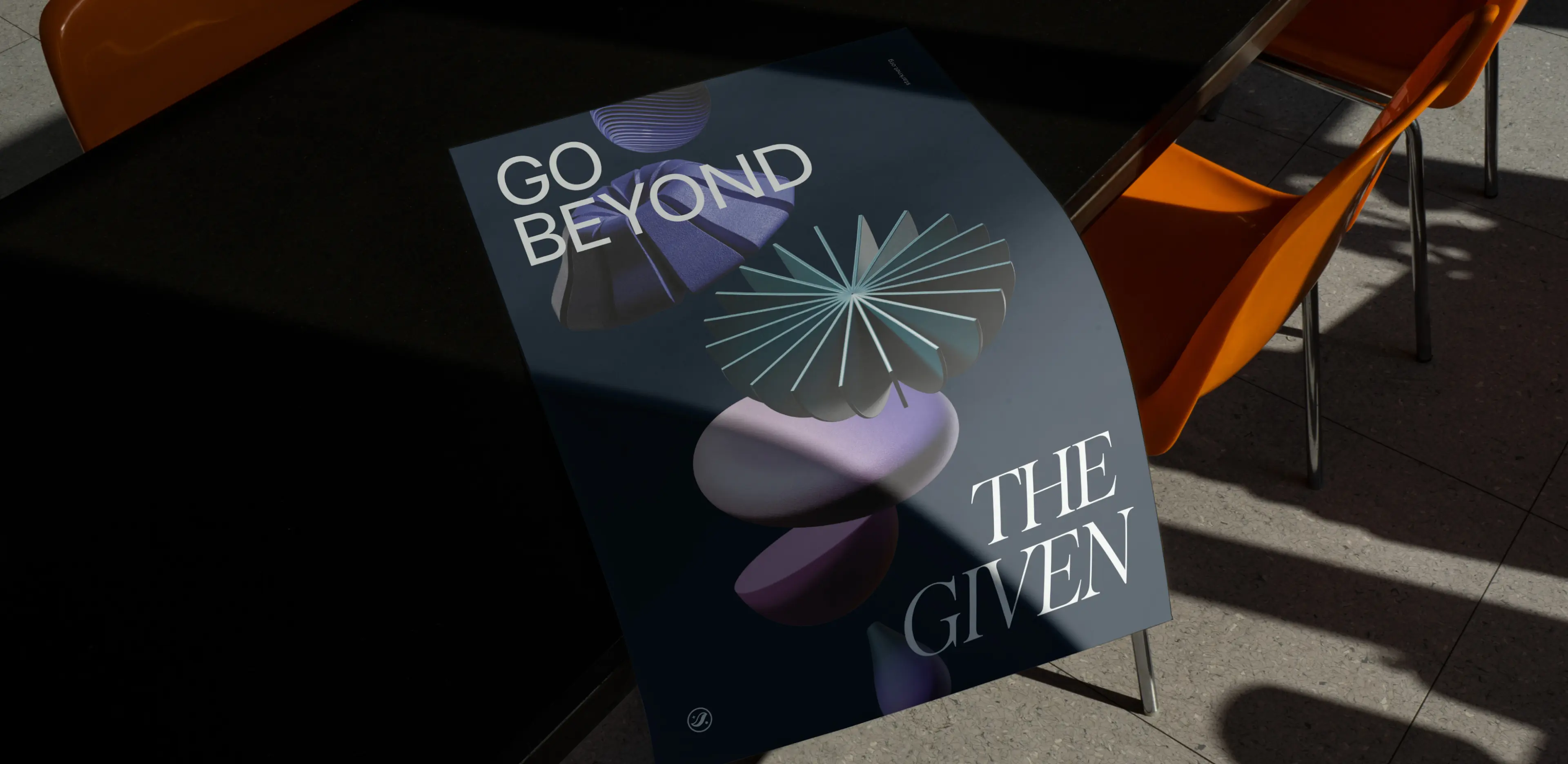
Solid Style shapes can frame photography, creating dynamic compositions that integrate imagery with the brand's graphic language. These frames add visual interest and context to photographs, helping bridge the gap between authentic human moments and the brand's abstract visual system.
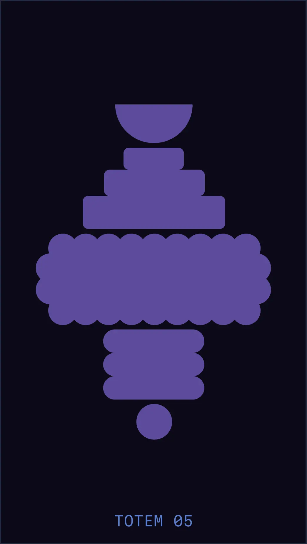
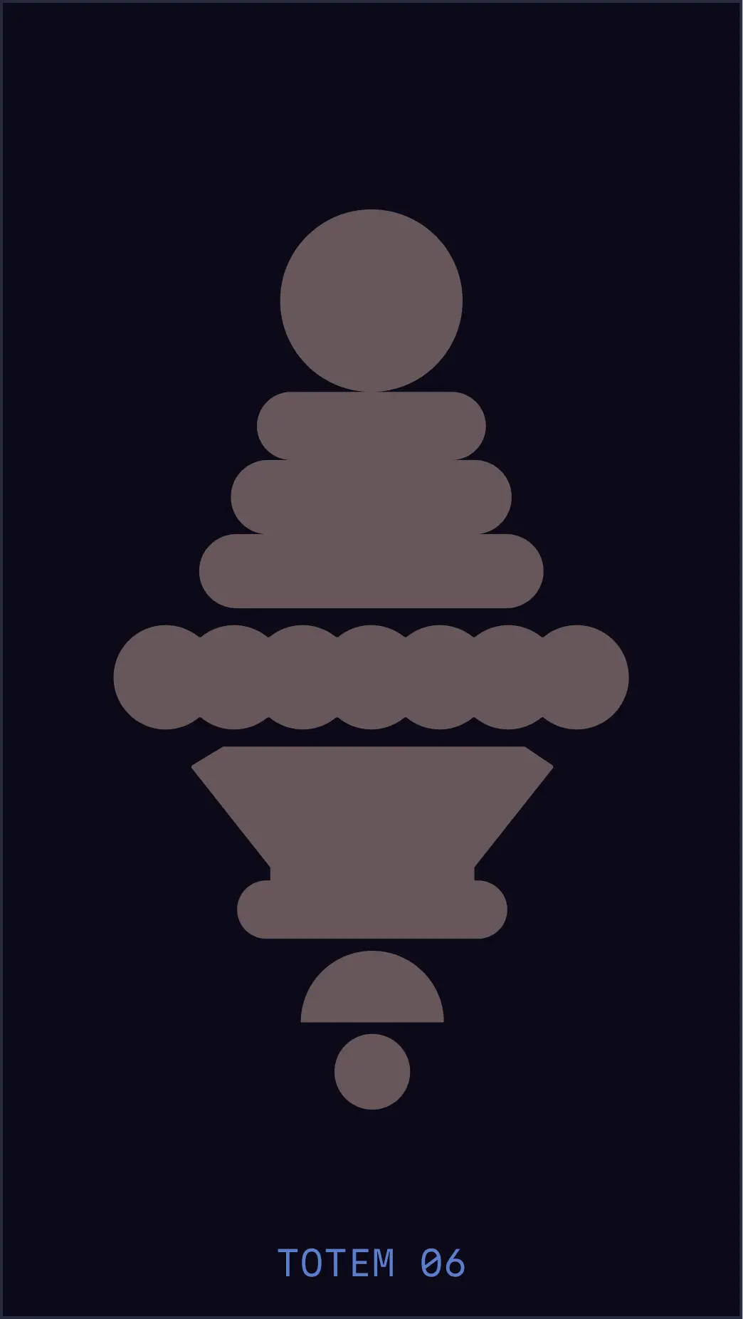
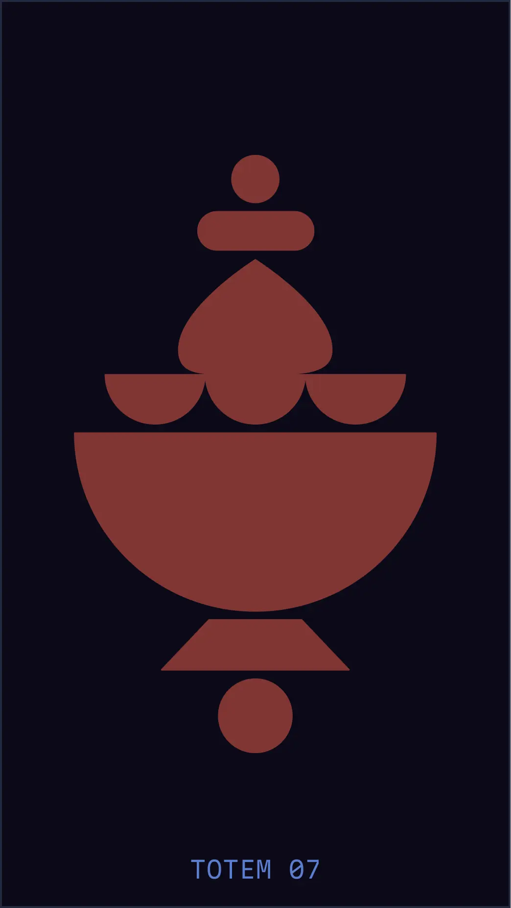
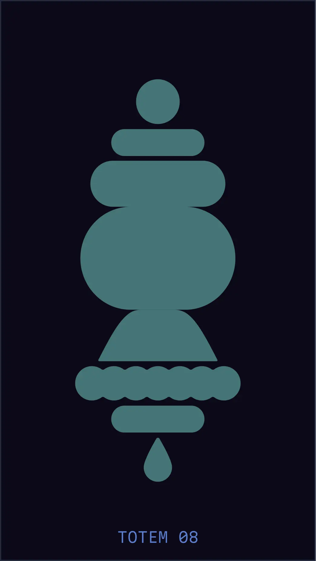
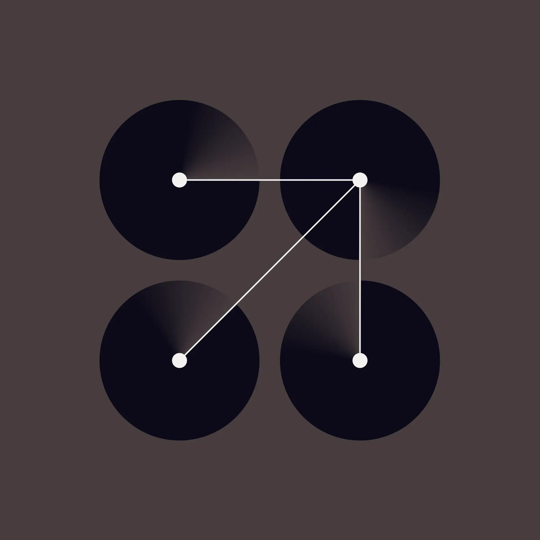
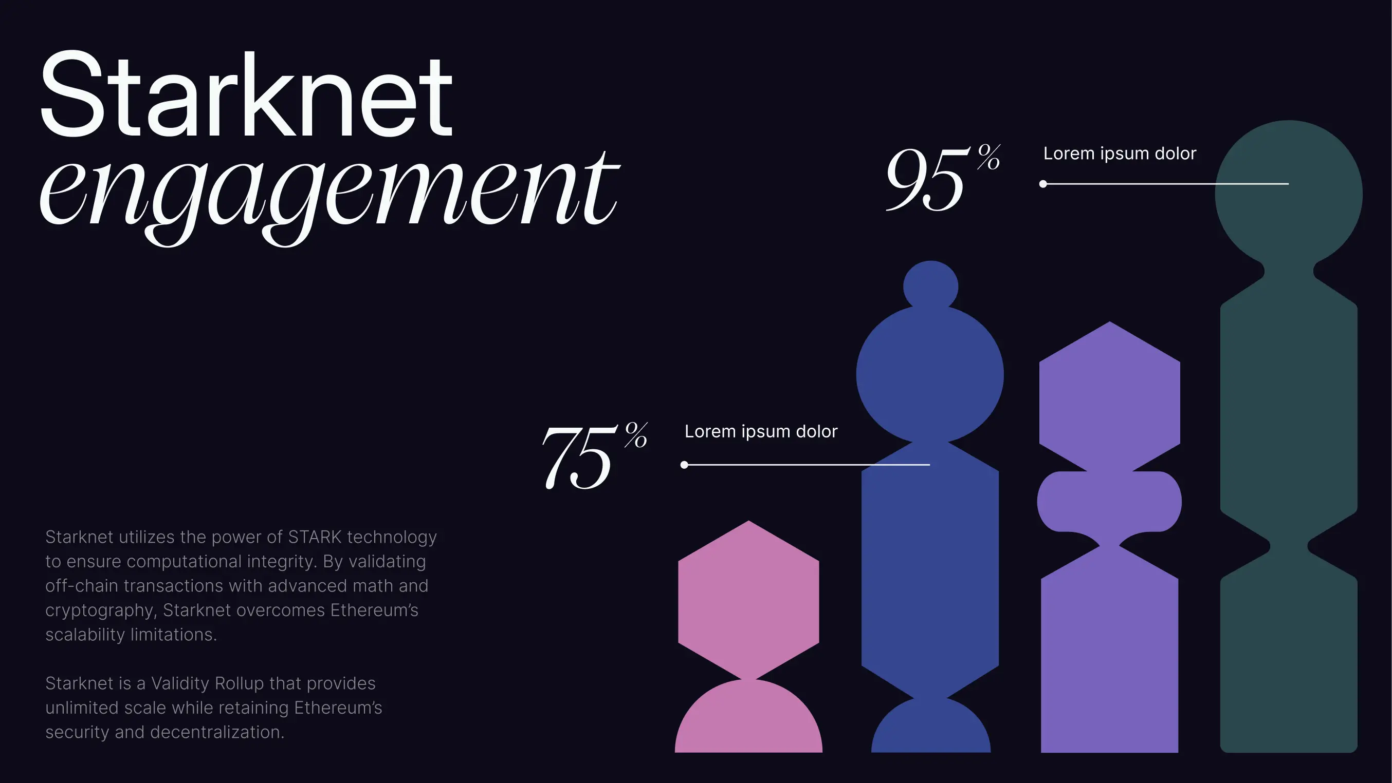
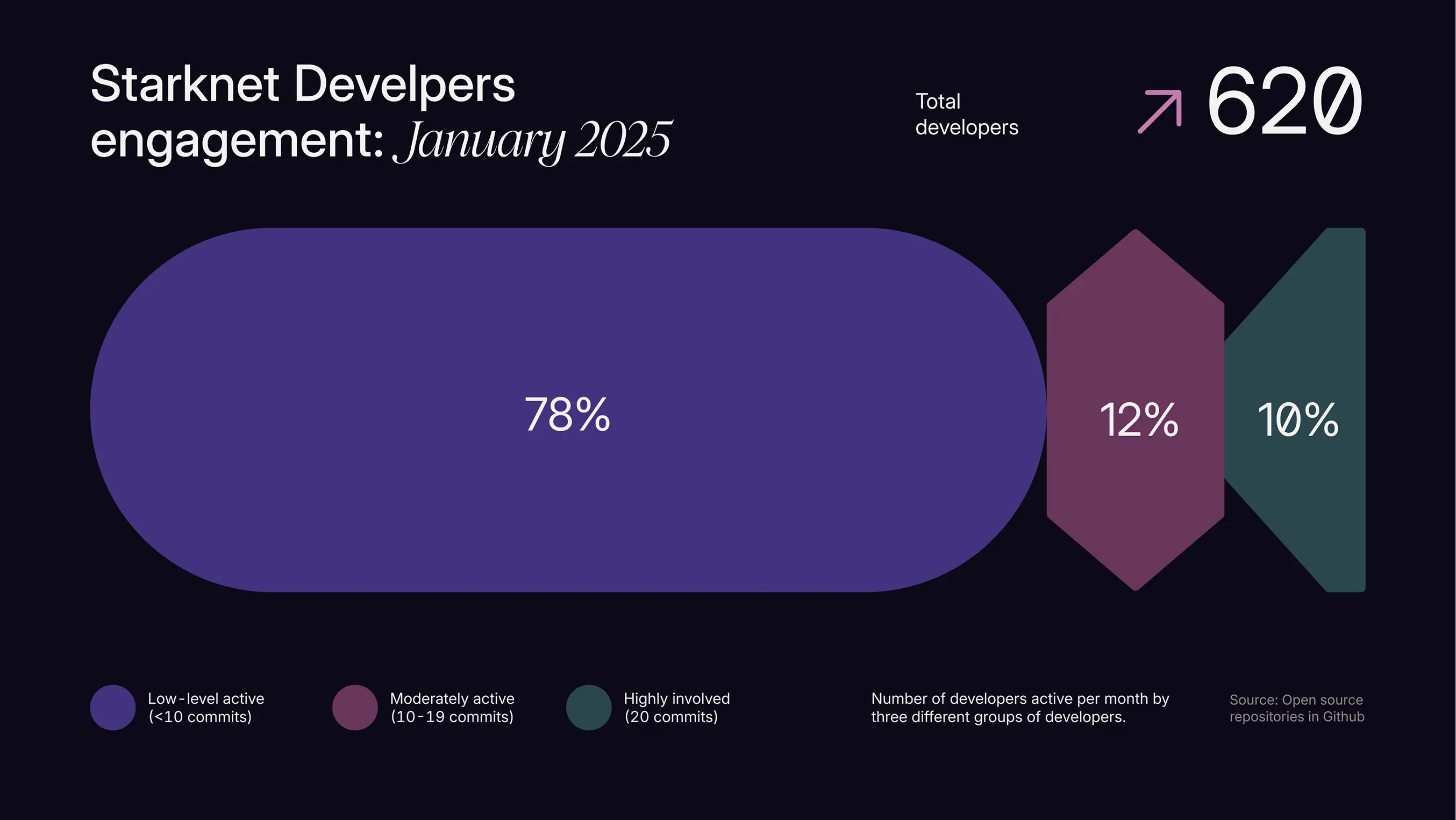
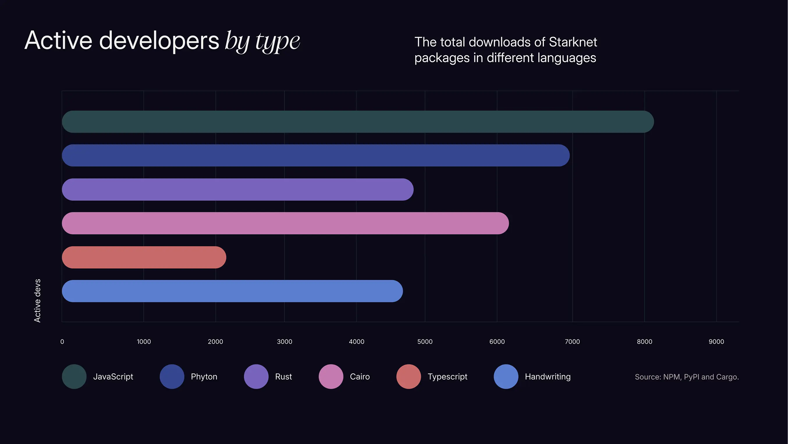
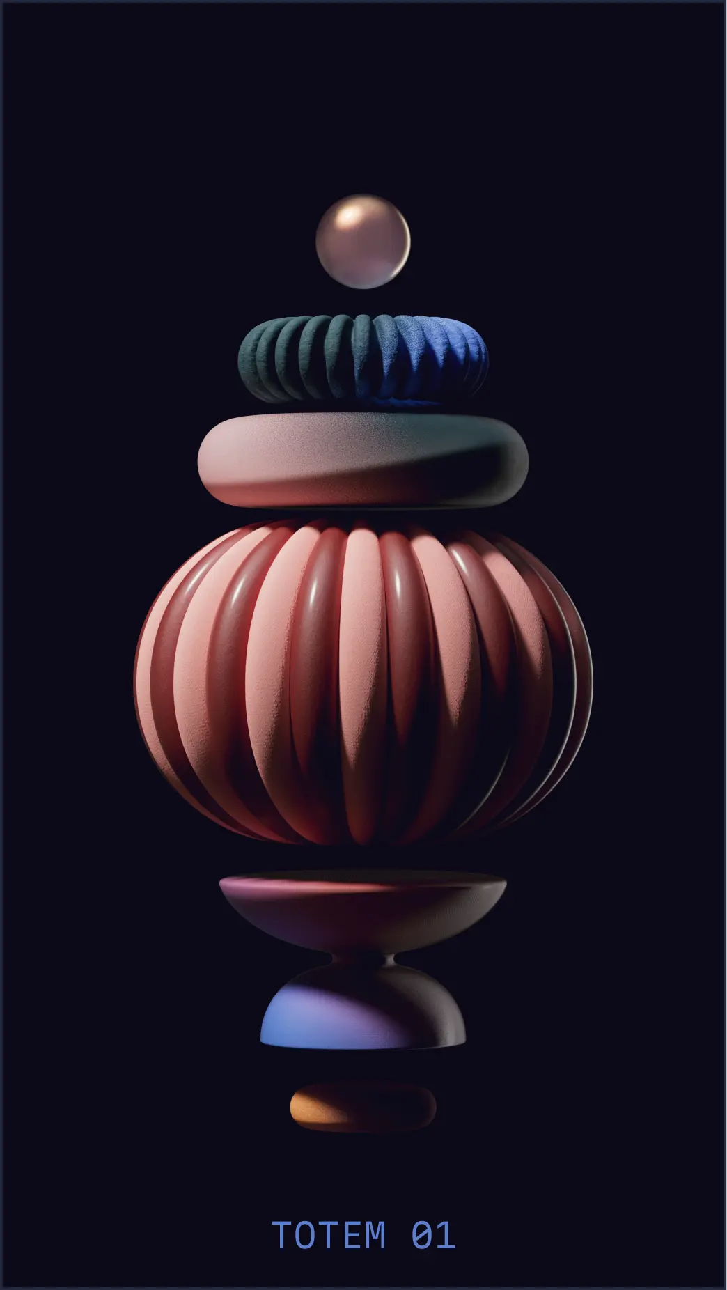
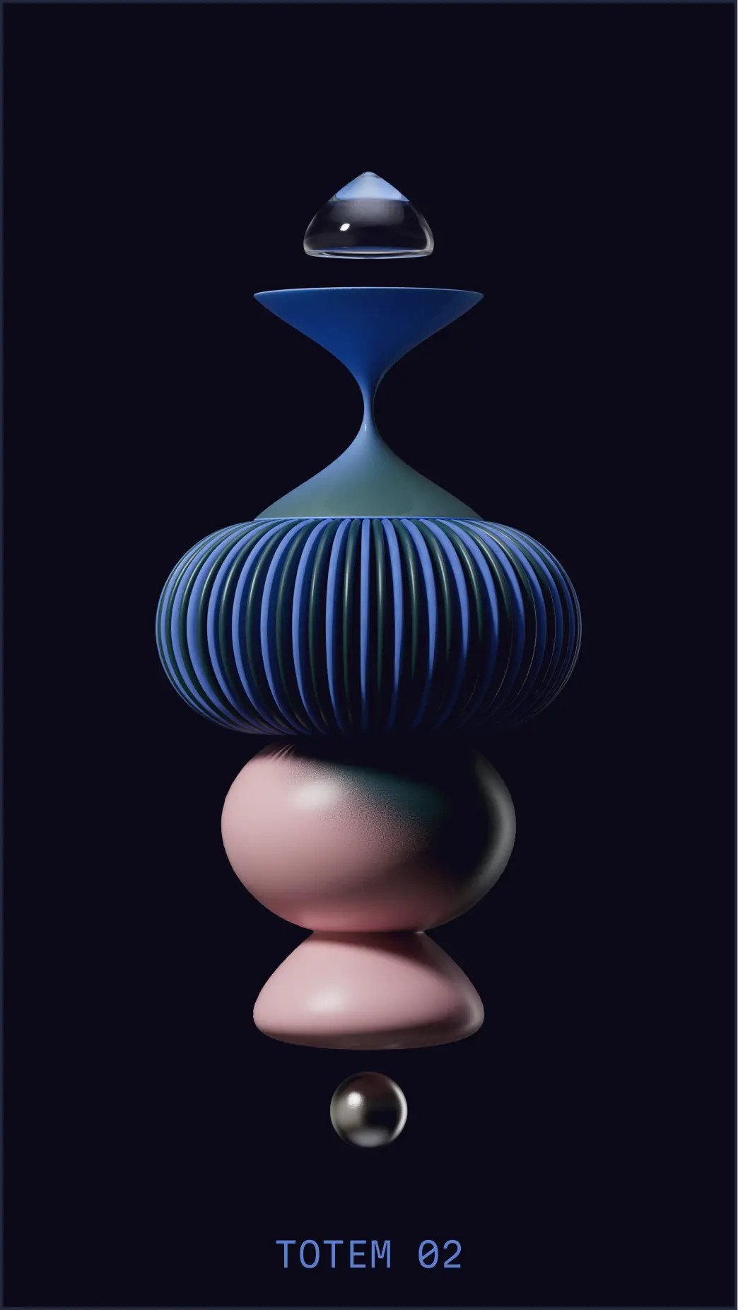
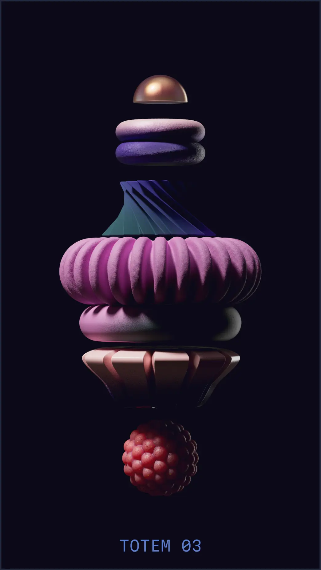
Charts leverage Solid Style shapes to visualize data in publications, reports, research papers, and presentations.
Because charts can incorporate shapes from the totem system, they allow for more editorialized styling when relevant—creating something unique that links data visualization even further to the brand identity. This flexibility means charts can shift from purely functional to more expressive depending on the context and audience.
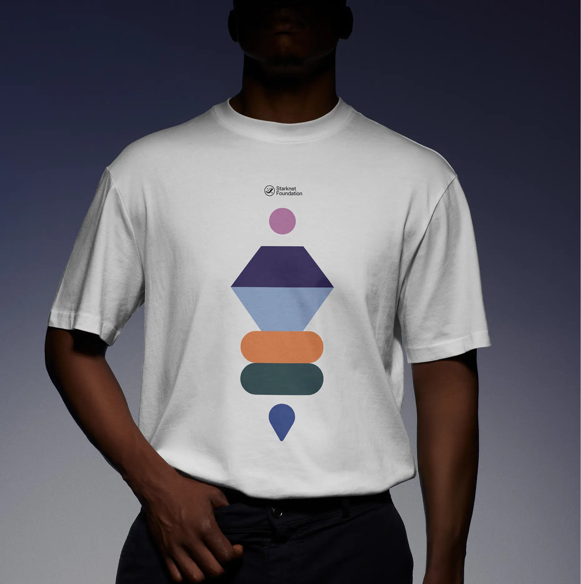
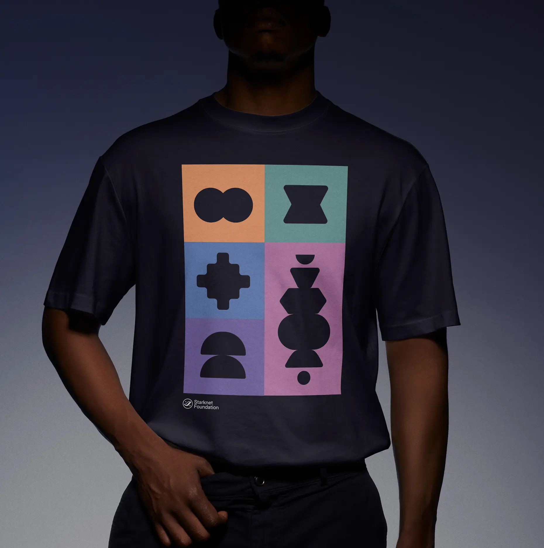
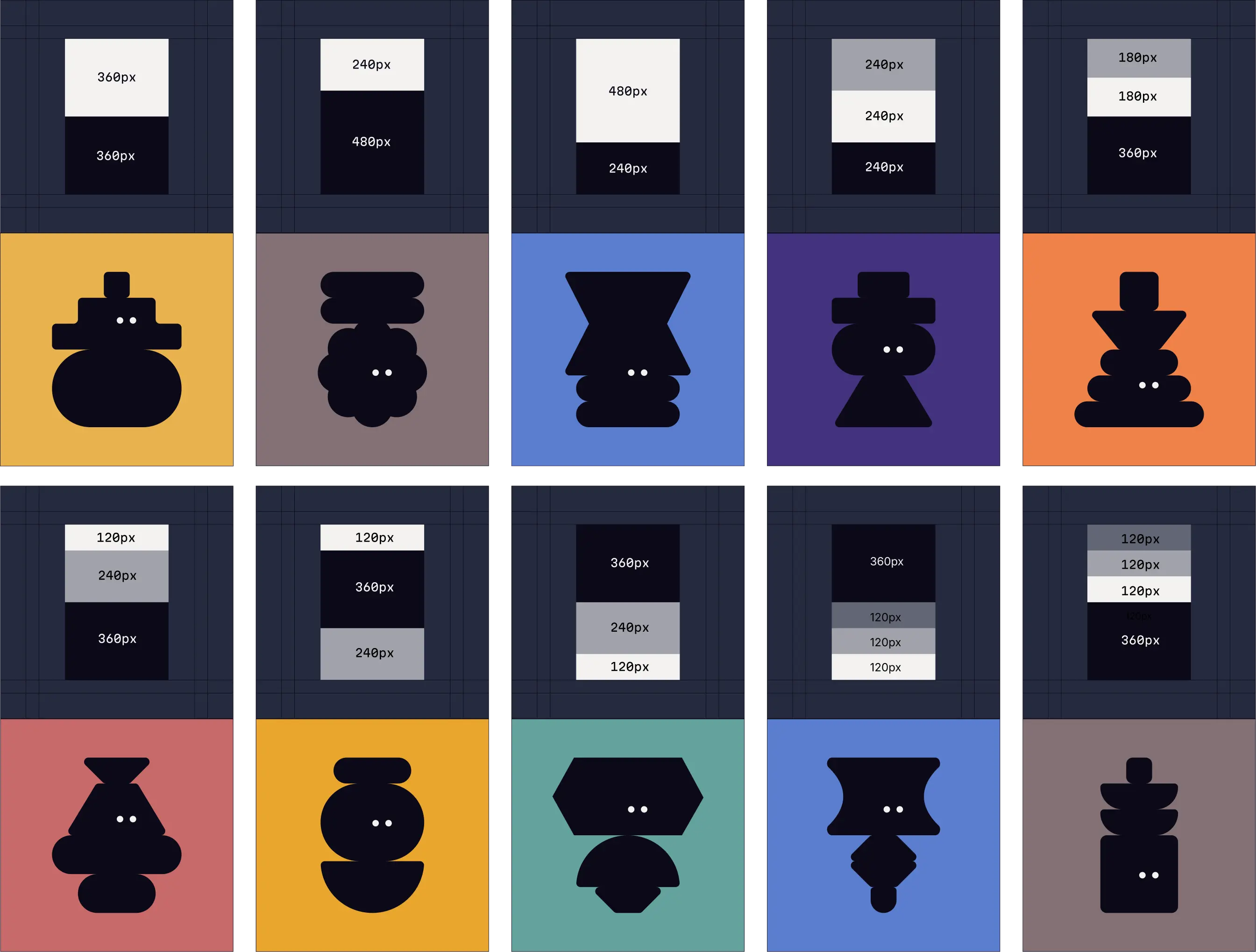
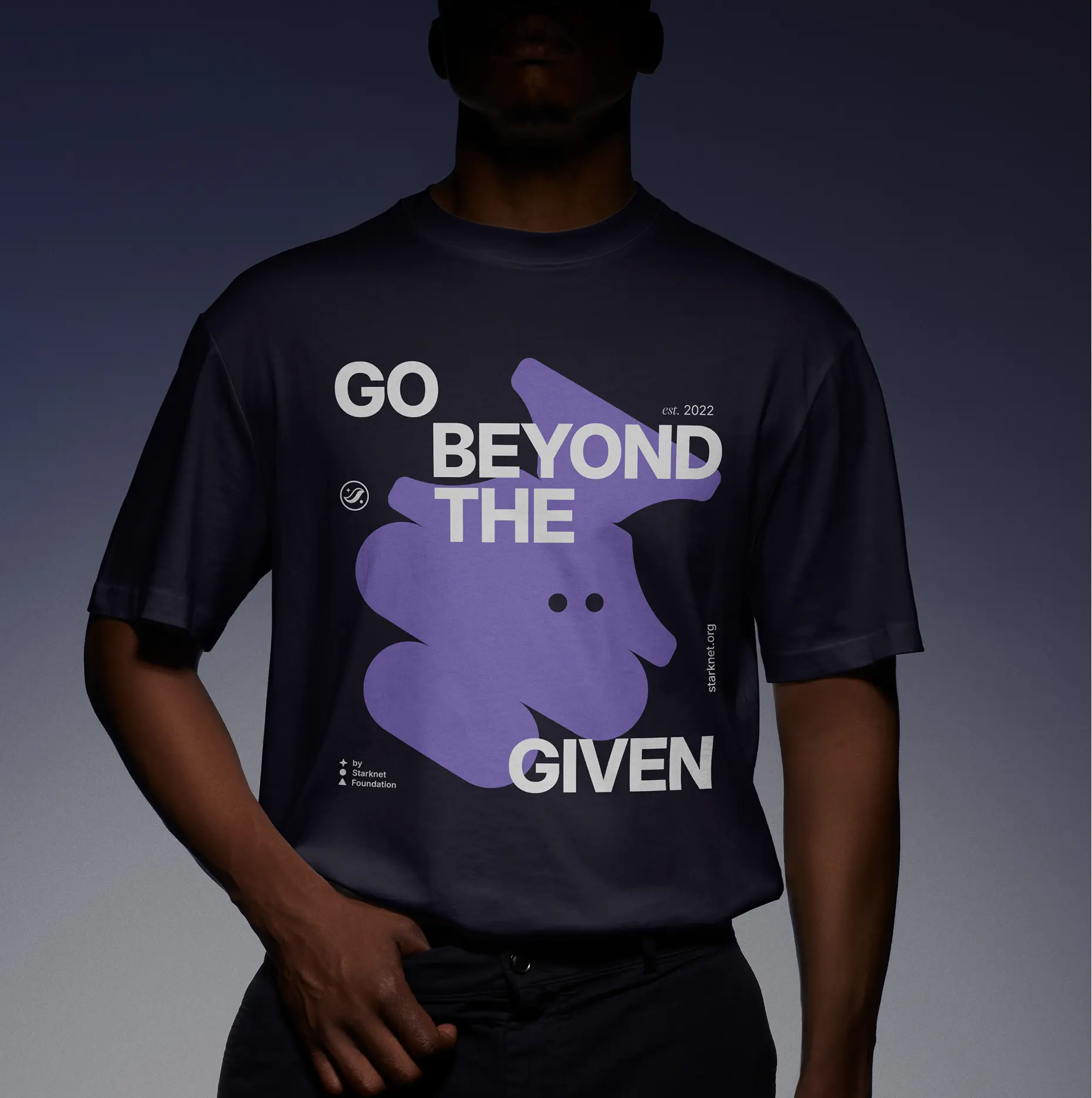
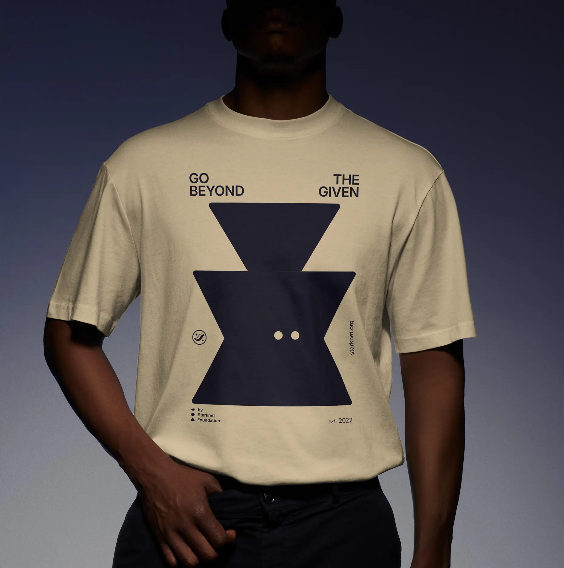
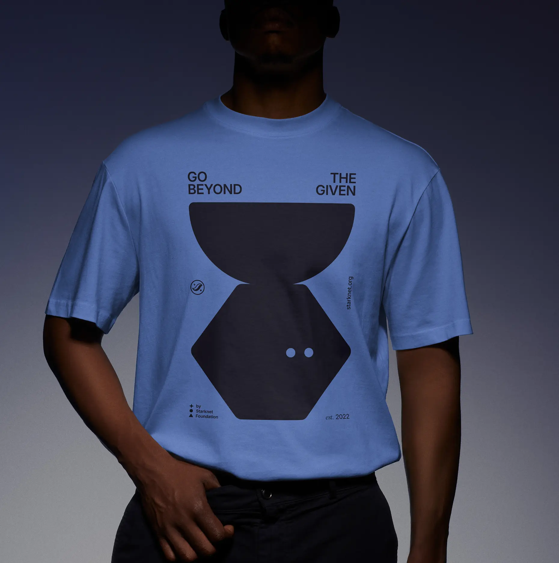
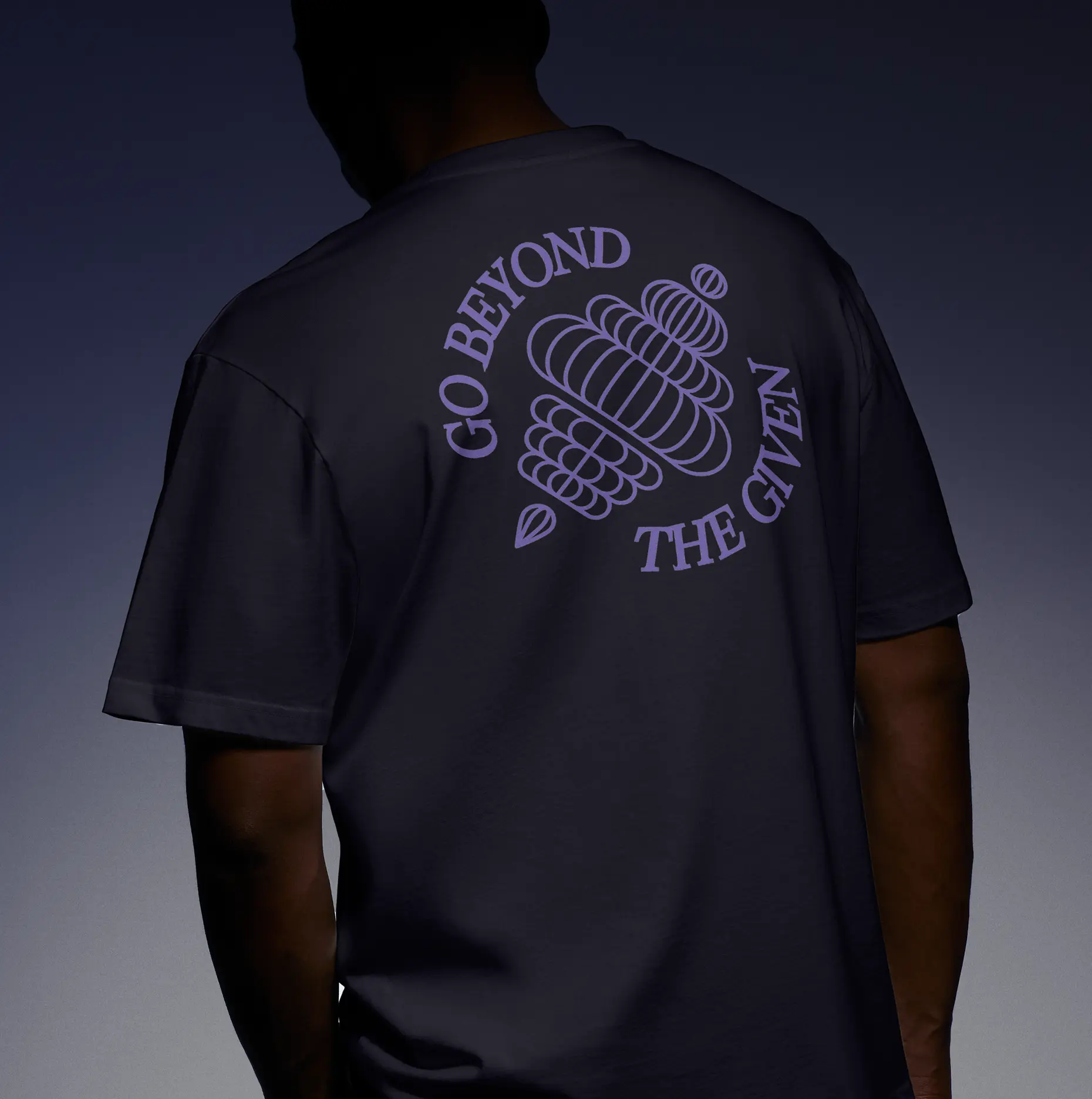
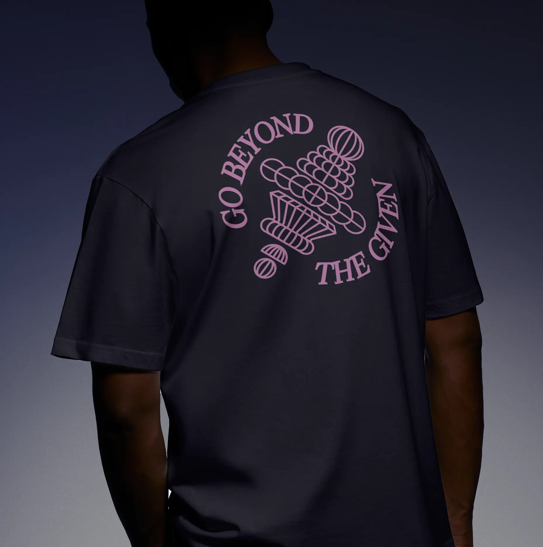
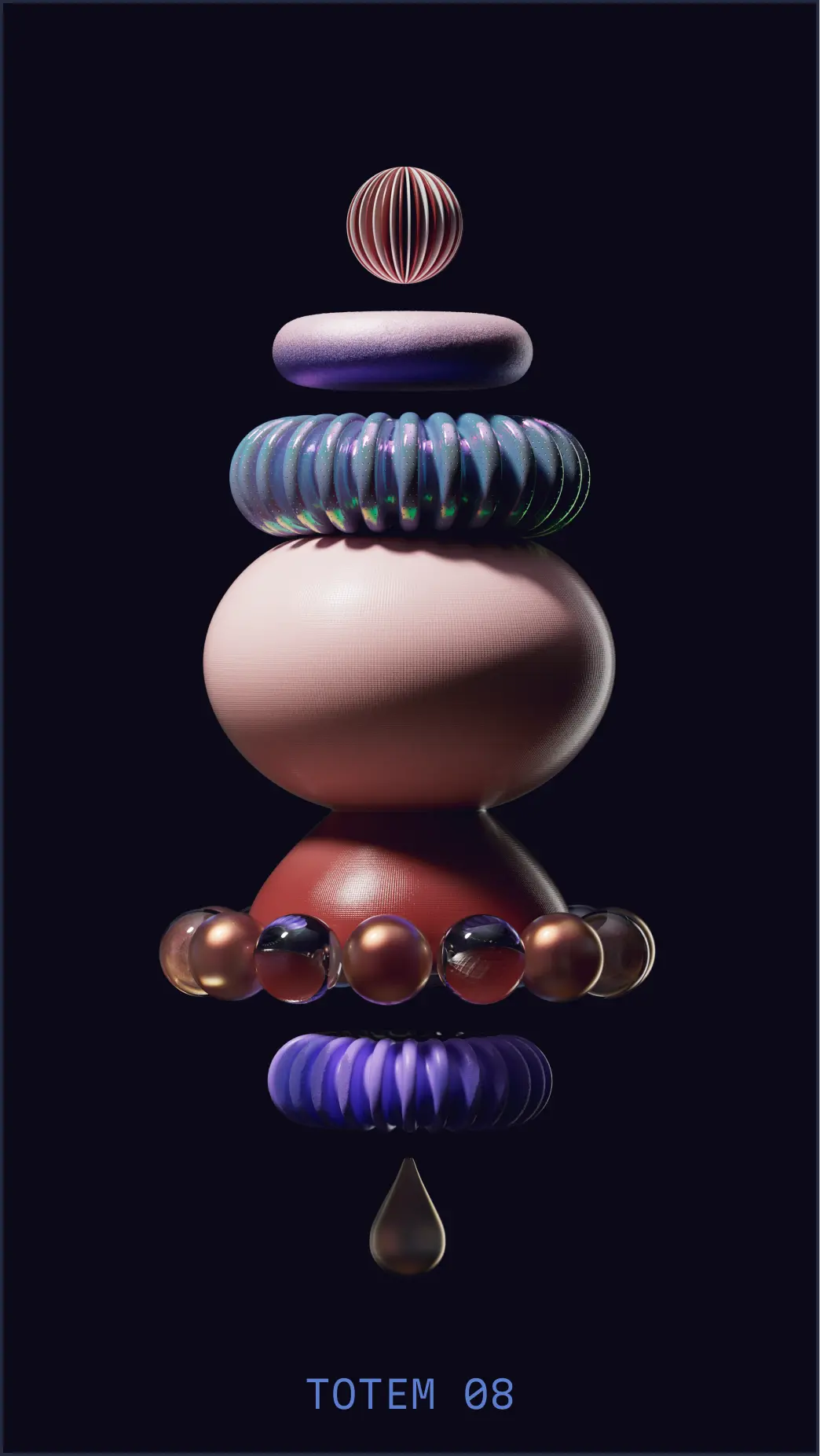
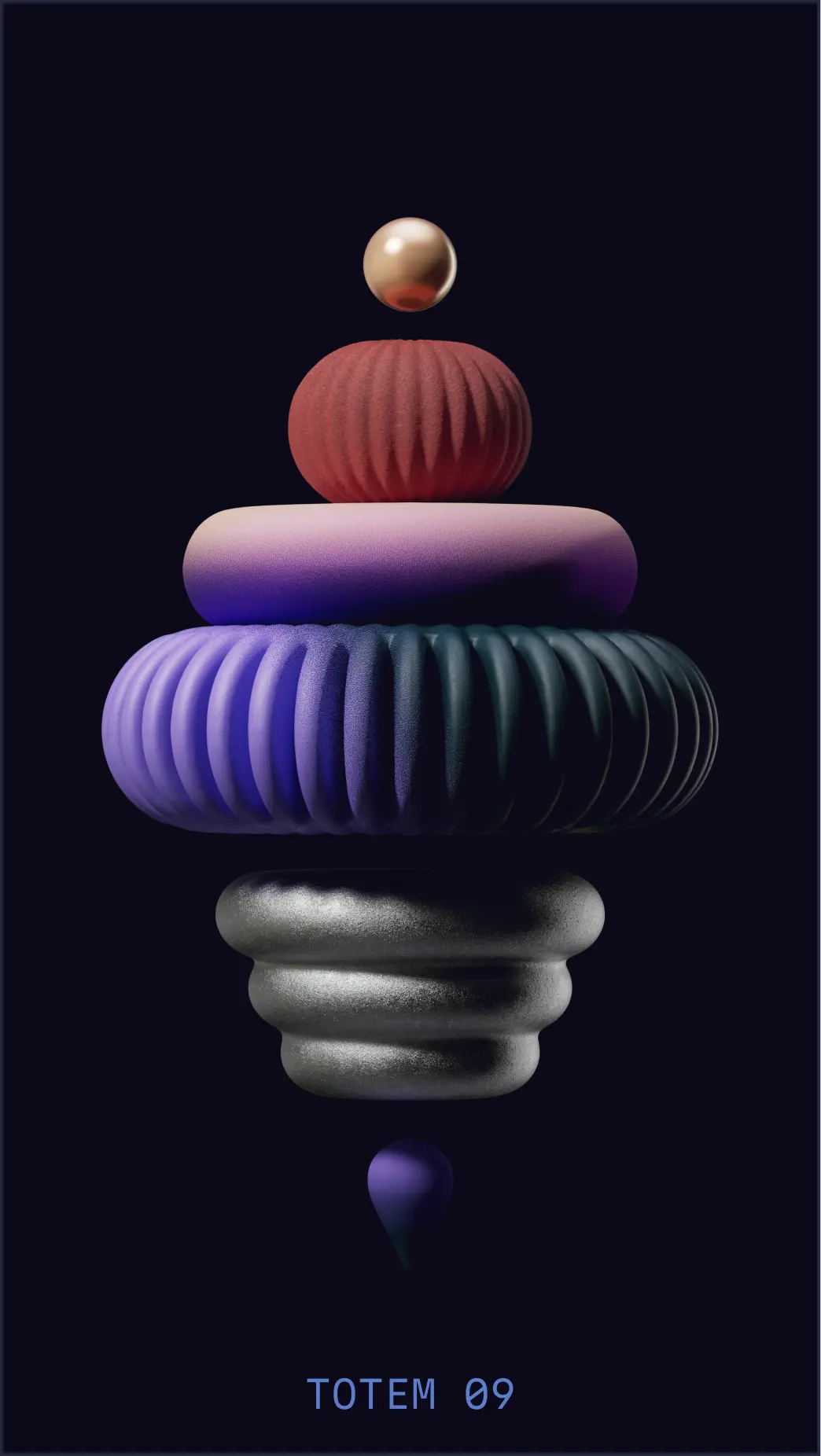
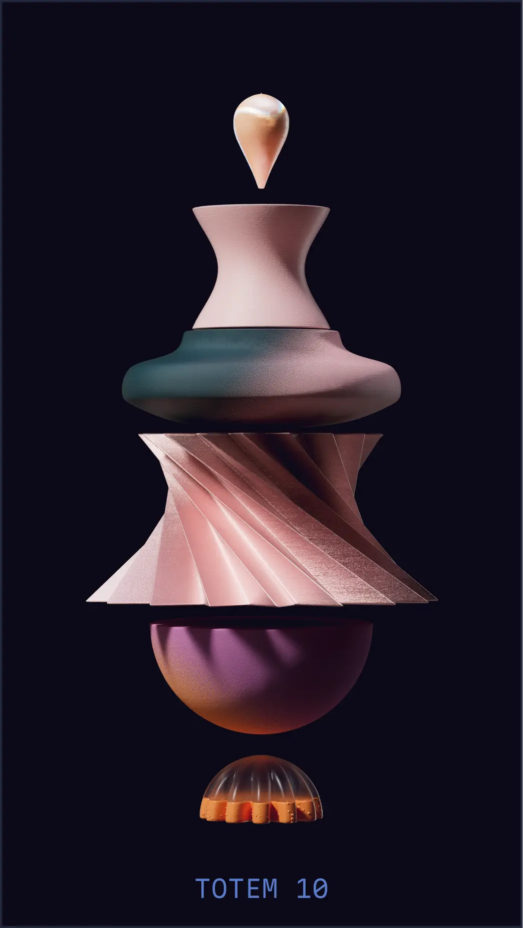
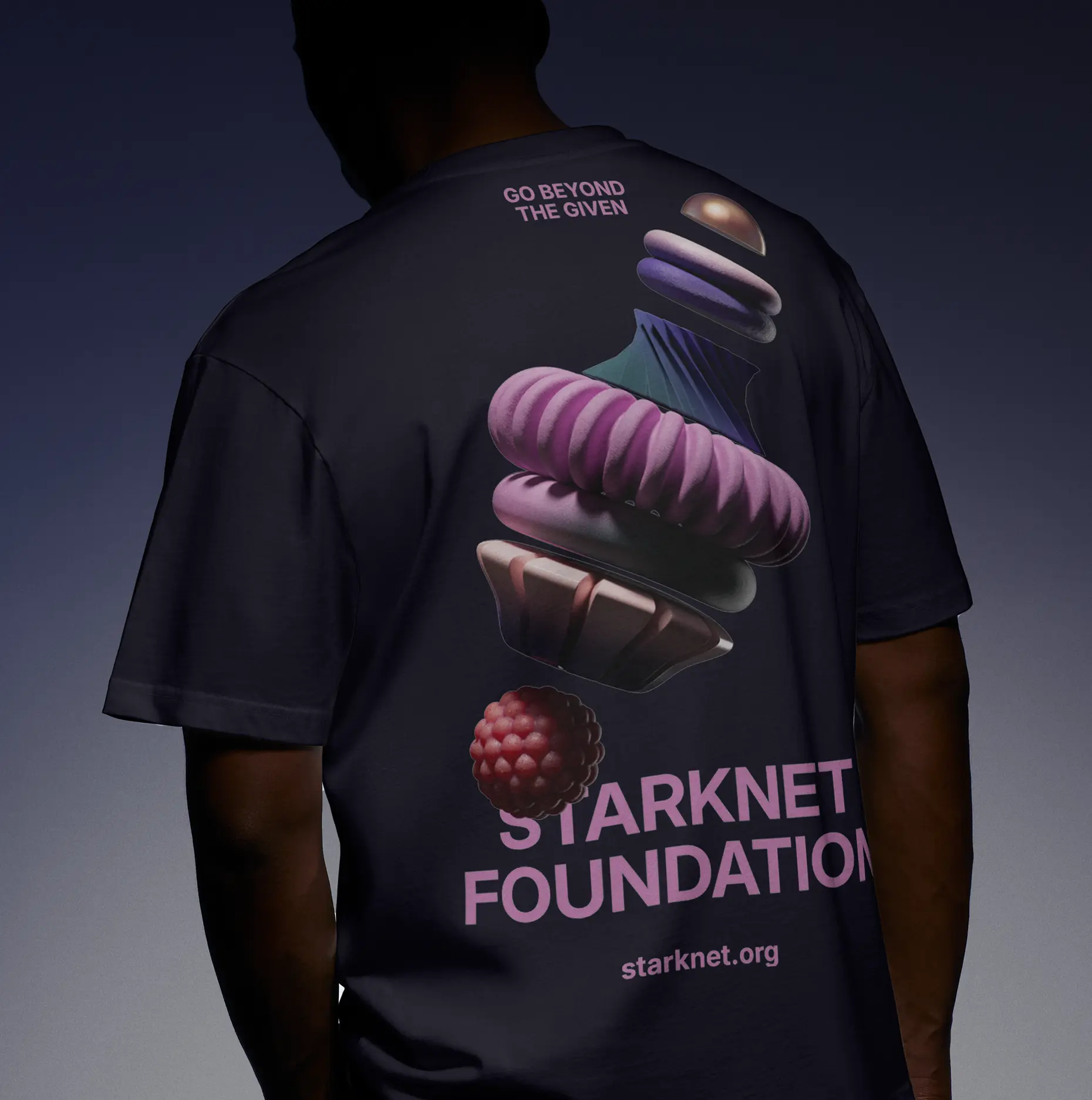
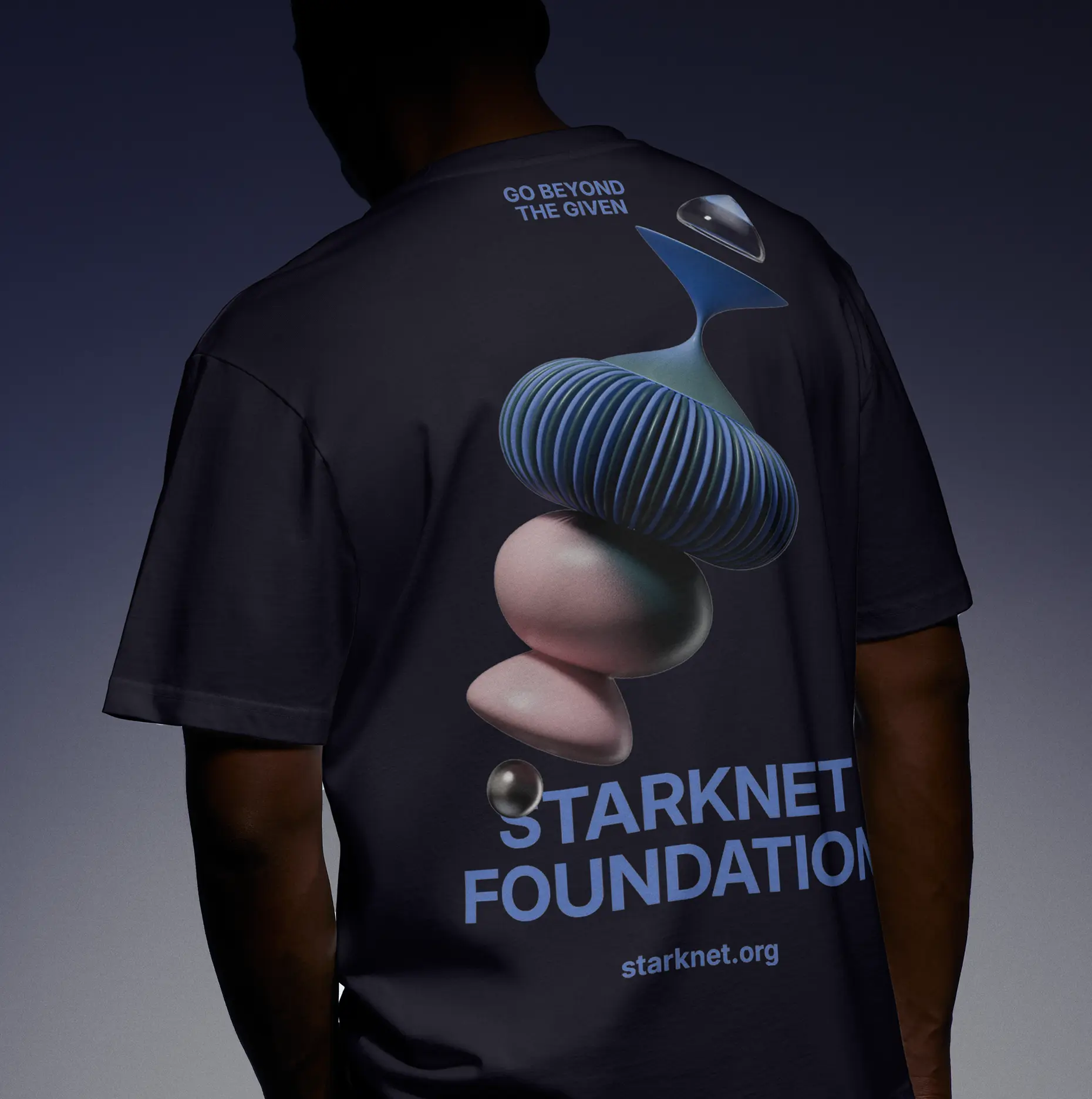
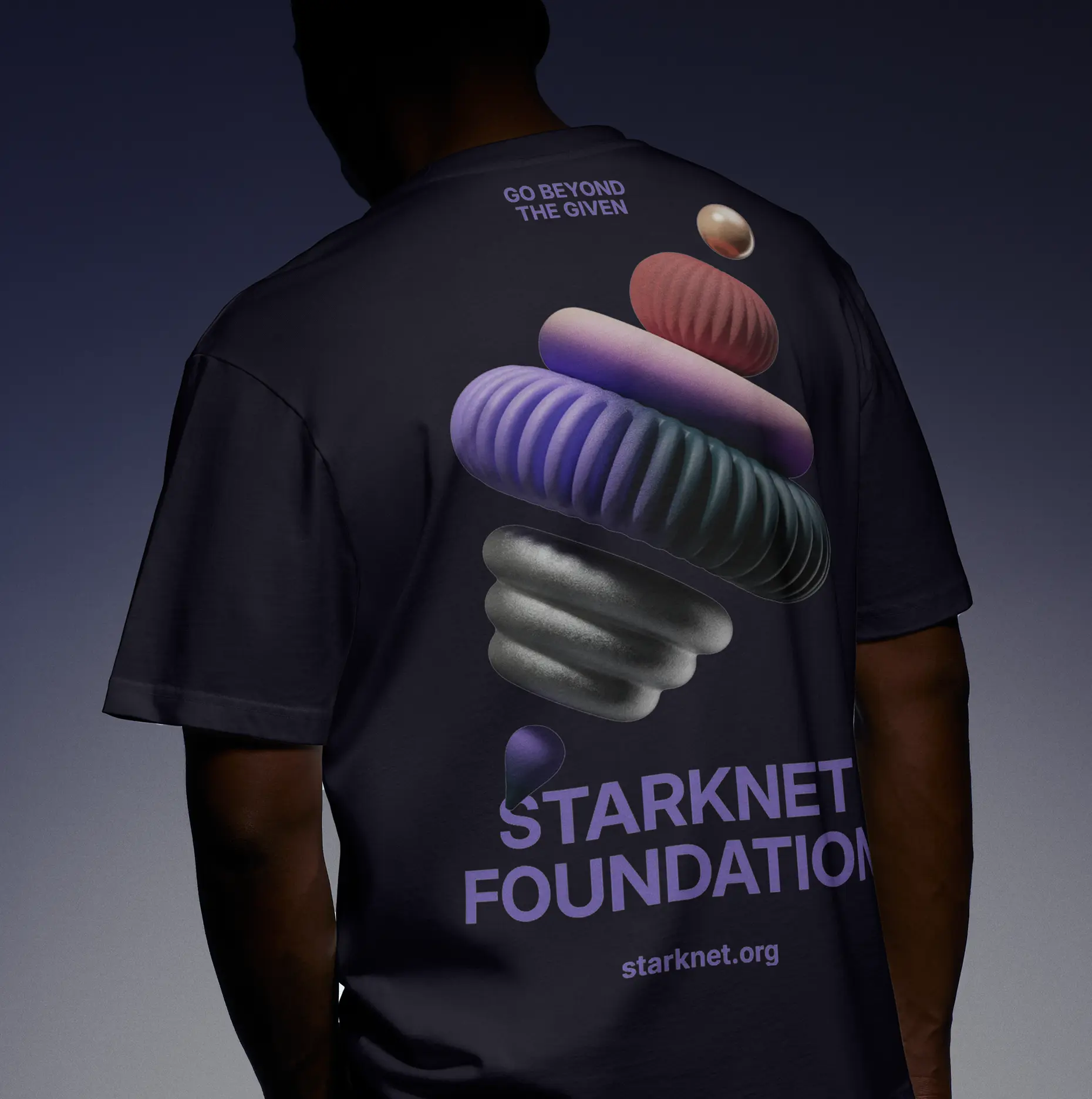
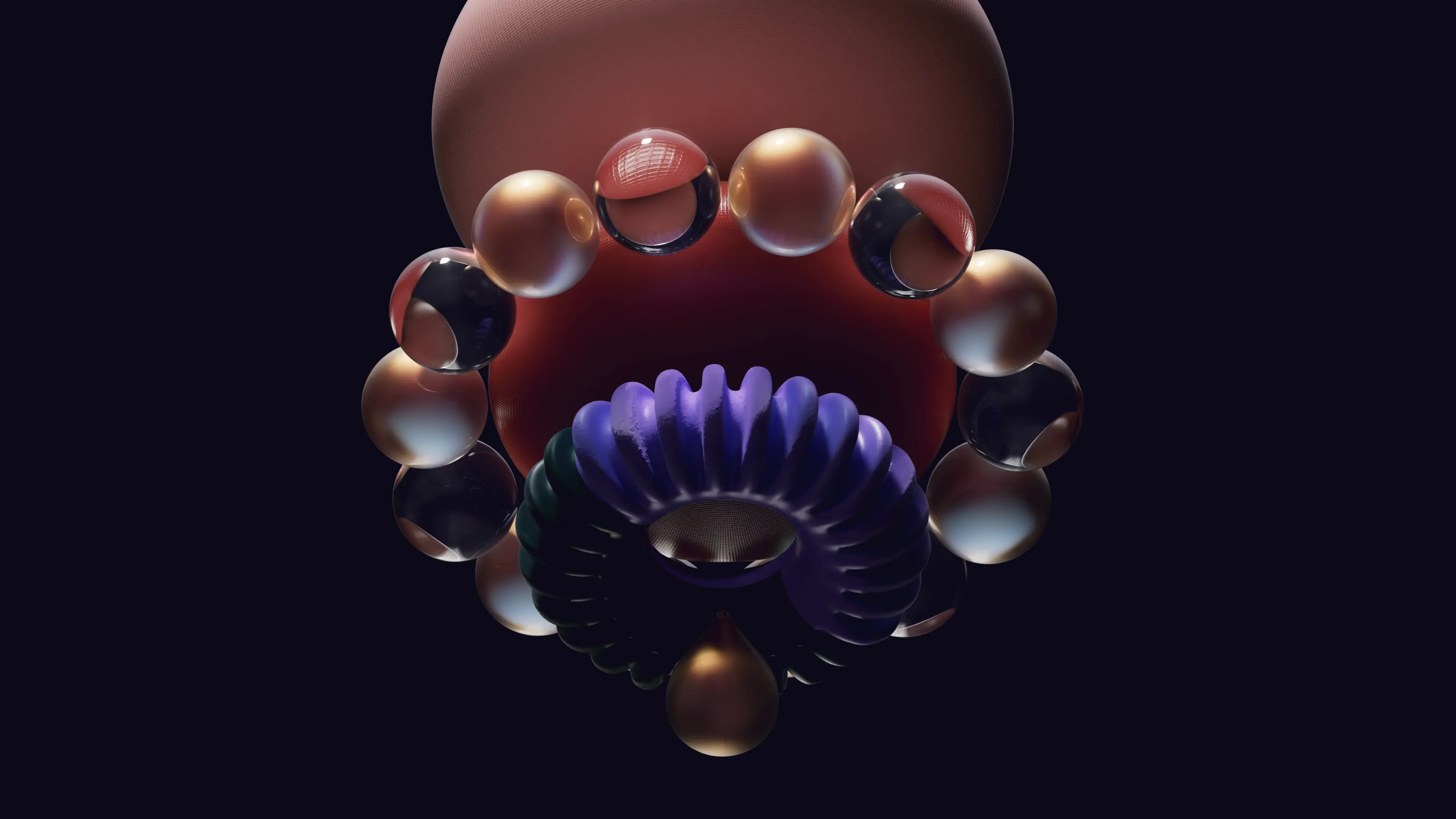
Starkies are character-based illustrations that serve as the most friendly and playful application of the Starknet Foundation brand. Functioning like miniature mascots, they bring personality, warmth, and individuality to the brand, making abstract concepts feel relatable and human. These small avatars can be used as profile pictures, NFTs, POAPs, community badges, and supporting visual assets for fun-toned applications.
Built entirely with Flat Style shapes and staying true to the brand's modular system, each Starkie is constructed from 2, 3, or 4 stacked shapes with small, minimal eyes added to give character and emotional presence.
Starkies goal is to humanize the Foundation's presence across digital platforms. Their modular, scalable nature makes them incredibly versatile across applications.
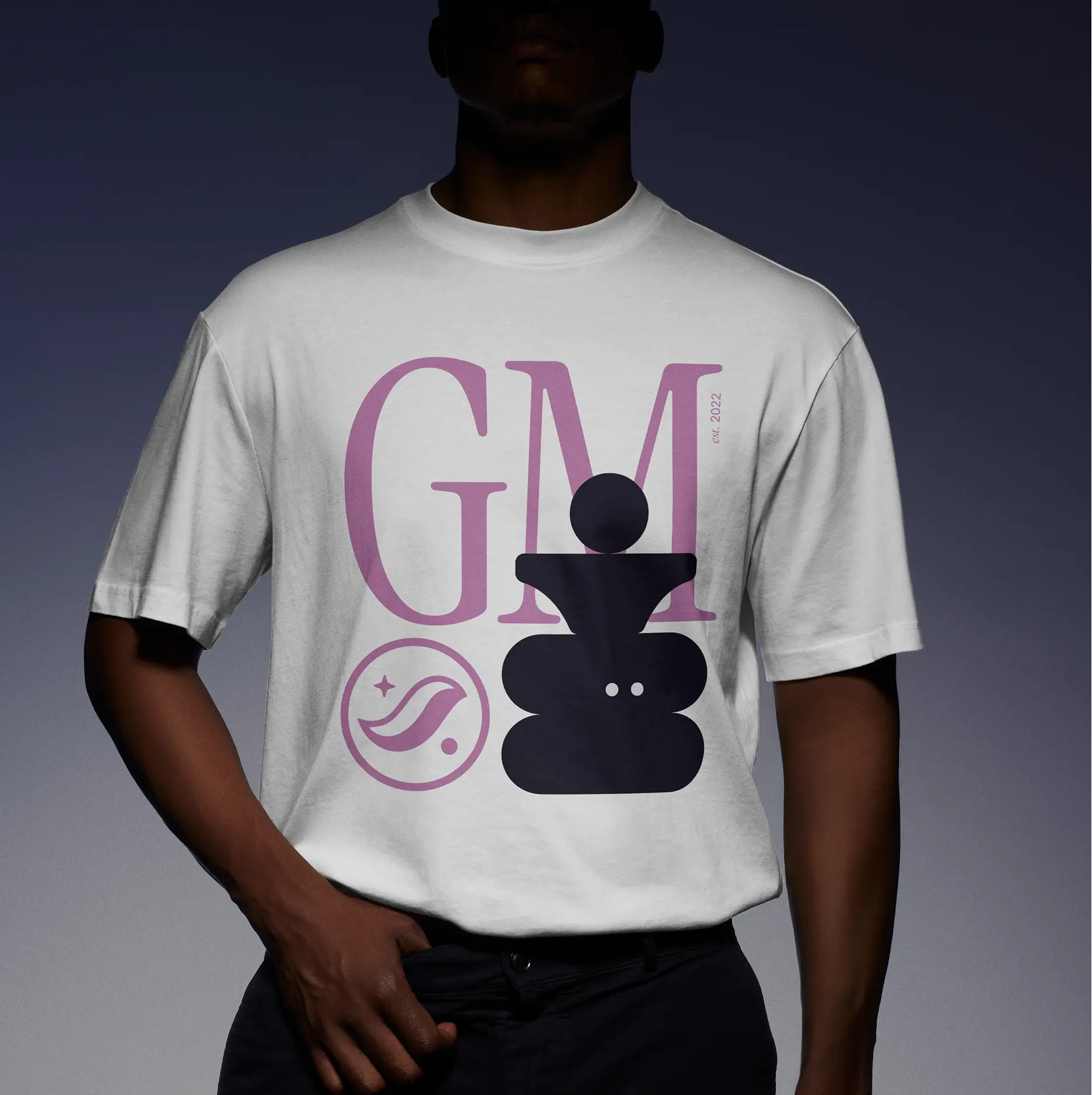
They work equally well as NFT collections, where each character becomes a unique collectible with distinct traits and rarity. They translate seamlessly to merchandise—appearing on t-shirts, hoodies, stickers, and other physical goods that help the community express their connection to Starknet Foundation. On the web, they serve as playful accents in otherwise formal communications. This flexibility allows Starkies to move fluidly between digital and physical spaces, maintaining their charm and recognizability regardless of medium or scale.